Warehouse & Distribution Professional Website Template
Dock is a split-screen cross-docking landing page template built for logistics and supply chain businesses. It leads with hard operational metrics, compares cross-docking against traditional warehousing in clinical spec-sheet tables, and drives conversions through an inline lane analysis form. The Carbon Fiber color system and mono typeface give every section a data-first, no-nonsense look built for freight professionals.
by Rocket studio
Quick summary
Dock is a single-page landing page template designed for cross-docking facilities targeting third-party logistics coordinators, retail distribution managers, and e-commerce operations leads. It opens with a full-width metrics wall, moves through three comparison tables that pit cross-docking against traditional warehousing, and closes with a four-field lane analysis form. The design is industrial, data-dense, and built to convert freight buyers.
Who this template is for
This template is built for logistics and supply chain businesses that need to prove their value with numbers rather than lifestyle photography. It speaks directly to the operations side of freight procurement.
- Third-party logistics coordinators managing less-than-truckload (LTL) consolidations who need to demonstrate speed and cost advantages to clients
- Retail distribution managers fighting chargebacks caused by late deliveries who need a credible, data-backed pitch
- E-commerce operations leads looking for next-day zone-skipping without paying for warehousing overhead
What problem this template solves
Most logistics landing pages rely on vague brand promises instead of measurable proof. Freight buyers are analytical. They need to see cost-per-pallet comparisons, handling touch counts, and on-time departure rates before they trust a pitch.
- Traditional warehousing messaging buries the cost difference instead of surfacing it immediately
- Generic lead forms feel like marketing traps rather than useful freight quote tools
- Operations decision-makers distrust pages that look like brochures rather than spec sheets
What you get with this template
You get a fully structured single-page layout that presents cross-docking performance data before asking for any visitor input. Every section is designed to build evidence, not atmosphere.
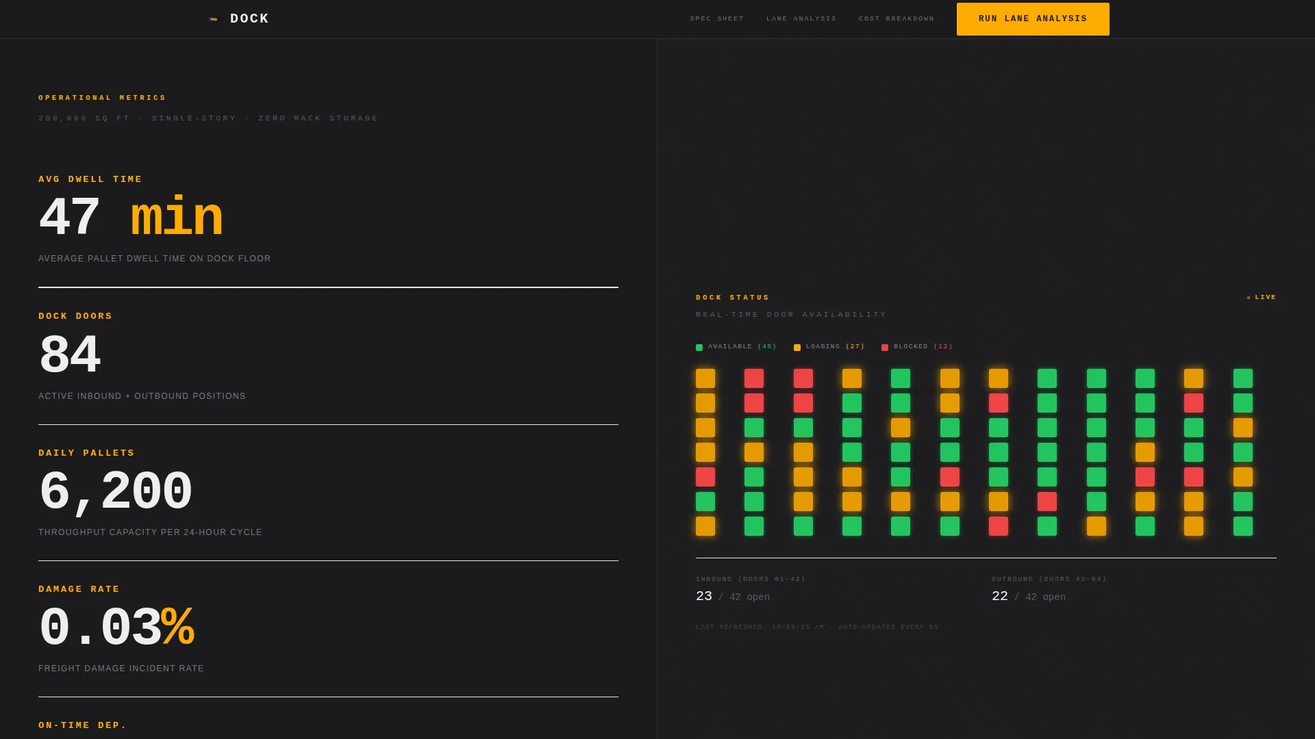
- A full-width stats wall with five oversized performance metrics and a live dock-door status grid
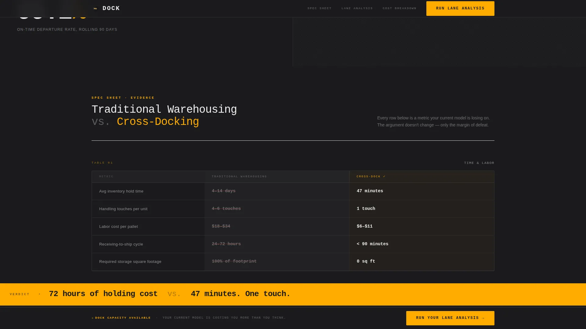
- Three side-by-side comparison tables in spec-sheet format, each contrasting traditional warehousing with cross-docking
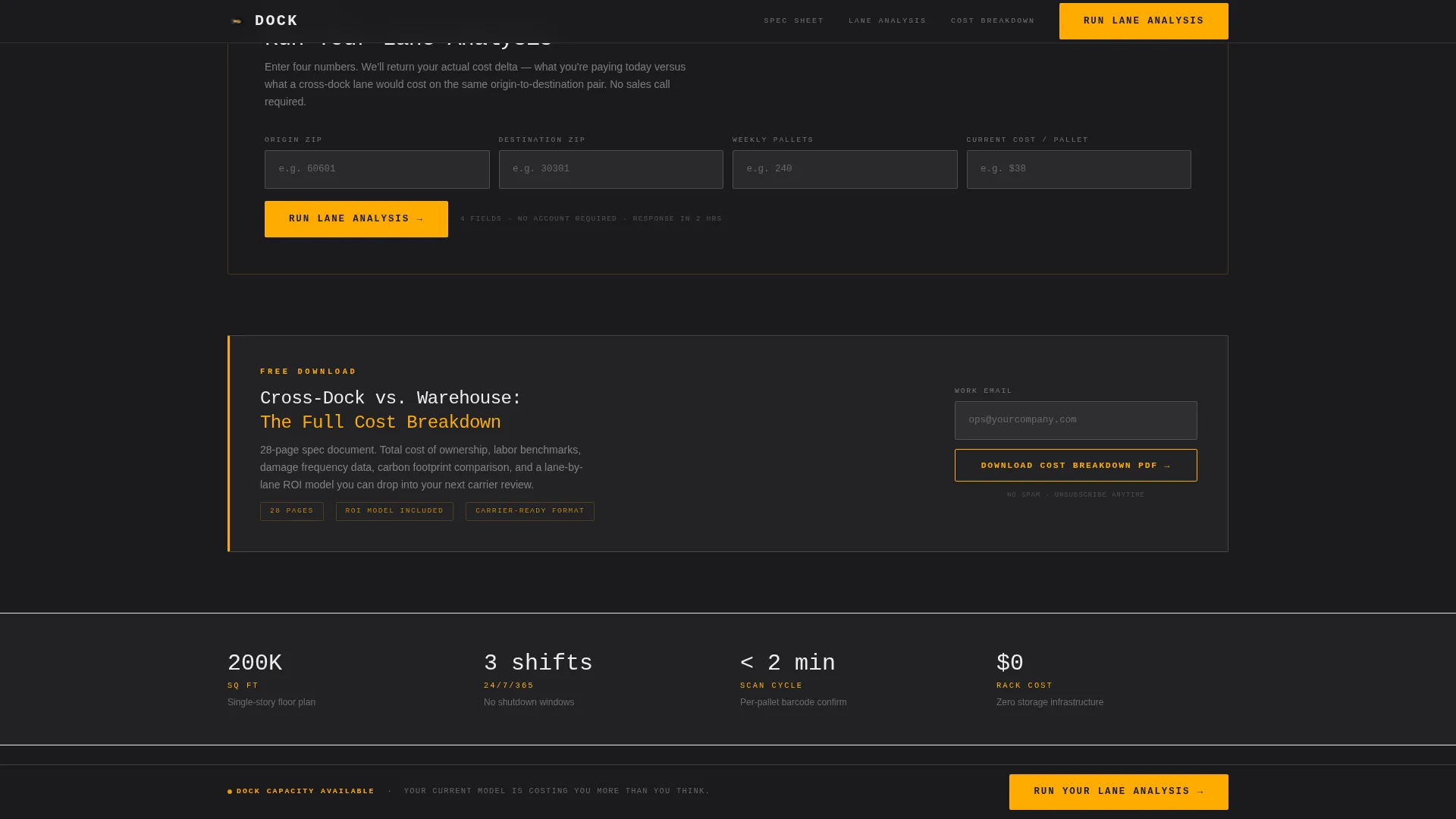
- A four-field inline lane analysis form (origin zip, destination zip, weekly pallet count, current cost per pallet) plus an email-gated PDF download call to action
- A persistent sticky bottom bar repeating the primary "Run Your Lane Analysis" call to action
Feature list
This template includes a focused set of layout components and interactive elements built around freight operations and conversion.
Full-Width Operational Stats Wall
Five oversized performance metrics sit on the left half of the header in a heavy mono typeface. Numbers include average dwell time, dock door count, daily pallet throughput, damage rate, and on-time departure rate. The right half displays a live dock-door status grid styled like an airport departures board, with green, amber, and red availability indicators. The amber accent pulses subtly to signal live operational data.
Spec-Sheet Comparison Tables
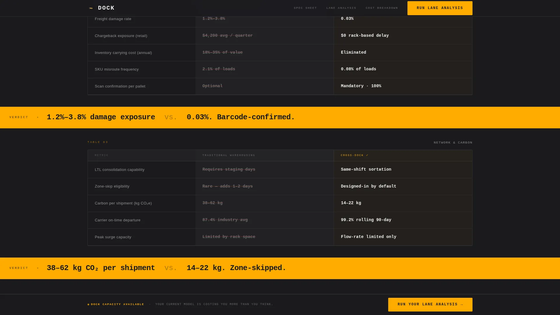
Three structured tables compare traditional warehousing against cross-docking row by row. Metrics covered include average inventory hold time, handling touches per unit, labor cost per pallet, damage frequency, and carbon footprint per shipment. Single-line amber callouts appear between tables to deliver the verdict on each comparison, reinforcing the clinical, evidence-first rhythm.
Inline Lane Analysis Form
The primary conversion form uses four inline fields on one row: origin zip code, destination zip code, average weekly pallet count, and current cost per pallet. The layout mirrors a freight quote form rather than a standard marketing form, reducing friction for logistics buyers who are used to quoting tools.
Email-Gated PDF Download
A secondary conversion path offers a downloadable PDF titled "Cross-Dock versus. Warehouse: The Full Cost Breakdown." It is gated behind a single email field, giving visitors a low-commitment way to engage before filling out the full lane analysis form.
Sticky Conversion Bar
A persistent bottom bar carries the "Run Your Lane Analysis" call to action across every scroll position. It remains visible as visitors move through the comparison tables, ensuring the conversion action is always one click away.
GSAP Scroll Animations and Count-Up Stats
Table rows reveal on scroll using GSAP animations. The header stats use a count-up effect on load. The amber pulse on the live status grid is handled with minimal JavaScript to keep the page feeling operational without heavy scripting.
Page sections overview
| Section | Purpose |
|---|---|
| Stats Metrics Wall | Display five key performance numbers and a live dock-door availability grid |
| Comparison Table One | Compare inventory hold time and handling touches between warehousing and cross-docking |
| Amber Verdict Callouts | Deliver single-line metric verdicts in safety amber between comparison tables |
| Comparison Table Two | Compare labor cost per pallet and damage frequency side by side |
| Comparison Table Three | Compare carbon footprint per shipment and overall cost structure |
| Lane Analysis Form | Capture freight quote inputs across four inline fields |
| PDF Download call to action | Offer the gated cost breakdown PDF via email capture |
| Sticky Bottom Bar | Persist the primary call to action across all scroll positions |
| Footer | Single-row linear footer with minimal navigation |
Design & branding system
The visual identity follows a Service Utility theme built around the Carbon Fiber color system. Every color choice is functional, not decorative, and the typography reinforces the data-first approach.
- Color palette: deep dock-floor charcoal (#1B1B1E) for backgrounds, trailer-wall gunmetal (#3A3A3C) for surfaces, high-visibility safety amber (#FFAB00) for all interactive elements and data callouts, and dock-light white (#EDEDED) for body text and table backgrounds
- Typography: JetBrains Mono for all metrics and data displays, DM Sans for body copy, and Fraunces for section labels, creating a clear visual hierarchy between raw data, readable prose, and structural labels
- Zero lifestyle photography; the metrics wall and comparison tables are the visual content, keeping the page feeling engineered rather than marketed
Mobile & speed optimization
This template is designed with a desktop-first priority, reflecting that dock managers and logistics operations leads typically work from terminals and workstations rather than mobile devices. The layout still holds up on smaller screens.
- Split-screen sections stack vertically on smaller viewports so comparison tables and the stats wall remain readable
- Server Components handle static content delivery, and JavaScript is kept minimal to support the amber pulse and GSAP scroll reveals without unnecessary overhead
- The inline form collapses gracefully on narrower screens so the four-field lane analysis input remains functional on tablets and mobile devices
How this template helps you convert
This template is structured so that every section builds the case for cross-docking before any call to action appears. Visitors arrive skeptical and leave with quantified reasons to act.
- The stats wall opens with hard numbers that establish credibility immediately, so visitors see operational proof before reading a single paragraph of copy
- Three progressive comparison tables make the cost and speed difference between traditional warehousing and cross-docking impossible to ignore by the time the visitor reaches the form
- The inline freight quote form uses familiar logistics language and a four-field structure that feels like a real quoting tool, reducing the psychological barrier to submission
Other information about this template
This template is a strong fit for any cross-docking facility, third-party logistics provider, or warehouse and distribution operator that sells on measurable performance rather than brand story.
- The page is localized for the United States market, using imperial units and USD pricing references throughout
- The split-screen (50/50) layout is used consistently across the header and comparison sections, making the side-by-side evidence format a structural feature rather than a one-off design choice
- The Comparison/Versus landing page direction means the entire scroll sequence is engineered to make the visitor's current logistics model look expensive and slow before any input is requested
- This template can support use cases in freight brokerage, regional distribution center marketing, and LTL consolidation service promotion where hard data is the primary sales tool
Theme
Service Utility
Creative direction
Spec Sheet
Color system
Carbon Fiber
Style
Split Screen (50/50)
Direction
Comparison/Versus
Page Sections
Operational Stats Wall with Live Status Grid
Three Spec-sheet Comparison Tables
Inline Lane Analysis Conversion Form
Email-gated PDF Download Section
Persistent Sticky Conversion Bar
Count-up Stats and Scroll Animations
Related questions
Who is this landing page template built for?
Can I customize the metrics shown in the stats wall?
What does the lane analysis form collect?
Is the dock-door status grid connected to a live data source?
Does this template include the PDF download document?