Brutalist Real Estate Case Management Landing Page
Docket is a bold brutalist real estate landing page template built for case management platforms. It opens with a simulated live transaction dashboard, hammers visitors with industry-versus-platform stats, then walks them through a raw comparison grid. The design uses a forge-black and electric-mint color system to project total operational control from the first scroll.
by Rocket studio
Quick summary
Docket is a single-page, dashboard-style landing page template designed for real estate case management platforms. It leads with a glowing transaction grid, follows with hard-hitting performance metrics, and closes with a brutalist comparison table. Every design choice communicates precision and control, built for operators who manage high-stakes closings every day.
Who this template is for
This template speaks directly to professionals who live inside real estate transaction workflows. It is built for people who cannot afford to miss a deadline or lose a document.
- Transaction coordinators managing dozens of simultaneous closings
- Brokerage operations managers who need pipeline visibility without chasing agents
- Real estate attorneys handling escrow disputes where missed dates carry liability
What problem this template solves
Real estate closings fail because information is scattered. Contingency deadlines get missed. Title searches sit buried in email threads. Earnest money disputes go untracked until they become legal problems.
- There is no central place where every deal status is visible at a glance
- Teams waste hours each week chasing status updates from agents and attorneys
- Compliance audits expose gaps that spreadsheets and email chains cannot fix
What you get with this template
This template delivers a fully structured, section-led landing page ready to represent a real estate case management platform. Every section has a clear conversion role, from first impression to final form submission.
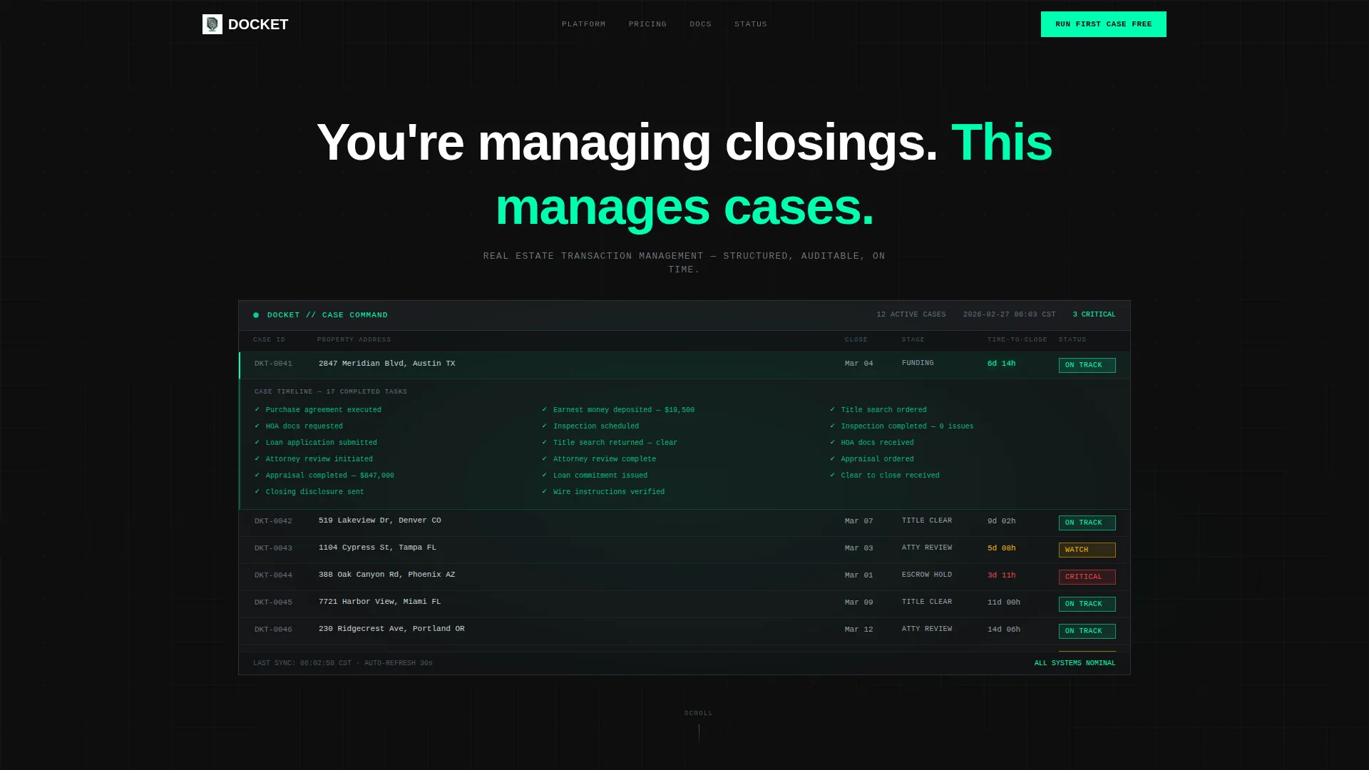
- A dark full-bleed header with a simulated live transaction dashboard and glowing countdown timers
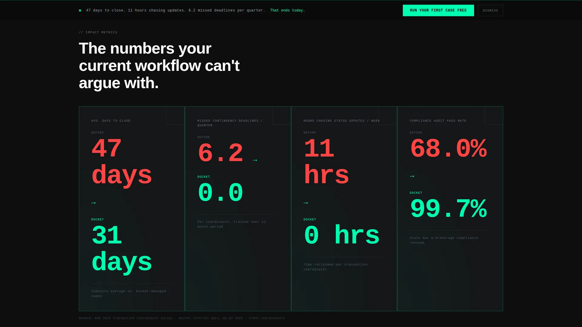
- A stats-first impact section with four animated metric comparisons and a twelve-row versus grid
- A fixed bottom call-to-action bar, a three-field intake form, and a full-width terminal block at page end
Feature list
This template is built around a set of deliberate design and layout features. Each one is grounded in the conversion logic of the brief.
Simulated Live Case Grid
The header dashboard shows twelve rows of real estate transactions with columns for property address, closing date, case stage, a countdown-to-close timer, and status chips in green, amber, and red. One row expands to show a seventeen-task completion timeline. The effect creates immediate product credibility before a single word of copy appears.
Brutalist Counter Animation
Four oversized metric blocks animate from the industry average to the platform result as they enter the viewport. The counters use hard ticks with no easing, making the performance gap feel immediate and undeniable. Each block covers a single, devastating comparison such as average days to close or missed contingency deadlines per quarter.
Comparison Versus Grid
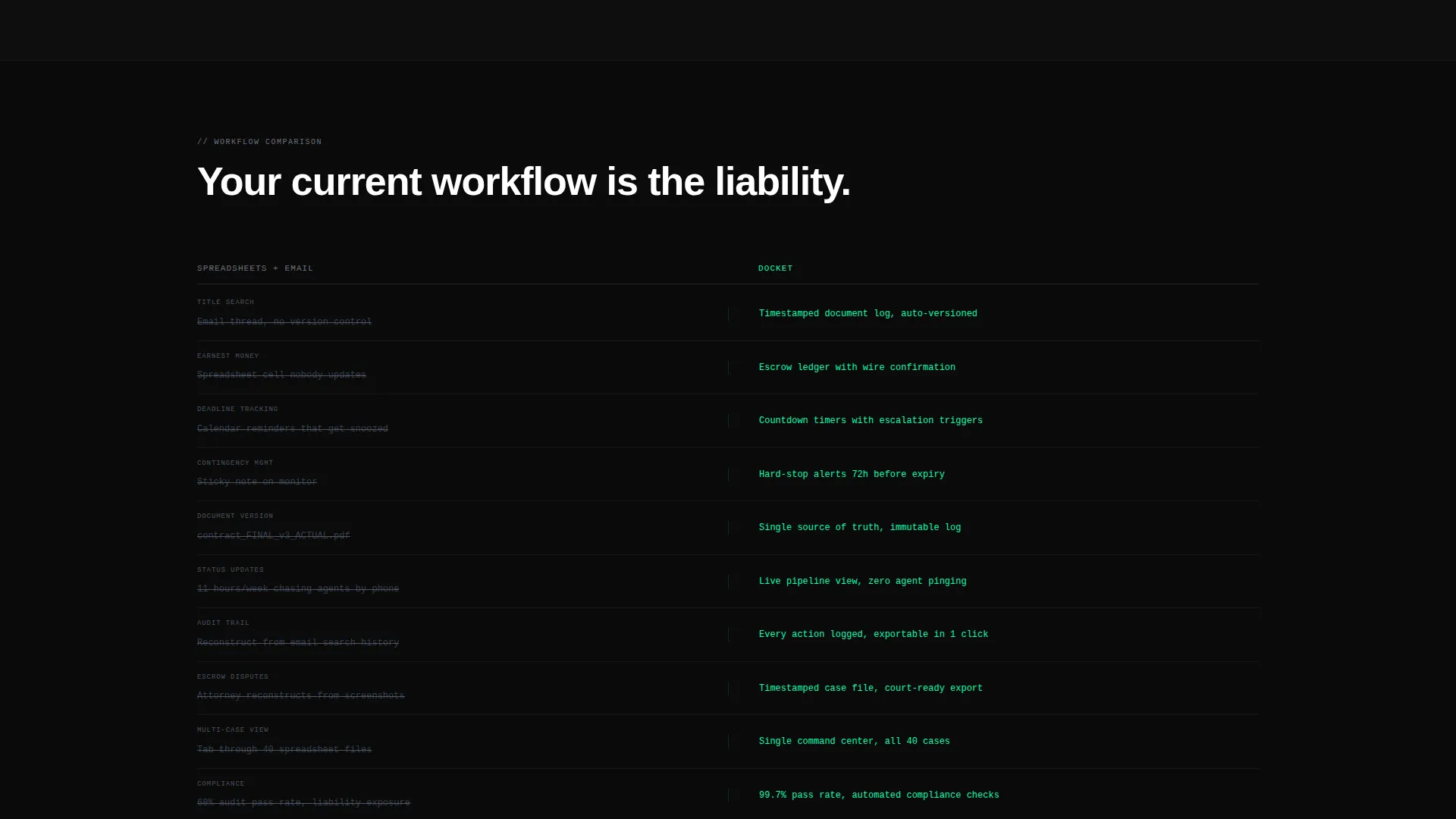
A two-column grid places the old workflow against the platform in twelve direct rows. The left column, labeled in brushed-steel, covers topics like title search tracking, earnest money accounting, and document versioning. Each row in the left column strikes through as the visitor scrolls, making the contrast impossible to ignore.
Annotated Product Screenshots
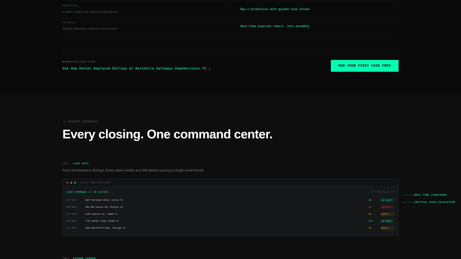
Three full-width dashboard screenshots sit on forge-black backgrounds. Each screenshot includes brutalist callout lines pointing to specific interface features, with hard lines and monospaced labels replacing rounded tooltips. This section shows the product in context rather than describing it in abstract terms.
Conversion-Optimized call to action Structure
The primary call-to-action reads "Run Your First Case Free" and appears twice: once as a fixed bottom bar after the stats section, and again as a full-width terminal block at the page end. The intake form uses three sequential fields covering brokerage name, monthly closing volume, and work email.
Secondary Migration Path
Below the comparison grid, a secondary link reads "See How Docket Replaced [Competitor]" and points toward a detailed migration case study. This gives high-intent visitors a lower-friction path to deeper proof before they commit to the primary form.
Page sections overview
| Section | Purpose |
|---|---|
| Dark Header Dashboard | Establish product credibility with a simulated live transaction grid and glowing countdown timers |
| Stats Impact Block | Show four animated metric comparisons that make the performance gap concrete and undeniable |
| Comparison Versus Grid | Contrast old workflows against the platform across twelve specific transaction management tasks |
| Product Screenshots Row | Display three annotated dashboard screenshots with brutalist callout lines pointing to features |
| Fixed call to action Bar | Keep the primary conversion action visible after the stats section without interrupting scroll |
| Terminal Form Block | Close the page with a full-width intake form and the primary call-to-action repeated at page end |
Design & branding system
The visual identity is Bold Brutalist rendered in a Monochrome Steel palette. Every color and type choice reinforces the idea of operational infrastructure, not a polished marketing brochure.
- Colors: forge-black (#0E0E0E) backgrounds, gunmetal slab (#2A2D31) data cards with hard 1px borders, brushed-steel mid (#6B7280) for body text, and electric mint (#00FFB2) for all interactive and status elements
- Typography: monospaced fonts wherever data appears, grotesque sans-serif for all narrative copy, both set oversized and without decorative treatment
- No shadows, no rounded corners, no warm tones; the palette reads like the inside of a server rack, built entirely around function
Mobile & speed optimization
The template is structured with a mobile-first layout in mind. The brutalist grid and hard-bordered card system adapt well to narrow viewports without losing visual impact.
- Data cards and the versus grid reflow cleanly from desktop to mobile widths
- The fixed bottom call to action bar remains visible and tappable on small screens throughout the scroll
- Oversized monospaced type and high-contrast colors maintain legibility at any screen size
How this template helps you convert
The entire page is engineered as a comparison-and-evidence conversion engine. It earns the click by making the visitor's current workflow look like a liability before asking for anything.
- The animated stats section delivers four precise performance comparisons before any narrative text appears, so the visitor understands the value gap within seconds of landing on the page.
- The twelve-row versus grid crosses out every familiar pain point one by one as the visitor scrolls, building cumulative pressure toward the call-to-action without a single soft-sell phrase.
- The three-field intake form keeps friction low, and the secondary migration case study link gives hesitant visitors a credible proof path that does not require an immediate commitment.
Other information about this template
This template sits inside the Technology category with a Real Estate Software subcategory, targeting the Real Estate Case Management niche. It is a strong starting point for any platform that needs to displace legacy tools in a high-stakes professional context.
- The template style is Dashboard and Data Grid, designed to show the product as a live operational environment rather than a static feature list
- The creative direction is Stats-First Impact, meaning the visitor encounters hard evidence before narrative, which suits buyers who are data-driven and skeptical of marketing copy
- The header concept is Dark Full-Bleed with Glow, using an electric-mint light effect bleeding from behind the dashboard interface to create depth without decoration
- The landing page direction is Comparison and Versus, making this template especially effective when the target audience currently relies on spreadsheets, email threads, or fragmented tools
Theme
Bold Brutalist
Creative direction
Stats-First Impact
Color system
Monochrome Steel
Style
Dashboard/Data Grid
Direction
Comparison/Versus
Page Sections
Simulated Live Transaction Dashboard
Animated Brutalist Stats Block
Twelve-row Comparison Grid
Annotated Product Screenshots
Dual Call to Action Conversion Structure
Secondary Migration Case Study Link
Related questions
Who is the ideal user for this template?
Can I customize the stat numbers and comparison rows?
What does the intake form collect by default?
Does the template include live dashboard data or just the visual layout?
Is this template suited for a software product launch?



