Bold Brutalist Legal Order Management Landing Page
Docket is a bold brutalist legal order management landing page built for litigation teams drowning in deadlines. The split-screen layout pits industry averages against Docket's tracked results, letting numbers do the arguing. Void black backgrounds, frosted glass panels, and electric green glows create a command-center experience that earns the demo request before a single sales word lands.
by Rocket studio
Quick summary
Docket is a single-page, stats-first landing page for a legal order management platform. It uses a 50/50 split-screen design to contrast the old world of missed filings against a zero-miss alternative. The brutalist web design approach strips away decoration and lets raw performance data make the case.
Who this template is for
This landing page is built for legal tech brands that need to convert serious buyers fast. It suits teams who want bold visuals and a functional structure that feels authoritative rather than polished.
- Litigation paralegals managing sixty or more open matters
- Managing partners and general counsel offices coordinating outside firms
- Legal SaaS brands and design studio teams launching a comparison-led site
What problem this template solves
Legal firms lose cases and clients because tracking systems fail silently. A strong landing page must communicate that gap instantly, before a visitor clicks away.
- Missed filing deadlines buried in spreadsheets or legacy software
- No single view connecting orders, motions, and case documents
- Visitors who need hard proof before they will sign up or book a demo
What you get with this template
You get a fully structured, single-page layout with every section pre-designed for a high-stakes legal audience. The template delivers bold visuals and clear conversion paths without requiring a redesign from scratch.
- Full-bleed hero with pulsing radial glow and oversized stat headline
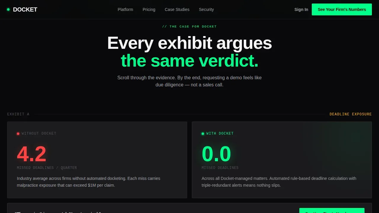
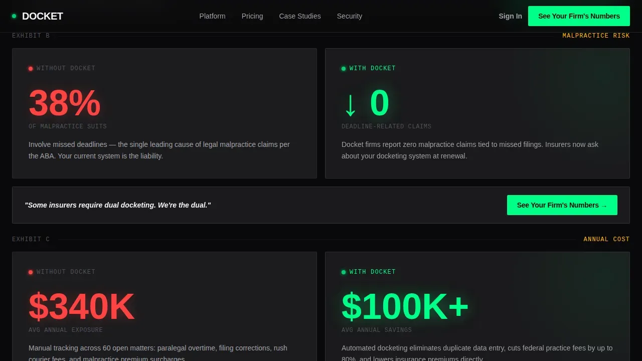
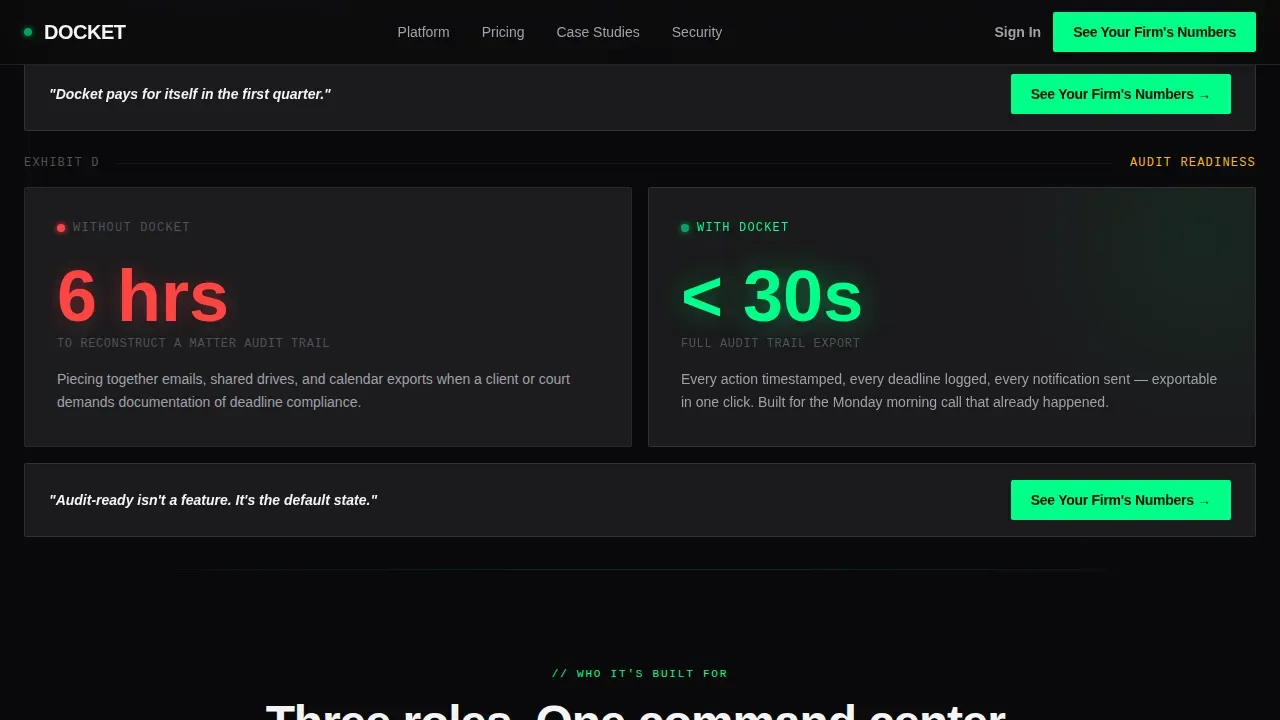
- Four split-screen comparison pairs covering deadlines, filing speed, malpractice exposure, and audit readiness
- Qualifier form modal and benchmark report capture section
Feature list
This template's key features are drawn directly from its brief. Each section serves a specific function in moving visitors from skepticism to action.
Split-Screen Comparison Layout
Each scroll pair places the industry average on the left and the platform result on the right. The contrast is immediate and visceral, letting numbers stand as the primary argument.
Stats-First Hero Section
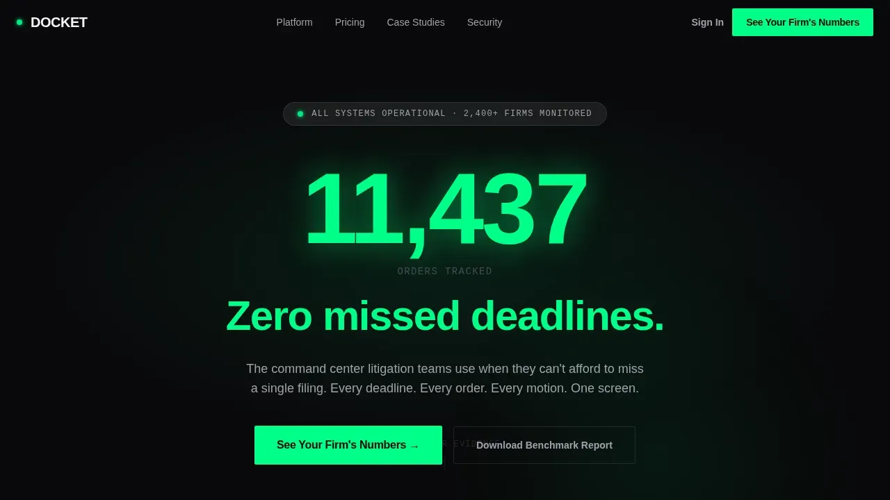
The hero opens with a massive tracked-order count and a zero-missed-deadlines claim. No stock photography, no filler. The idea is to hit the visitor with proof before context.
Qualifier Form with Two-Field Logic
The primary call to action opens a modal asking for firm size and current tracking method. This creates a unique, low-friction entry point that feels like due diligence rather than a sales funnel.
Role-Specific Audience Cards
Three cards address paralegals, managing partners, and general counsel offices separately. Each card names a specific pain and a specific gain, improving relevance for every visitor type.
Frosted Glass Navigation Bar with Pinned Call to Action
The frosted glass nav stays visible as visitors scroll. The call to action is always one click away, reinforcing the conversion path across all pages of the scroll journey.
Benchmark Report Secondary Capture
Visitors not ready to engage can download a benchmark report by submitting their email and role. This secondary path keeps passive visitors inside the experience rather than losing them.
Page sections overview
| Section | Purpose |
|---|---|
| Full-Bleed Hero | Opens with pulsing green glow and oversized deadline stat |
| Split-Screen Comparison | Contrasts industry averages with platform results across four metrics |
| Who It's For | Three role-specific cards with pain and gain per audience |
| Social Proof | Trust signal and role-specific testimonial quotes |
| call to action Qualifier Form | Two-field modal to segment visitors by firm size and tracking method |
| Benchmark Report Capture | Email capture for visitors not ready to request a demo |
| Footer | Linear single-row footer with essential links |
Design & branding system
The design draws from brutalist web design principles, characterized by raw honesty over decoration. The aesthetics prioritize function, making every visual element earn its place.
- Void black (#09090B) backgrounds with frosted panel white at 12% opacity for card surfaces
- Electric verdict green (#00FF88) for primary glows and data highlights, cautionary amber (#FFB800) for alert accents
- Cabinet Grotesk for display headings and JetBrains Mono for all stats and data figures
Mobile & speed optimization
The template is desktop-first in its command-center layout, and it scales responsively for mobile. The brutalist approach relies on minimal CSS and standard elements, which keeps pages light and fast to render.
- Responsive layout ensures professional display across devices and screen sizes
- Minimal third-party dependencies keep load times low and the experience consistent
- Server components handle static sections while client components manage animations and the qualifier form
How this template helps you convert
The entire design ui ux strategy is built around one idea: make the performance gap undeniable before asking for anything.
- Scroll-triggered stat counters and staggered reveals create a courtroom-of-evidence experience that builds conviction with each section.
- The pinned frosted glass nav and repeated call-to-action placement mean the sign-up path is never more than one click away.
Other information about this template
This template is well suited for brands in legal tech who want a brutalist landing page that stands apart from conventional sites. The docket bold brutalist legal order management landing page template is designed for attorneys, litigation professionals, and legal SaaS teams who need strong design branding without starting from zero.
- Back-end legal case management tools can be connected alongside this front-end template to create a complete workflow
- A design studio or creative agency can use this as a base for a full agency website or client-facing redesign project
- The template's social media and outbound share tags are pre-configured for open graph and link previews
- The source structure follows a StoryBrand-ready flow, guiding each user from pain to proof to action
Theme
Bold Brutalist
Creative direction
Stats-First Impact
Color system
Glassmorphic
Direction
Comparison/Versus
Page Sections
Split-screen Comparison Layout
Stats-first Hero with Radial Glow
Role-specific Audience Cards
Qualifier Form Modal
Pinned Frosted Glass Navigation
Benchmark Report Email Capture
Related questions
Is this template suitable for a non-legal SaaS product?
Can I customize the color palette and typography?
What makes the brutalist style appropriate for a legal audience?
Does the template include the qualifier form structure?
How many pages does this template include?



