Restaurant Software Pricing & Packages Website Template
Docket is a compliance-focused landing page template built for restaurant groups that manage multiple locations, licenses, and deadlines. It features a full-width dashboard screenshot header, a three-tier comparison table, and a freemium sign-up flow. The design uses a Monochrome Steel palette to project clarity and authority right from the first scroll.
by Rocket studio
Quick summary
Docket is a single-page landing page template designed for restaurant case management platforms. It opens with a live-looking dashboard screenshot, drives the scroll with a feature comparison table, and closes with a low-friction freemium sign-up. The layout is built to turn operators into confident, informed sign-ups without requiring a sales call.
Who this template is for
This template is built for software companies and product teams serving the restaurant compliance space. It speaks directly to buyers who juggle licenses, inspections, and renewal deadlines across many locations.
- Multi-unit restaurant operators managing health, fire, liquor, and lease obligations across a portfolio
- Hospitality finance leaders and compliance directors who need a clear audit trail and deadline visibility
- Software founders or marketers launching a restaurant case management product with a freemium go-to-market strategy
What problem this template solves
Running compliance for a restaurant group without a dedicated system is genuinely chaotic. Renewal dates live in spreadsheets. Inspection notes pile up in email threads. Nobody knows if the Southside location renewed its fire suppression certificate until it is too late.
- Operators lose track of critical deadlines scattered across spreadsheets, sticky notes, and shared drives
- Compliance directors have no single view showing every location's current status at a glance
- Software teams lack a landing page structure that can demonstrate dense, multi-tier feature value without overwhelming the reader
What you get with this template
You get a fully structured, single-page landing page template ready to represent a restaurant case management platform. Every section serves a specific role in moving a skeptical operator from "what is this?" to "I'll try the free tier."
- A full-width product screenshot header showing a portfolio dashboard with status pills, sidebar filters, and a notification badge
- A three-tier comparison table covering Free, Pro, and Portfolio plans with rows for key compliance features
- A freemium sign-up block asking only for email, restaurant group name, and number of locations, plus a secondary demo-booking path
Feature list
This template is built around a specific set of sections and components that work together as a cohesive spec-sheet landing page.
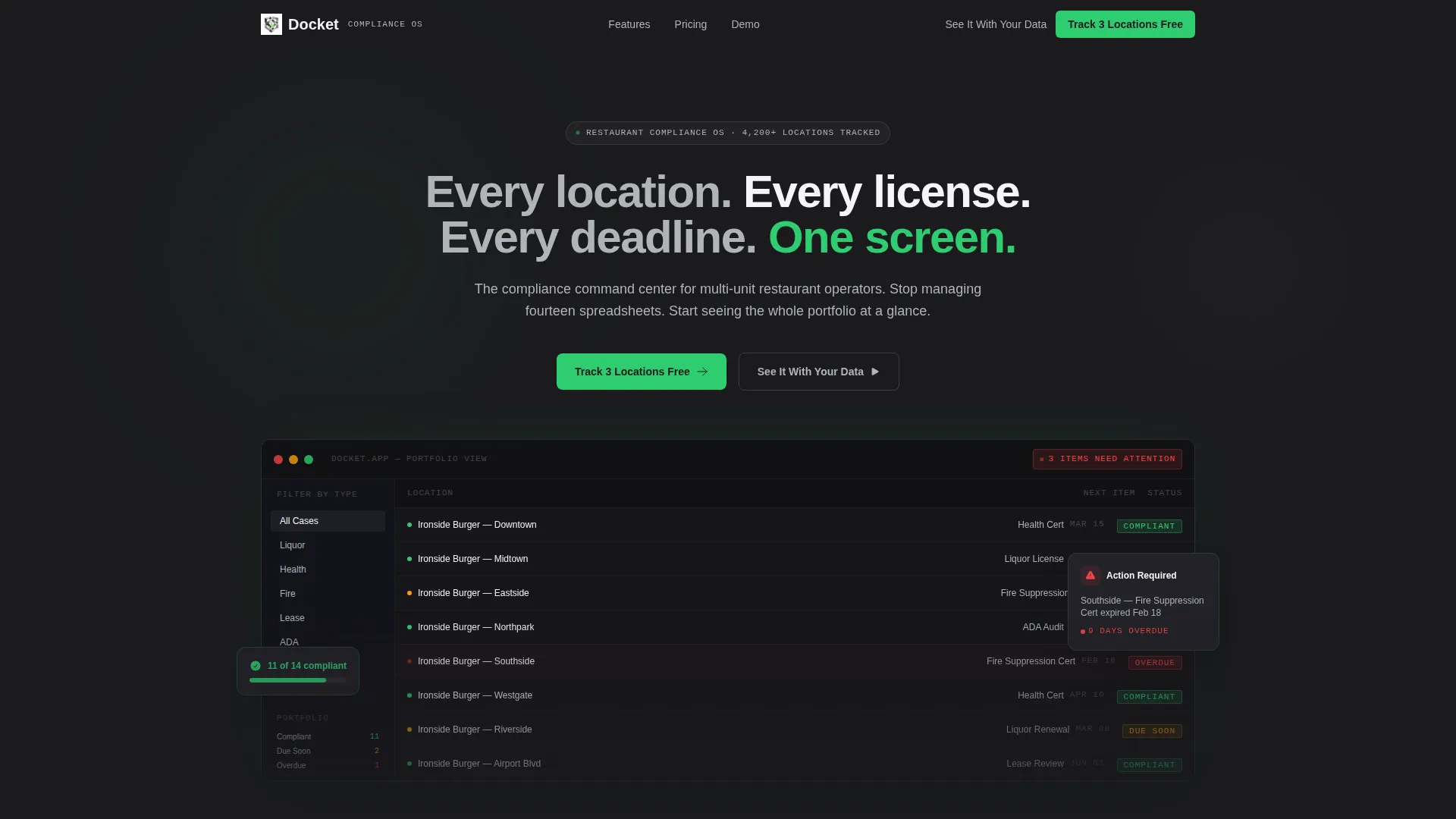
Full-Width Dashboard Screenshot Header
The header opens with a pixel-sharp product screenshot showing fourteen restaurant locations, status pills in green, amber, and red, a sidebar filtered by case type, and a notification badge reading "3 items need attention." A single headline in filed-edge silver sits above it: "Every location. Every license. Every deadline. One screen."
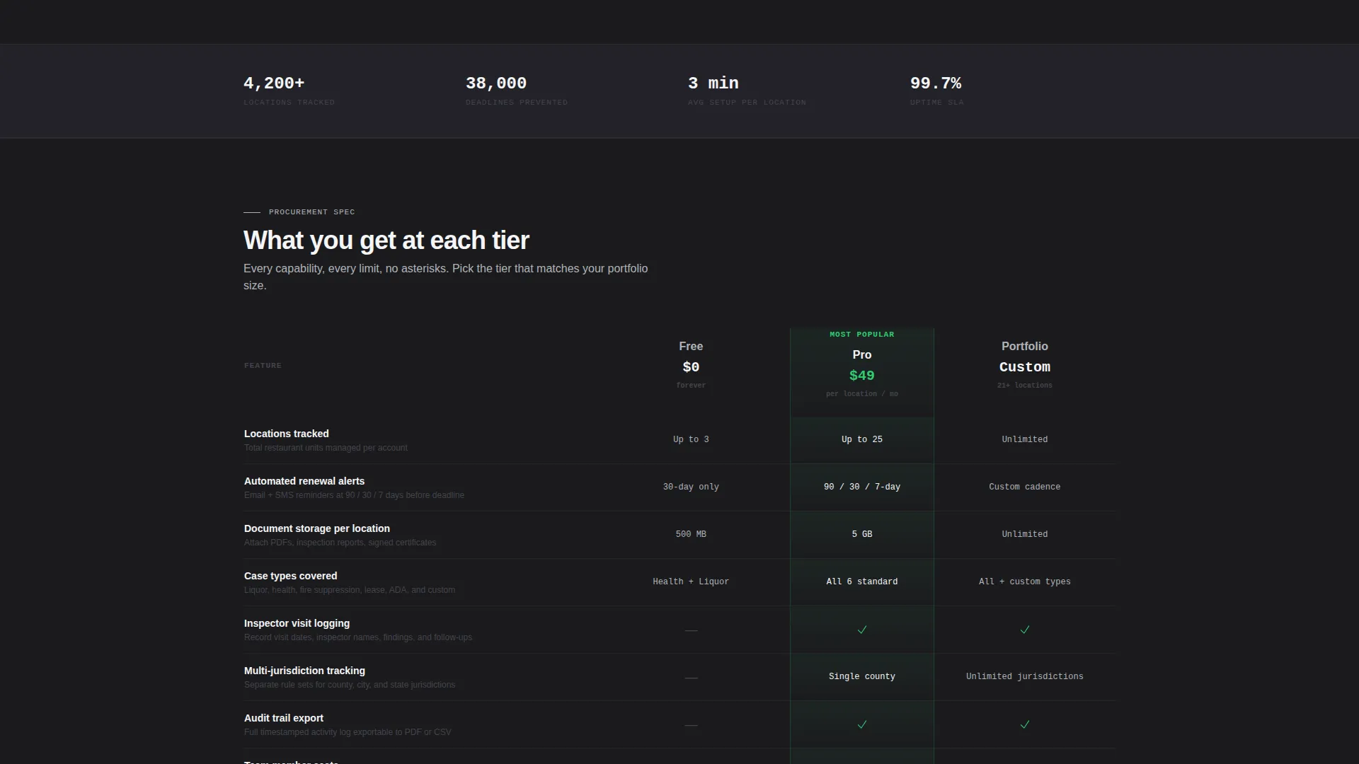
Three-Tier Comparison Table
The comparison table is the structural backbone of the page. It compares Free, Pro, and Portfolio tiers across rows including automated renewal alerts, document storage per location, inspector visit logging, multi-jurisdiction tracking, and audit trail exports. The table lets the product sell itself through density and specificity.
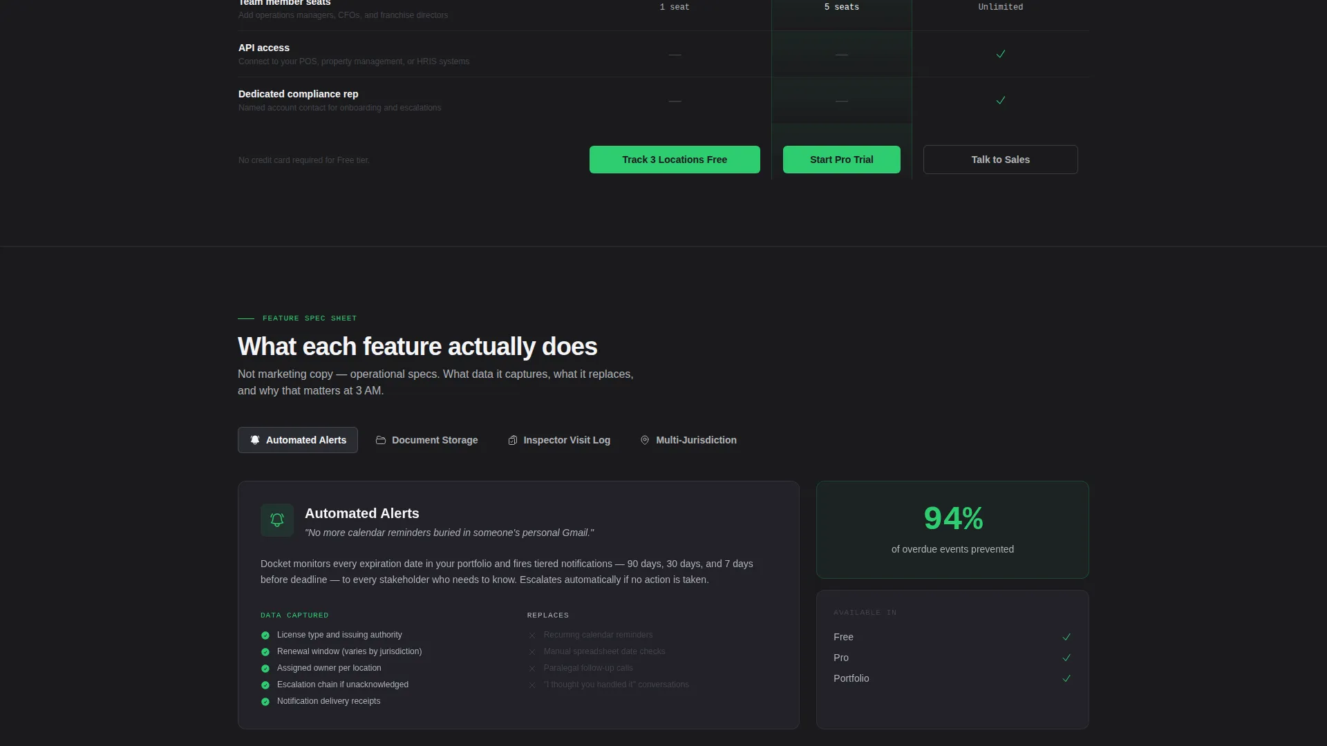
Feature Explainer Sections
Below the comparison table, each major feature gets its own isolated mini-spec block. Each block states what the feature does, what data it captures, and what manual process it replaces, whether that is a spreadsheet, a sticky note, or a paralegal's memory.
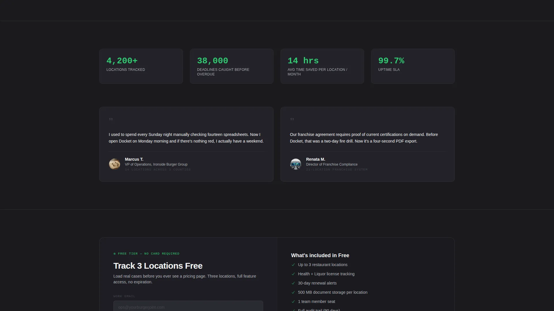
Pinned Freemium Call to Action
The primary call to action, "Track 3 Locations Free," is pinned directly below the comparison table and repeated at the bottom of the page. The sign-up form collects only three fields, keeping the barrier to entry as low as possible.
Demo Booking Secondary Path
A secondary conversion path labeled "See It With Your Data" links to a guided demo booking flow. This gives buyers who need more confidence a direct route to a hands-on walkthrough before committing.
Compliance Status Indicators
Throughout the page, compliance green (#2ECC71) is used exclusively for status indicators and call-to-action elements. Amber and red signals appear in the dashboard screenshot to show approaching and overdue deadlines, reinforcing the product's core value at a visual level.
Page sections overview
| Section | Purpose |
|---|---|
| Dashboard Screenshot Header | Establishes product credibility with a real-looking portfolio view and a single commanding headline |
| Comparison Table Block | Breaks down Free, Pro, and Portfolio tier features side by side to accelerate purchase decisions |
| Renewal Alerts Explainer | Isolates automated renewal alerts, describing what data is captured and what it replaces |
| Document Storage Explainer | Explains per-location document storage capability and its replacement for physical or scattered filing |
| Inspector Visit Logging | Details how inspection visits are recorded and what the log replaces in daily operations |
| Multi-Jurisdiction Tracking | Shows how the platform handles compliance across different counties and regulatory bodies |
| Audit Trail Exports | Covers the audit trail export feature and its value for compliance reviews and legal records |
| Primary call to action Block | Presents the "Track 3 Locations Free" sign-up form with three-field entry and no credit card required |
| Secondary Demo Path | Offers a "See It With Your Data" link for buyers who want a guided demo before signing up |
| Page-End call to action Repeat | Reinforces the freemium offer at the bottom for readers who scrolled past the first sign-up block |
Design & branding system
The visual identity follows a Directory and Discovery theme using a Monochrome Steel color system. The palette is deliberate and restrained, designed to feel like the interior of a commercial kitchen prep station: stainless, purposeful, and free of decoration.
- Core palette: forge black (#1B1B1E), brushed graphite (#44444C), filed-edge silver (#B0B3B8), and clean white (#F5F5F7)
- Single accent color: compliance green (#2ECC71) used exclusively for status indicators and call-to-action elements, never decoratively
- The Spec Sheet creative direction means the layout reads like a procurement document, dense with capability and light on persuasion copy
Mobile & speed optimization
The template is structured with a mobile-first layout in mind. Every section from the comparison table to the sign-up form is designed to reflow cleanly on smaller screens.
- The comparison table is built to scroll horizontally on mobile without losing column context or tier labels
- The sign-up form collapses to a single-column stack on smaller viewports, keeping the three-field entry fast and thumb-friendly
- The full-width dashboard screenshot scales responsively so status indicators and sidebar filters remain legible on all screen sizes
How this template helps you convert
The page is built around a freemium conversion model. Every design and copy decision is aimed at removing hesitation and proving value before any commitment is asked.
- The three-location free tier removes financial risk entirely, letting operators load real cases and experience the product before a credit card is ever needed
- The comparison table makes tier differences immediately visible, so buyers self-select into the right plan rather than needing a sales conversation
- The secondary demo path captures buyers who need hands-on proof, giving the sales team a qualified lead rather than a lost visitor
Other information about this template
This template is a strong fit for product teams building in the restaurant software and broader hospitality technology category. It can support a range of compliance-focused positioning strategies depending on how the feature explainer blocks are populated.
- The template style is Comparison Table, making it well suited for any multi-tier software offer in the restaurant or hospitality sector
- The freemium landing page direction means the primary conversion goal is a low-friction sign-up, not a direct purchase
- The header concept uses a Product Screenshot, which is particularly effective for software with a visual dashboard or portfolio view
- The Directory and Discovery theme makes the layout feel like a reference tool, which builds trust with operationally minded buyers like compliance directors and franchise managers
- The page structure can support seasonal compliance topics such as annual license renewal cycles or pre-inspection preparation campaigns
Theme
Directory & Discovery
Creative direction
Spec Sheet
Color system
Monochrome Steel
Style
Comparison Table
Direction
Freemium/Trial
Page Sections
Dashboard Screenshot Header
Three-tier Comparison Table
Feature Explainer Mini-specs
Pinned Freemium Sign-up Block
Secondary Demo Booking Path
Compliance Status Color System
Related questions
Who is this landing page template designed for?
Does this template include all three sign-up form fields mentioned in the brief?
What makes the freemium call to action effective in this template?
Can I adjust the comparison table to match my own pricing tiers?
Is the dashboard screenshot a real image or a placeholder?


