Specialist Government Software Professional Website Template
Docket is a government case management landing page template built for agencies ready to replace legacy tools. The split-screen layout contrasts the old way with the new, live dashboard previews, animated case queues, and a lead-generation flow that captures agency contacts before the page ends. It is designed to sell clarity to the people who need it most.
by Rocket studio
Quick summary
Docket is a single-page government case management template built on a 50/50 split-screen layout. It walks visitors through a Problem-to-Solution arc, showing a cluttered legacy interface on the left and a live-motion dashboard on the right. The page closes with a unified full-width command center and a focused lead capture form for agency contacts.
Who this template is for
This template is built for software vendors and product teams selling case management platforms to government agencies. The visual language and copy structure speak directly to the buyers who feel the pain every day.
- County IT directors managing complaints from department heads about outdated systems
- State program managers who track caseworker assignments in spreadsheets with dozens of open tabs
- City administrators whose legacy systems are approaching end-of-life and need a credible replacement fast
What problem this template solves
Government software buyers are skeptical. They have seen demos that overpromise and deployments that disappoint. A generic SaaS landing page does not earn their trust. This template solves the credibility gap by showing the dashboard doing real work before asking for anything.
- Visitors leave before converting because the page never demonstrates the product in action
- Legacy-system buyers need to see a familiar pain point reflected back at them before they believe a solution exists
- Lead forms placed too early collect no data because trust has not been established yet
What you get with this template
You get a complete, conversion-focused landing page layout built around a government case management use case. Every section is sequenced to build confidence and reduce friction for agency buyers.
- A split-screen hero with a blurred legacy interface on the left and an animated Docket dashboard on the right
- A scroll-triggered Problem-to-Solution arc with micro-animations including progress bars, flipping status chips, and ticking case counters
- A dual lead capture system with a primary "Schedule an Agency Walkthrough" form and a secondary buyer's guide download gate
Feature list
A single paragraph introduces the feature set before each item is broken out below.
Each feature below is drawn directly from the template layout and interaction design described in the brief. Together they form a cohesive page experience that moves a skeptical government buyer toward a confident conversion.
Split-Screen Hero with Live Dashboard Preview
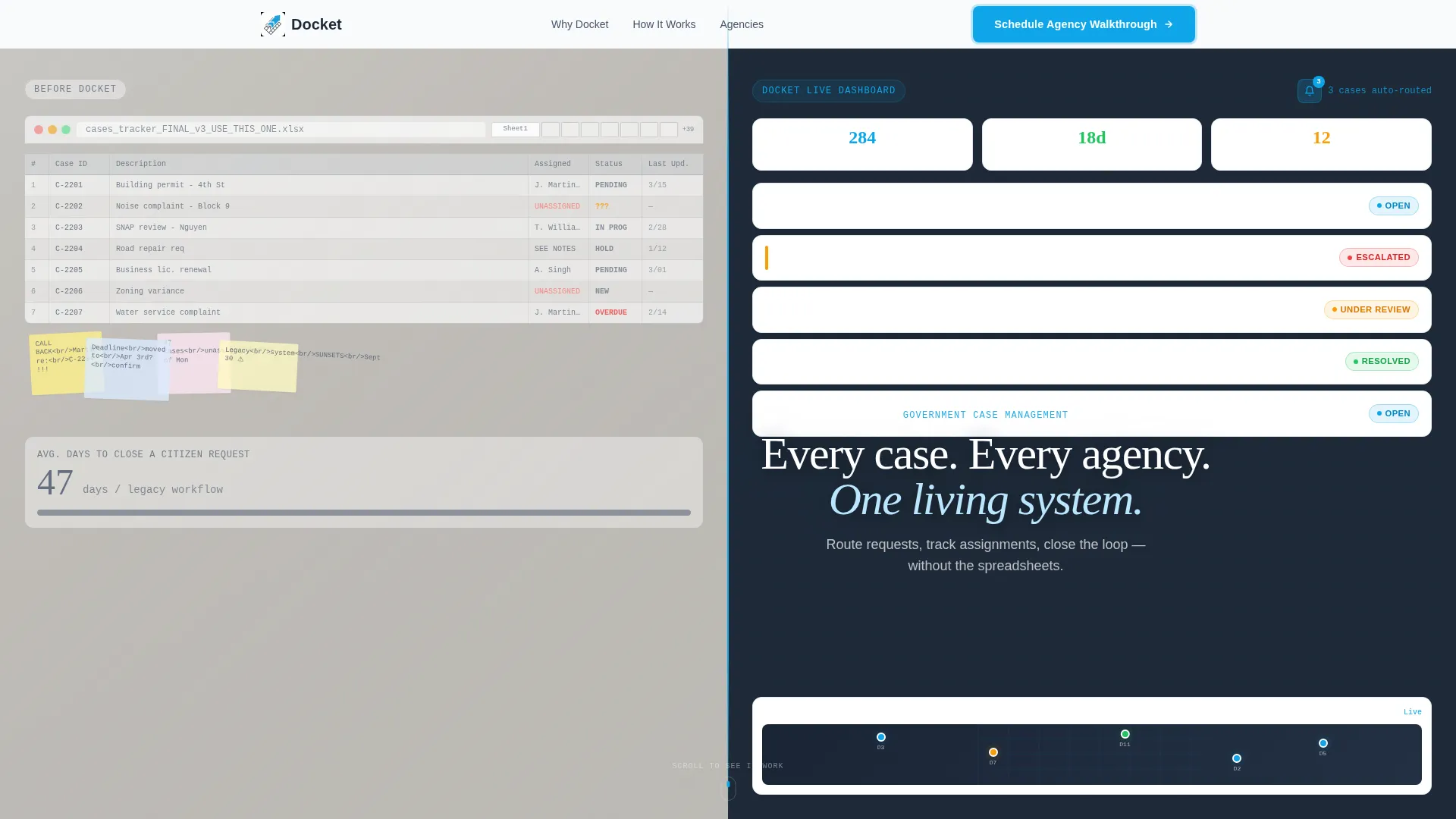
The header divides the viewport exactly in half. The left side shows a desaturated, blurred legacy interface with implied spreadsheet overload. The right side presents a crisp Docket dashboard with a priority-sorted case queue, color-coded status chips, a district map view, and a notification badge showing auto-routed cases. A case card is caught mid-transition from "Under Review" to "Approved" to signal real motion.
Scroll-Triggered Micro-Animations
As the visitor scrolls, progress bars fill, status chips flip states, and case count numbers tick upward. These animations are tied to the Problem-to-Solution arc so each interaction reinforces the narrative. The motion is purposeful, not decorative.
Problem-to-Solution Arc Layout
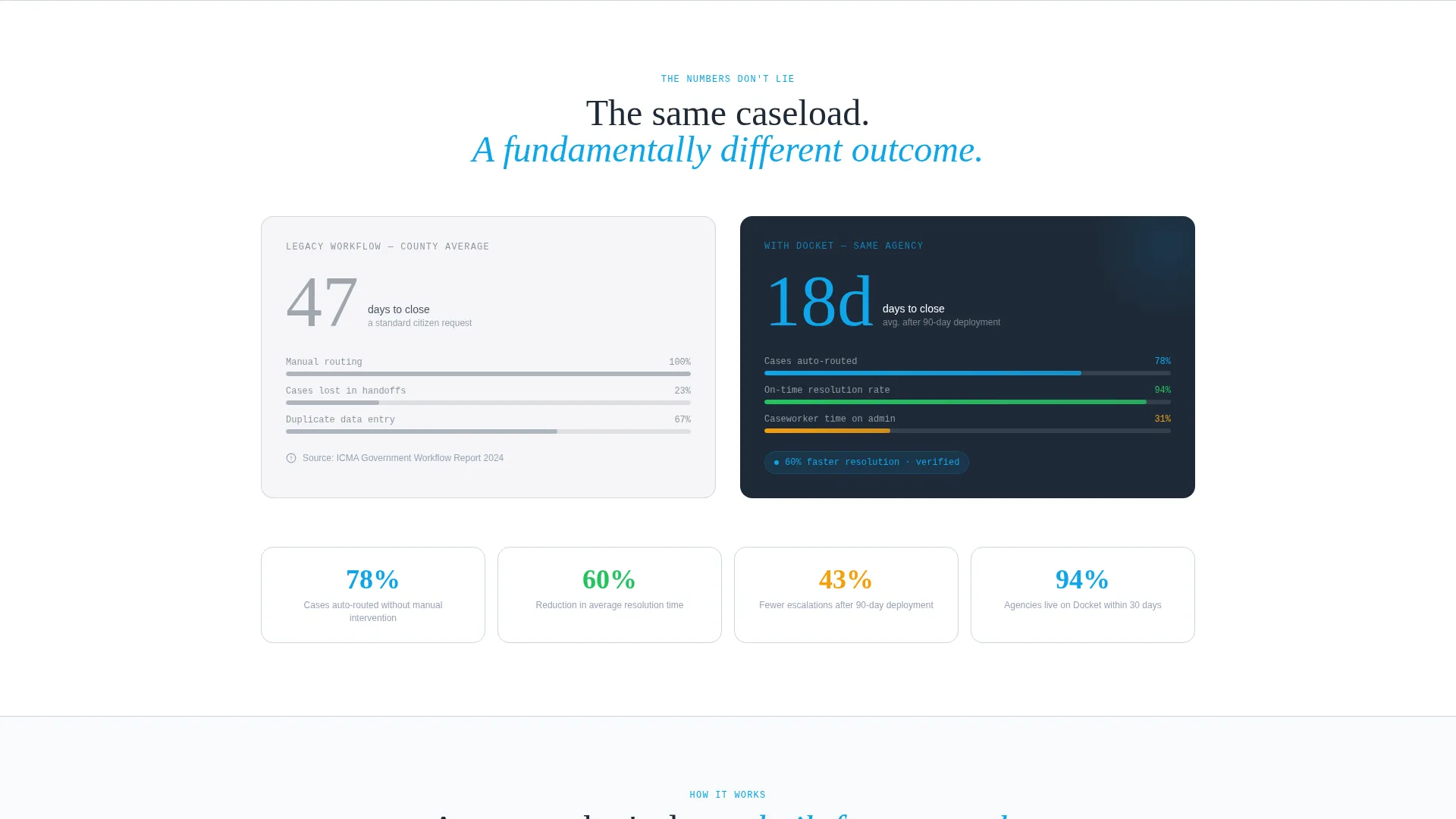
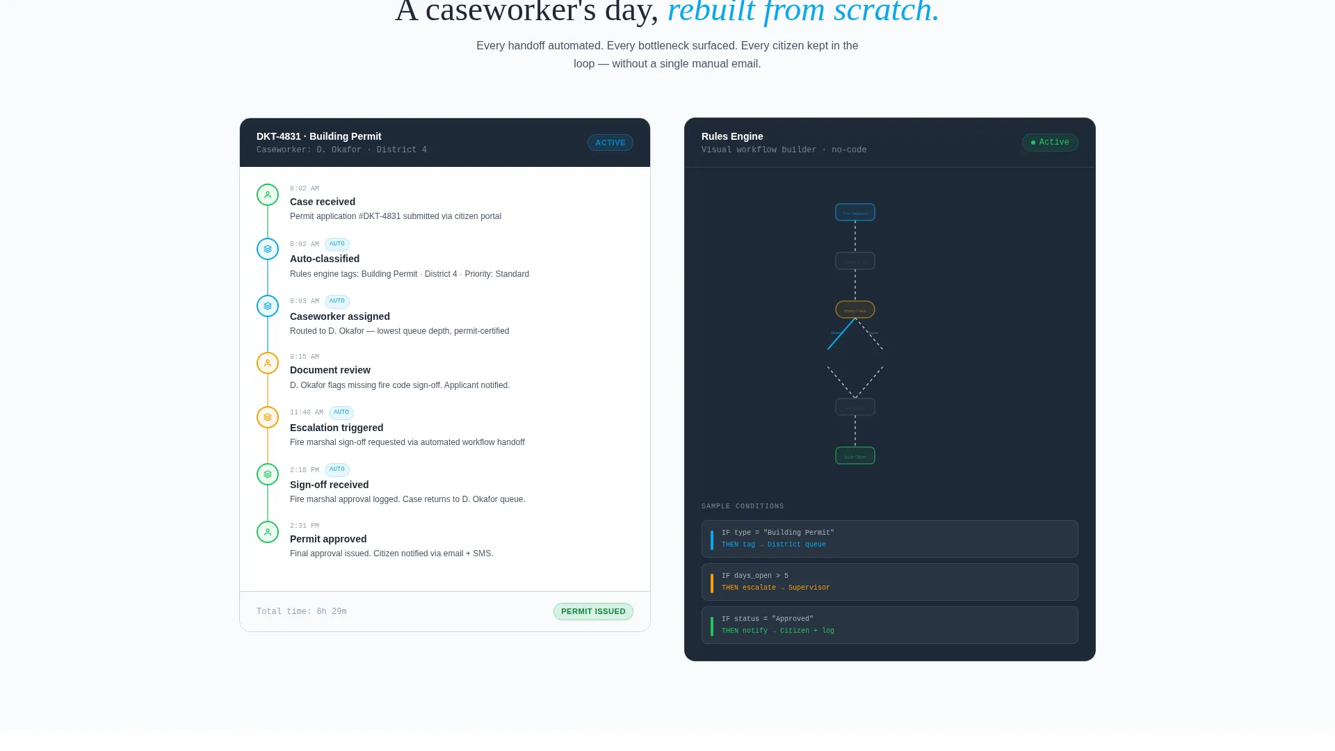
Each section below the hero tightens the argument. A painful legacy metric appears on the left; the right side animates the same metric improved by sixty percent. The next section shows a caseworker timeline with automated handoffs alongside a rules-engine node graph. The scroll journey ends when the split screen merges into a single full-width command center.
Dual Lead Capture Flow
The primary call to action, "Schedule an Agency Walkthrough," appears in both the sticky header and at the split-screen merge point. The form uses three deliberate fields: an agency type dropdown, a range selector for monthly active cases, and a work email input. A secondary path below offers a buyer's guide download behind a single-email gate for earlier-stage visitors.
Color-Coded Status Chip System
Case status is communicated instantly through a chip color system. Open cases use sky blue, escalated cases use amber, and resolved cases use green. The system is applied consistently across the dashboard preview, the hero section, and the scroll-driven animation sequence.
Sticky Header with Persistent call to action
The navigation remains fixed as the visitor scrolls. The primary call-to-action button stays visible throughout the entire page journey, so a buyer who is ready to act at any point does not need to scroll back to find the next step.
Page sections overview
| Section | Purpose |
|---|---|
| Split-Screen Hero | Contrast legacy chaos with the Docket dashboard in one view |
| Legacy Metric Panel | Show the painful average days-to-close with legacy tools |
| Metric Counter Animation | Animate the same metric reduced by sixty percent on scroll |
| Caseworker Timeline | Illustrate a rebuilt workday with automated handoff steps |
| Rules Engine Visual | Display the node-graph logic driving automated case routing |
| Forms Auto-Populate | Demonstrate forms filling and approvals routing in motion |
| Full-Width Command Center | Merge the split screen into one unified agency dashboard view |
| Primary call to action Form | Capture agency type, case volume, and work email for walkthroughs |
| Buyer's Guide Gate | Capture early-stage leads with a single-email guide download |
Design & branding system
The Slate and Sky color system is built to feel institutional enough to earn trust while signaling that something has genuinely changed. Every color choice maps to a specific content role on the page.
- Deep charcoal (#1E2A38) anchors headers and navigation; mid-tone slate (#475569) carries body text and card borders
- Open-sky blue (#0EA5E9) pulses on buttons, progress bars, and all status indicators to draw the eye toward action
- Civic white (#F8FAFC) fills content panel backgrounds so data-dense layouts never feel crowded or overwhelming
Mobile & speed optimization
The Dynamic Motion theme uses scroll-triggered animations that are tied to the page's narrative arc. The layout is designed to keep every interactive element reachable and readable across screen sizes.
- The 50/50 split-screen stacks vertically on smaller screens so both panels remain fully visible without horizontal scrolling
- Micro-animations trigger on scroll entry rather than on page load, keeping the initial render light and the experience smooth
How this template helps you convert
The page earns the conversion by showing the product in action before making any ask. The sequence is intentional and builds confidence at every step.
- The split-screen hero forces an instant visual comparison, making the problem and the solution undeniable in a single glance without reading a single word of copy.
- The scroll-driven arc moves the visitor through evidence first and then delivers the call-to-action form only after they have watched cases move, metrics improve, and complexity dissolve.
- The dual capture flow serves two buyer stages at once, collecting contacts from decision-ready visitors through the walkthrough form and nurturing earlier-stage visitors through the buyer's guide gate.
Other information about this template
This template is built specifically for the government software market, where procurement cycles are long and buyer skepticism is high. The layout respects that reality and designs around it.
- The agency type dropdown in the lead form covers county, state, municipal, tribal, and federal buyers, making every visitor feel the form was built for their context
- The range selector for monthly active cases replaces a free-text field to reduce form friction and improve completion rates
- The template suits vendors positioning a government case management platform against legacy tools nearing end-of-life
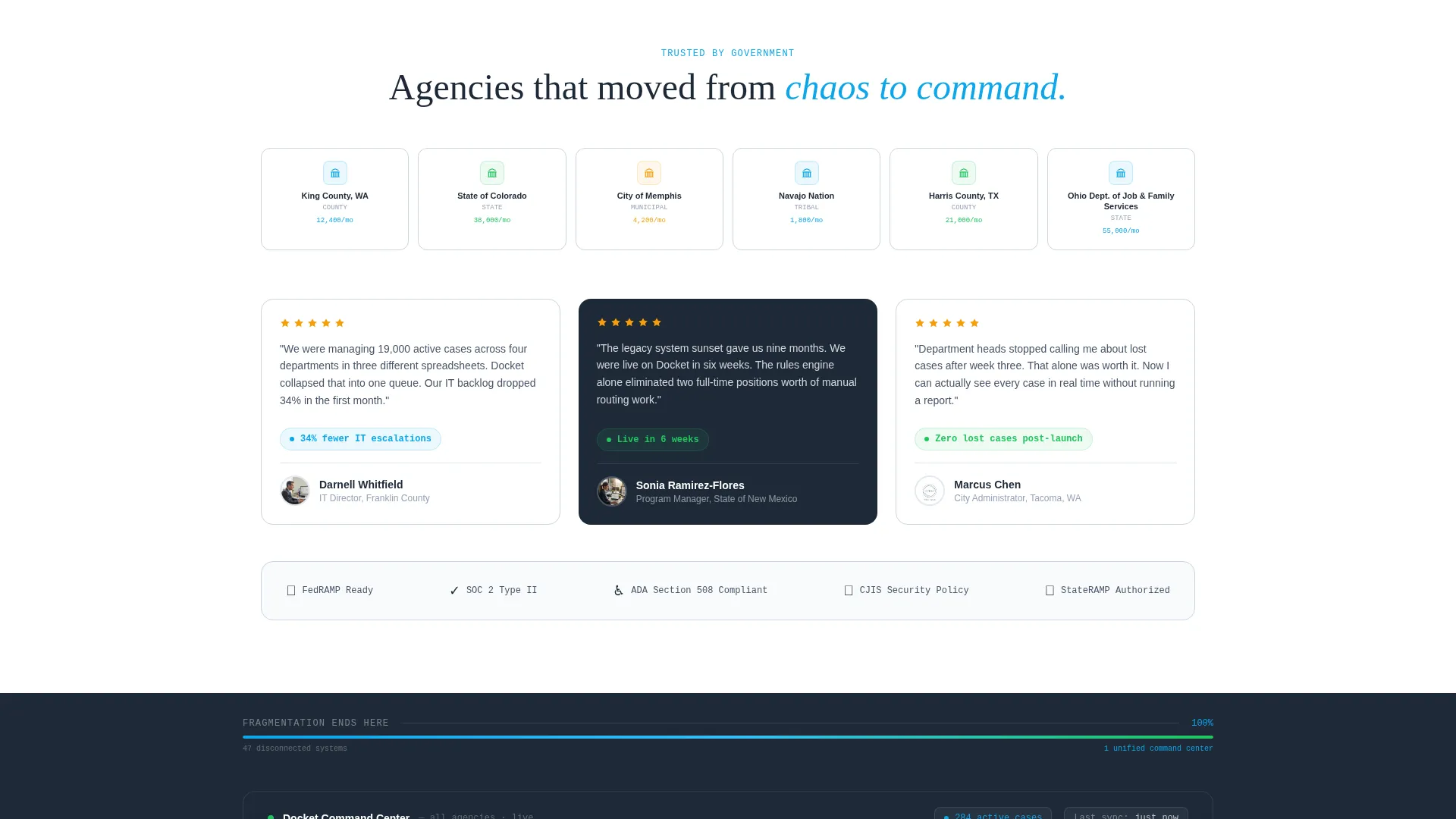
- The full-width command center at the page close is a deliberate visual metaphor: fragmentation ends, and a single system takes over
Theme
Dynamic Motion
Creative direction
Problem→Solution Arc
Color system
Slate & Sky
Style
Split Screen (50/50)
Direction
Lead Generation
Page Sections
Split-screen Hero with Dashboard Preview
Scroll-triggered Micro-animations
Problem-to-solution Arc Layout
Dual Lead Capture Flow
Color-coded Status Chip System
Sticky Header with Persistent Call to Action
Related questions
Who is this landing page template designed for?
Does the template include the actual dashboard or animations?
Can I change the color system to match my brand?
What fields does the lead capture form include?
Is this template suitable for a federal agency audience?



