Software & SaaS Booking Website Template
Docket is a legal practice management landing page template built as a glassmorphic dashboard for solo attorneys and mid-size firms. It opens with a live stats panel, flows into an interactive return-on-investment calculator, and closes with a side-by-side comparison grid. Every section is designed to turn a skeptical managing partner into a confident demo booking.
by Rocket studio
Quick summary
Docket is a single-page legal practice management template styled as a command center. It leads with a live metrics dashboard, then guides visitors through an interactive return-on-investment calculator and a feature comparison grid. The design uses frosted-glass dark panels, monospace data typography, and electric green accents to make the product feel immediately credible and ready to use.
Who this template is for
This template is built for legal technology teams and founders who need a high-converting landing page that speaks directly to law firm buyers. It works equally well for established platforms seeking a fresh evaluation-stage page and for early-stage legal software products entering a competitive shortlist.
- Managing partners and solo attorneys evaluating practice management platforms
- Legal operations coordinators running annual software renewal reviews
- Legal technology startups presenting a software-as-a-service product to law firm decision makers
What problem this template solves
Law firms evaluating practice management software arrive at a landing page with very specific questions. They want to know how much time and revenue they are losing right now, and whether switching platforms is worth the disruption. A generic hero image and a bullet list of features will not answer those questions.
- Visitors leave before converting because the page fails to show a personalized return-on-investment estimate
- Buyers cannot compare the product against familiar platforms without leaving the page to research elsewhere
- The lack of credible, specific data makes it hard for a managing partner to justify the decision internally
What you get with this template
You get a complete, fully structured landing page that functions as an interactive sales tool rather than a passive brochure. The template ships with every section a legal software buyer needs to evaluate, shortlist, and request a demo in a single scroll.
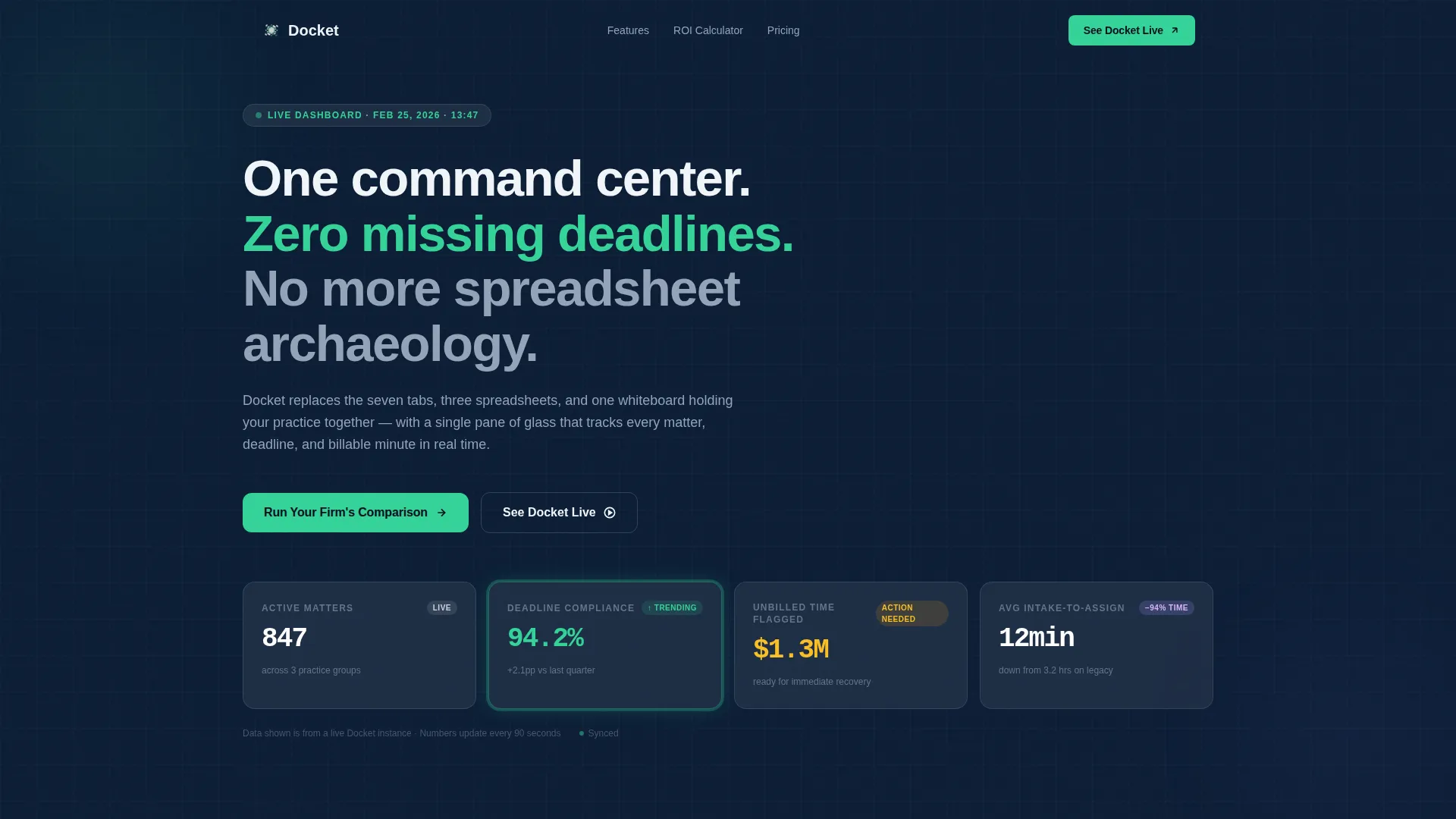
- A live stats hero dashboard with four floating metric cards showing active matters, deadline compliance, unbilled time flagged, and average intake time
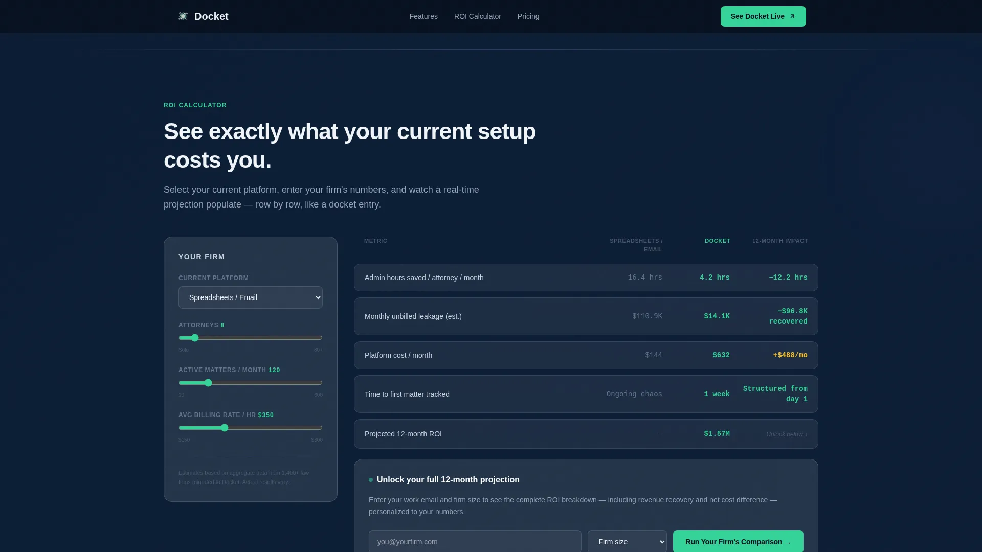
- An interactive return-on-investment calculator with a platform selector dropdown, headcount input, and animated projection grid
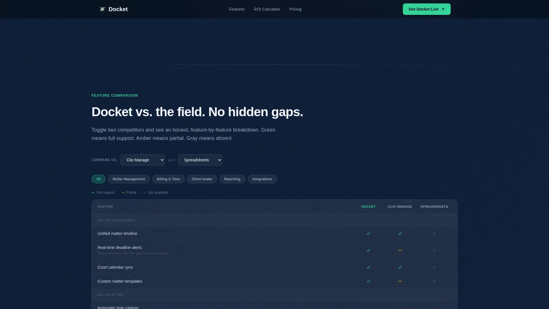
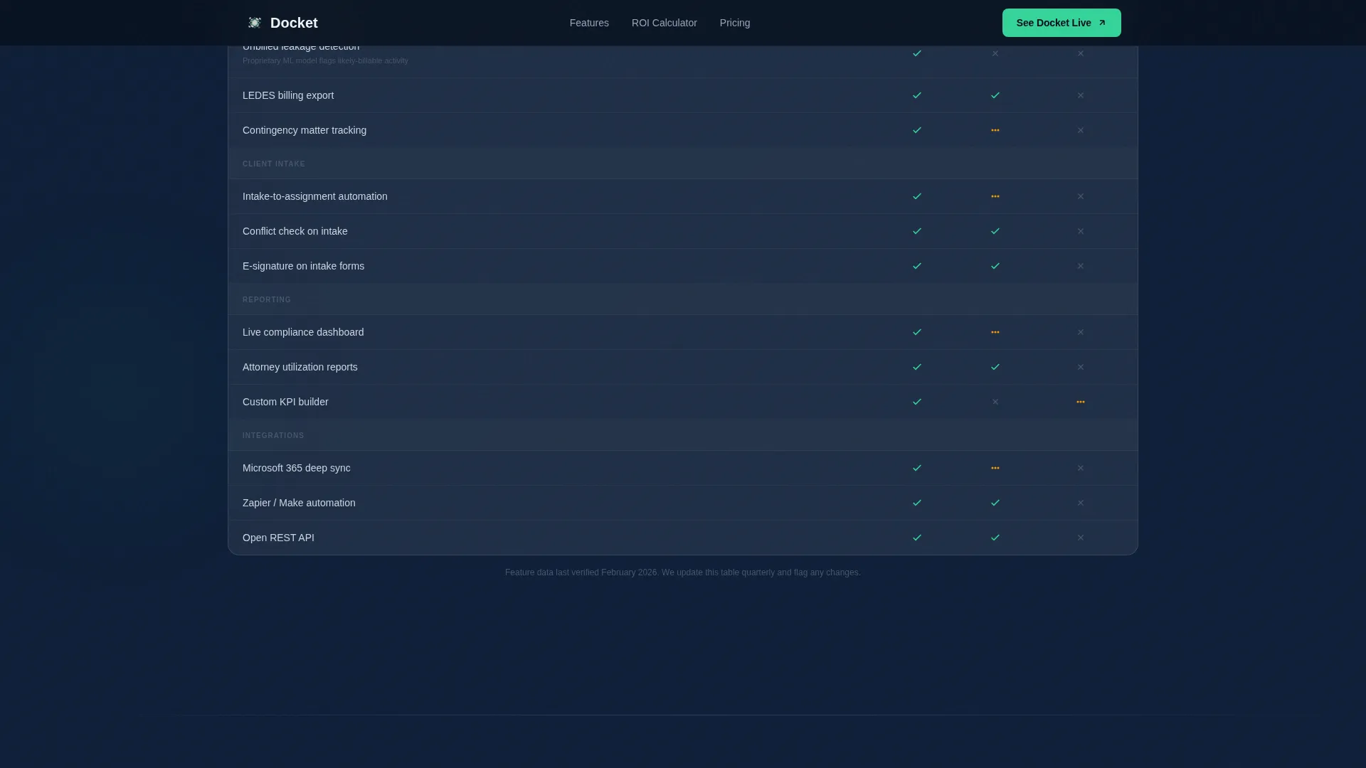
- A frosted-glass feature comparison grid with toggle tabs for evaluating the product against competing platforms simultaneously
Feature list
A paragraph introducing the core feature set:
Docket delivers a tightly designed set of interactive components. Each feature below is built directly into the template and serves a clear purpose in the buyer's decision journey.
Live Stats Hero Dashboard
The header section renders four glassmorphic metric cards mid-calculation. Numbers are displayed in oversized monospace type with a soft green pulse on the compliance metric. The panel communicates product credibility before a visitor reads a single word of copy.
Interactive Return-on-Investment Calculator
Visitors choose their current platform from a dropdown, enter attorney headcount and average monthly matter volume, and receive an animated projection grid. The grid populates row by row like a docket entry loading in real time, showing time saved, revenue recovered from unbilled leakage, and a 12-month cost comparison.
Side-by-Side Comparison Grid
A frosted-glass toggle tab system lets visitors compare the product against two competing platforms simultaneously. Green checkmarks indicate full support, amber icons indicate partial support, and muted gray marks honest gaps. Nothing is hidden.
Gated ROI Projection Form
The full 12-month projection is revealed after a visitor enters an email address and firm size. The form sits inside the calculator itself, so the ask feels like a natural next step rather than an interruption.
Demo Booking Section
A dedicated call-to-action section offers a 15-minute guided demo with a calendar embed. The section is separate from the calculator so visitors who skip the form still have a direct path to booking.
Social Proof Section
Named attorney testimonials and outcome statistics are displayed in a dedicated section between the comparison grid and the demo call to action. The social proof section reinforces credibility at the moment buyers are closest to a decision.
Page sections overview
| Section | Purpose |
|---|---|
| Live Stats Dashboard | Opens page with credible, specific firm metrics |
| ROI Calculator Tool | Delivers personalized time and revenue projections |
| Gated Projection Form | Captures email and firm size before full results |
| Comparison Feature Grid | Lets visitors evaluate against competing platforms |
| Social Proof Section | Builds trust with attorney testimonials and outcomes |
| Demo Booking call to action | Converts engaged visitors into scheduled demo calls |
| Linear Footer | Closes page with essential links in a single row |
Design & branding system
The visual identity follows a glassmorphic dark theme. Every layer of the page is built around translucency, depth, and luminous data visualization. The palette feels like looking through a rain-streaked glass office wall at a row of backlit monitors.
- Colors: deep courtroom navy (#0B1D35) as the primary background, electric docket green (#34D399) for live-status indicators and interactive accents, frosted panel white at 60% opacity (#FFFFFFCC) for card surfaces, and translucent divider lilac (#A78BFA33) for section separators
- Typography: JetBrains Mono for all numerical data and metric displays, Plus Jakarta Sans for all prose and interface labels
- Visual details: blurred navy-to-charcoal gradient backgrounds, floating card components with frosted borders and subtle box shadows, and crisp white or muted slate text depending on hierarchy level
Mobile & speed optimization
The template is designed desktop-first, reflecting the reality that managing partners and legal operations coordinators evaluate software on desktop during business hours. The interactive components are structured to keep static content rendered separately from dynamic calculator and comparison logic.
- Desktop-first layout ensures the dashboard, calculator grid, and comparison tabs display at full fidelity on the screens where buying decisions actually happen
- Static page sections use server-side rendering principles to stay lightweight, while the calculator and comparison grid are scoped as client-side interactive components
- High-animation scroll reveals, counter animations, and the row-populating calculator effect are designed to perform smoothly without blocking the initial page load
How this template helps you convert
The page is structured around a give-first philosophy. Visitors receive real, personalized value before they are asked to share any information. This makes every call to action feel earned rather than forced.
- The calculator delivers a specific return-on-investment number tied to the visitor's actual firm size and current platform, giving them a concrete reason to continue rather than bounce.
- The gated full projection captures a qualified lead at the exact moment the visitor has seen enough value to act, making the email and firm-size form feel like access to more rather than a barrier.
- The demo booking section offers a low-commitment next step for visitors who want to see the product before fully committing, keeping the conversion funnel active beyond the form.
Other information about this template
This template is categorized under Technology, specifically within the Software-as-a-Service and Legal Practice Management niche. It uses a Directory and Discovery theme with a Dashboard and Data Grid template style. The creative direction is Calculator and Tool First, meaning the interactive element leads the page rather than following a traditional hero pitch.
- The landing page direction follows a Comparison and Versus framework, which is the dominant decision-making context for legal software buyers on annual renewal cycles
- The header concept is Stats and Metrics, placing real data points front and center to establish product authority immediately
- The color system is Glassmorphic, chosen specifically to signal a modern, organized, data-driven product to an audience accustomed to legacy legal software interfaces
- Localization is set for United States audiences, using United States Dollar formatting and MM/DD/YYYY date conventions throughout the page
Theme
Directory & Discovery
Creative direction
Calculator/Tool First
Color system
Glassmorphic
Style
Dashboard/Data Grid
Direction
Comparison/Versus
Page Sections
Live Metrics Hero Dashboard
Interactive ROI Calculator
Gated Projection Form
Frosted Comparison Grid
Social Proof Section
Demo Booking Call to Action
Related questions
Who is this template designed for?
Can I customize the calculator inputs and dropdown options?
What conversion actions does this template support?
Does the comparison grid content come included?
Is this template suitable for both solo attorney products and mid-size firm products?



