Vibrant Fitness Landing Page for Asian-Owned Studios
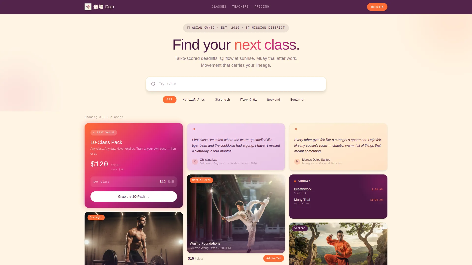
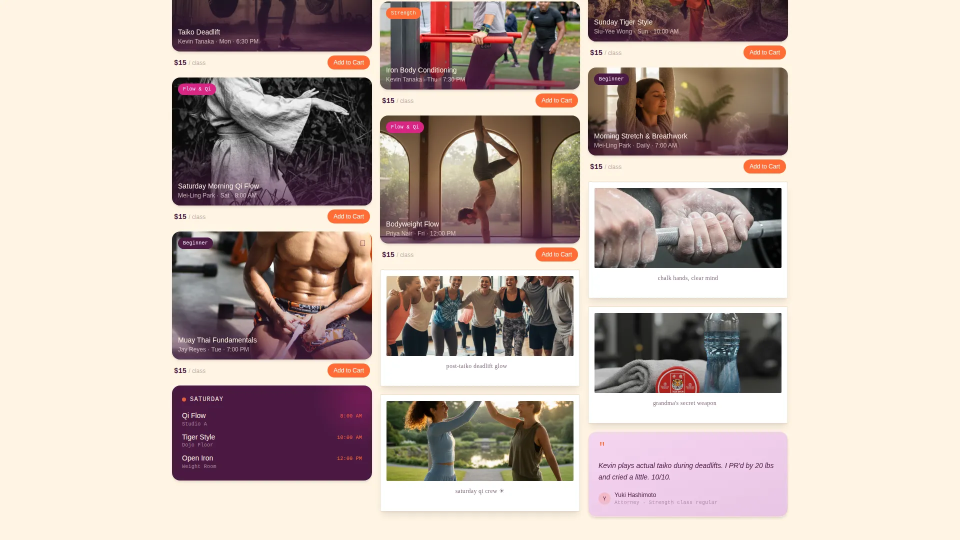
Dojo is a vibrant, masonry-style fitness landing page built for Asian-owned studios that blend cultural heritage with modern movement. The layout opens with an oversized search box, then cascades into a living grid of class cards, schedule tiles, and member polaroids. Every scroll brings a small surprise, and every card earns the sale with pricing, pulse animations, and a sticky booking bar.
by Rocket studio
Quick summary
Dojo is a single-page fitness landing page template designed for culturally rooted studios. It opens with a search-driven masonry grid instead of a standard hero image. Class cards carry price chips and booking buttons. Scroll-triggered surprises build personality at every depth. The result is a page that feels alive, personal, and ready to convert visitors into paying members.
Who this template is for
This template is built for studio owners who want their space to feel as distinctive online as it does in person. It suits businesses where culture, community, and movement overlap in meaningful ways.
- Asian-owned fitness studios offering classes like muay thai, qi gong, or wushu
- Independent gym owners tired of generic templates that strip away personality
- Fitness entrepreneurs targeting second-generation professionals and culturally curious newcomers
What problem this template solves
Most fitness landing pages look identical. They lead with a hero image, list a few class names, and drop a single sign-up form. That format does nothing for studios whose identity is their biggest selling point.
- Visitors cannot feel the studio's personality before they book
- Generic layouts fail to showcase a rich, multi-class schedule in a way that invites exploration
- There is no clear visual path from browsing to buying for price-sensitive first-timers
What you get with this template
You get a fully designed, single-page layout that replaces passive scrolling with active discovery. The masonry grid, search interaction, and surprise-and-delight moments work together to build trust before the purchase moment arrives.
- An oversized search box header with suggested tags that filter the masonry card grid in real time
- Individual class cards with price chips, pulse-animated "Add to Cart" buttons, and a 10-pack bundle card with a crossed-out single-class price
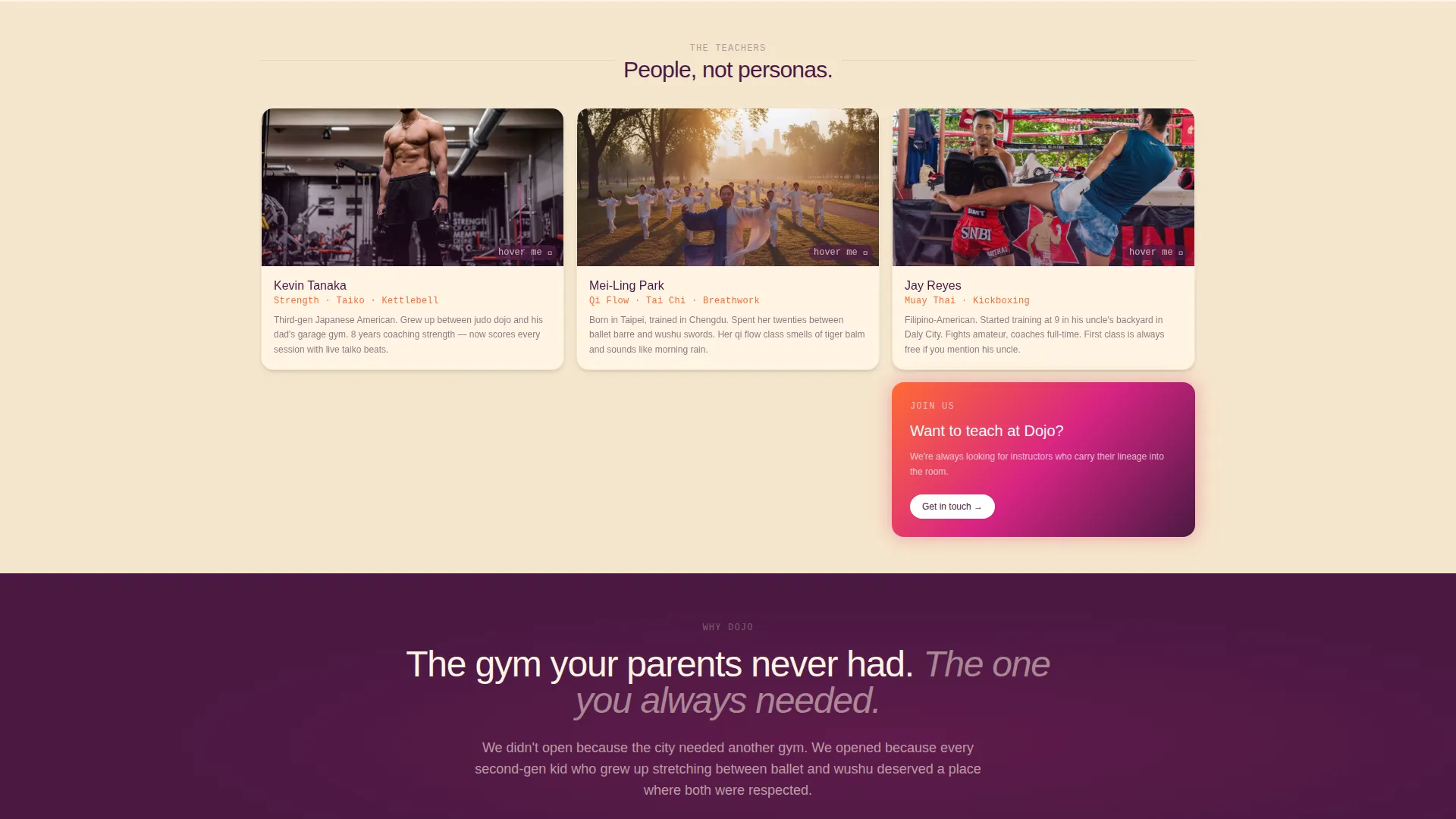
- Scroll-triggered micro-moments including card flips with fortune-cookie messages, instructor portrait swaps on hover, and a brief cursor-trailing dumpling emoji
Feature list
This section covers the core built-in capabilities that make Dojo work as both a discovery tool and a direct-sales page.
Search-Driven Masonry Header
The page opens with an oversized, centered search box on a rice paper cream field. Placeholder text reads "Try: 'muay thai for beginners' or 'Saturday morning qi flow'" with a blinking cursor. As visitors type or tap suggested tags, masonry cards cascade instantly below, turning the header into the primary interaction point.
Living Masonry Card Grid
Cards display class photos shot with film-grain filters, short looping video clips of instructors mid-kick, hand-lettered schedule tiles, and member polaroids pinned at slight angles. The density of the grid lets the studio's full personality show without overwhelming the layout.
Scroll-Triggered Surprise Moments
At defined scroll depths, small unexpected interactions fire. A card flips to show a fortune-cookie-style motivational line. Hovering a class photo swaps it to the instructor's childhood martial arts portrait. A floating dumpling emoji trails the cursor for exactly two seconds then disappears. These moments reward exploration without cluttering the page.
Direct-Sales Class Cards
Every class card includes a visible price chip and a persimmon orange "Add to Cart" button that pulses once as the card enters the viewport. A dedicated 10-pack bundle card sits higher in the masonry flow, showing a crossed-out single-class price to reinforce urgency and value.
Sticky Mobile Booking Bar
On mobile, the primary call to action "Book Your First Class - $15" is pinned as a sticky bottom bar. Tapping it expands to reveal a date picker and a time-slot carousel, keeping the purchase path short and immediate without requiring a separate page.
Neo-Retro Sunset Gradient System
The visual identity uses a four-color palette: persimmon orange, dragonfruit magenta, dusky plum, and rice paper cream. Gradients wash behind masonry cards, plum anchors the navigation and footer, cream carries body text, and magenta fires on hover states and badges. The overall effect is nostalgic and vivid at the same time.
Page sections overview
| Section | Purpose |
|---|---|
| Search Box Header | Entry point and primary filter interaction for the masonry grid |
| Masonry Card Grid | Visual discovery layer showing classes, schedules, clips, and polaroids |
| 10-Pack Bundle Card | Urgency-driven upsell pinned high in the masonry flow |
| Class Detail Cards | Individual class info with price chip and pulse-animated booking button |
| Sticky Booking Bar | Mobile-pinned primary call to action with date picker and time-slot carousel |
| Navigation Bar | Plum-grounded top nav anchoring the page structure |
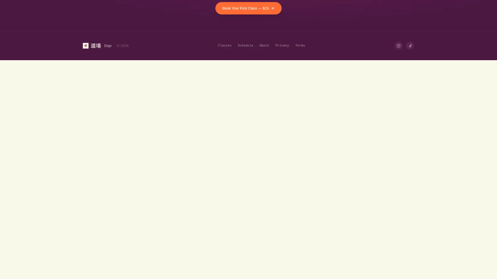
| Footer | Closing section grounded in dusky plum with supporting links |
Design & branding system
The Dojo template uses a Neo-Retro theme built around a Sunset Gradient color system. Every color in the palette has a specific structural role, so swapping your studio's content in feels cohesive rather than chaotic.
- Persimmon orange (#FF6B35) and dragonfruit magenta (#D72483) form the gradient washes behind cards and the primary interactive elements
- Dusky plum (#4A1942) grounds the navigation bar and footer for visual weight and contrast
- Rice paper cream (#FFF5E4) carries body text and open-field backgrounds, giving the layout room to breathe between vivid gradient sections
Mobile & speed optimization
The sticky booking bar is the centerpiece of the mobile experience. It keeps the purchase action within thumb reach at all times, removing friction from the final step of the customer journey.
- The date picker and time-slot carousel expand directly from the sticky bar on tap, avoiding redirects or page jumps
- Masonry card layout reflows naturally for narrower screens, maintaining the grid's discovery feel without horizontal overflow
- Looping video clips and film-grain photo treatments are designed to complement the visual grid without requiring heavy asset loads
How this template helps you convert
Dojo earns the sale through visual proof and progressive engagement rather than pressure tactics. Visitors window-shop the grid, encounter personality at every scroll depth, and arrive at the booking button already feeling like they belong.
- The search box interaction creates immediate investment. Visitors who filter by class type have already expressed intent, making them warmer leads before they see a single price.
- Price chips and the crossed-out bundle price make the value comparison visible and immediate. Visitors can assess cost and commitment without hunting for a pricing page.
- The sticky booking bar on mobile removes the most common drop-off moment. The call to action is always one tap away, with the date and time selection built directly into the expansion panel.
Other information about this template
Dojo is categorized under Retail and E-Commerce with a specific focus on Asian-owned business storefronts. The template's Gallery and Detail style means it functions equally well as a class discovery tool and a direct point-of-sale page. The intersection of Neo-Retro theme, masonry layout, and Sunset Gradient color system is intentional and consistent throughout every section.
- The template style is Gallery and Detail, making it suitable for studios with a broad, varied class schedule that benefits from visual browsing
- The creative direction follows a Surprise and Delight approach, which means personality is built into the layout mechanics rather than added as an afterthought
- This template is designed as a single landing page, not a multi-page website, so all content and conversion paths live within one scrollable experience
Theme
Neo-Retro
Creative direction
Comparison Journey
Color system
Obsidian & Gold
Style
Gallery + Detail
Direction
Marketplace/Multi
Page Sections
Search-driven Masonry Header
Scroll-triggered Surprise Moments
Direct-sales Class Cards with Price Chips
Sticky Mobile Booking Bar
Living Masonry Card Grid
Neo-retro Sunset Gradient Color System
Related questions
Can I use this template if my studio offers only one or two class types?
How does the search box filter cards without a backend system?
Is the sticky booking bar visible on desktop too?
Can I edit the fortune-cookie flip card text to match my studio?
Does the template support video clips inside the masonry grid?



