Specialist Pharmaceutical Digital Presence Comparison Website Template
Formulary is a pharmaceutical intelligence landing page template built for membership platforms that convert raw FDA filing data into actionable drug-launch timelines. It features a glassmorphic terminal aesthetic, a Free versus Command Access comparison table, a gated trial signup flow, and a redacted pipeline preview, all designed to compel pharmacy and biotech professionals to start a 14-day free trial.
by Rocket studio
Quick summary
Formulary is a single-page pharmaceutical membership landing page template. It turns the visual chaos of FDA pipeline data into a compelling case for joining a gated intelligence platform. The layout follows a Problem→Solution Arc, moving visitors from information overload to a clear 14-day free trial signup, no credit card required.
Who this template is for
This template is built for founders, product teams, and developers launching a gated pharmaceutical intelligence platform. It speaks directly to the professionals who will become members, and converts them efficiently.
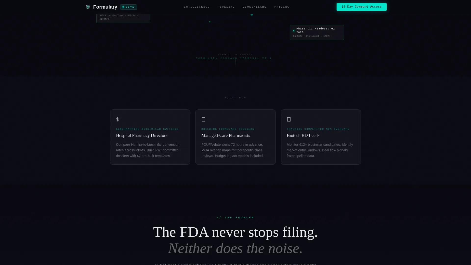
- Hospital pharmacy directors who benchmark biosimilar switches and need formulary dossiers built on verified pipeline data
- Managed-care pharmacists tracking New Drug Applications (NDAs), Biologics License Applications (BLAs), and Abbreviated New Drug Applications (ANDAs) across therapeutic areas
- Biotech business development leads monitoring competitor mechanism-of-action (MOA) overlaps and patent cliff exposure
What problem this template solves
Pharmacy and biotech professionals drown in unstructured FDA activity every week. There is no shortage of data, the problem is that raw filings, patent databases, and pipeline catalogs are fragmented, slow to parse, and impossible to act on before market consensus catches up. This template positions a membership platform as the solution to that exact gap.
- Visitors arrive with information overload and leave understanding that the platform compresses complexity into one clean, timed insight
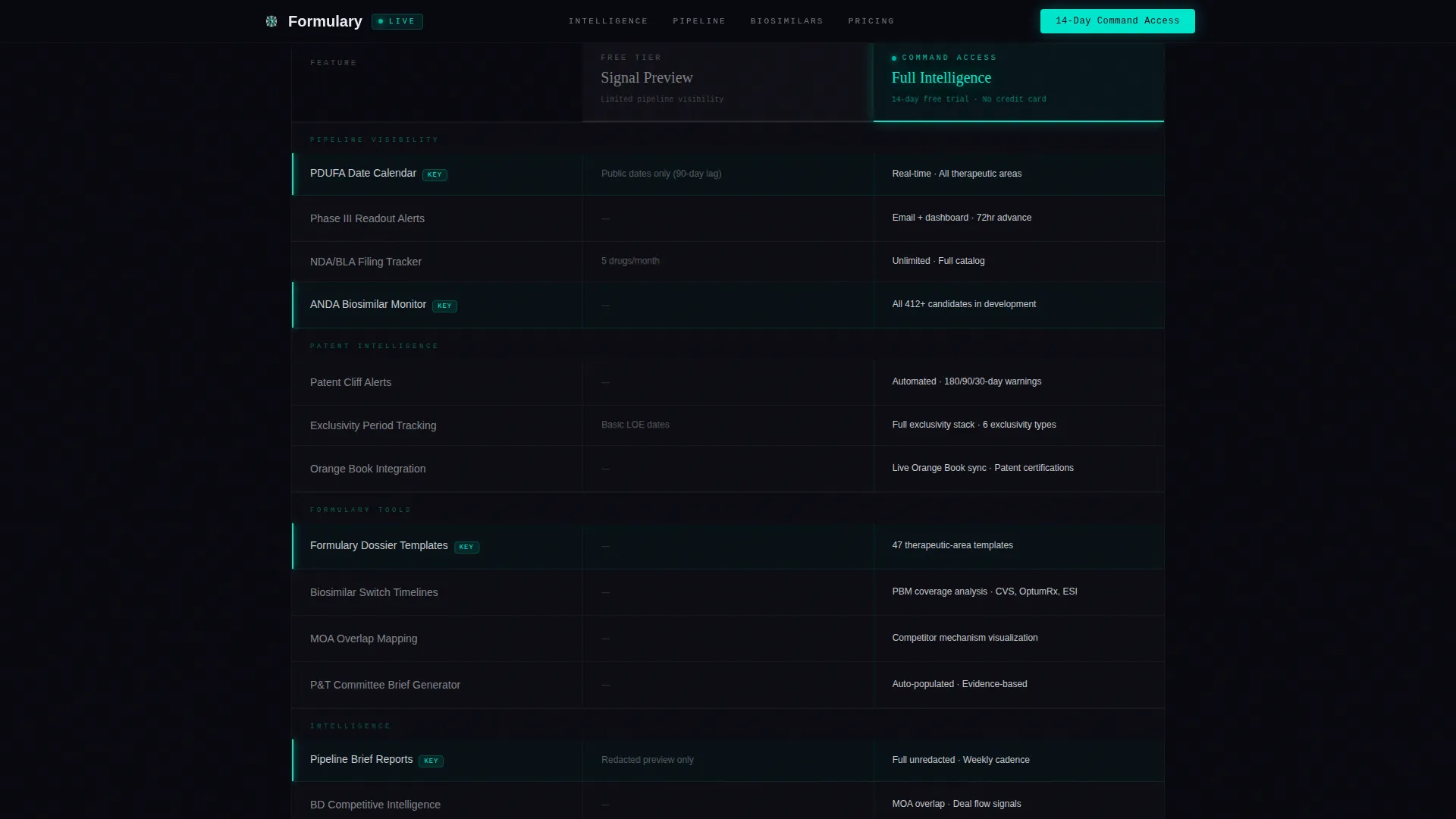
- The Free versus Command Access comparison table makes the value of upgrading immediately legible, with Pro tier rows rendered in full phosphor cyan to signal priority access
- The redacted pipeline brief preview creates a deliberate information gap, enough to prove depth, not enough to satisfy without a trial signup
What you get with this template
The template delivers a fully structured, single-page layout purpose-built for pharmaceutical membership conversion. Every section is sequenced to teach, persuade, and then capture.
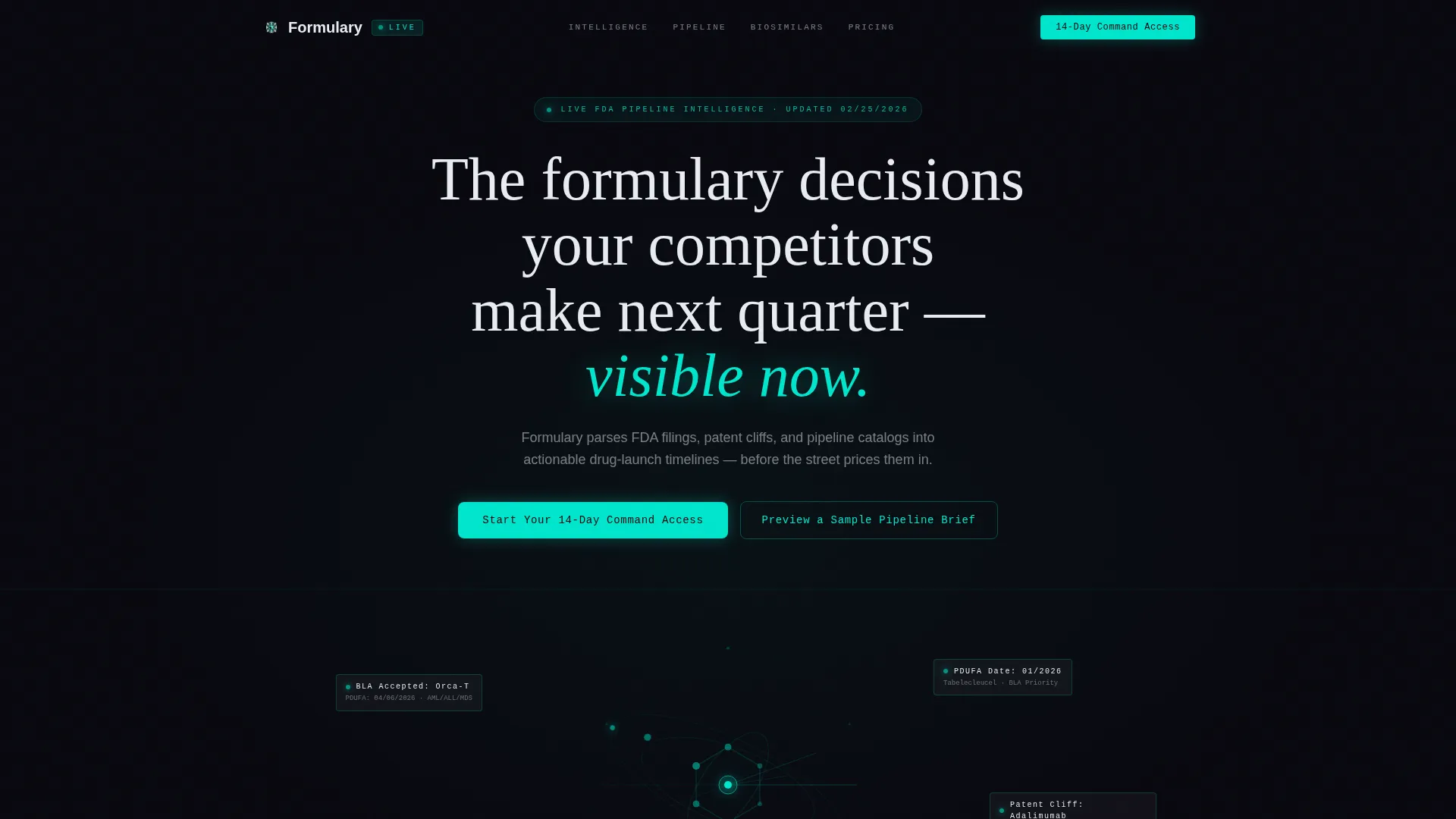
- A dark full-bleed hero with a rotating wireframe molecule, constellation-style pipeline data points, and a terminal headline that materializes in clinical white
- A glassmorphic comparison table with Free and Command Access tiers, hover states on Pro rows, and a primary call-to-action (call to action) directly beneath it
- A sticky bottom call to action bar that activates after 60% scroll depth, a gated signup form requesting only institutional email and therapeutic area, and a secondary path to preview a sample pipeline brief as a gated PDF
Feature list
Rotating Wireframe Molecule Hero
The hero section renders a single compound molecule structure in wireframe cyan that rotates slowly against a void black viewport. Pipeline data points fade in around it like constellations, showing live-style signals such as PDUFA dates, patent cliff labels, and Phase III readout quarters. The headline materializes in clinical white using Fraunces typography.
Signal-versus-Noise Visualization Section
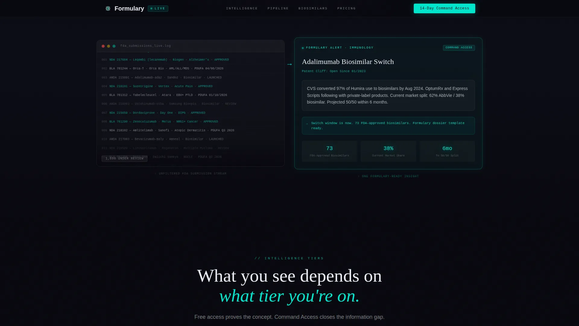
This section opens with a streaming visualization of FDA activity: hundreds of NDAs, BLAs, and ANDAs flowing past in muted text. It then collapses that volume into a single glassmorphic card showing one clean, actionable insight. The visual compression teaches visitors exactly what the platform does before any feature list appears.
Glassmorphic Comparison Table
The comparison table renders Free and Command Access tiers side by side on frosted-glass card layers. Free tier rows glow dimly; Pro tier rows burn full phosphor cyan. Hover states are built in for interactivity. The primary call to action, "Start Your 14-Day Command Access," appears directly below the table.
Redacted Intelligence Preview
Blurred glimpses of a real pipeline brief are embedded throughout the scroll. Each redacted block proves the depth of the platform's parsed output while creating an information gap that only a trial signup closes. This section reinforces credibility without giving the product away.
Sticky call to action Bar with Gated Signup Form
A sticky bottom bar activates after the visitor reaches 60% scroll depth. The signup form captures only two fields: institutional email address and therapeutic area of interest (oncology, immunology, rare disease, cardiovascular, presented as a dropdown). No credit card is required. A secondary path offers a gated PDF pipeline brief preview using the same email field.
GSAP-Animated Scroll Reveals
Section transitions use GSAP scroll-reveal animations throughout the page. Each Problem→Solution Arc segment animates raw complexity in, then compresses it into the platform's parsed output on the right. The streaming text effect in the FDA firehose section and constellation fade-ins in the hero are also handled through this animation layer.
Page sections overview
| Section | Purpose |
|---|---|
| Hero Full-Bleed | Establishes terminal aesthetic and headline promise with rotating molecule and pipeline data constellations |
| Signal versus. Noise | Visualizes FDA filing volume, then collapses it into a single actionable insight card |
| Comparison Table | Contrasts Free and Command Access tiers with glowing Pro rows and primary call to action placement |
| Redacted Intelligence Preview | Shows blurred pipeline brief excerpts to prove platform depth and create trial urgency |
| call to action Signup Form | Captures institutional email and therapeutic area; no credit card required |
| Sticky call to action Bar | Re-engages visitors at 60% scroll depth with the 14-day trial prompt |
| Footer | Horizontal flow footer pattern providing navigation and supporting links |
Design & branding system
The visual identity follows a Data Command theme rendered through a glassmorphic color system. Every design decision reinforces the feeling of a classified intelligence terminal, dark, layered, and surgically legible.
- Color palette: void black (#09090F) as the base viewport, translucent card layers at rgba(255,255,255,0.05), phosphor cyan (#00E5CC) for live-data accents and glowing borders, and clinical white (#E8ECF1) for all body text
- Typography system: DM Mono for data labels and terminal-style strings, Fraunces for editorial headlines, and DM Sans for body copy, each weight chosen to separate signal from context
- No stock photography and no lifestyle imagery; visual credibility comes from animated data structures, glassmorphic card layers, and redacted intelligence glimpses
Mobile & speed optimization
The template is built desktop-first, reflecting the working environment of hospital pharmacy directors and biotech business development leads who operate on large-screen terminals. Responsive behavior is included to support tablet and mobile viewports.
- Server Components handle all static content blocks, keeping initial load fast without disabling the animation layer
- Client Components are scoped to interactive and animated elements: the GSAP scroll reveals, the sticky call to action bar, the SVG molecule rotation, and the gated form modal
- High-fidelity animations (SVG rotation, constellation fade-ins, streaming text) are architected to run client-side only, leaving the static layout rendering unaffected
How this template helps you convert
Every section of this template is sequenced to move a skeptical, data-literate professional from curiosity to trial signup. The conversion architecture is deliberate and layered.
- The hero establishes immediate credibility through live-style pipeline data signals, PDUFA dates, patent cliff labels, Phase III readout quarters, before a single feature is explained, anchoring the visitor's attention on outcomes rather than product descriptions
- The comparison table makes the cost of staying on the Free tier visually obvious; phosphor cyan Pro rows glow against dimly lit Free rows, and the "Start Your 14-Day Command Access" call to action sits precisely where the decision is made
- The sticky bottom bar and the secondary gated PDF path create two parallel conversion lanes, ensuring that visitors who are not ready to sign up immediately can still enter the funnel by requesting a sample pipeline brief, captured with the same institutional email field
Other information about this template
This template is built for the pharmaceutical membership site niche within the broader pharmaceutical digital presence category. It is classified under the Technology category and is optimized for a freemium and free trial conversion model.
- The template style is a Comparison Table layout, making tier differentiation the central persuasion mechanism
- Localization is set for the United States market: USD pricing format and MM/DD/YYYY date formatting throughout
- Social proof is drawn from real FDA statistics, live PDUFA dates, and biosimilar market data points, all surfaced in the design as credibility anchors rather than testimonial copy
- The footer uses a horizontal flow pattern suited to platform-style membership sites
Theme
Data Command
Creative direction
Problem→Solution Arc
Color system
Glassmorphic
Style
Comparison Table
Direction
Freemium/Trial
Page Sections
Rotating Wireframe Molecule Hero
Signal-versus-noise Visualization
Glassmorphic Tier Comparison Table
Redacted Pipeline Intelligence Preview
Sticky Call to Action Bar and Gated Signup Form
GSAP Scroll-reveal Animation Layer
Related questions
What kind of business is this landing page template designed for?
Does the trial signup form require a credit card?
Can visitors access a content preview before signing up for the trial?
What animations and interactive elements are included in this template?
Is this template optimized for desktop or mobile viewing?



