Cannabis Digital Presence Cost Calculator Website Template
Dose is a bold brutalist cannabis dispensary landing page template built around a live terminal dosage calculator and a modular card grid of head-to-head product comparisons. The design uses deep black, catalytic teal, and warning amber to deliver a clinical yet earthy web presence. It is ready for dispensaries that want data-forward pages, not lifestyle fluff.
by Rocket studio
Quick summary
Dose is a single-page cannabis dispensary landing page template with a Calculator/Tool First creative direction. It opens with an interactive terminal dosage calculator, then flows into a modular brutalist card grid where products, methods, and brands compete head-to-head. The layout is sharp, dark, and data-dense, built to earn trust through precision before asking for a click.
Who this template is for
This landing page template is designed for dispensaries and cannabis retailers who want to lead with expertise rather than photography. It works equally well for medical-use stores and recreational shops that carry flower, concentrates, edibles, and tinctures.
- Dispensary owners and operators who want a data-driven landing page that speaks to informed buyers
- Web design agencies building cannabis brand pages for precision-retail clients
- Marketing teams who need ready product pages that showcase terpene profiles, pricing, and dosage data without a lot of filler
What problem this template solves
Most dispensary pages store their trust in lifestyle imagery and vague taglines. Visitors who understand the difference between strains, terpenes, and consumption methods leave those pages fast. Dose flips that dynamic by putting a working dosage calculator at the very top, no hero image, no marketing copy, just the tool.
- Daily consumers and medical patients need specific numbers, not mood boards, before they click "Add to Order"
- Newcomers need education first; a guided calculator lowers the barrier and keeps them on the page longer
- Standard cannabis landing pages fail to display price-per-milligram, onset time, and method comparisons in one place
What you get with this template
You get a fully structured landing page ready to set up and customize. The template delivers a modular card grid layout, a terminal-style dosage calculator header, a sticky checkout bar, and an SMS capture section, all styled in the Teal Catalyst color system.
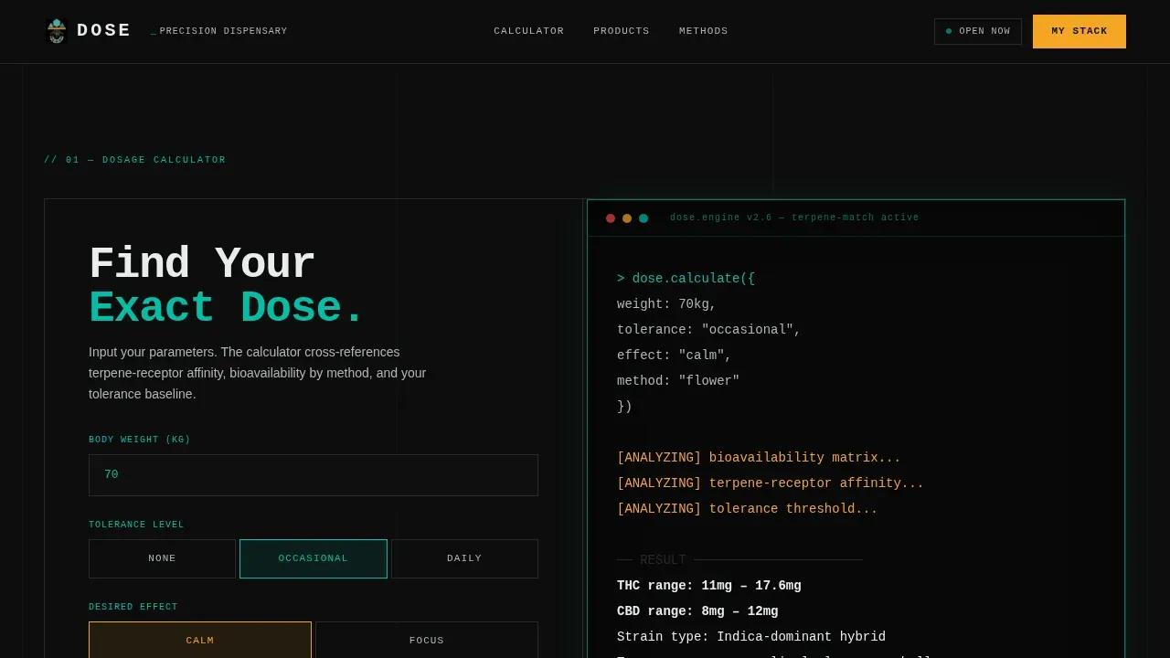
- Interactive terminal dosage calculator with real-time output and typewriter animation
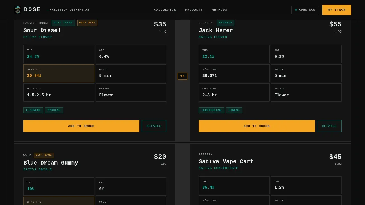
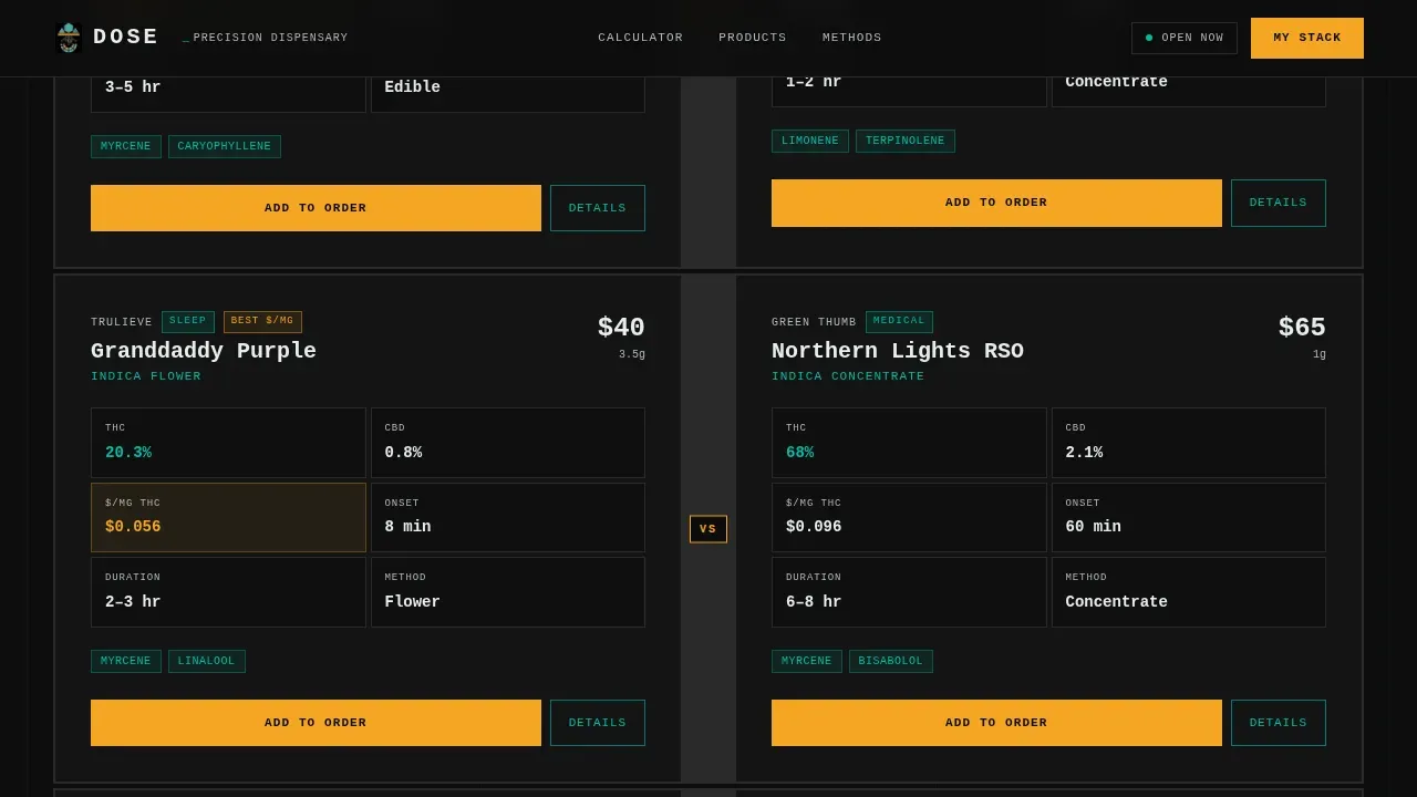
- Brutalist versus-card grid covering product, method, and brand comparison tiers
- Sticky bottom bar that tallies selections and displays a running cost with a "Check Out Your Stack" button
Feature list
A paragraph introducing the core features: this landing page template is packed with purpose-built components that deliver clear product information, comparison-driven conversion, and a bold visual identity that sets it apart from every polished dispensary site on the market.
Terminal Dosage Calculator Header
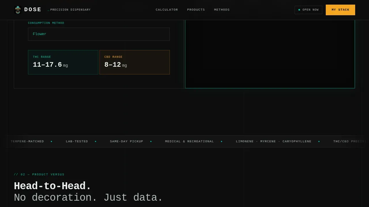
The page opens with a live, interactive calculator rendered in a monospaced terminal-style block. Visitors input weight, tolerance level, desired effect, and consumption method. Output appears line by line in real time, building trust through clinical precision before any product is shown.
Brutalist Versus Card Grid
Products go head-to-head inside modular comparison cards. Each card displays THC percentage, price per milligram, onset time, duration, and a terpene badge. Bold brutalist typography slams the numbers side by side with no decoration, making it simple to read and compare at a glance.
Tiered Comparison Scroll
As visitors scroll deeper, the card grid shifts through three tiers: product versus product, method versus method (smoking versus edibles versus sublingual), then brand versus brand. Each tier is more granular than the last, rewarding scroll depth with increasingly specific information.
Sticky Order-Building Bar
A sticky bottom bar tallies selected products and shows a running total cost. The primary call-to-action reads "Check Out Your Stack" in amber. This mechanic keeps purchase intent visible without interrupting the comparison experience across all pages of the scroll flow.
SMS Save Path
Visitors who are not ready to buy can tap "Save This Comparison" to receive their personalized product matchup via text message. The capture field asks for a phone number only, no email, no name, reducing friction and matching how this audience prefers to convert.
Age Gate and Footer
A mandatory age gate protects the landing page entry point. It can be styled with geometric shapes and bold buttons consistent with the brutalist design system. The footer follows a horizontal layout pattern with simplified contact information and direct menu links.
Page sections overview
| Section | Purpose |
|---|---|
| Terminal Calculator Header | Dosage tool builds trust via real-time output |
| Product Comparison Grid | Versus cards pit products head-to-head |
| Method Comparison Cards | Smoking versus. edibles versus. sublingual breakdown |
| Brand Comparison Tier | Granular brand-level product data grid |
| SMS Save + Checkout | Phone capture and sticky stack checkout bar |
| Footer | Horizontal layout with contact and menu links |
Design & branding system
The design uses a Teal Catalyst color system applied over a Bold Brutalist web design foundation. The layout exposes its grid structure with thick borders instead of shadows, and typography stays raw and oversized throughout. The palette feels like a concrete-walled facility at midnight, everything dark and industrial until the LEDs kick on.
- Color set: deep dispensary black (#0D0D0D), catalytic teal (#00BFA6), smoke-white (#E8EDEB) for card surfaces, and warning amber (#F5A623) reserved for comparison callouts and hover states
- Typography: JetBrains Mono for terminal headers and bold display text, DM Sans for readable body text across all cards and descriptions
- Visual tone: clinical-warm, high-contrast, grid-exposed, no lifestyle photography, no decorative elements
Mobile & speed optimization
The landing page is designed desktop-first to give the calculator and card grid the space they need. It is fully responsive so the layout adapts cleanly on smaller screens. The brutalist design approach keeps the page lean by nature, sparse imagery and a minimal CSS footprint contribute to faster load times.
- Scroll reveals and counter animations are scoped to client-side components; static sections use server components to keep performance steady
- The card grid collapses into a readable single-column layout on mobile without losing comparison data
- Reduced reliance on heavy assets means the site stays fast even with high-interactivity JavaScript powering the calculator and sticky cart
How this template helps you convert
The conversion architecture on this landing page is built around proof first, purchase second. The calculator earns credibility at the top. The versus cards build desire through transparent data. The sticky bar closes the loop without friction.
- The terminal calculator proves the page understands dosing better than the visitor does, establishing authority before any product description appears
- Amber "Add to Order" buttons on every card and a running total in the sticky bar create a continuous, low-pressure path to checkout across all comparison pages
- The SMS save path captures visitors who need more time, turning a near-miss into a warm lead without asking for a lot of personal information
Other information about this template
This template supports the creation of cannabis brand pages that agencies and in-house marketing teams can customize and launch quickly. No-code landing page builders and drag-and-drop tools simplify the process for users without deep technical skills, so no lengthy software development cycle is needed to get this landing page live and ready.
- The dose brutalist cannabis dispensary landing page template is built on a web design philosophy that rejects polished visuals in favor of raw, functional layout, making it quicker and more cost-effective to maintain than conventional dispensary sites
- Dispensary landing pages benefit from geographic targeting; this template can support location-based text and geo-targeted pages to attract local visitors and improve organic reach
- A well-crafted blog section on a dispensary website can position the brand as a knowledgeable voice; this template's structure can support blog links and strain pages in the footer or navigation
- Product type pages and brand pages built from this template deliver reliable information that builds customer trust; adding a blog, location pages, and strain pages around this core landing page creates a fuller cannabis web presence
- The template is set up for USA localization with USD pricing and imperial weights displayed across all product cards
Theme
Bold Brutalist
Creative direction
Calculator/Tool First
Color system
Teal Catalyst
Style
Card Grid (Modular)
Direction
Comparison/Versus
Page Sections
Terminal Dosage Calculator
Brutalist Versus Card Grid
Tiered Comparison Scroll
Sticky Order-building Bar
SMS Comparison Save Path
Age Gate with Bold Styling
Related questions
Who is this landing page template best suited for?
Does this template include an age gate?
Can I customize the colors and text in this template?
How does the SMS save feature work?
What makes this different from a standard cannabis landing page template?



