Mission Control Infrastructure Monitoring Landing Page Template
The Downtime Mission Control Infrastructure Monitoring landing page template is built for SRE and DevOps teams who need real-time visibility into scheduled maintenance windows and unplanned outages. It combines a live dashboard preview, an interactive downtime cost calculator, and a feature directory grid into a single high-impact page. The carbon-fiber visual system and freemium signup flow turn technical transparency into trust.
by Rocket studio
Quick summary
This template gives infrastructure teams a focused, data-dense landing page for a scheduled downtime alert service. The page opens with a pixel-accurate dashboard preview, then earns the scroll with an interactive cost calculator. A feature directory grid, named SRE testimonials, and a two-field freemium signup form complete the flow. Every design decision prioritizes clarity over noise.
Who this template is for
This template is built for technical and product teams who know that a generic status page is not enough. It speaks directly to the people managing complex distributed systems at scale, the ones who feel every minute of an unplanned outage in their pipeline and their inbox.
- Site reliability engineers juggling thirty-plus service dependency chains and needing instant alerts at 2 a.m. when a scheduled maintenance window overruns.
- DevOps leads who must produce audit-ready compliance logs and demonstrate that every window closed on time, supporting service level agreements with enterprise customers.
- Platform teams at mid-market SaaS companies tired of hearing about ongoing outage events from angry customer tweets instead of from their own monitoring tools.
What problem this template solves
Not every status page communicates what engineers actually need to know. Most tools tell you that something is down. Few tell you whether the downtime was planned, whether it ran over, or whether an unplanned outage is quietly masquerading as a scheduled maintenance event. That blind spot is expensive.
- Planned versus unplanned confusion causes support teams to misclassify incidents, which corrupts root cause analysis and delays corrective action.
- Window overruns go unnoticed until customers report performance issues, raising support cost and eroding trust that took months to build.
- Too much data with too little context leaves engineers staring at raw metrics without a clear picture of user impact or system status across different services.
What you get with this template
This template delivers a complete, ready-to-customize landing page designed around the workflow of infrastructure monitoring professionals. It is not a blank canvas. Every section, every data cell, and every interactive element is pre-built to demonstrate the product's value before a visitor scrolls to the signup form.
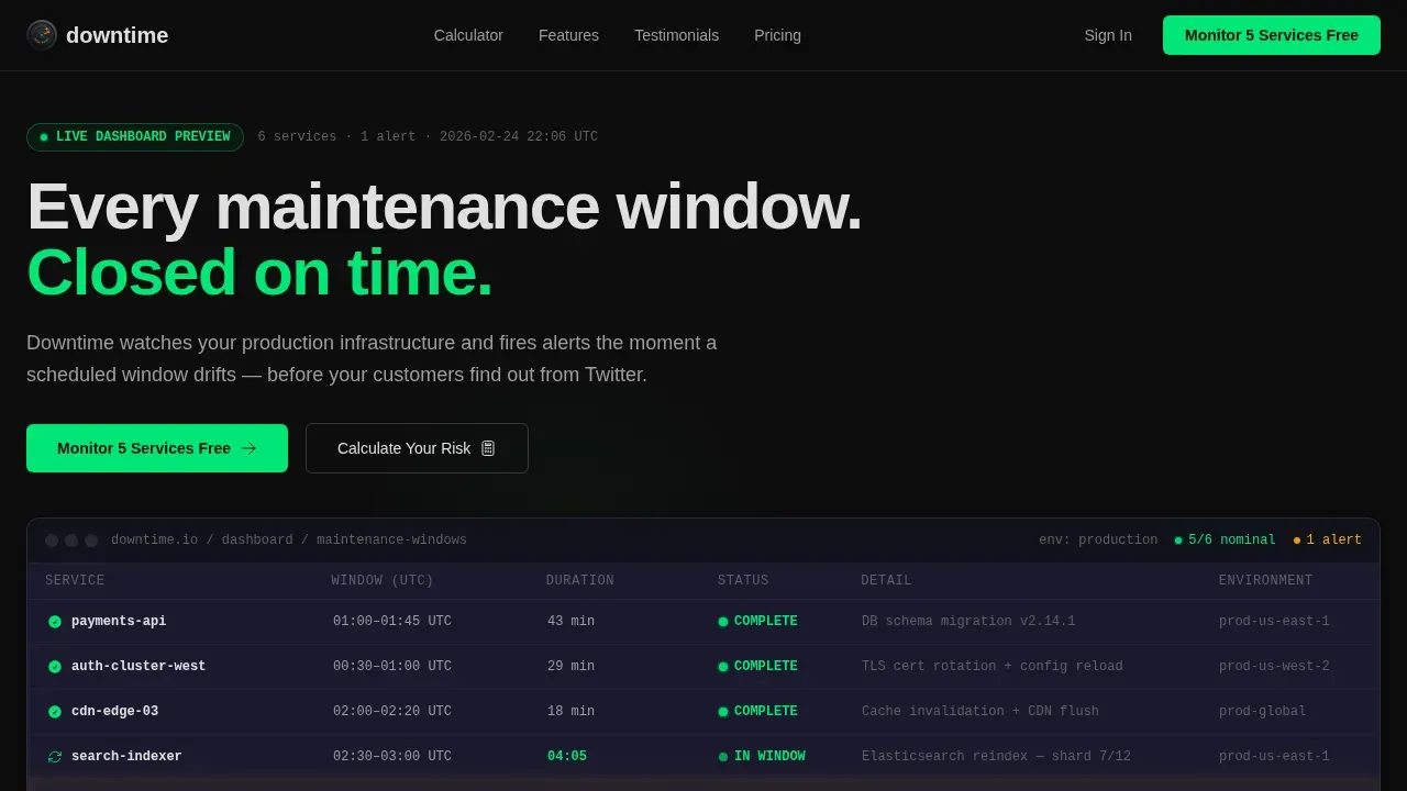
- A live dashboard hero section showing six real service cells, including a countdown timer, an amber overrun alert, and green completion checkmarks, so visitors immediately recognize the current state of their own environment reflected back at them.
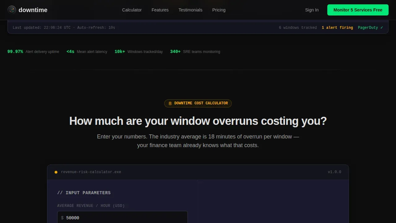
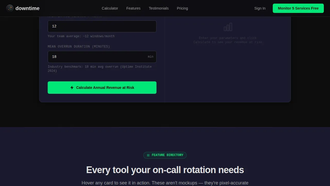
- An interactive Downtime Cost Calculator that accepts average revenue per hour, maintenance windows per month, and mean overrun in minutes, then instantly renders an annual revenue-at-risk figure in a carbon-fiber-styled data card.
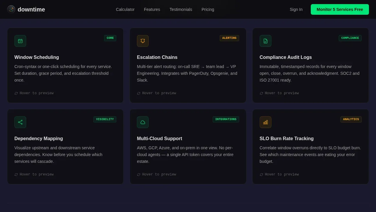
- A responsive feature directory grid with hover-flip cards covering window scheduling, escalation chains, compliance audit logs, and dependency mapping, plus a testimonial row and a two-field freemium signup form.
Feature list
This template packages every component that a high-stakes infrastructure monitoring landing page needs. Each feature is designed to move a technical visitor from skepticism to signup without friction.
Live Dashboard Hero Preview
The header renders a full-width, pixel-accurate bento grid of six service cells. Real service names, such as "payments-api," "auth-cluster-west," and "cdn-edge-03", populate each cell alongside live-style statuses. Three cells show green completion checkmarks, one displays a countdown timer, one glows amber with a window-exceeded alert, and one is queued. This is not a screenshot of a generic dashboard. It is a "single-pane-of-glass" display of key infrastructure metrics that makes visitors feel they are already inside the product. The goal is to demonstrate, at a glance, exactly what the mission control monitors across all critical systems.
Interactive Downtime Cost Calculator
Placed directly below the hero, the calculator asks three inputs: revenue per hour, maintenance windows per month, and mean overrun in minutes. It instantly computes annual revenue at risk from window overruns. The result appears in amber emphasis inside a carbon-fiber data card. This interaction is the page's secret weapon. It transforms an abstract reliability argument into a specific dollar figure the visitor computed themselves, creating the emotional urgency that drives freemium signup. The calculator demonstrates user impact in concrete business terms before any feature has been described.
Feature Directory Data Grid
Below the calculator, the page shifts into a browsable directory of feature cards. Each card covers a core capability: window scheduling, escalation chains, compliance audit logs, and dependency mapping. Cards flip on hover to reveal a micro-screenshot of the relevant interface. This data-grid pattern reflects the Directory and Discovery theme, letting visitors explore relevant information at their own pace. The layout is responsive and scales cleanly across viewport widths, so the grid remains readable whether a visitor is on a large desktop monitor or a smaller screen.
Escalation and Notification Engine
The template includes a dedicated feature card for the escalation chain system. This is the capability that fires pixel-precise alerts the moment a scheduled maintenance window drifts past its deadline. The card communicates that alerts can reach teams via text messages, email, or integrated channels, reducing the risk that an ongoing outage goes undetected. Automated incident logs provide a real-time feed of alerts and show the team is actively investigating, which reassures stakeholders and reduces incoming support tickets.
Compliance Audit Log Section
A dedicated section covers audit-ready compliance logging. This feature matters to DevOps leads who need proof that every maintenance window opened and closed on schedule. A well-structured downtime report captures when operations stopped, why the interruption occurred, and how long the disruption lasted. By standardizing this data, teams strengthen root cause analysis, improve accountability, and support smarter maintenance planning. Historical uptime data is preserved and exportable, giving companies the documentation they need to honor commitments and review root causes after any incident.
Freemium Signup and Inline Pricing
The page closes with a two-field signup form asking only for work email and primary cloud provider. A sticky bottom bar appears after the calculator interaction, anchoring the "Monitor 5 Services Free" call to action alongside the cost figure the visitor just computed. A secondary path opens an inline pricing grid without leaving the page. This low-friction conversion path eliminates every objection between realization and registration. Not everyone is ready to commit to a paid plan immediately, and the freemium tier removes that barrier entirely.
Page sections overview
| Section | Purpose |
|---|---|
| Dashboard Hero Preview | Show real service status cells with live-style indicators to build instant recognition |
| Downtime Cost Calculator | Let visitors compute annual revenue at risk from window overruns in real time |
| Feature Directory Grid | Present core capabilities as browsable, hover-flip cards in a data-grid layout |
| SRE Testimonial Row | Deliver social proof from named engineers with specific metrics and role context |
| Signup and Pricing | Capture work email and cloud provider with inline pricing toggle for plan comparison |
| Footer | Single-row linear footer with navigation links and brand identity elements |
Design & branding system
The visual identity is built around a Carbon Fiber color system that feels like the brushed-metal interior of a mission control console. Dark backgrounds let green status indicators glow with authority, while amber accents add warmth without making the interface feel clinical. The typography pairing of DM Sans for body copy and JetBrains Mono for data cells keeps the page readable and technically credible at the same time.
- Color palette: Deep cockpit black (#0D0D0D) for backgrounds, woven graphite (#1A1A2E) for panels, titanium mid-gray (#4A4A5A) for borders, status-green (#00E676) for active states, and alert amber (#FFAB00) for overrun emphasis, a system where brand identity is inseparable from functional communication.
- Animation and interactivity: Pulsing status indicators, scroll-reveal transitions, live calculator computation, card flips on hover, a sticky bar trigger after calculator interaction, and an inline pricing toggle all combine to create a high-interactivity experience without overwhelming the visitor.
Mobile & speed optimization
The template is designed desktop-first because site reliability engineers typically work on large monitors where data density is an asset. However, the layout is fully responsive and adapts cleanly to smaller viewports. Administrators checking status during off-hours need a mobile-responsive page that loads without delay, and this template is structured to support that.
- Desktop-first responsive layout: The bento grid hero, feature directory, and pricing section all reflow gracefully on tablet and mobile screen widths, so the page remains usable when an engineer checks it from a phone at 2 a.m.
- Component architecture: Static sections use server-rendered components for fast initial load, while the interactive calculator and sticky bar use client-side rendering only where needed, keeping the overall page weight controlled.
How this template helps you convert
The page is engineered to move a skeptical infrastructure engineer from first impression to freemium registration in a single, uninterrupted flow. Each section earns the next one.
- The hero earns attention. A pixel-accurate dashboard preview shows real service names and real status cells. Visitors immediately recognize the current state of their own environment, which builds credibility faster than any headline could.
- The calculator earns urgency. By computing an annual revenue-at-risk figure from the visitor's own inputs, the tool makes the cost of ignoring window overruns personal and specific. That amber dollar figure is more persuasive than any feature list.
- The signup form eliminates friction. Two fields, a free tier covering five services, and an inline pricing grid for comparison mean there is no excuse to delay. The sticky bar keeps the offer visible as the visitor scrolls through the feature directory, reinforcing the figure they computed and the ease of getting started.
Other information about this template
This template is categorized under Documentation and Support, specifically in the Status and Monitoring subcategory, targeting the scheduled downtime alert niche. It is designed as a single-page, section-led landing page rather than a multi-page site, which keeps the conversion path tight and intentional. Below is additional context that may be useful when evaluating this template for your use case.
- Observability foundation: The three pillars of observability are logs, metrics, and traces, which together provide a comprehensive view of system health. This template is designed to surface all three in a readable, data-dense format. Observability is the art of understanding what is happening inside complex distributed systems by examining external outputs such as logs, metrics, and traces, a principle that shapes how each status card is structured.
- Status page philosophy: Status pages are necessary to deliver a top-notch customer experience. The benefits are threefold: they reduce support cost, build higher customer trust, and increase productivity for support teams. The main mission of any status page is to communicate incidents as they unfold to avoid confusion and frustration. Good status pages provide a single source of truth for users regarding service status and incidents.
- Not every status page is built equal: Not every status page communicates the difference between planned and unplanned downtime. An internal status page that cannot distinguish a scheduled maintenance window from an unplanned failure creates false confidence. This template is built around that distinction as its core value proposition.
- Own your status page: Teams that own their status page and host it on a custom domain maintain brand identity and control the narrative during an incident. An own status page hosted on separate infrastructure ensures high availability during outages, so customers can always access current status even when primary systems are affected.
- Downtime reporting discipline: A downtime report is a structured record that captures when operations stopped, why the interruption occurred, and how long the disruption lasted. Organizations depend on downtime reports to pinpoint failures, evaluate the severity of interruptions, and strengthen overall operational resilience. This template supports that discipline by making compliance audit log data a first-class feature.
- Overall equipment effectiveness context: Companies in manufacturing, construction, and IT all rely on downtime reports to track overall equipment effectiveness and equipment effectiveness metrics over time. In an IT context, overall equipment effectiveness translates directly to system performance and uptime monitoring scores. This template helps teams communicate those metrics clearly to stakeholders.
- Third party services and cloud platforms: The signup form collects the visitor's primary cloud platform (Amazon Web Services, Google Cloud Platform, Microsoft Azure, or other) so onboarding can be tailored. Teams managing third party services alongside internal tools benefit from a unified status view rather than switching between custom dashboards for each provider.
- Predictive and automated alerting: Predictive alerts indicate potential issues before they become outages, for example, "Disk capacity at 90%." Automated incident logs provide a real-time feed of alerts, showing that the team is investigating. These capabilities are highlighted in the feature directory to demonstrate the product's proactive posture versus a reactive one.
- Competitor context for informed buyers: Well-known tools for creating and managing status pages include Statuspage (created by Atlassian), Status.io, and Pulsetic. Not everyone needs a standalone status page tool. This template is designed for teams who want to present their own monitoring product with a landing page that reflects the sophistication of their infrastructure work.
- Feature development and low code flexibility: The template is low code in its customization approach, teams can update service names, color tokens, and content blocks without rebuilding the layout. This preserves engineering capacity for feature development rather than front-end maintenance.
- Popular languages and software compatibility: The template works alongside software stacks across popular languages and frameworks. It does not require a specific back-end runtime to display status data. Teams can connect their existing monitoring software and route alert data into the dashboard cells as needed.
- Error rate and request rate visibility: The feature directory grid is designed to surface critical metrics including error rate and request rate alongside uptime data. A component status breakdown that pinpoints the exact failure point helps teams communicate recent incidents clearly to both engineers and non-technical stakeholders.
- Historical uptime and performance issues tracking: Historical uptime records are surfaced in the compliance audit log section, giving teams a transparent log of past incidents and scheduled maintenance events. Providing a detailed history of incidents demonstrates a commitment to transparency and helps users understand performance issues in context.
- Support and notification paths: Users can subscribe to updates via email, text messages, or integrated channels to reduce support tickets. Status pages should include links to customer support for urgent issues during ongoing outage events. This template includes a footer with those links built in.
Theme
Directory & Discovery
Creative direction
Calculator/Tool First
Color system
Carbon Fiber
Style
Dashboard/Data Grid
Direction
Freemium/Trial
Page Sections
Live Dashboard Hero with Real Service Cells
Interactive Downtime Cost Calculator
Feature Directory Data Grid with Hover-flip Cards
Escalation and Automated Alert Engine
Compliance Audit Log and Historical Uptime Records
Freemium Signup with Sticky Bar and Inline Pricing
Related questions
What sections are included in this landing page template?
Who is this template best suited for?
Can I customize the service names and status indicators in the hero?
How does the downtime cost calculator work?
Does this template support a custom domain and brand identity?



