Architecture Firm Site Maintenance Website Template
Downtime is a single-page architecture firm maintenance landing page built around a Data Command visual theme. It replaces a generic "be right back" screen with a structured, terminal-style status display. Architects, project managers, and developers get real-time system status, a module comparison table, and a clear path to keep working via the firm's offline mobile app.
by Rocket studio
Quick summary
Downtime is a maintenance landing page designed for architecture firms that need to communicate planned downtime with technical confidence. Instead of a blank holding screen, visitors see a live terminal status block, a structured comparison table of system modules, and a direct call to action linking to an offline mobile app. The page informs rather than frustrates.
Who this template is for
This template is built for architecture firms and technical studios that run cloud-based project workflows. It speaks directly to the people who hit the page mid-task and need immediate clarity.
- Architects and project managers who rely on BIM (Building Information Modeling) cloud tools and client portals during active project phases
- Developers and technical leads responsible for communicating system status during planned maintenance windows
- Firm administrators who want a professional, on-brand holding page rather than a default server error screen
What problem this template solves
A default 503 error page destroys trust. It gives no timeline, no context, and no alternative path forward. For architecture firms, this means clients and internal teams feel abandoned right when they need access most.
- Visitors have no idea when systems will return or which specific modules are affected
- There is no offline fallback offered, leaving users with nothing to do while they wait
- A blank or generic error page signals poor technical management, which contradicts the authority an architecture firm works hard to build
What you get with this template
This template gives you a complete, single-page maintenance experience that looks deliberate and functions usefully. Every section has a clear job to do.
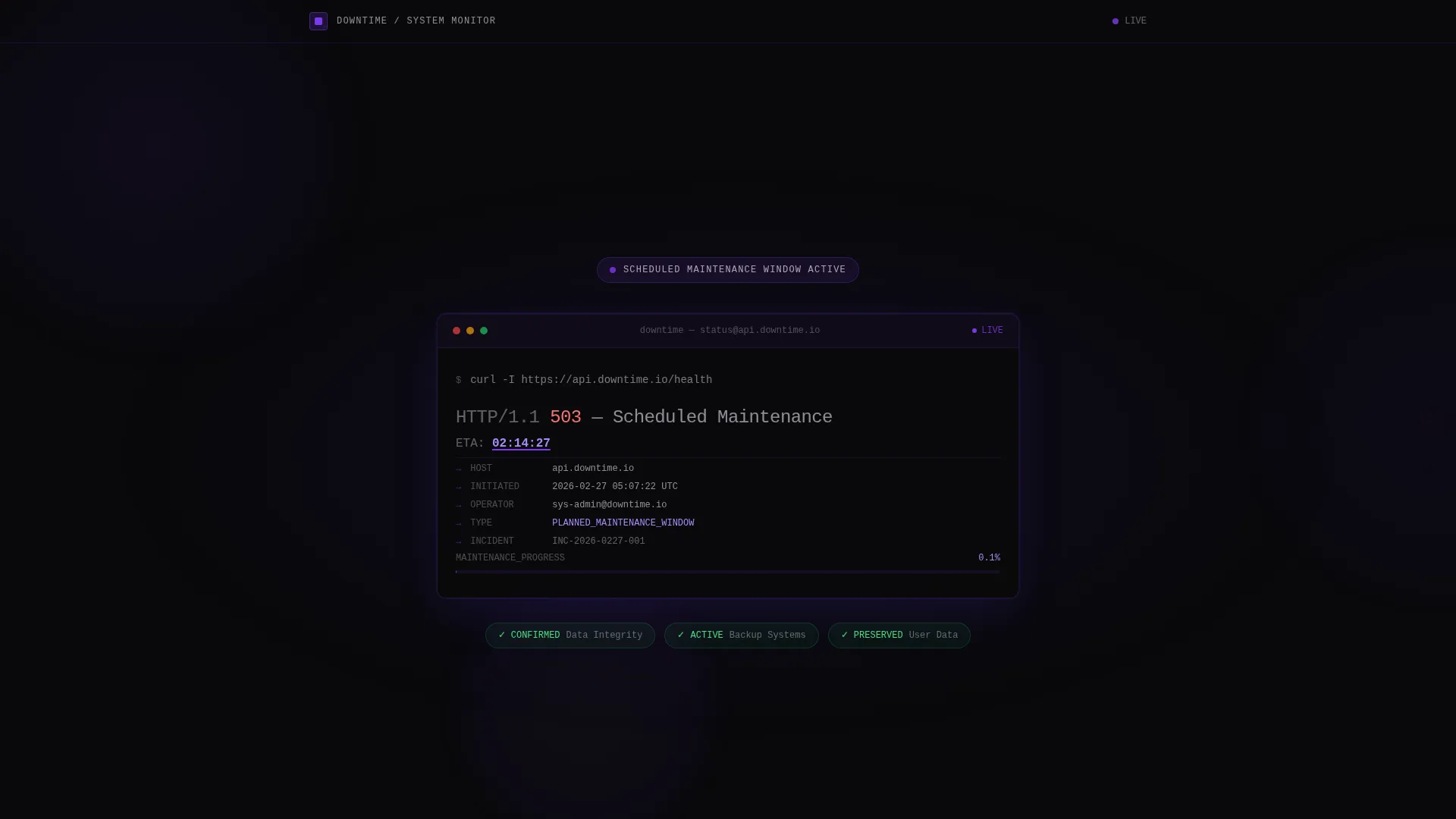
- A full-screen terminal header block with a live countdown timer showing the estimated time to restoration
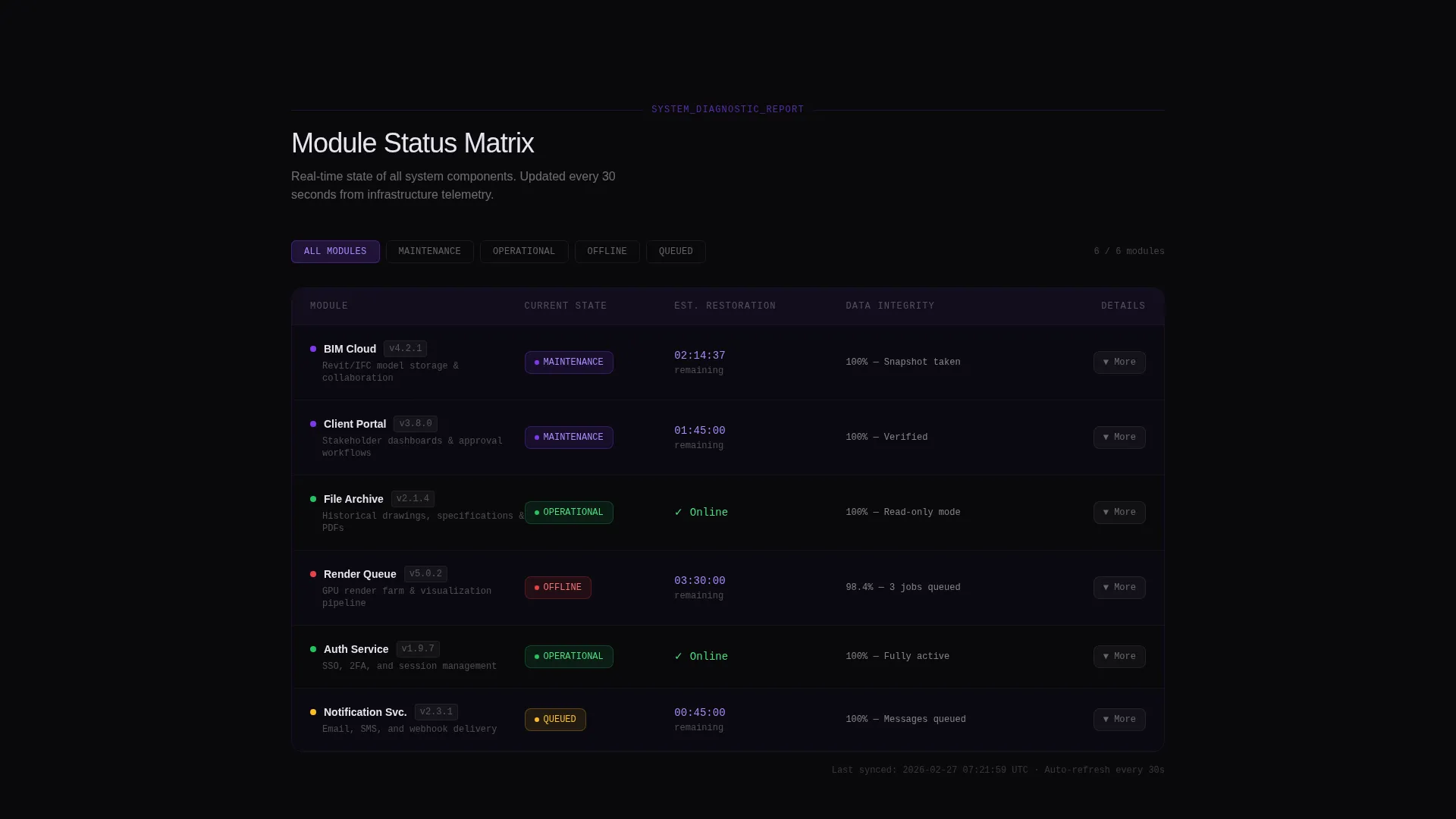
- A structured comparison table covering system modules including BIM Cloud, Client Portal, File Archive, and Render Queue with status, restoration time, and data integrity columns
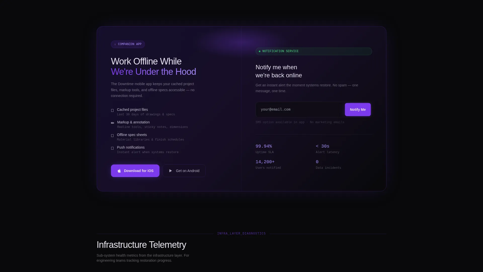
- A primary call-to-action block promoting the firm's companion mobile app and a secondary notification signup field for SMS or email alerts
Feature list
This landing page includes six purpose-built components drawn directly from the template brief.
Live Terminal Status Header
The header opens with a styled terminal block centered on a void-black background. It displays a real server status response in monospaced font: HTTP/1.1 503, Scheduled Maintenance with a countdown timer actively decrementing. The cursor blinks and a violet accent underlines the estimated time to restoration. No imagery, no apologies, just raw, readable system output.
System Module Comparison Table
Below the terminal, a structured table lists each system module in its own row. Columns cover current state, expected restoration time, and data integrity confirmation. Each row carries subtle violet pulse animations that update as status changes, keeping the page feeling live rather than static.
Progressive Diagnostic Scroll
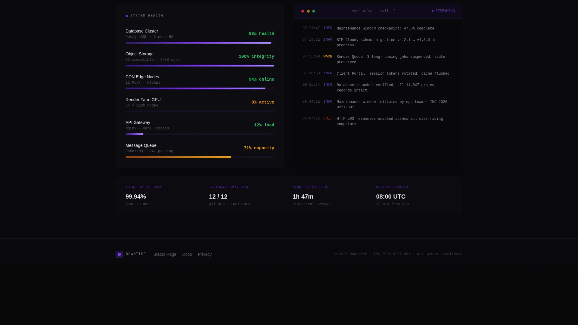
As the visitor scrolls, the page reveals deeper layers of system information. The structure moves from user-facing services at the top down to infrastructure-level metrics further down. This makes the visitor feel genuinely informed, like reading a transparent engineering report in real time.
Offline App Call to Action
Positioned directly beneath the comparison table, the primary call to action reads "Work Offline While We're Under the Hood." It links to the firm's companion mobile app, where cached project files, markup tools, and offline specifications remain accessible. The placement earns the download by showing exactly what is currently unavailable.
Notification Signup Field
A secondary conversion path sits alongside the primary call to action. A single input field lets visitors enter a phone number or email address to receive an alert the moment systems are back online. The minimal design keeps friction low and signup fast.
Void and Violet Visual System
The entire page uses a strict four-color palette built for dark, high-contrast display. Electric violet pulses on status indicators and progress bars. Phosphor white monospaced text sits against absolute void black. The result is a page that feels like a mission control interface rather than a maintenance placeholder.
Page sections overview
| Section | Purpose |
|---|---|
| Terminal Status Header | Displays live 503 status with countdown timer |
| System Module Table | Compares BIM Cloud, Portal, Archive, Queue status |
| Diagnostic Scroll Layer | Reveals infrastructure metrics on deeper scroll |
| Offline App call to action | Drives download of companion mobile app |
| Notification Signup | Captures email or SMS for restoration alert |
Design & branding system
The Void and Violet color system defines every visual decision on this page. The palette feels clinical and intentional, built to communicate technical authority rather than warmth or approachability.
- Four-color palette: absolute void black (#09090B), deep ultraviolet (#2D1B69), electric violet (#7C3AED) for pulsing indicators, and phosphor white (#E8E4F0) for all monospaced body text
- Typography is monospaced throughout, reinforcing the terminal and data-output aesthetic without relying on decorative fonts
- Violet pulse animations appear on status indicators and comparison table rows, adding controlled motion that signals live data rather than a frozen static page
Mobile & speed optimization
The page is designed as a focused single-screen experience with minimal layout complexity. Its lean component set makes it practical across screen sizes where users land unexpectedly mid-workflow.
- The terminal header and comparison table stack cleanly on smaller screens, keeping the most critical status information readable without horizontal scrolling
- The notification signup field and app call to action remain prominent and tappable at mobile scale, reducing friction for users on phones who need a quick alternative
How this template helps you convert
This template is engineered to move visitors from frustration toward a productive alternative in as few steps as possible.
- The live countdown timer and module-level status table immediately answer the visitor's primary question: what is down and when will it be back. This reduces support contact and keeps trust intact.
- The comparison table makes the offline app feel necessary rather than optional. By showing exactly which tools are unavailable, it positions the companion app as the obvious next move, increasing the likelihood of a genuine download.
- The notification signup field captures high-intent leads at the moment they are most motivated to re-engage, turning a maintenance window into a touchpoint rather than a dead end.
Other information about this template
This template fits within a broader category of technology-focused architecture firm website templates where professional presentation during downtime matters as much as the main site experience.
- The Data Command theme and Industry Report creative direction make this suitable for firms that want their technical infrastructure to feel as refined as their design work
- The template style follows a comparison table layout, which is uncommon in maintenance pages and gives this design a distinct, reportlike authority
- The header concept is a Code Snippet display, making it a strong fit for firms that value transparency and want to show technical competence rather than hide behind a vague "maintenance" message
- This landing page can support any architecture firm running cloud-based project tools that needs a credible, informative holding page during planned or unplanned maintenance
Theme
Data Command
Creative direction
Industry Report
Color system
Void & Violet
Style
Comparison Table
Direction
App Download
Page Sections
Live Terminal Status Header
System Module Comparison Table
Progressive Diagnostic Scroll
Offline App Call to Action
Notification Signup Field
Void and Violet Color System
Related questions
Can I update the countdown timer and module status information?
Does this template work if my firm does not have a companion mobile app?
What system modules does the comparison table include by default?
Who is this maintenance landing page designed for?
Can the notification signup field send alerts automatically?



