Architecture Digital Presence Professional Website Template
Blueprint is a scroll-reveal landing page template built for an architecture-focused online store. It serves project architects, interior designers, and general contractors who need specification-grade building materials and hardware fast. With a Spec Sheet creative direction, Dynamic Motion theme, and a persistent device mockup that updates as users scroll, Blueprint earns the app download before it ever asks for one.
by Rocket studio
Quick summary
Blueprint is a single-page, scroll-driven landing page template for a professional architecture online store. It combines a Dashboard Preview header, progressive section reveals, and a sticky device mockup to walk visitors through three core app capabilities before surfacing the download call to action. Every design decision reflects the precision and urgency of professionals sourcing specification-grade materials under deadline.
Who this template is for
This template is purpose-built for teams launching or promoting a professional-grade architecture product catalog app. It speaks directly to the people who use those apps every day.
- Project architects sourcing custom fixtures and hardware before submittal deadlines
- Interior designers matching exact finish codes and material specifications for commercial renovations
- General contractors reordering structural fasteners and building materials they spec on every job
What problem this template solves
Professional buyers in architecture and construction have no patience for landing pages that sell features before proving value. They arrive with a specific problem and a tight timeline. This template solves the credibility gap by demonstrating the app's core capabilities through the scroll experience itself, before any download request appears.
- Generic product pages fail to communicate spec-sheet precision to trained professionals
- Download calls to action that appear too early get ignored by skeptical, time-pressured users
- Static screens cannot convey the speed and accuracy that distinguishes a professional tool from a consumer app
What you get with this template
You get a fully structured, scroll-reveal landing page that functions as a live product demo. The layout guides visitors through the app's capabilities one section at a time, mirroring how a well-organized product data sheet presents material properties.
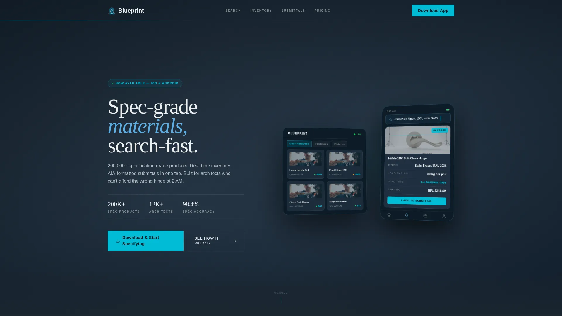
- A parallax header with angled phone and tablet mockups showing a live product search mid-action
- Three progressive content reveals, each presenting one app capability in a left-label, right-proof layout
- A floating app-download bar that appears after the second reveal and anchors permanently in the final section
Feature list
This section covers the core capabilities built into the Blueprint template as described in the source brief.
Parallax Dashboard Header
The header opens with angled phone and tablet mockups shown in parallax. The device screens display a live product search mid-action, complete with a full spec sheet pulled open showing dimensions, finish codes, load ratings, lead times, and a one-tap add button. A slow-moving diagonal grid of architectural line drawings animates in the background, giving the static devices a sense of forward motion.
Progressive Scroll Reveals
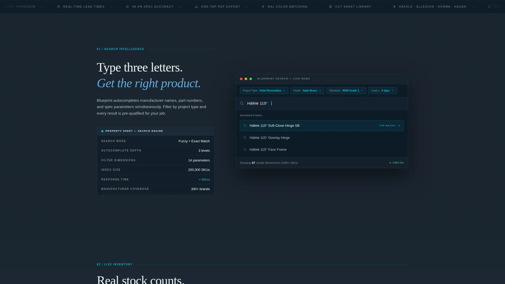
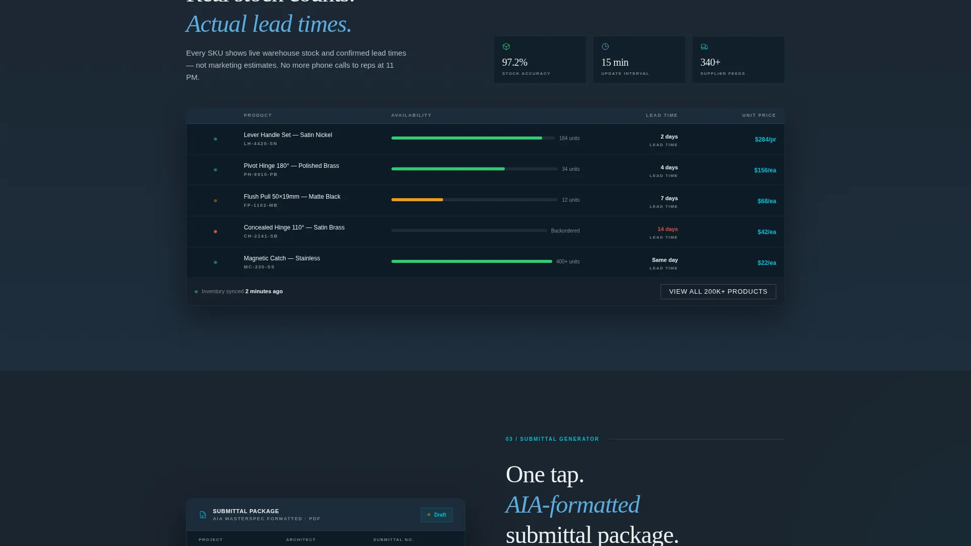
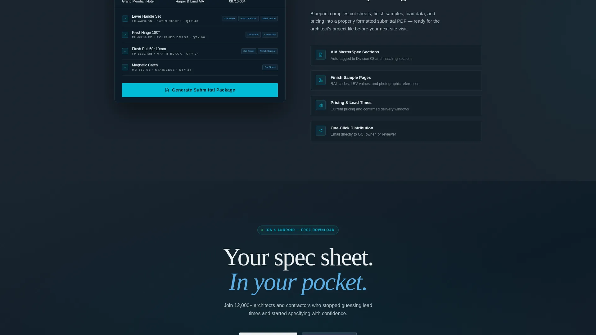
Each scroll reveal presents a single app capability the way a product data sheet presents one material property: left-aligned label, right-aligned proof. The first reveal demonstrates search intelligence with autocomplete behavior. The second shows real-time inventory and lead time status. The third presents submittal package generation with one-tap PDF export formatted to professional standards.
Sticky Updating Device Mockup
A device mockup persists as a sticky element throughout the scroll. As the visitor moves through each reveal section, the mockup screen updates its content to match the capability in view. The result feels like a live product demo unfolding frame by frame rather than a static marketing page.
Floating and Anchored Download call to action
The primary call to action reads "Download and Start Specifying." It first appears as a floating bottom bar after the second scroll reveal, then anchors permanently in the final section. App Store and Google Play badges are included alongside the primary button in the final section.
Secondary Desktop Conversion Path
A secondary conversion option lets desktop visitors send the app link directly to their phone via a single phone-number field. This path serves architects and designers browsing on desktop during a deadline who want the app on their device without breaking their workflow.
Spec Sheet Section Layout
Every content section follows a consistent two-column structure: label on the left, proof on the right. Sections slide in from the bottom with a subtle upward momentum. This rhythm reinforces the template's Spec Sheet creative direction and keeps the page feeling technically precise rather than decorative.
Page sections overview
| Section | Purpose |
|---|---|
| Parallax Header | Introduces the app with a live search mockup and animated blueprint grid background |
| Search Intelligence Reveal | Demonstrates autocomplete and project-type filtering with left-label, right-proof layout |
| Inventory Status Reveal | Shows real-time stock and lead time information rendered as a live status bar |
| Submittal Package Reveal | Presents one-tap PDF export of cut sheets, finish samples, and pricing |
| Floating Download Bar | Surfaces the primary call to action after the second reveal as a persistent bottom element |
| Final Anchor Section | Locks the download call to action with App Store and Google Play badges plus the phone-link field |
Design & branding system
The visual identity follows a Dynamic Motion theme built on the Slate and Sky color system. The palette is described in the brief as a rooftop in a dense city: dark parapets framing an expanse of moving sky, technical at the base and expansive where it matters.
- Core colors: deep drafting slate (#2C3E50), specification gray (#7F8C8D), open-sky blue (#5DADE2), and cloud white (#ECF0F1) for breathing room
- Signal cyan (#00BCD4) is used as an accent for interactive states and download triggers throughout the page
- The animated background grid uses architectural line drawings that drift diagonally upward, reinforcing the living-blueprint aesthetic without overwhelming the device mockups
Mobile & speed optimization
The template is designed with a mobile-first conversion goal in mind. The app-download flow is the primary outcome, and the layout supports both mobile and desktop visitors without friction.
- Device mockups are shown at phone and tablet scale, making the app screens immediately relatable to mobile users
- The secondary "Send Link to My Phone" field serves desktop visitors who want to move the conversion to their mobile device
- Section reveals use upward-sliding momentum animations that are designed to feel responsive and deliberate rather than heavy or decorative
How this template helps you convert
Blueprint is structured to earn the download before it asks for it. Every scroll event moves the visitor closer to confidence, not just closer to a button.
- The parallax header immediately communicates professional precision, filtering out casual visitors and signaling to trained professionals that this tool was built for them.
- Three sequential capability reveals each solve a recognizable Tuesday-night problem: finding an exact product fast, confirming it is in stock, and generating a compliant submittal package in one tap.
- The floating call to action appears only after two reveals have already demonstrated value, so by the time "Download and Start Specifying" locks into the final section, the visitor has seen the app work three times.
Other information about this template
Blueprint is built on a Scroll Reveal (Progressive) template style, meaning each section enters the viewport on scroll rather than loading all at once. This pacing is intentional: it mirrors the experience of reviewing a spec sheet one property at a time. The template sits within the Architecture Digital Presence subcategory under the broader Technology category, making it well-suited for teams building a digital presence around professional construction and architectural product tools.
- The template style is classified as Scroll Reveal (Progressive) with a Dynamic Motion theme
- The header concept is Dashboard Preview, featuring a mid-search device mockup as the opening visual statement
- The landing page direction is App Download, and every structural decision from section order to call to action placement supports that single conversion goal
Theme
Dynamic Motion
Creative direction
Spec Sheet
Color system
Slate & Sky
Style
Scroll Reveal (Progressive)
Direction
App Download
Page Sections
Parallax Dashboard Header with Live Mockup
Progressive Scroll Reveal Sections
Sticky Updating Device Mockup
Floating and Anchored Download Call to Action
Desktop-to-mobile Conversion Field
Spec Sheet Two-column Section Layout
Related questions
Who is the Blueprint template built for?
Can I customize the device mockup screens?
Does the sticky device mockup update as visitors scroll?
How does the app download call to action work in this template?
What color system does Blueprint use?



