Complete Construction Software & SaaS Professional Website Template
Blueprint is a modular construction ERP landing page template built for general contractors who need to stop managing million-dollar projects across scattered spreadsheets. It combines an interactive micro-dashboard header, scrollable card grid sections, and a streamlined freemium sign-up flow to show operations managers, project engineers, and CFOs exactly what the platform delivers before they commit.
by Rocket studio
Quick summary
Blueprint is a single-page construction ERP landing page template that brings estimating, scheduling, procurement, and field logs into one visual nerve center. It targets mid-size commercial general contractors and uses an interactive dashboard header, modular card grids, and a frictionless three-field sign-up to move serious buyers from first scroll to free trial.
Who this template is for
This template was built for software teams marketing a construction ERP platform to mid-size commercial general contractors. The buyer personas are specific and demanding, they live on jobsites, manage tight budgets, and have zero patience for vague product claims.
- Operations managers overseeing eight or more active jobsites at once
- Project engineers buried in RFI (Request for Information) queues who need faster response workflows
- CFOs who are discovering cost overruns weeks after they become real problems
What problem this template solves
Most construction software landing pages describe features in the abstract. This template solves a more specific problem: decision-makers at commercial general contracting firms cannot quickly see whether a platform handles their actual workload. They land, skim, and leave without connecting the product to their daily pain.
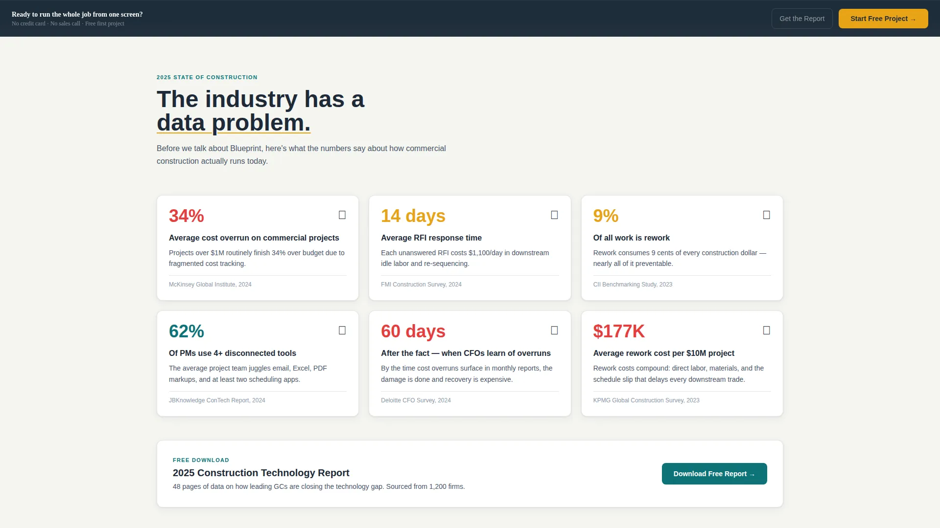
- The industry-report scroll structure leads with hard data on cost overruns and RFI delays before introducing the product
- The interactive header lets visitors touch the platform before reading a single feature claim
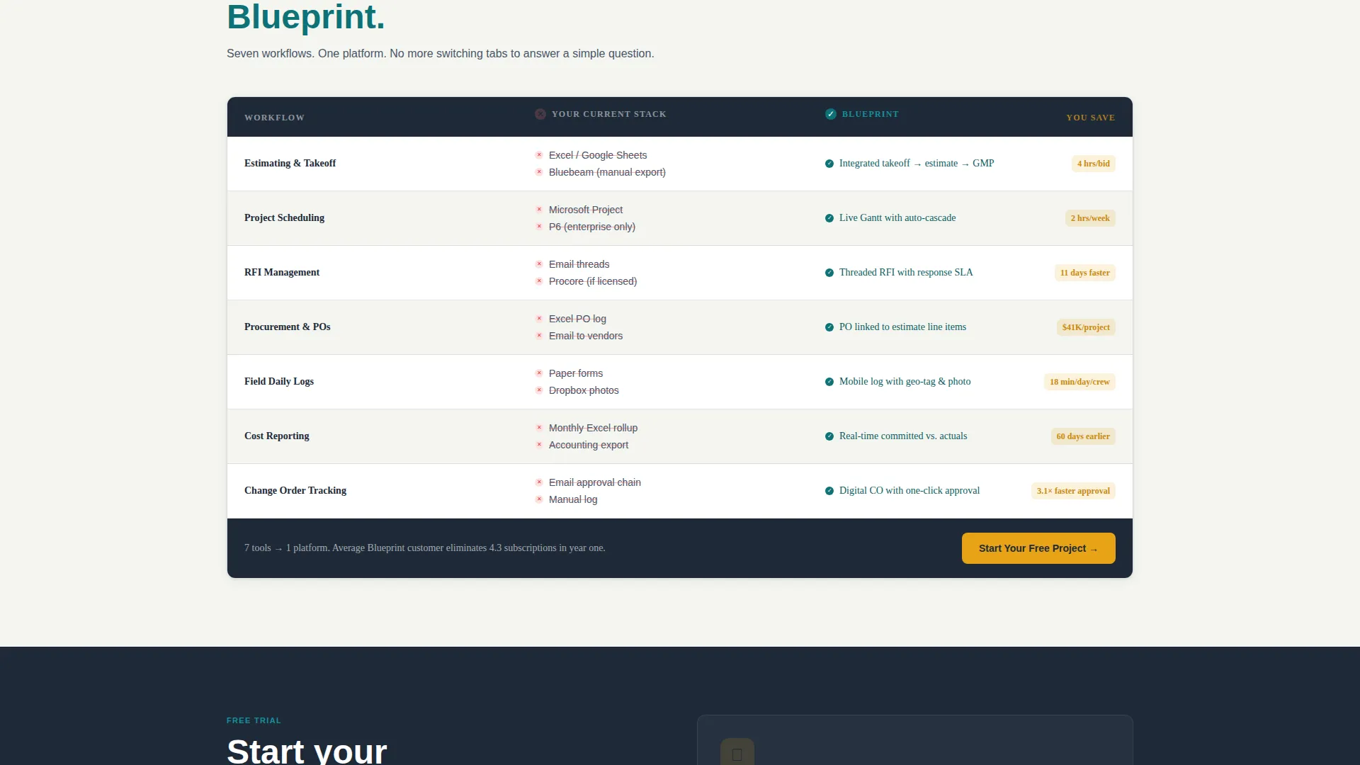
- The comparison grid directly maps their current tool stack to Blueprint's consolidated workflows
What you get with this template
You get a fully designed, modular card grid landing page ready to adapt for a construction ERP product launch or marketing campaign. Every section is purposeful and built around the specific conversion journey of a construction technology buyer.
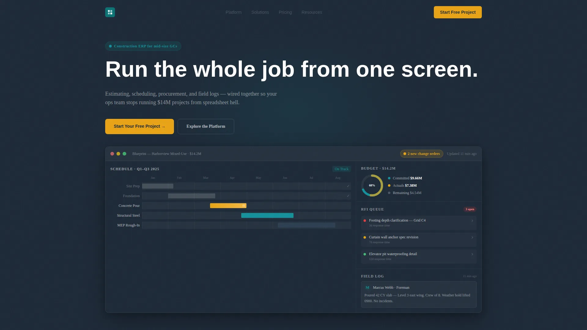
- An interactive micro-dashboard header showing a live fictional project with draggable Gantt bars, a budget donut chart, an RFI queue, and a pulsing change-order notification badge
- Three structured scroll sections moving from industry statistics to product module cards to a head-to-head comparison grid
- A freemium conversion flow with a sticky call to action bar, a three-field sequential sign-up, and a secondary gated PDF download path
Feature list
This section covers the core built-in components that make Blueprint a complete construction ERP landing page template.
Interactive Dashboard Header
The full-viewport header renders a fictional $14.2M mixed-use project in motion. Visitors can drag a Gantt bar for the concrete pour, read a budget donut chart showing committed costs versus actuals, and see an RFI queue with three urgency-coded items. A notification badge pulses with two new change orders and a daily log entry timestamped eleven minutes ago. The headline types itself below the dashboard: "Run the whole job from one screen."
Industry Statistics Card Grid
Section one presents hard construction industry data as a browsable card grid. Each card displays a sourced statistic, average cost overrun percentages, RFI response delays, rework rates, and is clickable for context. This section establishes the industry's data problem before any product claim appears, building credibility through evidence rather than marketing copy.
Product Module Card Grid
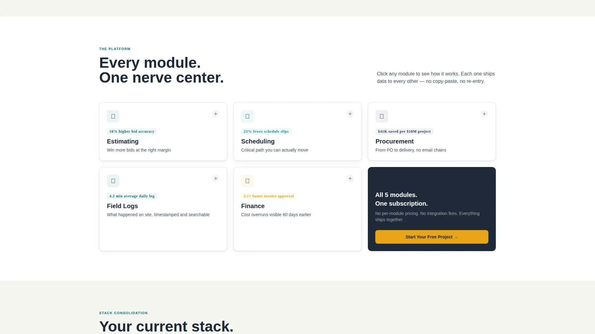
Section two flips the grid to five product module cards: Estimating, Scheduling, Procurement, Field, and Finance. Each card is expandable to reveal a screenshot, a key metric it improves, and a thirty-word use case. The cards are slightly smaller and denser than the statistics section, pulling the visitor closer into product detail.
Tool Consolidation Comparison Grid
Section three presents a side-by-side comparison between a visitor's current fragmented tool stack and Blueprint's unified platform. Seven workflows are mapped across two columns, making the consolidation case visually and immediately clear without requiring the visitor to do any mental math.
Freemium Sign-Up Flow
The primary conversion path uses a three-field sequential form: company name, average project size via dropdown, and work email. No credit card or phone number is required. The form appears first inside the interactive header as a natural user interface button and again as a sticky bar after the second scroll section.
Gated PDF Secondary Path
Visitors who are not ready to start a free trial can download the "2025 Construction Tech Report" as a gated PDF. This secondary path captures email and role, keeping potential buyers in the funnel without forcing them into the primary sign-up flow.
Page sections overview
| Section | Purpose |
|---|---|
| Interactive Dashboard Header | Show a live project mid-flight and anchor the primary call to action inside a working user interface |
| Industry Statistics Grid | Lead with sourced data on cost overruns, RFI delays, and rework rates |
| Product Module Cards | Expand each core module with a screenshot, metric, and use case |
| Comparison Grid | Map current fragmented tools against Blueprint across seven workflows |
| Sticky call to action Bar | Reintroduce the free project call to action after the second scroll section |
| Gated PDF Download | Offer a secondary conversion path for visitors not ready to trial |
| Sequential Sign-Up Form | Collect company name, project size, and work email in three steps |
Design & branding system
The template uses a Teal Catalyst color system built to feel like a well-organized plan room rather than a generic SaaS product page. Every color choice has a functional role, and the overall palette reads as authoritative without being cold.
- Deep site-plan teal (#0D7377) is the primary action color used for links, highlights, and active states across the card grid
- Hard-hat charcoal (#1E2A38) anchors headers, navigation, and structural drawing-style typography while concrete dust white (#F4F5F0) fills card backgrounds and open space
- Safety-stripe amber (#E8A317) is reserved exclusively for calls to action and alert states, making every conversion prompt visually distinct from informational content
Mobile & speed optimization
The card grid layout is modular by design, which means it adapts across screen sizes without losing the browsable, submittal-log feel the template is built around. Each card is a discrete unit that reflows naturally on smaller viewports.
- Generous padding and 1px charcoal card borders maintain visual clarity on mobile without crowding interactive elements
- The sticky call to action bar remains accessible during scroll on all screen sizes, keeping the conversion path reachable at any point in the page
- The sequential three-field form is structured to work cleanly on touch devices without overwhelming the screen with input fields at once
How this template helps you convert
The conversion strategy is built around letting the visitor experience the product before committing. By the time they reach the primary call to action, they have already interacted with the platform through the header dashboard.
- The interactive header functions as the demo, visitors drag a Gantt bar, read live budget data, and see a pulsing notification badge before scrolling to a single feature description, so the sign-up call to action feels like a natural next step rather than a cold ask.
- The industry report scroll structure moves from broad pain to specific proof to personal relevance, tightening with each section so the visitor arrives at the comparison grid already convinced the problem is real.
- The gated PDF secondary path means visitors who are not ready to trial still enter the funnel, giving the platform a second conversion opportunity without adding friction to the primary sign-up flow.
Other information about this template
Blueprint is categorized under Technology, specifically within the Construction Software and SaaS subcategory, and is purpose-built for the construction ERP niche. It matches the Directory and Discovery theme with an Industry Report creative direction, meaning the scroll experience doubles as a credibility-building briefing document.
- The template style is Card Grid (Modular), with each card functioning as a discrete discovery unit that invites browsing the way a superintendent flips through a submittal log
- The header concept is Interactive Preview, a full-viewport functioning micro-dashboard that replaces the traditional hero image with a working product experience
- The landing page direction is Freemium and Trial, optimized for no-credit-card sign-ups with a low-friction three-field form and a supporting gated content path
- The color system is named Teal Catalyst and the intersection match score between the template's category, subcategory, and niche is 13, reflecting a tightly aligned use case
Theme
Directory & Discovery
Creative direction
Industry Report
Color system
Teal Catalyst
Style
Card Grid (Modular)
Direction
Freemium/Trial
Page Sections
Interactive Micro-dashboard Header
Industry Statistics Card Grid
Expandable Product Module Cards
Tool Consolidation Comparison Grid
Freemium Three-field Sign-up
Gated PDF Secondary Conversion Path
Related questions
Who is the intended buyer persona for this template?
Does the interactive dashboard header require custom development?
Can this template be adapted for a different industry?
What does the sign-up form collect, and why is it kept to three fields?
What is the secondary conversion path for visitors who are not ready to sign up?



