Luxe Adaptive Fashion Landing Page Template
Drape is a full-width immersive landing page template built for adaptive fashion brands. It pairs a Holographic Chrome visual identity with a curated, gallery-style scroll that reveals each garment as both engineered object and lived experience. Inline purchase tools, a personalized fit quiz, and a swipeable lookbook make the page as functional as the clothing it sells.
by Rocket studio
Quick summary
Drape is a Luxe Minimal landing page template designed for adaptive fashion brands. It uses a Holographic Chrome color system and a curated, full-viewport scroll to present garments one at a time. Each product gets two frames: a pure-object shot and a motion shot. Direct sales tools sit beside every piece, making the path from discovery to purchase short and considered.
Who this template is for
This template is built for fashion-forward brands whose clothing is designed around real mobility needs. It speaks directly to founders and creative directors who want their store to feel like a high-end boutique, not a medical supply page.
- Adaptive fashion brands selling directly to wheelchair users, amputees, and people with limited dexterity
- Independent designers offering seated-cut trousers, magnetic closures, one-handed zippers, and side-opening garments
- Style-focused founders who need a sales page that earns trust through storytelling before asking for a purchase
What problem this template solves
Most fashion templates assume a standard body and a standard shopping experience. Adaptive clothing brands are left trying to fit nuanced, deeply personal products into generic grid layouts that flatten the story behind each design decision.
- Shoppers need to see garments in motion on real bodies before they commit to a purchase
- Adaptive features like magnetic closures and seated cuts are invisible in flat product photography alone
- A generic template signals that the brand is an afterthought, not a destination built for its audience
What you get with this template
This template delivers a complete, single-page direct-sales experience purpose-built for an adaptive fashion brand. Every section is designed to show the garment working in real life before the price ever appears.
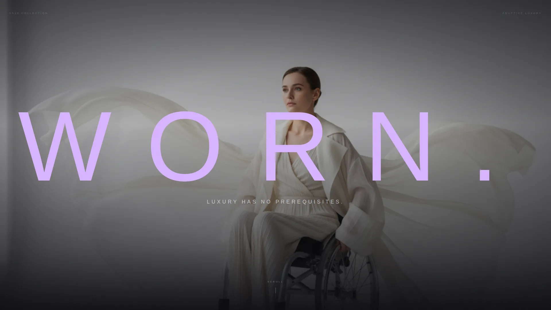
- A full-viewport editorial header with a large-scale typographic overlay and a timed subtitle fade
- A gallery-style vertical scroll that alternates between still product frames and motion model frames
- A horizontal-scroll lookbook with six swipeable outfits, each captioned with its adaptive feature
- Inline "Add to Closet" purchase tools beside each garment, with size, color, and adaptive-feature selectors
- A "Build Your Fit" guided quiz that returns a personalized four-piece capsule based on three answered questions
- A sticky mini-cart icon that pulses softly in the top right after the first item is added
Feature list
This template ships with a tightly sequenced set of components, each serving both the visual identity and the conversion goal.
Full-Viewport Editorial Header
The header fills the entire screen with an editorial photograph and a single oversized word in prismatic lilac. Navigation stays hidden until the reader begins to scroll. After three seconds of stillness, a subtitle fades in beneath the main type, setting the brand's tone before anything else loads.
Alternating Gallery Scroll
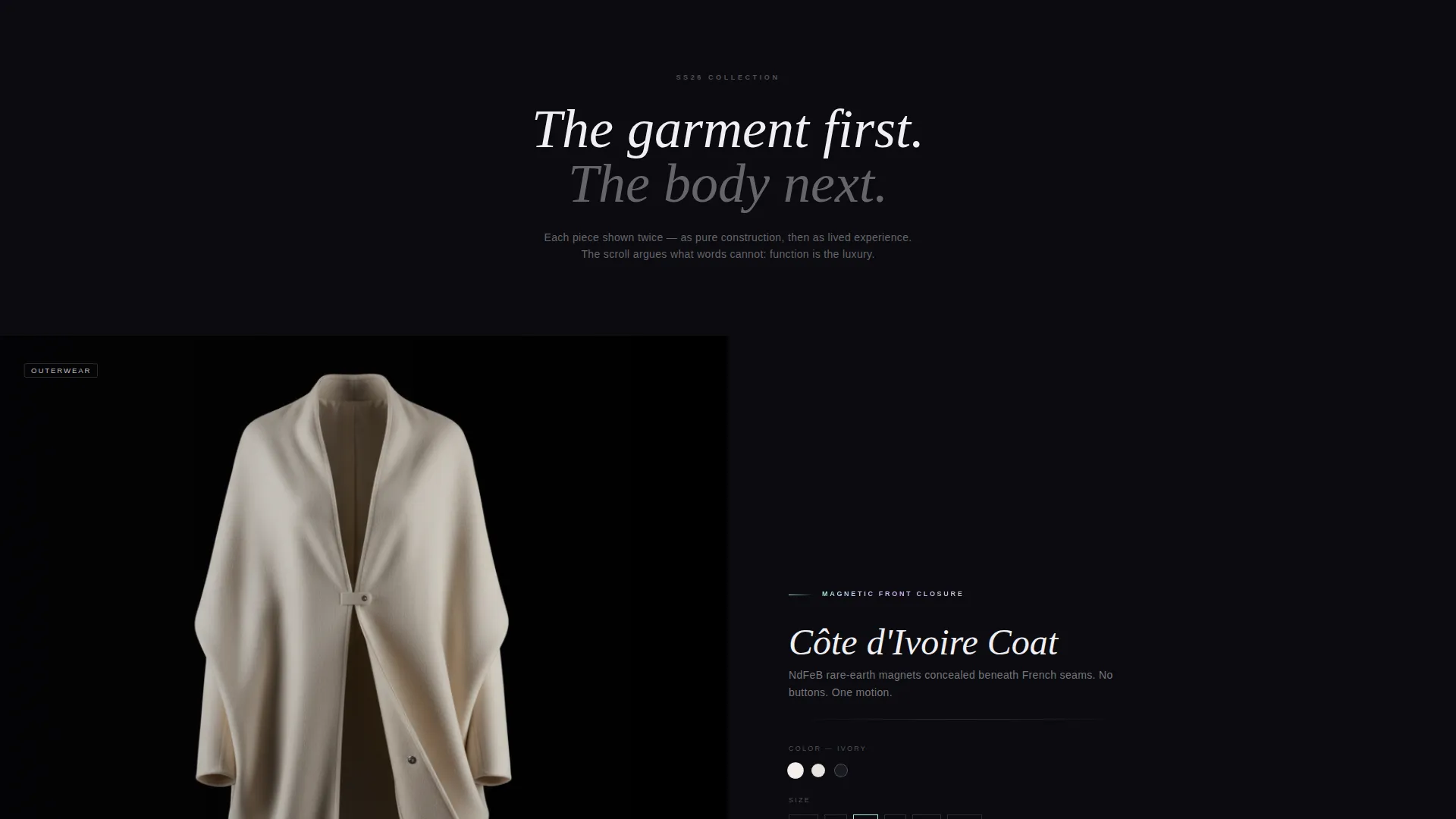
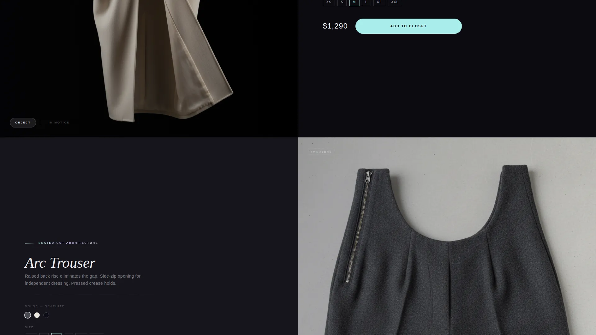
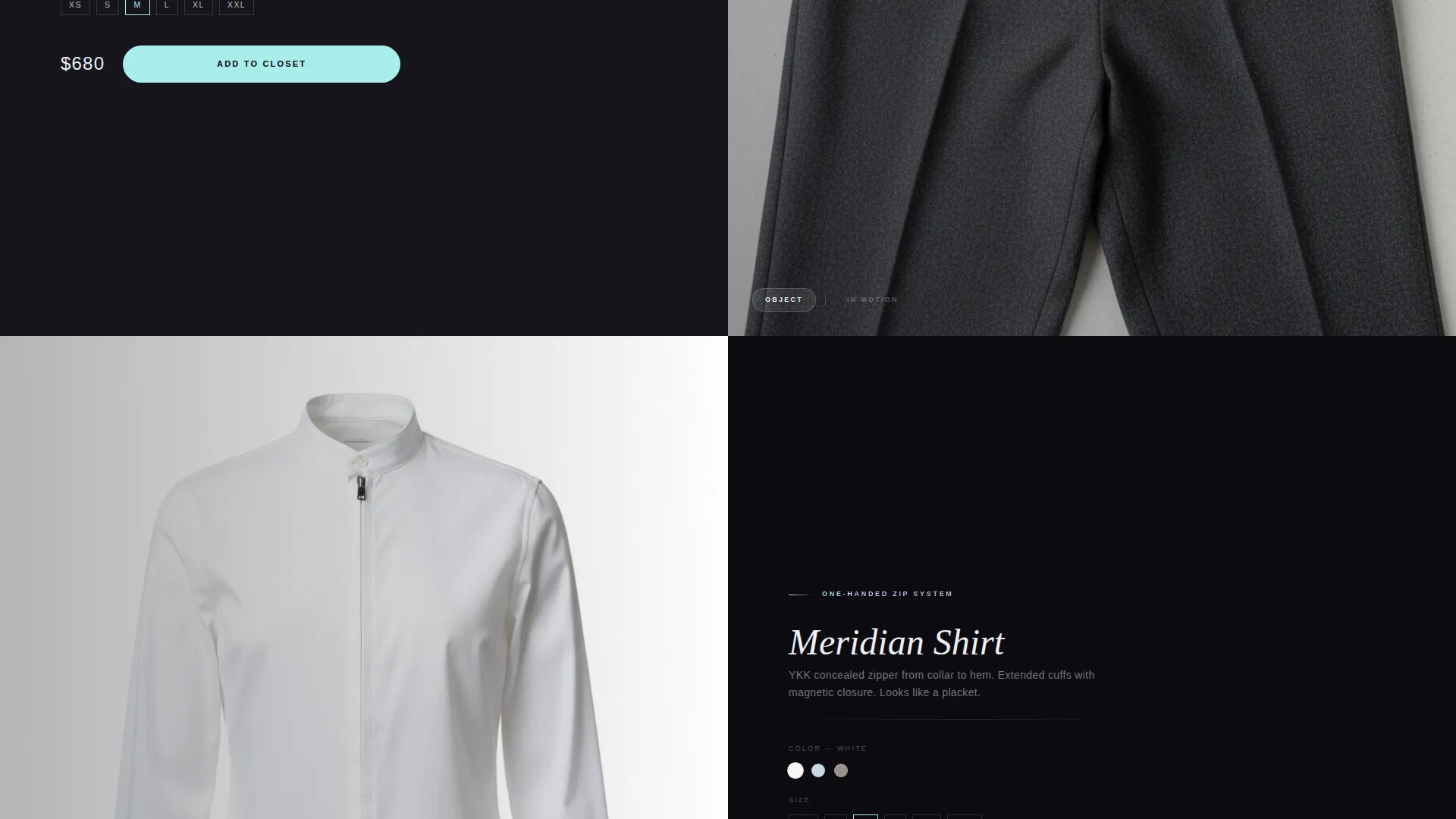
Each garment occupies its own full-viewport frame before the next one appears. The scroll alternates between a still object shot against void black and a motion shot showing the garment on a model in a real-life moment. This rhythm makes the case that function and luxury are the same thing.
Horizontal Lookbook Interlude
Midway through the vertical scroll, the page shifts to a swipeable horizontal lookbook. Six complete outfits appear in sequence, each carrying a small pearl-white caption that names its adaptive feature. The interruption in rhythm creates a natural pause and encourages deeper exploration.
Inline Purchase Controls
An "Add to Closet" button in iridescent accent on void black sits beside every garment. Size selectors, color options, and adaptive-feature filters are all inline, so the shopper never leaves the editorial flow to configure a purchase.
Sticky Mini-Cart
After the first item is added, a mini-cart icon anchors to the top right of the screen and pulses softly. It remains visible as the reader continues scrolling, reducing the friction between browsing and completing a purchase.
Build Your Fit Quiz
A three-question guided quiz asks about primary mobility, dressing independence level, and style archetype. The result is a personalized capsule of four recommended pieces. The quiz turns a potentially overwhelming catalog into a curated, personal recommendation.
Page sections overview
| Section | Purpose |
|---|---|
| Editorial Header | Opens with a full-viewport photograph and large typographic statement |
| Timed Subtitle Fade | Delivers the brand's core promise three seconds after load |
| Garment Object Frame | Shows each piece as a constructed object against void black |
| Garment Motion Frame | Shows each piece on a model in a real-life action |
| Horizontal Lookbook | Presents six swipeable outfits with adaptive feature captions |
| Inline Purchase Block | Houses size, color, and feature selectors beside each garment |
| Build Your Fit | Runs the three-question quiz and returns a capsule recommendation |
| Sticky Cart Icon | Persists in the top right after the first item is added |
Design & branding system
The Holographic Chrome palette is the visual spine of this template. Every color decision references the cold, shifting quality of light on metal, keeping the page clinical enough to signal engineering and beautiful enough to belong in a luxury context.
- Background surfaces use liquid silver (#C0C0C8), deep void black (#0B0B0F), and shifting pearl white (#F0EFF4); prismatic lilac (#D8B4FE) carries the primary display type
- Iridescent accent (#A8EDEA) is reserved for hover states and cart interactions, creating a clear visual signal for every actionable element
- Typography is ultra-thin, tracked-out sans-serif at display scale for headers, with small pearl-white captions used for adaptive-feature labels throughout the lookbook
Mobile & speed optimization
The template is structured so that the immersive scroll experience translates cleanly to smaller screens. Swipeable sections and inline controls are designed with touch interaction in mind.
- The horizontal lookbook uses native swipe gestures, so the interaction feels natural on a phone or tablet
- Inline purchase controls stack vertically on smaller viewports, keeping selectors reachable without zooming or side-scrolling
- The sticky mini-cart remains anchored and visible across screen sizes, maintaining the path to purchase at every scroll depth
How this template helps you convert
The page is structured around a single principle: show the garment working on a real body before asking for the purchase. Every layout decision reinforces that sequence.
- The alternating still-and-motion scroll places proof before price at every product reveal, so the reader already understands the garment's value when the "Add to Closet" button appears
- The "Build Your Fit" quiz reduces decision fatigue by narrowing a full catalog down to four personally relevant pieces, making the first purchase feel curated rather than risky
- The sticky mini-cart and inline selectors keep the path to checkout visible and reachable throughout the scroll, reducing the steps between intent and action
Other information about this template
This template is a strong fit for brands launching a debut collection or refreshing a seasonal campaign for an adaptive fashion audience. Its full-width immersive structure suits editorial storytelling as much as direct selling.
- The Luxe Minimal theme and Curated Collection creative direction make it well suited to limited-run or small-batch fashion drops
- The template is designed as a single-page flow, making it straightforward to deploy as a campaign page or a permanent brand storefront
- Designers working in the adaptive and inclusive fashion space will find the layout supports nuanced product storytelling that standard fashion templates cannot accommodate
Theme
Luxe Minimal
Creative direction
Curated Collection
Color system
Holographic Chrome
Style
Full-Width Immersive
Direction
Direct Sales
Page Sections
Full-viewport Editorial Header
Alternating Gallery Scroll
Horizontal Lookbook Interlude
Inline Purchase Controls
Build Your Fit Quiz
Sticky Mini-cart Icon
Related questions
Can I use this template for a brand that sells both adaptive and non-adaptive clothing?
How does the Build Your Fit quiz work for shoppers?
Is the horizontal lookbook easy to update for new collections?
Does the header navigation stay hidden the entire time?
Can the Holographic Chrome color palette be adjusted to match a different brand?