Advanced Veterinary Software Professional Website Template
Drip is a scroll-reveal landing page template built for veterinary email marketing platforms. It uses a Data Command visual theme, Electric Indigo color system, and a Spec Sheet creative direction to present automated recall reminders, post-op follow-ups, and seasonal campaigns as numbered proof cards. Every section is engineered to build trust and drive demo clicks.
by Rocket studio
Quick summary
Drip is a single-page, scroll-reveal landing page template designed for veterinary email marketing platforms. It opens with a full-width product screenshot dashboard, then unfolds capability after capability as numbered spec cards. The goal is simple: give practice managers and clinic groups enough evidence, fast enough, that clicking "See It With Your Clinic's Data" feels like the only logical move.
Who this template is for
This template is built for veterinary software companies and email marketing platforms targeting the clinical side of animal healthcare. It speaks directly to the people carrying the weight of patient communication every day.
- Practice managers handling thousands of active patient files across one or multiple locations
- Multi-location veterinary hospital groups looking to standardize client communication at scale
- Solo veterinarians who know their recheck compliance rate is costing them revenue but lack the time to act
What problem this template solves
Most veterinary clinics are sitting on a patient list that never gets fully activated. Recall reminders go unsent, post-op follow-ups fall through the cracks, and seasonal campaigns get postponed because no one has time to write a subject line. The result is a steady bleed of recoverable revenue and declining patient retention.
- Practice teams struggle to convert patient data into consistent, timely outreach without manual effort
- Clinics with multiple locations have no unified way to present or prove the ROI of their communication programs
- Potential platform buyers need proof of results before they will commit to a demo, not just a feature list
What you get with this template
You get a complete, conversion-focused landing page layout that mirrors the confidence of a well-run campaign dashboard. Every design and content decision is oriented toward making the platform's value obvious before the visitor reaches a form or a pricing page.
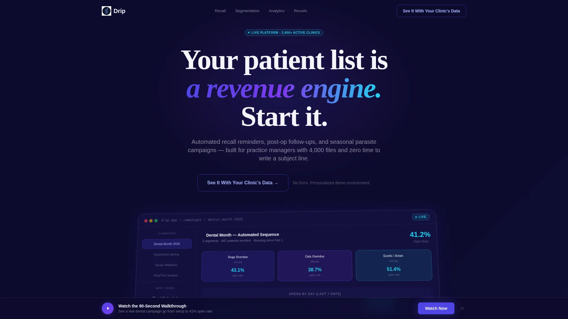
- A full-width product screenshot header showing a live campaign dashboard with real-time open rate counters and pet-name merge tags
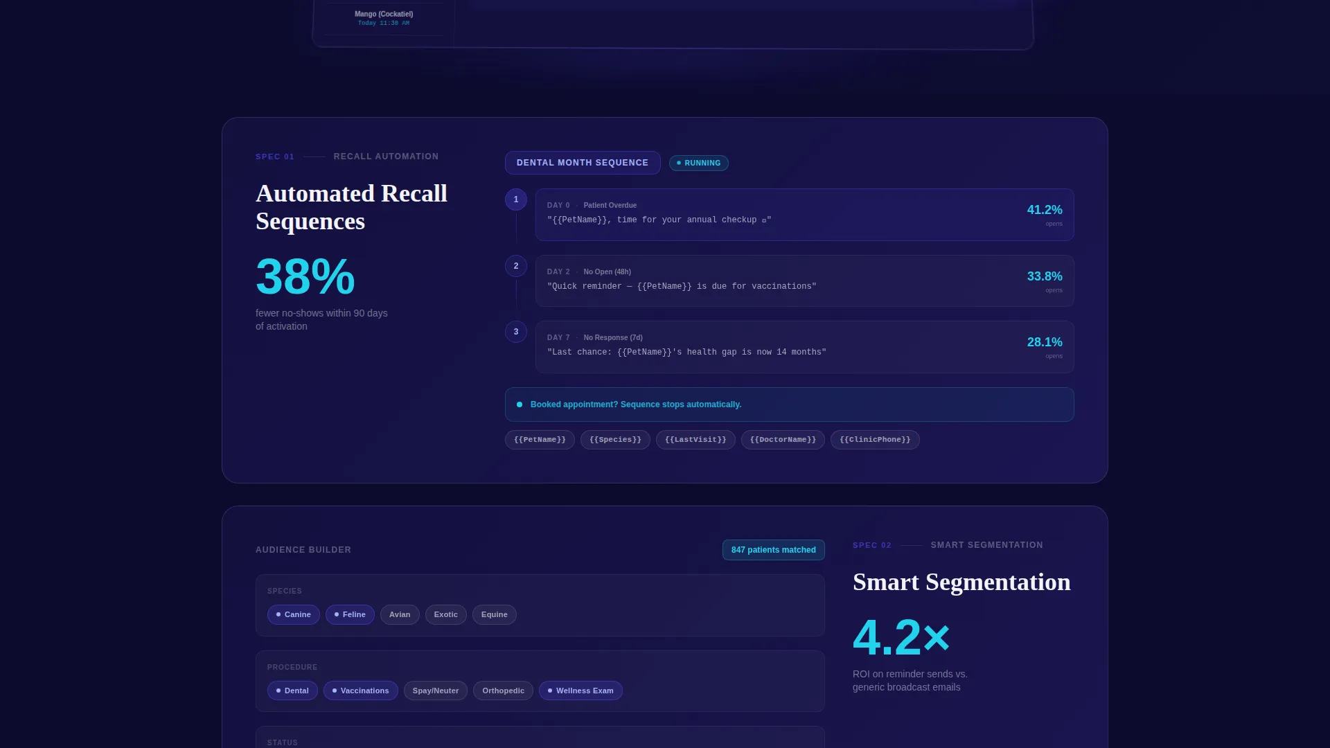
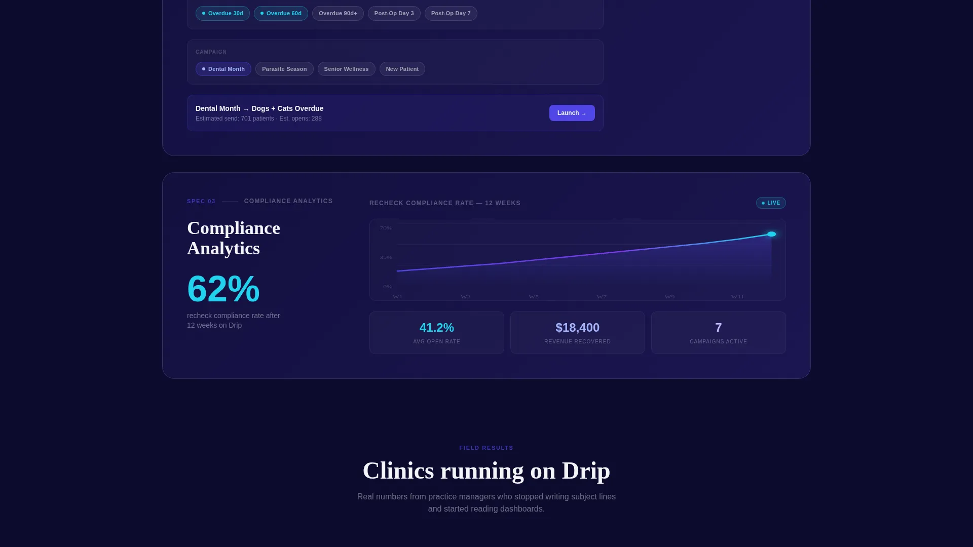
- Three numbered spec card sections revealing automated recall sequences, smart segmentation, and compliance analytics, each with oversized proof metrics
- A two-stage call-to-action system: a ghost button in the header and a solid indigo button after the third spec card, plus a sticky secondary bar
Feature list
This template includes carefully structured components drawn directly from the brief. Each one serves a specific job in moving a skeptical clinic buyer toward a demo click.
Product Screenshot Header
The header fills the full width with a pixel-sharp dashboard screenshot mid-campaign. A dental-month email sequence branches into three segments, open rate counters tick at 41.2%, and a sidebar displays next-scheduled sends with pet-name merge tags visible. The screenshot sits on a subtle 3D plane with a soft indigo glow beneath it.
Scroll Reveal Spec Cards
Each section slides up from opacity zero as the visitor scrolls. The effect feels like reading a live spec sheet. Every card surfaces one capability, one sample visual, and one oversized proof metric, so momentum builds with each reveal rather than flattening out.
Oversized Proof Metrics
Key numbers appear in large display type inside each card: "38% fewer no-shows" and "4.2x ROI on reminder sends" are examples pulled directly from the brief. These figures do the objection-handling work before a visitor can form the doubt.
Two-Stage Call-to-Action System
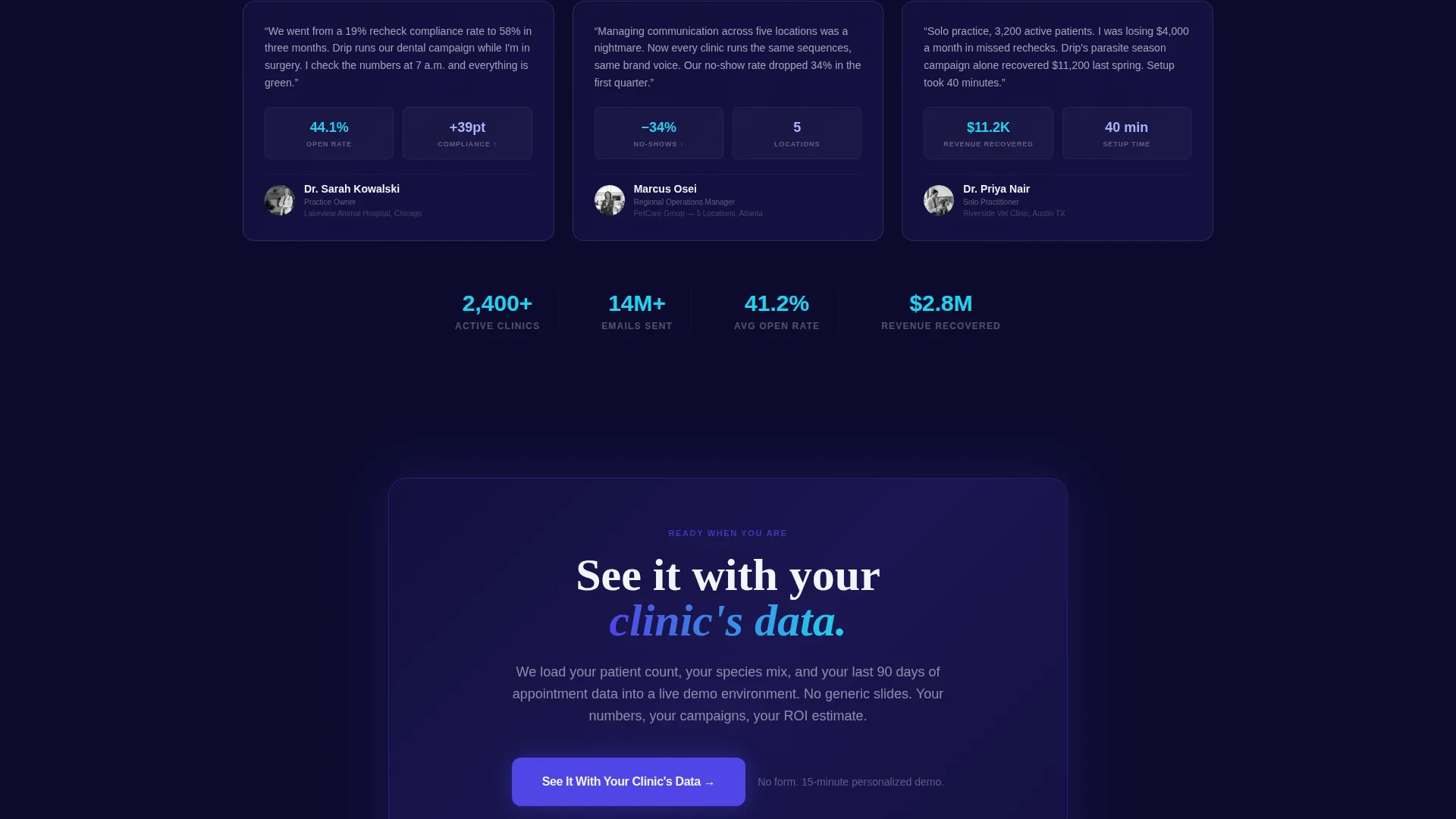
The primary call to action, "See It With Your Clinic's Data," appears first as a ghost button in the header, then returns as a solid indigo button after the third spec card. The sequencing is intentional: evidence accumulates before the commitment ask intensifies.
Sticky Secondary Action Bar
A persistent bar at the bottom of the page reads "Watch the 90-Second Walkthrough." It captures visitors who need motion before commitment without interrupting the scroll experience above it.
Smart Segmentation Visual
The second spec card displays species, breed, and procedure filter chips to make segmentation tangible. Visitors see exactly how a campaign gets targeted before they ever ask the question.
Page sections overview
| Section | Purpose |
|---|---|
| Dashboard Screenshot Header | Establishes platform credibility and sets the data-driven tone immediately |
| Spec Card One | Reveals automated recall sequences with a sample flow diagram |
| Spec Card Two | Demonstrates smart segmentation using filter chip visuals |
| Spec Card Three | Shows compliance analytics with a recheck rate graph over twelve weeks |
| Primary call to action Block | Delivers the solid indigo demo button after sufficient proof has accumulated |
| Sticky Walkthrough Bar | Provides a low-commitment secondary action for hesitant visitors |
Design & branding system
The Electric Indigo color system is built around a Data Command theme: precise, luminous, and clearly clinical in its confidence. The palette reads like a mission control screen at night, where every lit element signals something meaningful.
- Deep terminal navy (#0D0B2E) anchors the background; primary indigo (#4F46E5) dominates section headers and graph fills; charged violet (#7C3AED) pulses through notification badges and active state indicators
- Reactive cyan (#22D3EE) is reserved exclusively for metrics that move, such as open rates, click counts, and recovered revenue figures, keeping those numbers visually distinct
- The cool-white surface (#F4F4F8) provides breathing room between data-dense cards, preventing the dark palette from feeling heavy
Mobile & speed optimization
The scroll-reveal structure and card-based layout are designed to translate cleanly from desktop to smaller screens. The single-page format keeps navigation simple and the content hierarchy intact regardless of device.
- Each spec card is a self-contained unit, making it straightforward to restack vertically on mobile without losing the sequential proof-building logic
- The sticky secondary action bar remains accessible at any scroll depth, giving mobile visitors a persistent path to the walkthrough without disrupting the main content flow
- The absence of a form on the page removes a common friction point on mobile, keeping the click-to-demo path frictionless
How this template helps you convert
The entire page is engineered around a single conversion event: a click to a personalized demo environment. No form, no generic signup, just a direct route from evidence to action.
- The product screenshot header establishes immediate platform credibility, so visitors arrive in a trusting mindset before reading a single line of copy
- Each scroll-reveal spec card answers the objection raised by the previous one, building a cumulative case that makes the demo click feel earned and obvious rather than premature
- The two-stage call-to-action system delays the hard ask until after three rounds of proof, aligning the commitment level with the visitor's confidence level at each scroll depth
Other information about this template
This template is categorized under Technology, with a subcategory of Veterinary Software and a niche focus on veterinary email marketing. It is built as a single scroll-reveal landing page, not a multi-page website, so all navigation and content decisions reflect that single-flow format.
- The Spec Sheet creative direction means no long feature paragraphs; every capability is presented as a tight data card with a visual and a metric
- The lp direction is Click-Through, meaning the page is optimized for a single click event rather than a form fill or a checkout
- The template style is Scroll Reveal (Progressive), so the page intentionally withholds full content until the visitor earns it through scrolling, which reinforces the sense that each revealed card is a discovery
Theme
Data Command
Creative direction
Spec Sheet
Color system
Electric Indigo
Style
Scroll Reveal (Progressive)
Direction
Click-Through
Page Sections
Product Screenshot Header
Scroll Reveal Spec Cards
Oversized Proof Metrics Display
Two-stage Call-to-action System
Sticky Secondary Action Bar
Smart Segmentation Visual
Related questions
Does this template include a contact form or signup form?
Can I customize the proof metrics shown in the spec cards?
Is this template suitable for a multi-location veterinary group?
How many calls to action does this template include?
What visual style does this template use?



