Dental Software Booking Website Template
Drip is a dental email marketing landing page template built for practices that need automation to work harder than their front desk. It features a glassmorphic dark design, a live comparison table, a cinematic code-terminal hero, case study cards, and a three-step lead generation form, all engineered to turn dental software visitors into booked demos.
by Rocket studio
Quick summary
Drip is a single-page landing page template for a dental-specific email automation platform. It opens with a frosted glass code terminal, builds momentum through a live email counter and a side-by-side comparison table, and closes with a progressive three-step lead capture form. The design runs on a Tech Glass visual system in deep midnight navy with cyan accents.
Who this template is for
This template is built for anyone marketing or selling a dental email automation platform to dental professionals. It speaks directly to people who understand patient retention, no-show rates, and the specific software tools dental offices already use.
- Solo dental practitioners who need proven, ready-to-run email sequences without technical setup
- DSO marketing directors managing campaigns across multiple locations who need scale and reporting clarity
- Dental marketing consultants looking for white-label infrastructure that reflects their professional standards
What problem this template solves
Generic email marketing landing pages fail in the dental vertical. They do not speak to patient reactivation, practice management system integrations, or the very specific workflows dental offices depend on. Drip closes that gap with a page built entirely around dental buyer priorities.
- Visitors cannot quickly see how this platform differs from general tools like standard email platforms or basic customer relationship managers
- Dental buyers need proof of dental-specific features before they will commit to a demo
- The lead capture process on most templates is abrupt; dental buyers need a warmer, more qualified entry path
What you get with this template
You get a complete, conversion-focused landing page with every section a dental software buyer needs to evaluate and act. From the animated hero to the gated PDF download, every element has a job to do.
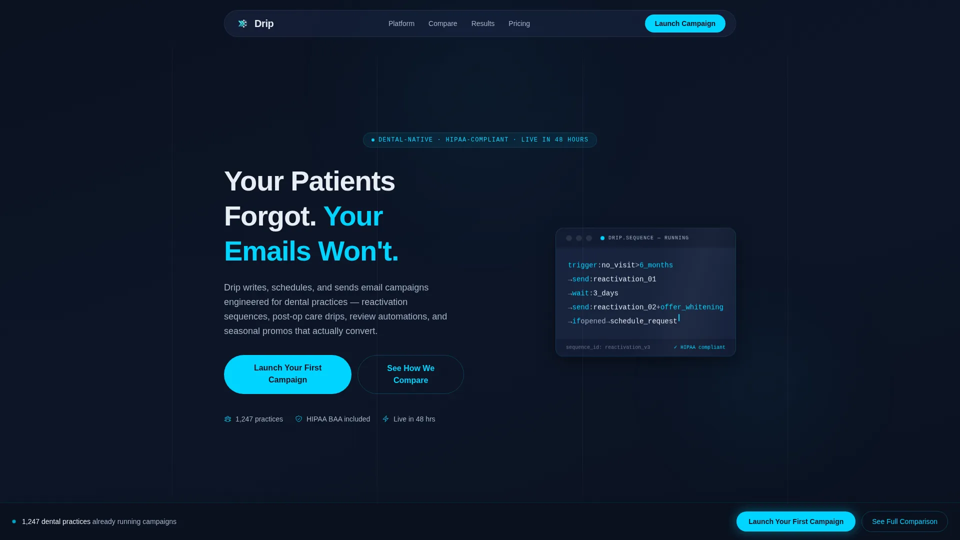
- A cinematic hero section with a frosted glass code terminal, animated cursor blink, and a live email-sent counter
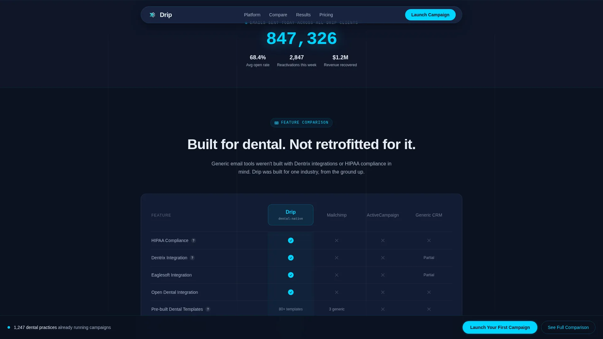
- A dental-specific comparison table with scroll-reveal row animations pitting the platform against general alternatives
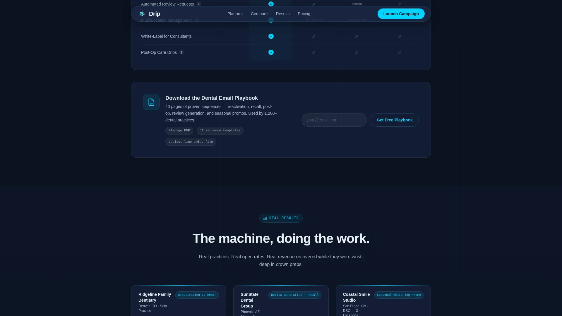
- Three case study cards showing real open rates, reactivation figures, and revenue recovered
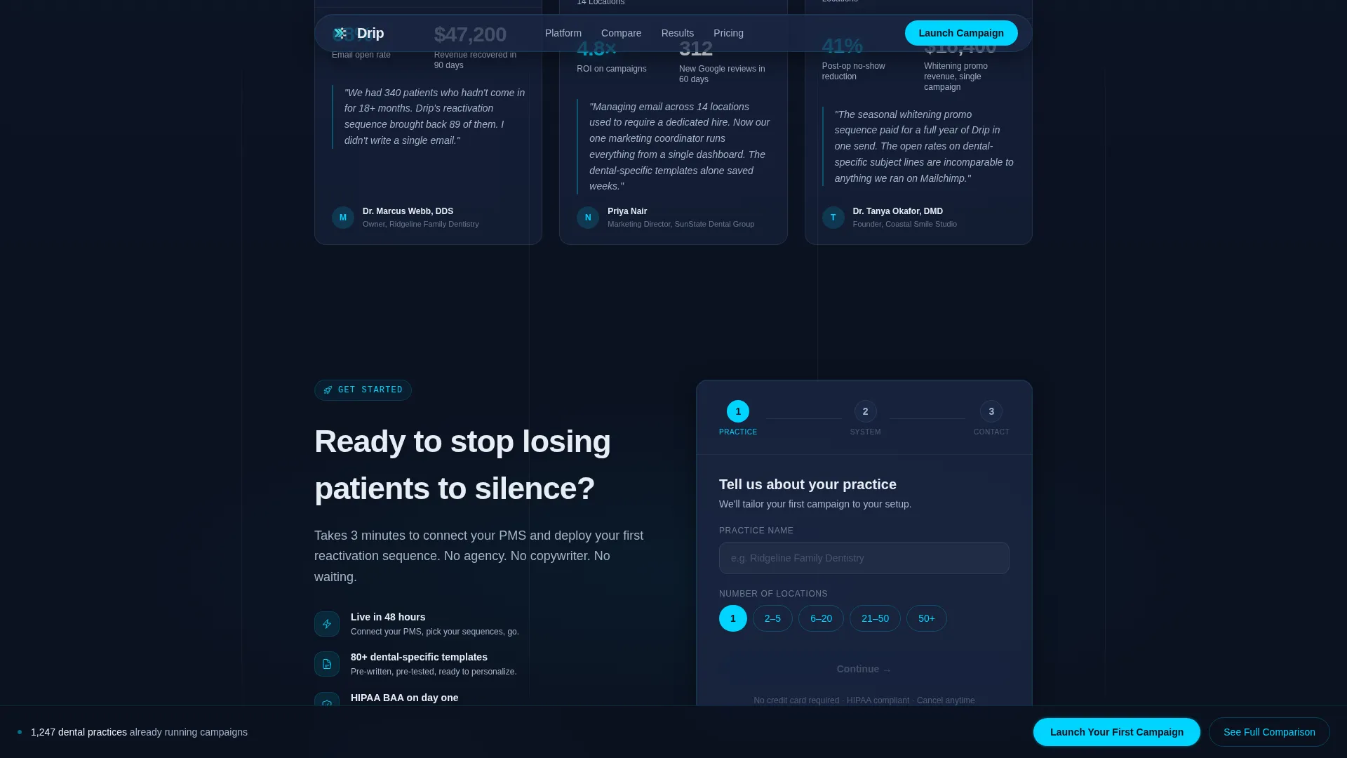
- A three-step progressive disclosure lead generation form and a secondary gated PDF download path
- A fixed bottom call-to-action bar that appears after the visitor scrolls past the comparison table
Feature list
This template includes purpose-built components that match the buying journey of dental software decision-makers.
Glassmorphic Code Terminal Hero
The header features a frosted glass terminal window floating over the midnight navy background. It displays a live email automation sequence in pseudo-code with cyan and frost syntax highlighting and a blinking cursor. This visual immediately communicates that the product is technical, purposeful, and running right now.
Dental-Specific Comparison Table
The comparison table is the centerpiece of the page. It stacks the platform against general email tools and basic customer relationship managers across rows that matter to dental practices: patient management system integrations, pre-built dental templates, reactivation sequence libraries, and review generation workflows. Each row reveals on scroll with a glass-slide animation.
Live Email Counter Animation
A live-counter animation below the hero shows emails sent today across all dental clients. This real-time social proof element reinforces platform credibility before the visitor reaches the comparison section.
Three-Step Progressive Lead Form
The lead generation form uses a three-step progressive disclosure structure. Step one collects practice name and number of locations. Step two captures the patient management system in use via a dropdown. Step three takes the email address and preferred demo time. This sequence qualifies leads before they submit.
Case Study Cards
Three case study cards drop in below the comparison table with scroll-triggered entrance animations. Each card presents a specific outcome: open rates, reactivation numbers, and revenue recovered. The data points are concrete and practice-specific, not generic claims.
Secondary PDF Gated Download
A secondary conversion path sits beneath the comparison table. Visitors can download a forty-page dental email playbook by submitting only their email address. This path captures not-yet-ready leads who are not ready to book a demo but are still worth nurturing.
Page sections overview
| Section | Purpose |
|---|---|
| Hero Code Terminal | Opens with animated pseudo-code and the platform's core promise |
| Live Email Counter | Shows real-time send volume to establish scale and credibility |
| Comparison Table | Compares platform against general tools on dental-specific criteria |
| Case Study Cards | Delivers specific open rates, reactivation data, and revenue proof |
| Lead Generation Form | Qualifies and captures visitors through a three-step progressive flow |
| PDF Playbook Download | Catches mid-funnel visitors with a low-commitment email-only offer |
| Fixed call to action Bar | Keeps the primary call-to-action visible after the comparison section |
| Footer | Provides a clean single-row linear close to the page |
Design & branding system
The visual identity runs on a Tech Glass aesthetic. Every surface feels like looking through smart glass into a server room late at night. The palette is purposefully restrained, with cyan reserved only for live and interactive moments.
- Core colors: deep terminal navy (#0B1120) for backgrounds, translucent panel blue (#1A2744) for layered glassmorphic panels, clinical frost (#E8EDF4) for body text and card surfaces, and electric accent cyan (#00D4FF) for call-to-action elements, hover states, and live data pulses
- Typography: DM Sans for headlines and body copy, JetBrains Mono for the code terminal to reinforce a technical, precision-first tone
- Animation style: cinematic entrance animations, cursor blink in the terminal, scroll-reveal glass-slide row transitions on the comparison table, mousemove glow effects, and shimmer accents throughout
Mobile & speed optimization
The template is built desktop-first to match where dental office managers and DSO marketing directors typically work. It remains fully responsive for mobile visitors.
- Desktop-first layout prioritizes the wide comparison table and multi-column case study card arrangement for large screens
- Client-side components handle animations and interactive elements while server components manage static content delivery
- The three-step form and fixed bottom call-to-action bar adapt gracefully to smaller viewport widths
How this template helps you convert
Every layout decision on this page pushes a qualified dental buyer toward one of two actions: booking a demo or downloading the playbook. The page does not ask for commitment before establishing trust.
- The comparison table builds the case before any form appears, so visitors arrive at the lead section already convinced of the platform's dental-specific advantages
- The three-step progressive form reduces friction by asking small, practice-relevant questions first, which improves completion rates and lead quality simultaneously
- The fixed bottom call-to-action bar keeps the primary conversion action visible at all times after the visitor passes the comparison section, without interrupting the reading flow
Other information about this template
This template is designed specifically for the dental software market and the dental email marketing niche. It reflects the real operational realities of dental practices across the United States.
- The page uses United States locale conventions throughout: USD pricing references, MM/DD/YYYY date format, and US-based practice name context
- Patient management system integrations referenced in the comparison table include Dentrix, Eaglesoft, and Open Dental, the most widely used systems in US dental practices
- Social proof figures built into the template design include a 68% open rate benchmark and $47,000 in recovered reactivation revenue, drawn from the source brief
- The template style is a Comparison Table layout, which is a high-trust format for B2B software buyers evaluating alternatives
- The creative direction is Launch Energy: the page builds forward momentum through each scroll, from the terminal animation through the comparison reveal to the form
- The header concept is a Code Snippet, using a floating frosted glass terminal as the first visual impression rather than stock photography
- The lead generation direction is dual-path: a high-intent demo booking flow and a lower-commitment PDF download for mid-funnel visitors
- The footer follows a linear single-row pattern, keeping the close clean and uncluttered
Theme
Tech Glass
Creative direction
Launch Energy
Color system
Midnight Blue
Style
Comparison Table
Direction
Lead Generation
Page Sections
Glassmorphic Code Terminal Hero
Dental Comparison Table with Scroll Reveal
Live Email Counter Animation
Three-step Progressive Lead Form
Case Study Cards with Real Data
Secondary Gated PDF Download
Related questions
Who is this landing page template designed for?
What sections are included in this template?
What makes the comparison table dental-specific?
Can this template support more than one conversion goal?
Is this template suitable for a multi-location dental group?


