Shipyard Vertical SaaS Directory Website Template
Drydock is a shipyard management software landing page template built for vertical SaaS products targeting port operations teams. It uses a full-viewport stats header, a punchy before-and-after comparison table, and a clear app download flow to convert operations managers and port directors into confident users fast.
by Rocket studio
Quick summary
Drydock is a single-page landing page template designed for shipyard management software. It opens with an animated metrics wall, drops into an eight-row before-and-after comparison table, and closes with a focused app download call to action. The template targets operations managers, port directors, and fleet maintenance leads who need fast, credible proof before committing to a download.
Who this template is for
This template is purpose-built for SaaS teams selling software into the shipyard and port operations space. It speaks directly to buyers who manage complex yard environments and need a digital solution they can trust at a glance.
- Operations managers juggling multiple dry docks and subcontractor networks daily
- Port directors who currently rely on radio updates and whiteboard status boards
- Fleet maintenance leads losing time reconciling paper inspection logs with spreadsheet trackers
What problem this template solves
Shipyard operations are notoriously hard to communicate in a general-purpose template. Generic SaaS landing pages fail to capture the specific pain of coordinating berth schedules, crane crews, hull inspections, and vessel arrival windows at the same time. Drydock solves this by pairing raw operational data with a direct comparison table that makes the before-and-after case instantly.
- Visitors leave other templates without understanding what the product actually changes
- Feature lists alone do not convey time-cost penalties or process friction
- Abstract benefit statements fail to land with buyers who think in shift schedules and dock capacity
What you get with this template
You get a complete, structured landing page layout designed around proof-first conversion logic. Every section earns its place by advancing the visitor one step closer to downloading the app or booking a walkthrough.
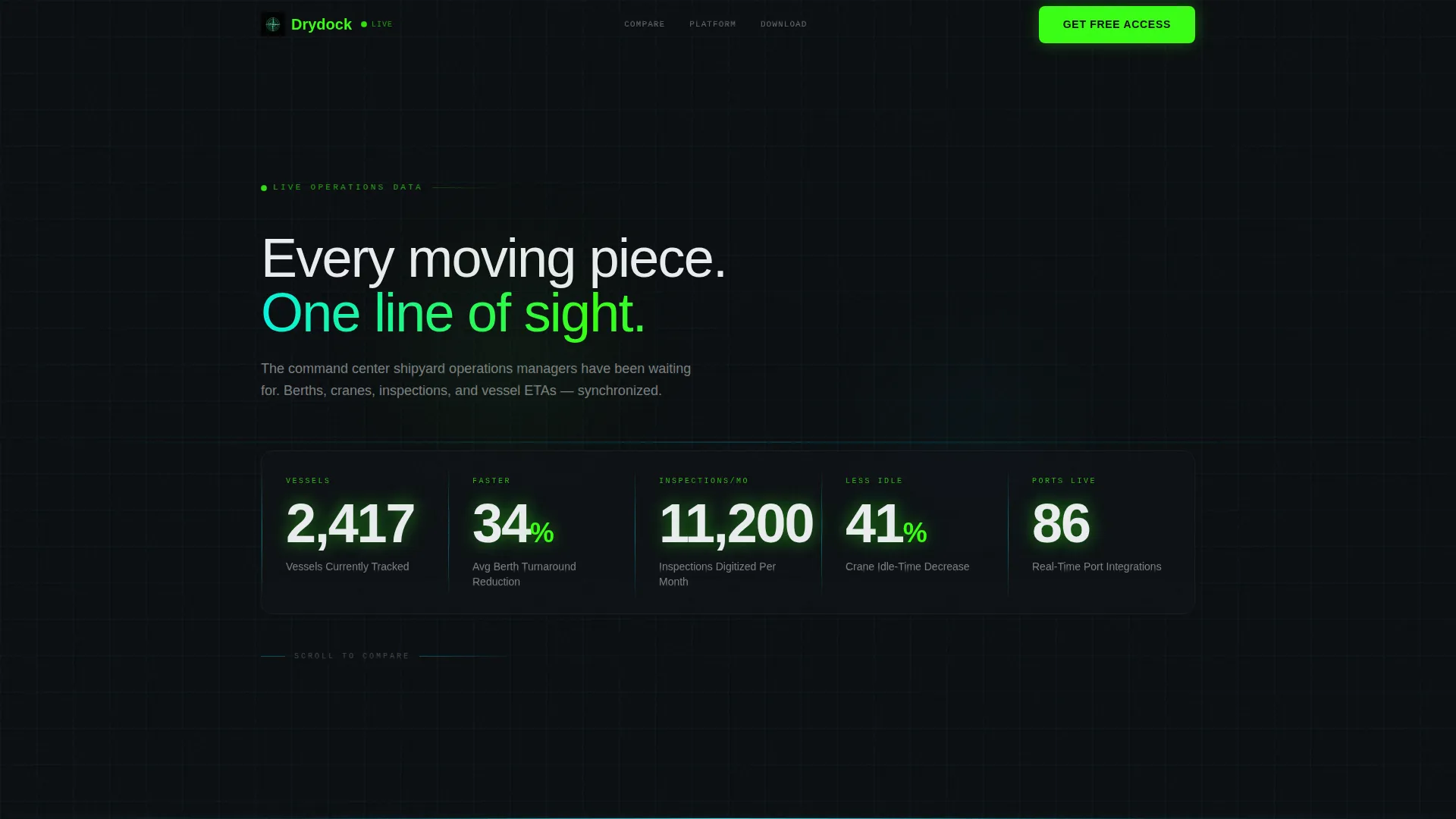
- A full-viewport animated stats header showing five live operational numbers
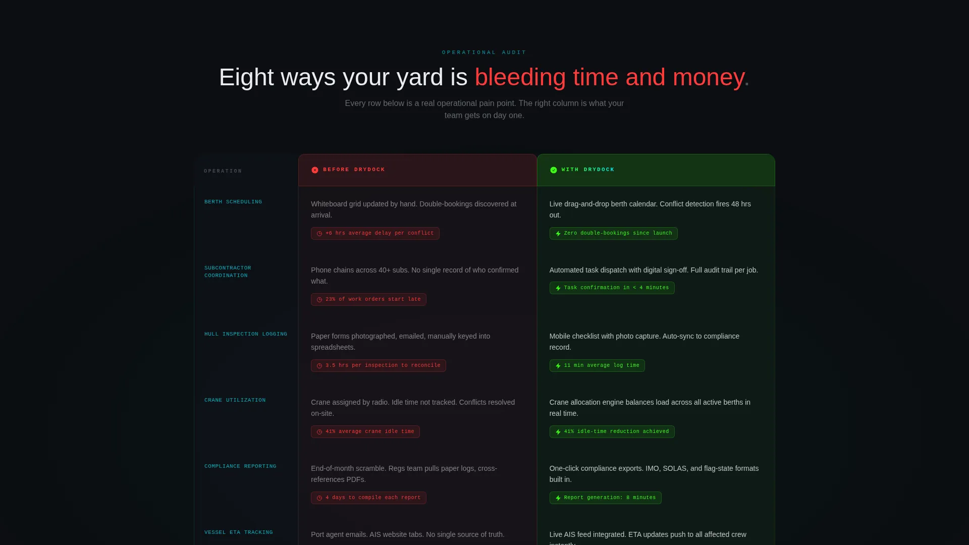
- An eight-row side-by-side comparison table contrasting current pain with product outcomes
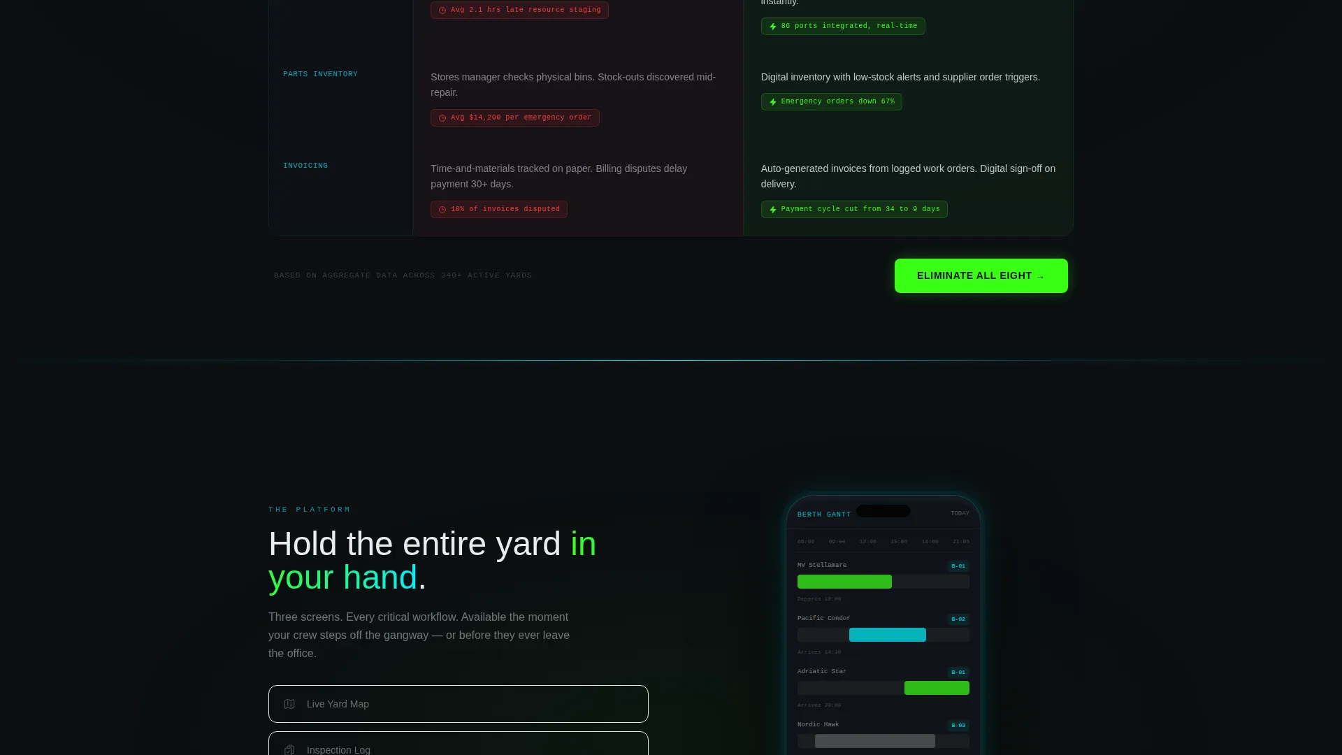
- A device mockup section, a dual-platform app download block, and a secondary demo booking path
Feature list
This template delivers a focused set of layout components, each built around the specific conversion needs of a shipyard software product.
Animated Operational Stats Header
The header fills the full viewport with five key metrics animating up from zero on page load. Numbers covered include vessels tracked, berth turnaround reduction, inspections digitized per month, crane idle-time decrease, and real-time port integrations. No stock photography is used. The data itself acts as the visual anchor.
Eight-Row Comparison Table
The core of the page is a structured before-and-after table covering eight operational pain points. These include berth scheduling, subcontractor coordination, inspection logging, crane utilization, compliance reporting, vessel ETA tracking, parts inventory, and invoicing. The left column uses red status icons and plain time-cost penalties. The right column uses green check marks and compressed timelines.
Animated Device Mockup Section
Below the comparison table, a single device mockup cycles through three app screens. The screens show a live yard map, an inspection checklist with photo capture, and a berth Gantt chart. This gives visitors a tactile sense of the product before they download it.
Dual-Platform App Download Block
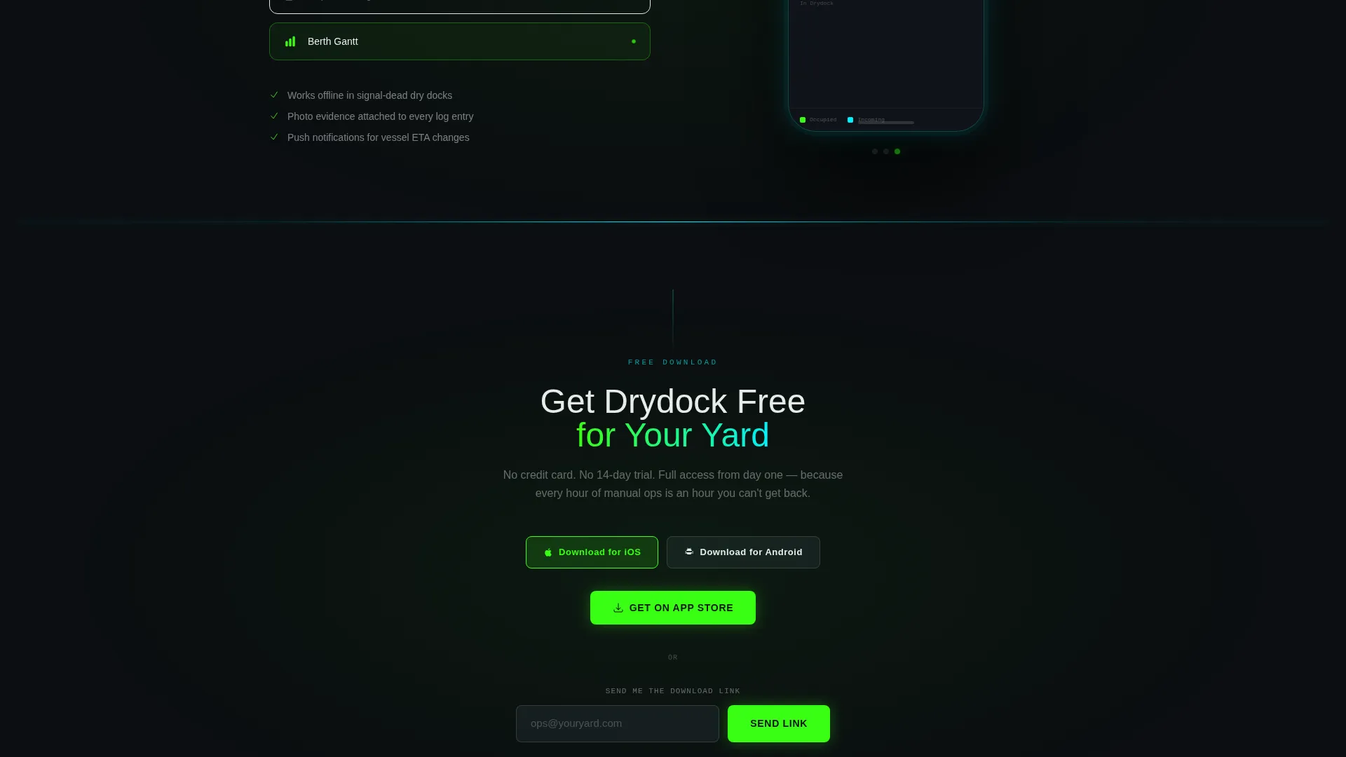
The primary call to action reads "Get Drydock Free for Your Yard." Platform toggle buttons for iOS and Android sit side by side. A single email input field labeled "Send me the download link" serves visitors who are not on a mobile device at the time of browsing.
Secondary Demo Booking Path
A second conversion option labeled "Book a Yard Walkthrough" targets enterprise decision-makers who need a guided demonstration before committing. This path runs parallel to the download block without competing with it visually.
Gradient Comparison Table Headers
Table column headers use a green-to-cyan gradient that guides the eye from left to right. The visual direction mirrors reading an instrument panel, reinforcing the operational control-room aesthetic throughout the comparison section.
Page sections overview
| Section | Purpose |
|---|---|
| Stats Metrics Header | Anchors visitor attention with five animated operational numbers on page load |
| Comparison Table | Contrasts eight before-and-after operational pain points row by row |
| Device Mockup Block | Cycles through three app screens to show the product in use |
| App Download Block | Drives iOS and Android downloads with a parallel email capture field |
| Demo Booking Path | Offers enterprise visitors a guided walkthrough option |
Design & branding system
The visual identity follows a Startup Velocity theme using an Acid Digital color palette. The overall feel is a sonar screen in a darkened bridge room. Every background recedes to near-black while data points and calls to action pulse forward in bright, high-contrast hues.
- Core palette: void black (#0B0E11) for backgrounds, reactor green (#39FF14) for primary buttons and live data labels, electric cyan (#00F0FF) for section dividers and accents, and signal white (#EAECEF) for body text
- Comparison table headers use a green-to-cyan gradient that creates left-to-right visual momentum across each row
- Section dividers glow faintly in cyan, and primary interactive elements burn reactor green to create a clear visual hierarchy against the dark canvas
Mobile & speed optimization
The template is designed with a mobile-first download flow in mind. The app download block features platform toggle buttons and an email fallback, making the page functional regardless of the device a visitor arrives on.
- The animated stats header and comparison table are laid out to stack cleanly on smaller screens
- The device mockup section is built around a single cycling animation rather than multiple heavy assets, keeping the visual weight manageable
- The page uses no stock photography, relying on data display and user interface components to carry the visual story
How this template helps you convert
Drydock is structured around a proof-first conversion sequence. Each section builds on the last, lowering buyer resistance one step at a time before presenting any call to action.
- The animated stats header establishes credibility immediately. Visitors see real operational numbers before reading a single marketing claim, which builds trust before any scroll.
- The eight-row comparison table does the persuasion work by showing specific time-cost penalties in the left column and compressed, green-coded outcomes in the right. By the time a visitor reaches row eight, the download feels like the logical next step rather than a risk.
- The dual-path conversion block captures both impulsive downloaders and cautious enterprise buyers in the same view, with the demo booking option ensuring no high-value lead is left without a path forward.
Other information about this template
This template is part of a broader family of vertical SaaS landing page designs built for niche operational software markets. It is particularly well-suited to teams presenting shipyard management software to buyers who are skeptical of generic productivity tools and need industry-specific proof.
- The Drydock template is optimized for shipyard vertical SaaS products where the buyer journey involves multiple stakeholders including operations managers, port directors, and procurement leads
- The Launch Energy creative direction is intentional: the page is designed to feel urgent and decisive, matching the high-stakes environment of a working yard
- Template customization involves swapping the five metric values, updating the eight comparison table rows with your product's specific claims, and replacing the device mockup screens with your actual app interfaces
Theme
Startup Velocity
Creative direction
Launch Energy
Color system
Acid Digital
Style
Comparison Table
Direction
App Download
Page Sections
Animated Operational Stats Header
Eight-row Before-and-after Table
Cycling Device Mockup Section
Dual-platform Download Block
Secondary Demo Booking Path
Green-to-cyan Gradient Table Headers
Related questions
Who is this landing page template designed for?
Can I change the stats shown in the header?
Does this template support both iOS and Android app downloads?
What are the eight comparison table rows about?
Is this template suitable for enterprise sales cycles?



