Economics Education Comparison Website Template
The Econ Adaptive Flashcard landing page is built for economics learners who need theory to stick, not just skim. It pairs a free-trial header, a study-method comparison table, and three case study narratives with a diagnostic quiz flow. The Forest Trust color system gives it the feel of a serious study space, not a generic app pitch.
by Rocket studio
Quick summary
This single-page template turns visitors into active learners before they ever sign up. A desk-scene header, a side-by-side study method comparison table, and three student case study narratives build layered proof. A ten-question diagnostic quiz closes the loop by earning the email capture with a promise of self-knowledge, not a sales push.
Who this template is for
This template is designed for economics education products that need to demonstrate real learning outcomes. It works best when the audience already feels the pain of passive study and needs a reason to switch.
- Undergraduate economics students preparing for midterm and final exams
- AP Economics students targeting a top score on their exam
- Career-changers and graduate school applicants studying for entrance exams like the GRE
What problem this template solves
Most study tool landing pages tell visitors what the product does. They rarely show why passive habits fail. This template flips that by leading with evidence before the ask.
- Passive methods like rereading and highlighting feel productive but produce weak recall
- Students under time pressure need proof a new tool works before they commit
- Generic sign-up prompts create friction because they ask for something before giving anything
What you get with this template
You get a fully structured, single-page layout that guides a skeptical visitor through evidence and into action. Every section has a distinct job, and each one hands off cleanly to the next.
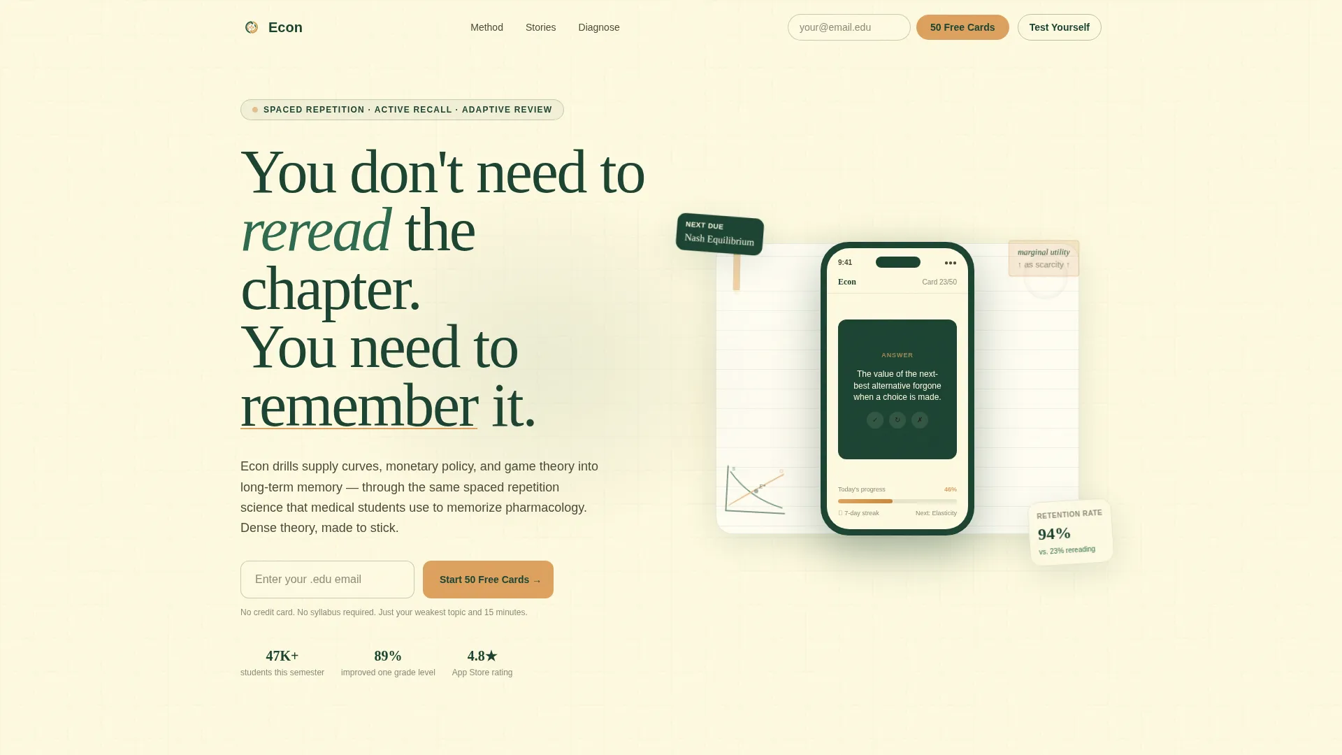
- A free-trial header with an illustrated desk scene and a single email capture field
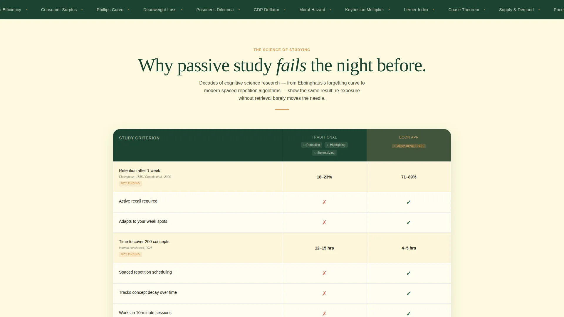
- A comparison table contrasting passive study methods against active recall and spaced repetition
- Three student archetype case studies with escalating stakes and review stat screenshots
- A gated diagnostic quiz that identifies weak topics and unlocks a custom review deck
Feature list
This template is built around five focused components that work together to move a visitor from doubt to sign-up.
Illustrated Free-Trial Header
The header frames the product as a study companion, not a software pitch. A phone screen mid-card-flip shows "Define: Opportunity Cost" in serif type, surrounded by a supply-and-demand sketch, a pencil, and a coffee ring on notebook paper. A headline fades in above, and a single gold-button email field sits below.
Study Method Comparison Table
A structured table stacks traditional study habits against the app's approach across three dimensions: active recall versus passive review, spaced repetition intervals versus unstructured rereading, and adaptive difficulty versus static content. Check marks, time-saved metrics, and retention percentages pulled from cognitive science research make the case visually and factually.
Three-Arc Case Study Narrative
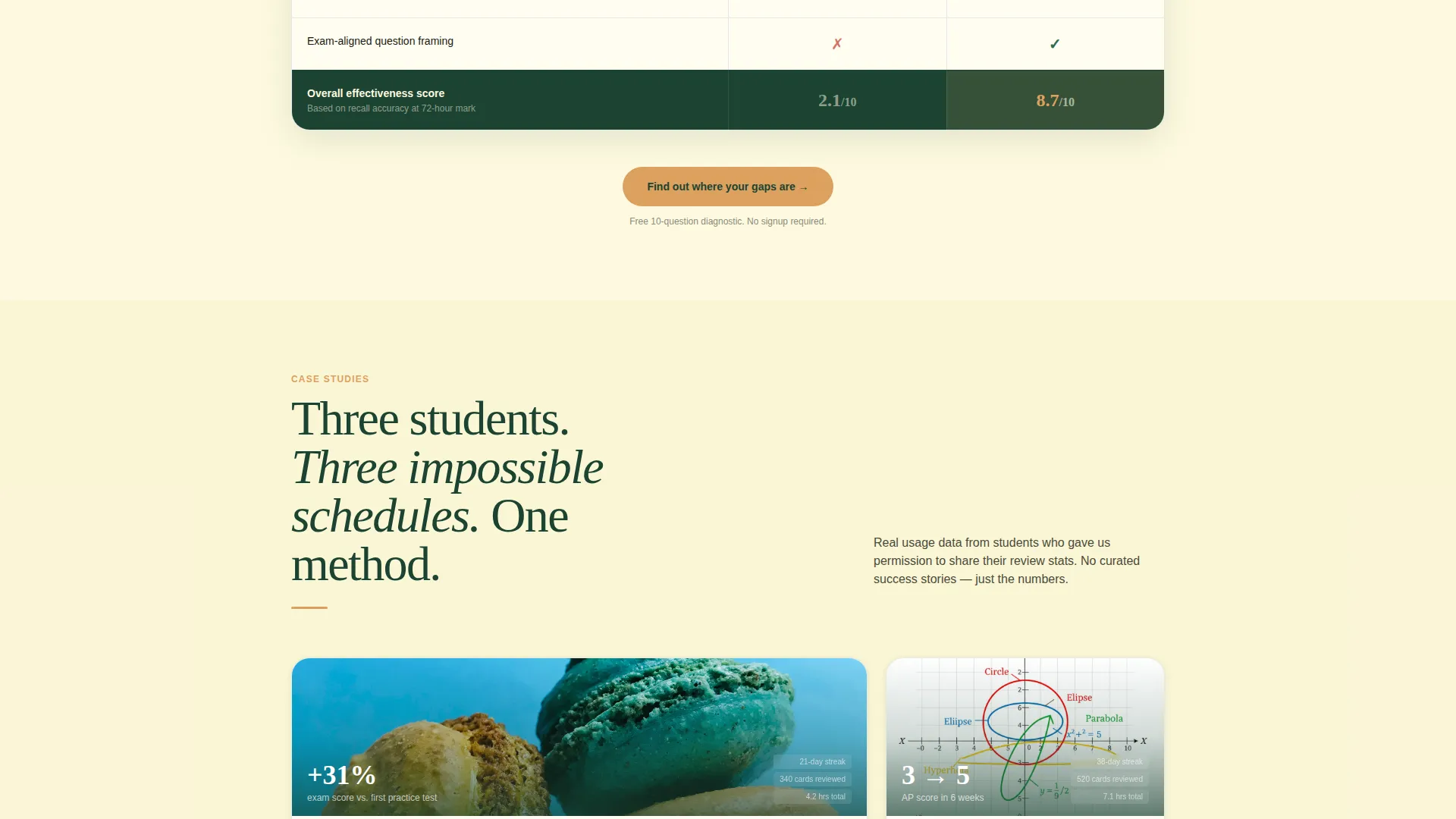
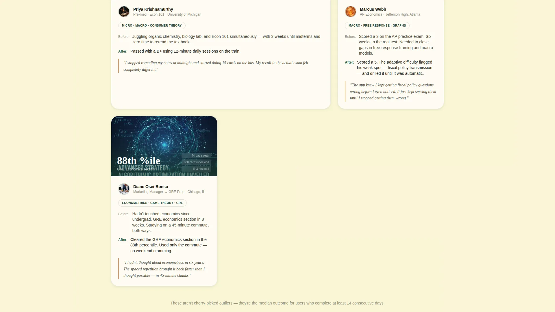
Three student stories follow real archetypes through their study journeys. A pre-med student who passed Econ 101 alongside organic chemistry, an AP student who moved from a 3 to a 5 in six weeks, and a working professional who cleared the GRE economics section during a train commute. Each story ends with a screenshot of actual review stats.
Diagnostic Quiz with Gated Results
A ten-question diagnostic identifies weak spots across microeconomics, macroeconomics, and econometrics fundamentals. The results page is gated behind an email capture framed as a reward: "See your score and get a custom review deck." The quiz earns the click because it offers self-knowledge first.
Repeated Secondary Conversion Points
The free-trial email field appears in both the header and the footer. This gives returning visitors and scroll-heavy readers a second chance to convert without hunting for the sign-up prompt.
Page sections overview
| Section | Purpose |
|---|---|
| Desk Scene Header | Free trial email capture with illustrated context |
| Study Method Table | Side-by-side comparison of passive versus. active study |
| Case Study One | Pre-med student story with review stat screenshot |
| Case Study Two | AP student progression from score 3 to 5 |
| Case Study Three | GRE commuter prep story with stat screenshot |
| Diagnostic Quiz Block | Ten-question assessment with gated results |
| Footer Email Field | Secondary free-trial conversion repeat |
Design & branding system
The Forest Trust color system gives every section a distinct role without visual clutter. The palette feels like a wooded university campus in early October, grounded in library oak and green banker's lamp tones.
- Deep evergreen (#1B4332) anchors backgrounds and navigation for a focused, serious feel
- Warm parchment (#FEFAE0) opens up content sections with breathing room between dense text blocks
- Annotation gold (#DDA15E) is reserved strictly for buttons, progress indicators, and highlighted terms so the eye lands only where action lives
- Worn chalkboard slate (#2D6A4F) carries body text and secondary interface elements
Mobile & speed optimization
The layout is designed with vertical scroll and narrow viewports in mind, which matters for students studying late at night on a phone.
- The comparison table is structured to remain readable on smaller screens without horizontal scrolling
- The illustrated header elements are positioned to scale cleanly across device sizes
- The diagnostic quiz flow and email capture fields are sized for comfortable thumb interaction
How this template helps you convert
Every section of this template is engineered to reduce a specific hesitation before asking for anything in return.
- The comparison table removes doubt about whether the method works by presenting retention data and time-saved metrics visually, before any sign-up prompt appears.
- The three case study narratives accumulate proof across different student types, so visitors who identify with at least one story arrive at the quiz already persuaded.
- The diagnostic quiz converts by giving first. Visitors complete ten questions and feel they have earned a personalised result, making the email gate feel like a fair trade rather than a wall.
Other information about this template
This template is built for the economics education niche but the underlying structure, a comparison table paired with case study proof and a gated diagnostic tool, can serve any adaptive learning product where evidence-based conversion matters.
- The Educational Guide theme and Forest Trust palette are designed to signal academic credibility without feeling corporate or clinical
- The template style is a Comparison Table layout, making it especially strong for products that compete directly with familiar habits like textbook rereading or classroom review
- The creative direction follows a Case Study Narrative arc, which means the page earns trust through accumulated student evidence rather than feature lists alone
- The quiz-led conversion path fits products in the assessment and personalized learning space where visitors respond better to self-discovery than to direct sales language
- This template is a strong fit for economics flashcard and review app products, tutoring platforms, and test-prep services that want to demonstrate learning outcomes on a single page
Theme
Educational Guide
Creative direction
Case Study Narrative
Color system
Forest Trust
Style
Comparison Table
Direction
Quiz/Assessment
Page Sections
Illustrated Desk Scene Header
Study Method Comparison Table
Three-arc Student Case Studies
Gated Diagnostic Quiz
Repeated Free-trial Capture Fields
Forest Trust Color System
Related questions
Can I edit the comparison table data to match my own research?
Do I need to use all three case study sections?
How does the gated quiz flow work in this template?
Is this template only suitable for economics products?
Where does the free-trial sign-up field appear on the page?



