Cloud & DevOps Comparison Website Template
Edge is a bold brutalist landing page template built for edge computing and CDN providers. It uses a 50/50 split-screen layout, live latency detection, and a progressive comparison arc to prove network superiority through raw numbers before asking for anything. Designed for platform engineers and DevOps teams who trust data over promises, this one page template turns benchmark results into conversions.
by Rocket studio
Quick summary
Edge is a single-page, split-screen landing page template for edge computing and CDN platforms. It combines a brutalist design system with live client-side latency detection and a staged problem-to-solution comparison arc. Every section is built to show rather than tell, serving hard numbers to platform engineers and DevOps leads before a single form field appears.
Who this template is for
This template was built for technical infrastructure brands that need to prove performance claims to skeptical, data-driven buyers. If your audience dismisses marketing copy on instinct but stops scrolling for a real benchmark, this landing page was designed for them.
- Platform engineers and DevOps leads who are dealing with P99 latency spikes and need hard evidence to justify a platform switch
- CTOs at e-commerce or streaming companies who connect milliseconds directly to revenue and want to see a cost-per-request comparison before a sales call
- Infrastructure SaaS teams creating a high-trust, engineer-first landing page that puts live network data front and center
What problem this template solves
Technical buyers ignore landing pages that lead with brand promises. They scroll past hero sections that use stock imagery, vague uptime claims, and generic copy. The real problem is that most infrastructure website templates are built for marketers, not for engineers. This template is built the other way around.
- It gives visitors immediate, real context: their own latency, their resolved location, and their nearest edge node, displayed in monospaced type the moment the page loads
- It replaces marketing language with visual proof: request waterfall comparisons, throughput tables, and cost-per-request data that create an undeniable argument before any call to action appears
- It removes friction from the conversion path by letting users run a free latency test with just a domain name, no email required, earning trust before asking for it
What you get with this template
This template delivers a complete one page layout structured as a live comparison engine. The design, copy structure, interaction model, and visual identity are all pre-built and fully customizable to match your platform's specific network data and brand voice.
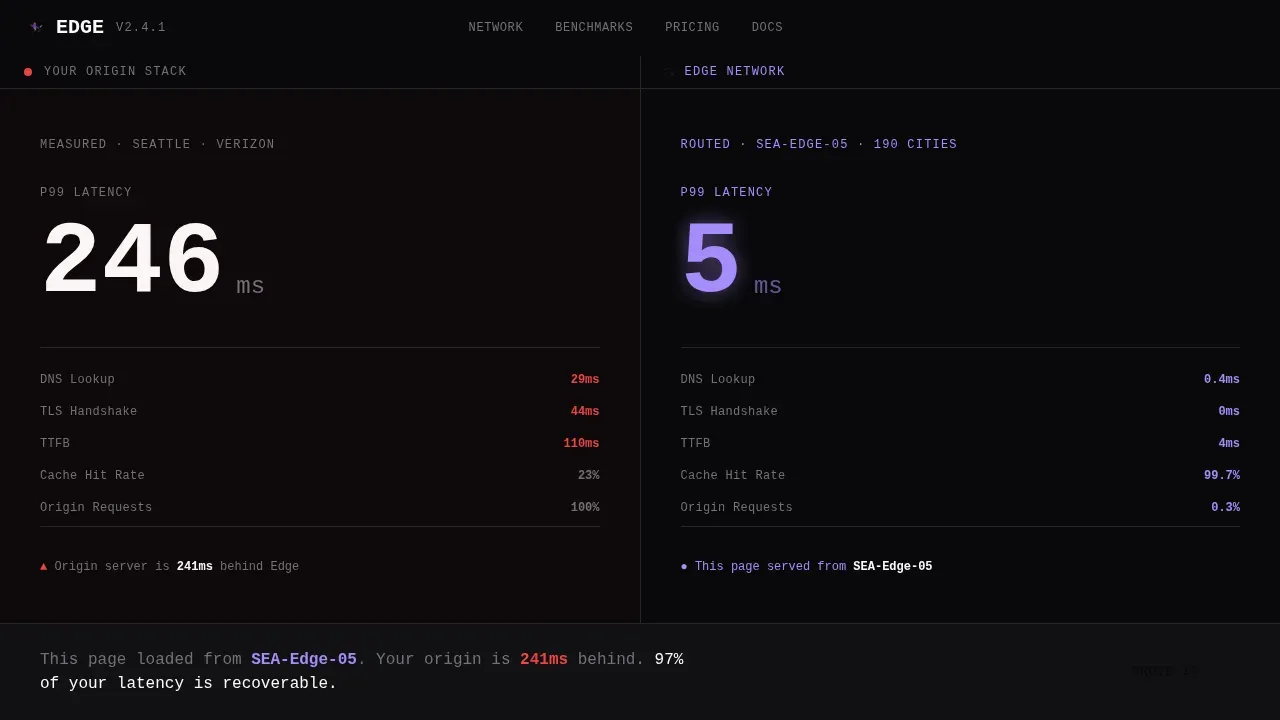
- A 50/50 split-screen homepage with a live stats wall in the header that detects and displays the visitor's real latency, location, and nearest edge node alongside the platform's routed response
- Five distinct page sections that escalate through latency, throughput, cost, and uptime comparisons, culminating in a free domain latency tester with progressive email disclosure
- A fully customizable brutalist design system built on void black, deep ultraviolet, and cathode phosphor, with oversized monospaced typography and no gradients, no stock images, and no softness
Feature list
This template is built around features that create conviction in technical buyers. Each element of the interface is designed to display real data, support smooth animations, and sustain a focused comparison narrative from the first scroll to the final call to action.
Live Latency Detection Header
The header functions as a real-time stats wall. The left panel detects the visitor's own latency, resolved location, and nearest edge node using lightweight client-side code. The right panel shows the same request routed through the platform with a hard numerical comparison rendered at 96px monospaced type. A pulsing violet dot marks the edge node on a minimal world map. A single generated line beneath reads: "This page loaded from [City]. Your origin is [X]ms behind." This element is the first thing visitors see, and it sets the context for every section that follows.
Problem-to-Solution Waterfall Comparison
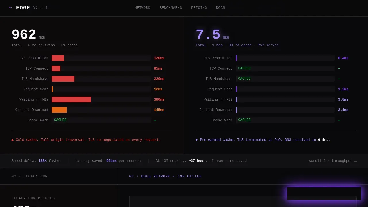
The first section below the fold presents a side-by-side request waterfall. The left side shows a typical origin-server request with long red bars representing DNS lookups, TLS handshakes, and cold cache misses. The right side shows the edge-routed equivalent: collapsed, compressed, violet bars that barely register. This visual proof requires no description or explanation. The contrast speaks directly to platform engineers who know exactly what they are looking at.
Tilting Split-Screen Comparison Arc
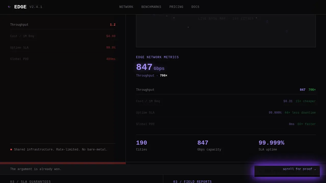
As users scroll through the landing page, the split-screen layout physically shifts. The left panel narrows while the right panel claims more viewport space. This dynamic transition reinforces the argument visually: latency comparisons escalate into throughput comparisons, then into cost-per-request comparisons, then into uptime SLA comparisons. Each stage of the comparison arc builds on the last, creating a sense of momentum that matches the platform's performance story.
Fixed Violet Call-to-Action Button
After the first scroll, a fixed call-to-action button appears in the bottom-right corner. It reads "Run a Free Latency Test" and stays visible throughout the page. The button is rendered in deep ultraviolet against void black, making it impossible to miss without being disruptive. It is the only interactive element that appears in that space, so users always know where to focus when they are ready to act.
Progressive Domain Latency Tester
Clicking the fixed call to action opens a single-field input: "Enter your domain." No signup, no email gate. The tool runs a multi-region latency comparison and delivers results in-page within seconds. The result is a data artifact sharp enough to screenshot and paste into a Slack thread. A secondary call to action beneath the results reads "See Full Report, Enter Your Email," converting already-convinced users through progressive disclosure that earns the inbox by proving value first.
Engineer Social Proof Wall
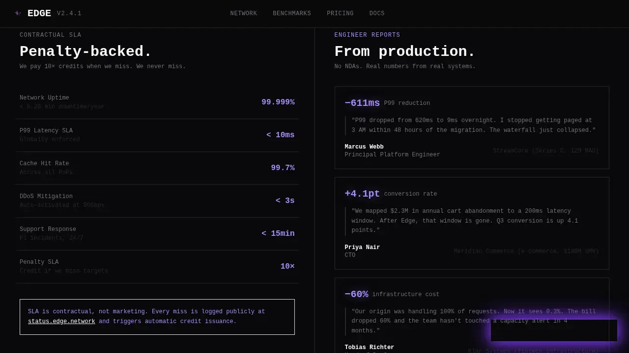
The SLA and social proof section displays uptime numbers and engineer testimonials alongside specific latency deltas. These are not generic customer quotes. They are structured like feedback from technical peers: company type, before-and-after numbers, and a direct statement about impact. The design keeps this section consistent with the rest of the template's data-first aesthetic, using the same monospaced type and high-contrast color system.
Page sections overview
| Section | Purpose |
|---|---|
| Hero Stats Wall | Display live visitor latency versus edge-routed response in real time |
| Waterfall Comparison | Show origin-server versus edge request waterfalls side by side |
| Network Coverage | Compare 190-city throughput and cost per request with a tilting split |
| SLA Social Proof | Present uptime SLA data and engineer testimonials with specific numbers |
| Latency Test Tool | Let visitors test their own domain with no signup required |
| Footer Developer Minimal | Close the page with a clean, GitHub-style developer footer |
Design & branding system
The visual identity is built on a Void and Violet color system. Brutalist design principles drive every decision: no gradients, no decorative illustration, no soft shadows. The aesthetic feels like staring at a terminal display in a dark room where every number is green and dropping. Neo-brutalism is a current trend in web design that incorporates bold typography and high-contrast colors to create expressive layouts, and this template fully embodies that approach. The result is an interface that communicates seriousness and confidence before the visitor reads a single word.
- Color system: void black (#09090B) as the base, deep ultraviolet (#7C3AED) for interactive edges and calls to action, cathode phosphor (#A78BFA) for secondary text and graph lines, and searing white (#FAFAFA) for primary display type
- Typography: oversized monospaced type as the primary face for all data and headings, with a clean sans-serif body font; all type is unapologetic, terminal-style, and optimized to display numbers at large scale
- Layout: a strict 50/50 split-screen grid with sharp corners, visible structural edges, and no decorative space between panels; the layout shifts dynamically as users scroll through the comparison arc
Mobile & speed optimization
The template is designed desktop-first, reflecting the reality that platform engineers and DevOps leads work primarily on workstations. The desktop layout uses the full split-screen grid at high resolution. For mobile screens, the layout adapts to a single-column responsive stack that preserves the brutalist aesthetics and keeps all comparison data accessible.
- Desktop-first grid that maintains the full 50/50 split panel layout and large-format monospaced type for workstation users
- Responsive stacking for mobile screens that keeps live latency data, waterfall visuals, and the domain tester tool accessible without horizontal scrolling
- Static Server Components handle the structural page shell for fast loading, while Client Components manage live latency detection and smooth animations so the dynamic elements do not block the initial page response
How this template helps you convert
This template converts by earning trust before asking for anything. The conversion path is built around progressive proof: visitors receive data about themselves before they see a call to action, and they run a real test before they give an email address. This is a deliberate design choice calibrated to the way technical buyers make decisions.
- The live latency header gives every visitor a personalized data point the moment the page loads, creating immediate relevance and giving them a concrete reason to keep reading rather than bouncing
- The free domain latency tester produces a result the visitor generated themselves, making it far more persuasive than any brand claim; when the secondary email call to action appears beneath the result, the visitor is already convinced
Other information about this template
This template sits at the intersection of brutalist web design and infrastructure marketing, a category that has historically been underserved by template marketplaces. Most infrastructure website templates default to polished SaaS aesthetics. This one takes the opposite approach. Brutalist design is characterized by a raw and unapologetic aesthetic that challenges conventional design norms, and that directness is a strategic match for an audience that values honesty and precision over polish.
Brutalist landing page templates are optimized for low latency by stripping away heavy assets that clog network paths. Removing polish, such as complex parallax effects, ensures lower Time to First Byte (TTFB) and Largest Contentful Paint (LCP) compared to standard modern templates. This makes the design choice a functional one, not just a stylistic one. Brutalist designs align with edge computing goals by reducing the weight of the data being pushed to the edge.
The broader brutalist web design trend has produced notable reference points across platforms. BRUTAL/ST on Framer is a modern, responsive portfolio template that is fully customizable without custom code. EMVY on Webflow is a community-clonable template that showcases the boxier HTML effect and grid-like layout characteristic of brutalism. Sven Soric combines brutalism and minimalism with simple lists and hover-triggered previews. Minimalio on WordPress offers brutalist demos designed to be lightweight and fast-loading by minimizing decorative elements. These examples illustrate how broadly the brutalist category has matured across the web design ecosystem, and this edge brutalist latency comparison landing page template fits squarely into that lineage while being purpose-built for a specific technical use case.
- This is a one page template. There are no internal page links to additional sub-pages. All sections exist within a single scrollable landing page file.
- The template is fully customizable. You can swap colors, update copy, replace live-data endpoints, and adjust the comparison arc to match your platform's specific network story with a small change to the configuration file.
- Accessibility considerations such as sufficient color contrast between the violet and void black elements and keyboard-accessible interface controls are supported by the design system's high-contrast color choices.
- The template is built to support teams creating a new project quickly. AI-powered platforms can generate production-ready websites from natural-language prompts, and users can customize this template without requiring any custom code if the platform supports visual editing.
- New features can be added to any section of the template. The flexible component structure means you can extend the comparison arc, add new features to the latency tester, or introduce additional data panels without rebuilding from scratch.
- The footer uses a GitHub developer minimal pattern, signaling to the technical audience that this is a site built for people who read documentation, not brochures.
Theme
Bold Brutalist
Creative direction
Problem→Solution Arc
Color system
Void & Violet
Style
Split Screen (50/50)
Direction
Comparison/Versus
Page Sections
Live Latency Detection Header
Request Waterfall Comparison
Tilting Split-screen Comparison Arc
Fixed Violet Call-to-action Button
Progressive Domain Latency Tester
Engineer Social Proof Wall
Related questions
Who is this landing page template built for?
Can I customize the colors and typography?
Does the latency tester require a backend integration?
Is this template responsive on mobile?
How does the progressive email call to action work?



