Dynamic Coaching Social Media Landing Page Template
Grind is a bold brutalist coaching social media landing page template built for coaches who need scroll-stopping posts without the design overhead. It delivers a modular card grid layout, a Feature Tab Switcher for Instagram, Stories, and Reels, a side-by-side versus comparison section, and a full flipping template library, all in a raw, high-contrast Monochrome Steel visual system.
by Rocket studio
Quick summary
Grind is a direct-to-consumer digital product landing page template designed for coaches selling social media template vaults. It uses brutalist web design principles, raw structure, bold typography, and high contrast color schemes, to mirror the intensity coaches bring to their clients. Every section is engineered to move visitors toward one action: grabbing the full vault.
Who this template is for
This template was built for coaches who post daily and still feel like their content looks amateur. The target buyers are coaches working across fitness, life coaching, and business mentoring who need a professional-grade visual presence without hiring a graphic designer.
- Fitness coaches running 8-week Instagram challenges and program launches
- Life coaches promoting group programs through Stories and daily posts
- Business mentors who need a stronger social media presence across multiple social media platforms
What problem this template solves
Generic posts blend into feeds. Coaches spend hours in Canva and still end up with content that looks like everyone else's. This template gives the landing page a framework that shows visitors the quality gap immediately, before they scroll to pricing.
- Coaches lack a fast, credible way to present a social media template product
- DIY layouts fail to communicate the transformation a polished template vault delivers
- Without a clear comparison, visitors leave without understanding the value
What you get with this template
This is a full-section landing page built around the concept of momentum. Every scroll rewards the eye with proof, contrast, and a clear path forward. The structure is dense, fast, and mobile-first.
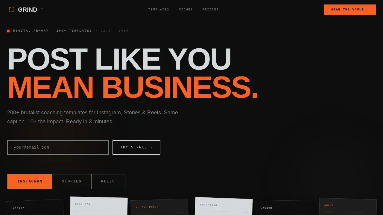
- A Feature Tab Switcher showing Instagram, Stories, and Reels template previews in a polaroid-style card grid
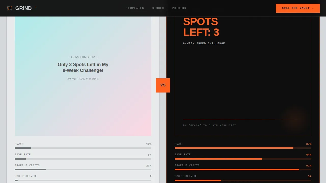
- A versus comparison section with side-by-side DIY and Grind template examples, complete with mocked engagement metrics
- A cascading flip-card template library, a scrolling niche ticker, a pricing card grid, and a linear single-row footer
Feature list
This section covers the core functional design elements delivered inside this template.
Feature Tab Switcher with Polaroid Grid
Three oversized brutalist tabs, labeled Instagram, Stories, and Reels, sit across the top of the viewport in heavy mono typography. Clicking each tab swaps a modular grid of template previews below. Cards sit at slight rotations, overlapping like a spread of polaroids thrown onto a desk. The active tab highlights in arc-weld orange while inactive tabs rest in cold steel gray.
Versus Comparison Section
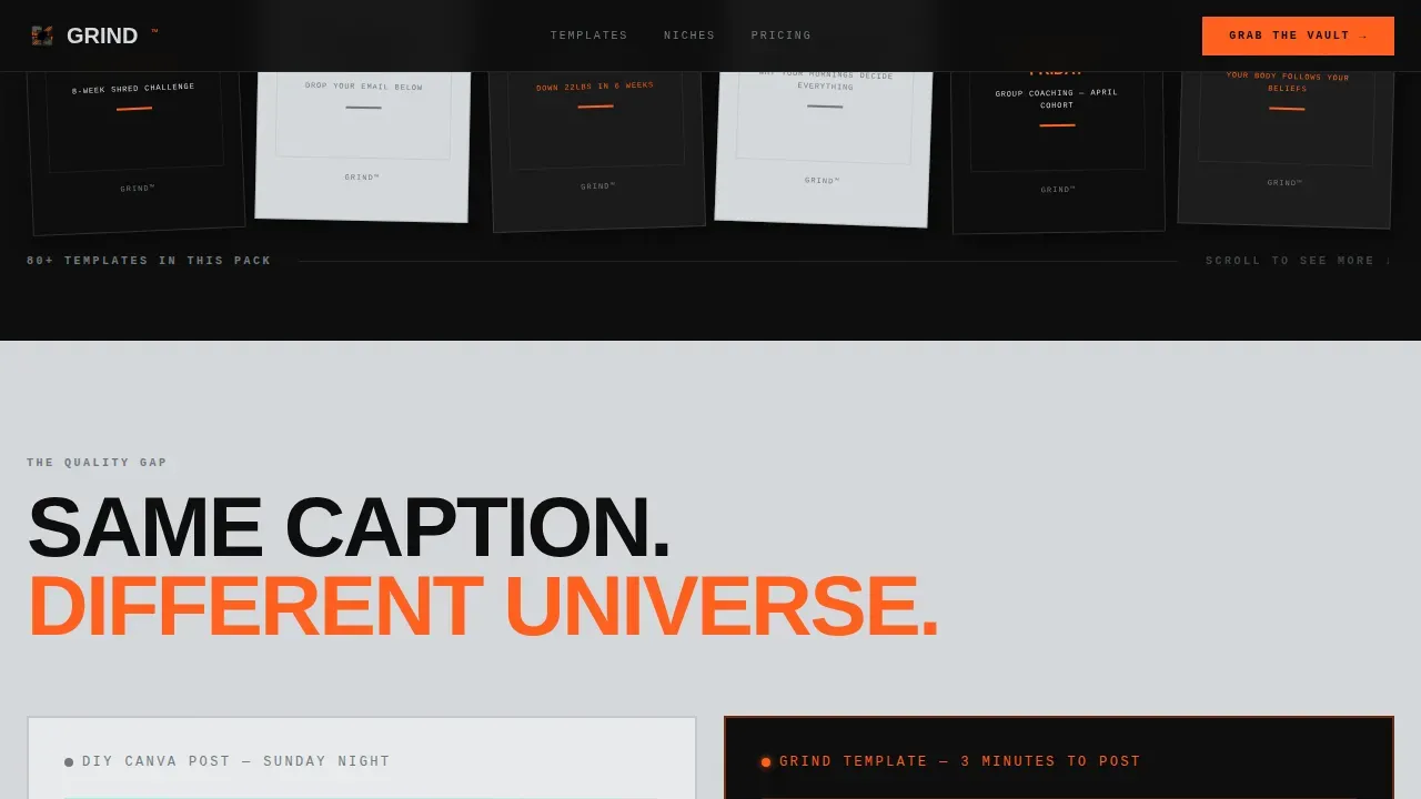
The side-by-side layout places a generic DIY post next to a Grind template using identical copy. Mocked engagement metrics appear beneath each example, making the quality gap immediately visible. This section puts the selling argument at center stage before visitors ever reach the pricing grid, lowering the bounce rate by closing the value gap early.
Cascading Flip-Card Template Library
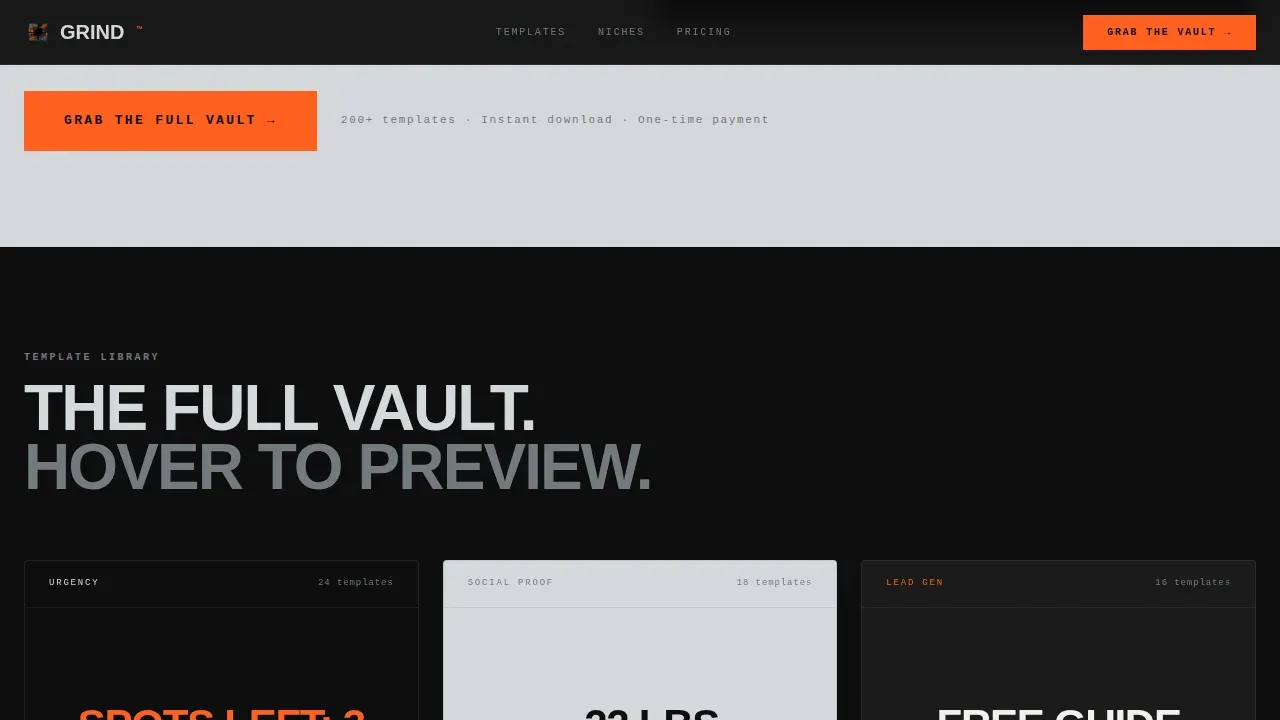
The full template library displays as a cascading card grid. Each card flips on hover to reveal customization ideas and options. This delivers an interactive, tactile sense of the product without requiring visitors to leave the page.
Niche Ticker and Bundle Strip
A rapid-fire scrolling ticker cycles through coach niches: fat loss, executive coaching, breathwork, mindset, and nutrition. Each highlighted niche links to a matching template bundle card. This section shows the breadth of coverage and helps every visitor find content that reflects their specific audience.
Sticky Mobile Call-to-Action Bar
A persistent bottom bar on mobile keeps the primary call-to-action visible throughout the entire scroll. This is critical for coaches browsing on phones, who represent the core user base for this product. The call-to-action uses arc-weld orange to remain bold and unmissable against slab black backgrounds.
Free Template Entry Point
A secondary conversion path sits directly beneath the tab switcher. Visitors can claim five free templates with only an email field. This low-commitment entry point opens the funnel to coaches who are not yet ready to commit to the full vault, delivering a better user experience and a wider top of funnel.
Page sections overview
| Section | Purpose |
|---|---|
| Hero Tab Switcher | Display Instagram, Stories, Reels previews in polaroid card grid |
| Versus Comparison | Show DIY versus Grind side-by-side with mocked engagement metrics |
| Template Library Grid | Cascading flip-card display with customization reveal on hover |
| Niche Ticker Strip | Scrolling coach niche tags linking to matching template bundles |
| Pricing Card Grid | Present vault tiers with primary "Grab the Full Vault" call-to-action |
| Linear Footer | Single-row footer with essential links and brand mark |
Design & branding system
The visual identity draws from brutalist architecture's core philosophy: nothing decorative survives, and everything functional is exactly where it should be. Like brutalist buildings that expose their raw materials instead of concealing them, this template puts structure and content at the forefront.
- Monochrome Steel palette: slab black (#0D0D0D), industrial fog (#D5D8DC), cold-rolled steel (#71797E), with arc-weld orange (#FF5F1F) reserved exclusively for calls-to-action and hover states
- Bold typography using DM Sans for body text and custom slab-weight headings for an aggressive, high-contrast visual hierarchy
- Solid color backgrounds alternating between slab black and industrial fog, with no decorative elements diluting the message
Mobile & speed optimization
The template is built mobile-first because its primary audience are coaches scrolling and buying on their phones. The minimalist approach means fewer heavy assets, which supports fast load behavior consistent with the raw, stripped-down aesthetic.
- Interactive elements such as the tab switcher, card flips, and ticker scroll are isolated as client components to protect static content rendering
- The sticky mobile call-to-action bar keeps the primary conversion action accessible throughout the entire mobile scroll experience
- The layout uses a clean grid layout structure with minimal styling to reduce visual noise and keep load behavior predictable
How this template helps you convert
The entire page is a single funnel shaped around a comparison that closes itself. Brutalism in web design is a reaction against polished, overproduced interfaces, and this template uses that raw power intentionally to make the product feel honest and immediate.
- The versus section does the selling first: visitors see the quality difference before they hit the pricing section, which transforms the purchase into a logical upgrade rather than a speculative buy.
- The free template entry point captures undecided visitors with minimal friction, creating a second conversion path that keeps leads inside the funnel even if they are not ready to grab the full vault.
Other information about this template
This template sits inside the intersection of brutalist web design and coaching-specific graphic design. The concept takes direct inspiration from brutalist buildings and raw concrete aesthetics, exposed structures, no polish, no unnecessary decoration, and applies those ideas to a web design context built for coaches who want to stand out on social media platforms.
Brutalist websites are known for their defining characteristics: bold, flat structure, high contrast, and a refusal of sleek decoration. Many brutalist websites use this extremely simplistic visual language to protect message clarity. This template applies those same brutalist elements, including high contrast color schemes, geometric components, and open navigation logic, to a product that serves coaches specifically.
Web brutalism has seen a rise among designers and web designers who want to move past the generic. This template gives coaches access to that distinctive style without needing to be a graphic designer themselves. Its ideas draw from examples in the brutalist web space: sites like Craigslist show how an extremely simplistic layout can still deliver functionality at scale. Studio Push shows how brutalist design communicates personality with raw power. Teacherie.how demonstrates how solid color backgrounds and bold brutalist text blocks reinforce a core message. Jeremy Baxter's portfolio uses bold typography and a high-contrast black-and-white palette that inspired the same sense of clarity here. Derek McKechnie's work with geometric components and interactive elements echoes the flip-card library concept in this template. Ryan Haskins shows how vibrant colors and large geometric objects create a unique experience. Kelly Phuong Phan's graphic design work proves how every design element can immerse visitors in a visual journey.
This template is also the grind bold brutalist coaching social media landing page template that prioritizes raw functionality and honest communication. The brutalist social media templates inside the vault come in two standard sizes: 1080 x 1080 pixels and 1080 x 1350 pixels, suitable for various social media platforms including Instagram, Pinterest, and Facebook. Each design encapsulates raw and unpolished characteristics. Templates are designed for use in Adobe Illustrator for easy customization.
- Brutalist design appeals to niche audiences who value authenticity over polished designs, which aligns directly with coaching audiences seeking genuine transformation
- The "ugly-cool" aesthetic grabs attention more effectively than conventional, polished designs because it feels honest and deliberate
- Brutalist design is not suitable for mainstream businesses that need sleek, conventional interfaces, but it is highly effective for coaches who want to project credibility and creative confidence
Theme
Bold Brutalist
Creative direction
Launch Energy
Color system
Monochrome Steel
Direction
Comparison/Versus
Page Sections
Feature Tab Switcher with Polaroid Card Grid
Versus Comparison Section
Cascading Flip-card Template Library
Scrolling Niche Ticker with Bundle Cards
Sticky Mobile Call-to-action Bar
Free Template Low-commitment Entry Point
Related questions
Who is this landing page template built for?
What makes the versus section effective for selling?
Can coaches with no web design background use this template?
What social media formats are the templates sized for?
Does the free template offer require a purchase?



