Seamless DataOps Landing Page Template
Pipeline is a DataOps landing page template built for teams who live inside terminals and dashboards. It presents a command-line orchestration tool with a mission-control aesthetic, using a dark Electric Indigo palette, a full-width DAG dashboard screenshot, and an industry-report scroll rhythm that turns operational pain into a compelling case for action.
by Rocket studio
Quick summary
Pipeline is a single-page, click-through landing page template for a DataOps orchestration tool. It opens with a full-width pipeline dashboard screenshot, unfolds like a data-driven industry report, and drives visitors toward a free sandbox with zero form fields on the page itself. The design runs on a dark void-black and electric-violet palette that feels like mission control at 2 AM.
Who this template is for
This template speaks directly to the engineers and technical leaders who carry the weight of broken data infrastructure. It is built for people who already know the problem and need to see proof that a solution exists.
- Senior data engineers who have accumulated years of orchestration debt and need a credible alternative
- Platform teams responsible for connecting multiple data tools and keeping pipelines observable
- Startup CTOs who have recently discovered unreliable data in their core business metrics
What problem this template solves
Data infrastructure pages often look like marketing brochures. Engineers distrust vague claims and skip pages that do not show the actual product. This template solves that credibility gap by anchoring every section to a real operational failure mode.
- Visitors bounce when they see no evidence of how the tool works in production
- Research-mode engineers need a softer conversion path before committing to a signup
- Teams evaluating tools need to see the product, not just read about it
What you get with this template
You get a fully structured, single-page layout that guides technical visitors from problem recognition to action. Every section is designed to reduce hesitation and build confidence through product evidence.
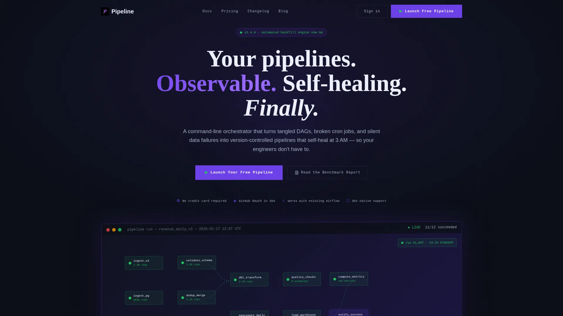
- A full-width, isometric pipeline dashboard screenshot as the hero, showing twelve DAG nodes, real-time row counts, and a latency graph
- An industry-report scroll structure where each bold statistic is immediately followed by a product proof card
- A primary call to action ("Launch Your Free Pipeline") placed under the hero and repeated in a sticky bar, plus a secondary path ("Read the Benchmark Report") for engineers still comparing options
Feature list
This template is built around a specific set of design and layout capabilities drawn directly from the brief.
Full-Width DAG Dashboard Hero
The header section displays a pixel-sharp pipeline dashboard screenshot on a slight isometric tilt against void black. Twelve nodes glow green, one shows amber with a retry counter, and real-time row counts stream beneath each stage. This is the first thing visitors see, and it immediately proves the product is real.
Industry Report Scroll Rhythm
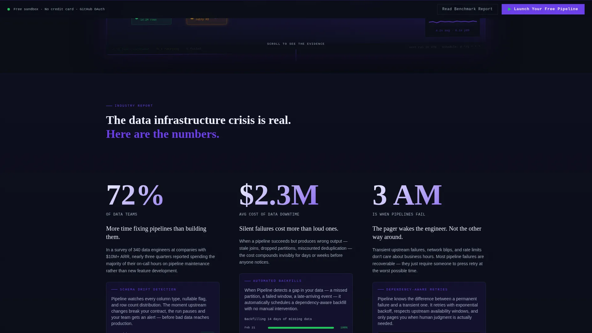
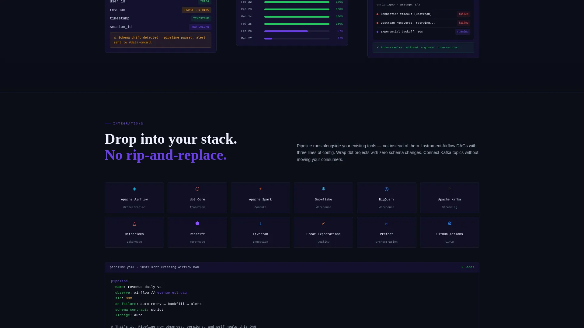
The page unfolds in a repeating pattern: a bold statistic, then a grid card that shows exactly how the tool addresses that failure mode. Failure modes covered include schema drift detection, automated backfills, and dependency-aware retries. The rhythm escalates stakes with each section, making the cost of inaction feel concrete.
Embedded Micro-Dashboard Cards
Each stat section expands into a grid card containing a micro-dashboard visual. These embedded displays feel interactive even as static images, giving engineers a sense of live product behaviour without requiring a demo environment.
Dual Conversion Path Layout
The primary call-to-action button appears below the hero screenshot and again in a sticky bar after the second stat section. A secondary "Read the Benchmark Report" link offers a lower-commitment path for engineers still in research mode, capturing email on download.
Sticky Call-to-Action Bar
After visitors scroll past the second statistics section, a sticky bar appears with the primary call to action. No form fields appear on the landing page itself. The click passes visitors directly to a signup flow using GitHub OAuth.
Dark Electric Indigo Color System
The entire layout uses a five-color palette built for dark-mode readability. Void black and deep indigo form the background layers, electric violet marks live accents and interactive states, cool slate handles secondary text, and phosphor white carries all primary type.
Page sections overview
| Section | Purpose |
|---|---|
| Hero Header | Anchors visitors with the DAG dashboard screenshot and primary headline |
| Primary call to action Block | Drives immediate action with the "Launch Your Free Pipeline" button |
| Stat Section One | Opens the industry-report rhythm with the first operational benchmark |
| Product Proof Card One | Expands the first stat into a micro-dashboard showing schema drift detection |
| Stat Section Two | Raises stakes with a second benchmark tied to pipeline failure cost |
| Product Proof Card Two | Shows automated backfill and dependency-aware retry behaviour |
| Sticky call to action Bar | Reintroduces the primary call to action after the second stat section |
| Stat Section Three | Continues the escalating claim-evidence-proof pattern |
| Product Proof Card Three | Closes the product evidence loop with a final failure-mode card |
| Secondary call to action Block | Offers the "Read the Benchmark Report" download for research-mode visitors |
Design & branding system
The visual identity is built around a Data Command theme that communicates operational precision and live system awareness. Every color choice reinforces the feeling of watching a healthy production run from a dark monitoring room.
- Background layers use void black (#0B0E17) and deep indigo (#1A1440) to create depth without distraction
- Electric violet (#6C3FE8) marks all live accents, interactive states, and pulse indicators, while cool slate (#A0AEC0) handles secondary text and phosphor white (#EDEFFF) carries all primary type
Mobile & speed optimization
The template is designed with a responsive layout in mind, keeping the dashboard-heavy visuals legible at smaller breakpoints. The isometric screenshot and grid cards reflow cleanly so the page remains scannable on any device.
- The sticky call-to-action bar adapts to mobile viewports so the primary action stays visible while scrolling
- Grid cards and micro-dashboard visuals are sized to remain readable without horizontal scrolling on standard mobile screens
How this template helps you convert
The entire page structure is engineered around a single goal: getting a technical visitor to click "Launch Your Free Pipeline" with confidence. Every layout decision reduces friction and builds trust.
- The hero dashboard screenshot removes doubt immediately by showing the real product interface before a single word of copy is read
- The claim-evidence-proof scroll pattern transforms industry statistics into specific product answers, making the value case feel earned rather than asserted
- The dual conversion path captures both ready-to-act engineers and research-mode visitors, so no qualified traffic is lost to indecision
Other information about this template
This template fits naturally within the DataOps tool and framework category, where buyers are technically sophisticated and highly skeptical of generic marketing pages. A few additional details worth knowing before you use it:
- The page is structured as a click-through landing page, meaning the signup flow lives off-page and the landing page itself carries zero form fields
- The GitHub OAuth reference in the brief positions this tool for developer-native audiences who expect code-first onboarding
- The "Read the Benchmark Report" secondary path is a useful email-capture mechanism for audiences earlier in their evaluation process
- The isometric dashboard screenshot treatment and dark-palette design make this template well-suited for any infrastructure or developer tooling product that benefits from showing a live operational interface
Theme
Data Command
Creative direction
Industry Report
Color system
Electric Indigo
Style
Dashboard/Data Grid
Direction
Click-Through
Page Sections
Full-width DAG Dashboard Hero
Industry Report Scroll Structure
Embedded Micro-dashboard Cards
Dual Conversion Path Layout
Sticky Call-to-action Bar
Dark Electric Indigo Color System
Related questions
Is this template suitable for a developer tool that is not specifically a pipeline orchestrator?
Does the landing page include a signup form?
Can the Electric Indigo color palette be swapped for a different brand identity?
How many call-to-action placements does this template include?
What content do I need to fill in the stat and proof card sections?



