Student Exchange Program Landing Page Template
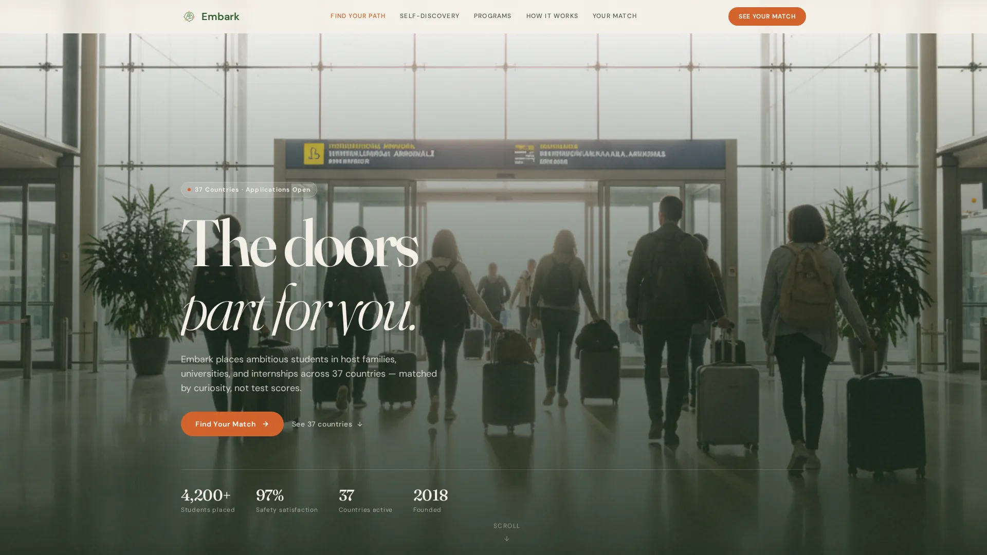
Embark is a hub and spoke landing page template built for student exchange programs. It uses a Persona Selector header, branching quiz cards, and a sticky "See Your Match" call to action to guide students, parents, and counselors through a personalized discovery flow. The template matches visitors to recommended countries and program types before asking for a single detail.
by Rocket studio
Quick summary
Embark is a single-page, anchor-navigated landing page template designed for student exchange programs. It opens with a Persona Selector, moves visitors through branching quiz cards, and closes with a results panel and short sign-up form. The layout serves three distinct audiences at once: the student browsing late at night, the parent researching safety records, and the counselor comparing program options.
Who this template is for
This template is built for organizations running structured international student exchange programs. It works especially well when your audience spans multiple decision-makers with different questions and different levels of urgency.
- Student exchange program coordinators who need one page to speak to students, parents, and school counselors simultaneously
- Admissions and outreach teams promoting placements across multiple countries and program tracks
- Education marketers who want a conversion-focused layout that earns trust before it asks for contact details
What problem this template solves
Most program pages present a wall of information and leave the visitor to figure out where they fit. That gap between "I'm interested" and "I'm applying" is where most prospective students disappear. Embark closes that gap by making the page feel responsive to the person reading it.
- Visitors arrive with different goals, adventure, academics, or career experience, but land on the same URL with no clear entry point tailored to them
- Parents and counselors need reassurance and structured information, while students need inspiration and a sense of personal fit
- Generic brochure layouts fail to build the emotional momentum needed to move a seventeen-year-old from curiosity to committed action
What you get with this template
You get a fully structured landing page built around a quiz-driven personalization flow. Every major section is already designed, sequenced, and connected through an anchor navigation spine.
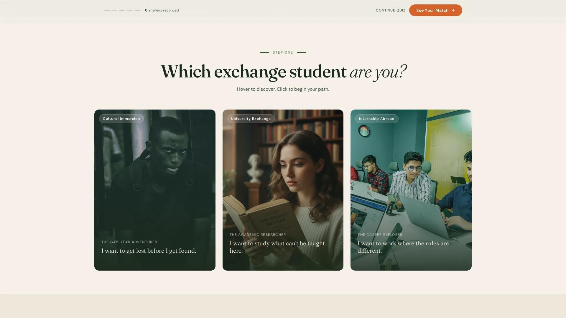
- A Persona Selector header with three photographic portrait frames and hover interaction states that reveal identity statements
- Branching spoke sections that populate based on the selected persona, including homestay timelines, university partnership views, and internship outcome panels
- A sticky footer bar with the primary "See Your Match" call to action, a results panel showing top country matches and program type, and a secondary "Download the Parent Guide" email capture path
Feature list
A paragraph introduces each feature below, describing what it does and why it matters to the visitor experience.
Persona Selector Header
Three photographic portrait frames sit side by side against the pressed-linen cream background. A single question above them reads "Which exchange student are you?" Hovering desaturates the two non-selected portraits and surfaces a one-line identity statement beneath the active one. Clicking a portrait locks in the visitor's path and activates the corresponding spoke sections in the anchor navigation.
Branching Anchor Navigation
Once a persona is selected, the hub and spoke navigation updates to surface the sections most relevant to that archetype. The gap-year adventurer sees homestay stories and cultural immersion timelines. The academic researcher sees university partnerships and credit transfer information. The career explorer sees internship placement data and alumni career trajectories. Every spoke is pre-built and toggled by the initial choice.
Sliding Quiz Cards
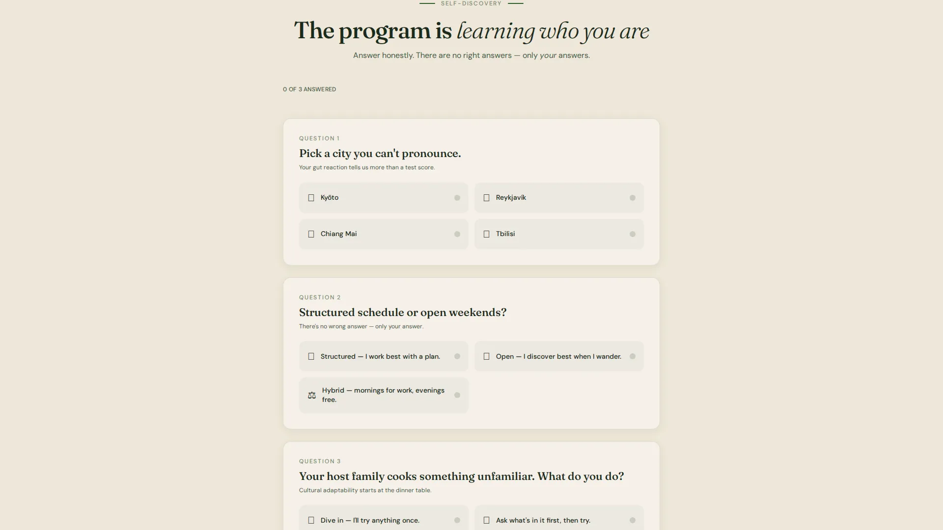
Between spoke sections, single-question quiz cards slide into view. Each card presents a short, instinctive choice, a city to pick, a schedule preference, a reaction to an unfamiliar meal. Answers quietly accumulate to build a country and program recommendation in the background. The scroll feels less like reading a brochure and more like a conversation.
Sticky "See Your Match" Footer
A persistent footer bar activates after three or more quiz cards are answered. It holds the primary call to action in ripe persimmon, keeping the conversion moment always visible without interrupting the discovery flow above it.
Results Panel and Sign-Up Form
Clicking "See Your Match" opens a results panel displaying the top two recommended countries, the matched program type, and an estimated timeline. A short form follows: first name, email address, graduation year, and passport country. The form feels earned because the visitor has already shared enough to make the result feel personal.
Parent Guide Secondary Path
A secondary capture path labeled "Not ready? Download the Parent Guide" sits alongside the primary call to action. It requires only an email address. This path serves the parent researching visa requirements and safety records who is not yet ready to commit to a full inquiry.
Page sections overview
| Section | Purpose |
|---|---|
| Persona Selector Header | Sets visitor archetype and activates the personalized navigation spine |
| Anchor Navigation Bar | Provides quick access to all spoke sections relevant to the selected persona |
| Adventurer Spoke | Showcases homestay stories and cultural immersion program timelines |
| Researcher Spoke | Presents university partnerships and credit transfer pathway details |
| Career Explorer Spoke | Displays internship placement data and alumni career trajectory outcomes |
| Quiz Card Interludes | Collects preference signals between spokes to build a country recommendation |
| Country Match Panel | Reveals top two country matches, program type, and estimated timeline |
| Sign-Up Form | Captures first name, email, graduation year, and passport country |
| Parent Guide Capture | Secondary email-only form targeting parents and guardians researching the program |
Design & branding system
The template follows a Corporate Precision theme expressed through a Botanical color system. The palette is disciplined and institutional, yet carries a warmth that keeps it from feeling cold or transactional.
- Deep fern (#2D5F2D) anchors the navigation spine and section dividers; pressed-linen cream (#F5F0E8) dominates all backgrounds; dried eucalyptus (#7A8B6F) softens secondary panels; annotation ink (#1B2A1B) is reserved for body text
- Ripe persimmon (#D4622B) appears exclusively on interactive elements and call-to-action states, ensuring that every clickable moment stands out without competing with the editorial calm of the surrounding layout
- The overall visual tone evokes a leather-bound field journal left open on a mahogany desk: structured and precise, with every detail grounded in a sense of real-world purpose
Mobile & speed optimization
The template is designed so that the quiz card flow, persona portraits, and sticky footer all translate cleanly to smaller screens. The interaction model is built around taps rather than hovers on mobile, so the persona selection and quiz card logic remain fully accessible to a student refreshing their inbox at midnight on a phone.
- Portrait frames stack vertically on narrow viewports, with the identity statement revealed on tap rather than hover
- Quiz cards are sized for thumb-friendly interaction, with clear spacing between answer options to reduce misfire taps
- The sticky "See Your Match" footer bar remains fixed at the bottom of the screen throughout the scroll, matching the same behavior as desktop
How this template helps you convert
Embark earns the conversion before it asks for one. The layout is designed so that by the time any form appears, the visitor already feels understood.
- The Persona Selector immediately signals that this page is not generic. Choosing an archetype creates a sense of ownership and investment in the result, which increases the likelihood of continuing through the quiz flow.
- Each quiz card answer adds to a visible sense of progress. The recommendation building in the background gives the visitor a reason to keep scrolling, because stopping means leaving a result unfinished.
- The sticky "See Your Match" button activates only after meaningful engagement, so the call to action appears at exactly the right moment. The Parent Guide path ensures that no high-intent visitor leaves empty-handed, even if they are not ready to submit a full inquiry.
Other information about this template
This template is built specifically for the student exchange program category within the broader study abroad and admissions space. It is designed to serve education programs that match participants by curiosity profile, language readiness, and cultural adaptability rather than by academic scores alone.
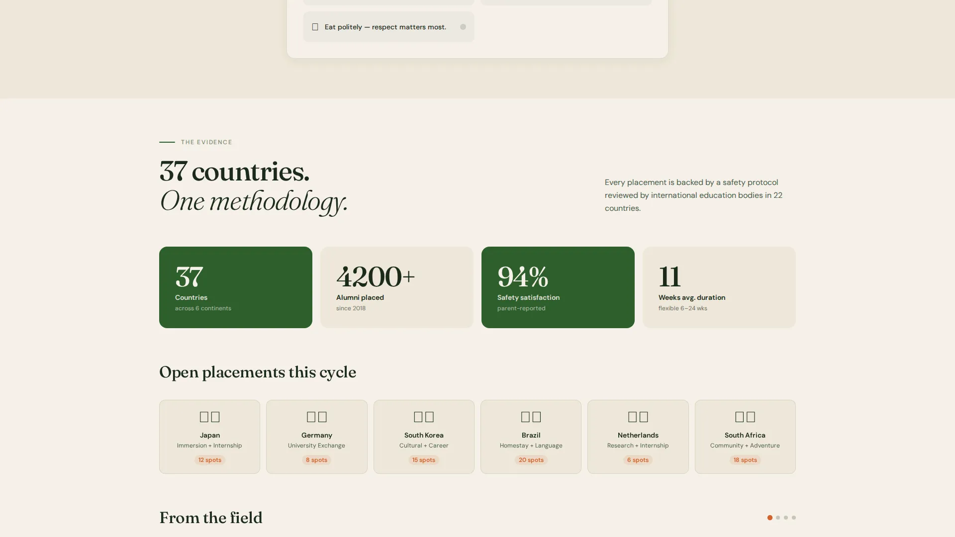
- The template covers thirty-seven-country program scope through the branching spoke architecture, allowing coordinators to represent a wide geographic portfolio without overwhelming the visitor on a single screen
- The quiz-driven personalization model is well suited to the study abroad and admissions niche, where prospective students need guidance, not just information, to move forward
- The hub and spoke layout with anchor navigation makes it straightforward to add, reorder, or swap spoke sections as program offerings evolve over time
Theme
Corporate Precision
Creative direction
Quiz & Personalize
Color system
Botanical
Style
Hub & Spoke (Anchor Nav)
Direction
Quiz/Assessment
Page Sections
Persona Selector Header
Branching Anchor Navigation
Sliding Quiz Cards
Sticky See Your Match Footer
Results Panel and Sign-up Form
Parent Guide Secondary Capture
Related questions
Can I use this template for a program that covers only a few countries?
Is the Persona Selector designed for touch screens?
How does the Parent Guide capture path work?
Can the quiz cards and spoke sections be edited to match my program's tracks?
Who is the sticky footer bar designed for?



