Ember — Contemporary Kitchen Landing Page Template
Ticket is a hub-and-spoke restaurant point-of-sale landing page template built for operators who run high-pressure, multi-cover services. It opens with a live-data hero, earns the scroll with an interactive savings calculator, and moves operators through five focused spoke sections before landing them at a device-specific app download call to action.
by Rocket studio
Quick summary
Ticket is a single-page, anchor-nav restaurant point-of-sale template built around a Data Command visual identity. An interactive savings calculator sits above the fold, five spoke sections guide operators through core capabilities, and the page closes with a device-specific install call to action. It is designed for independent owners, general managers, and multi-unit operators who need to act fast on real numbers.
Who this template is for
This template speaks directly to the people managing service from the inside. It does not assume a tech-savvy audience. It assumes a busy, numbers-driven one.
- Independent restaurant owners running dining rooms of 40 to 200 covers
- General managers juggling front-of-house and back-of-house on a double shift
- Multi-unit operators who need a cross-location view before the morning briefing
What problem this template solves
Restaurant operators lose money and time when their point-of-sale system cannot keep pace with service. A missed ticket, a slow floor map, or a reporting screen buried three menus deep turns a manageable rush into a cascading problem. This template is built to address that gap directly.
- Visitors cannot quickly see how the system fits into their specific operation
- Generic software pages bury the numbers that operators actually care about
- No clear path from "curious visitor" to "installed on my terminal"
What you get with this template
You get a complete, single-page landing page structured around a sticky anchor navigation that mirrors the feel of switching tabs on the point-of-sale itself. Each section is purposeful and operator-focused.
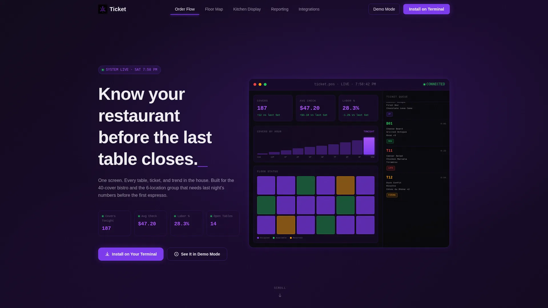
- A full-bleed dark hero with a live-data dashboard visualization showing real-time covers, average check, labor percentage, and a scrolling ticket queue
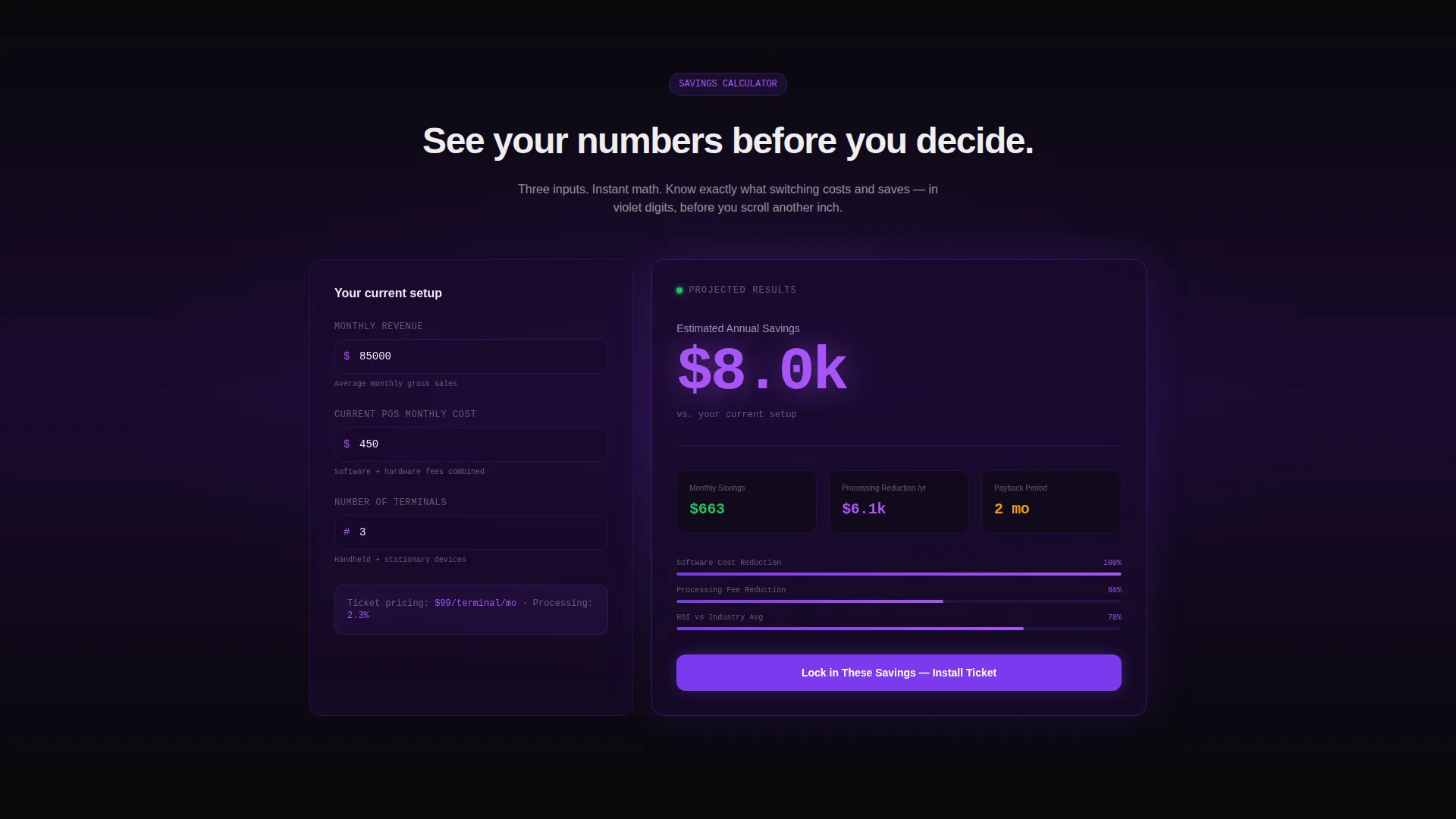
- An interactive savings calculator that takes three operator inputs and returns projected savings, processing fee reduction, and payback period in real time
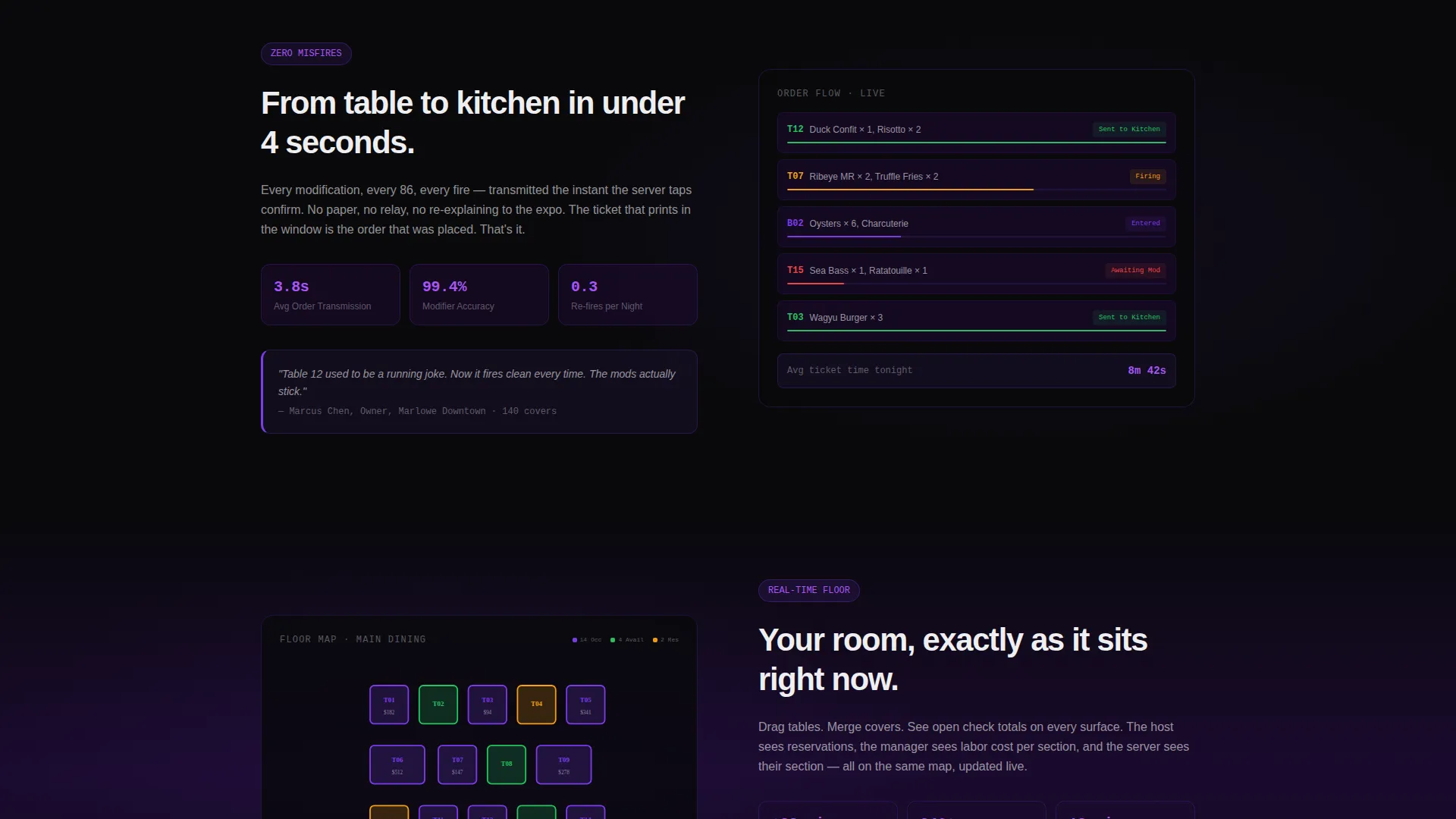
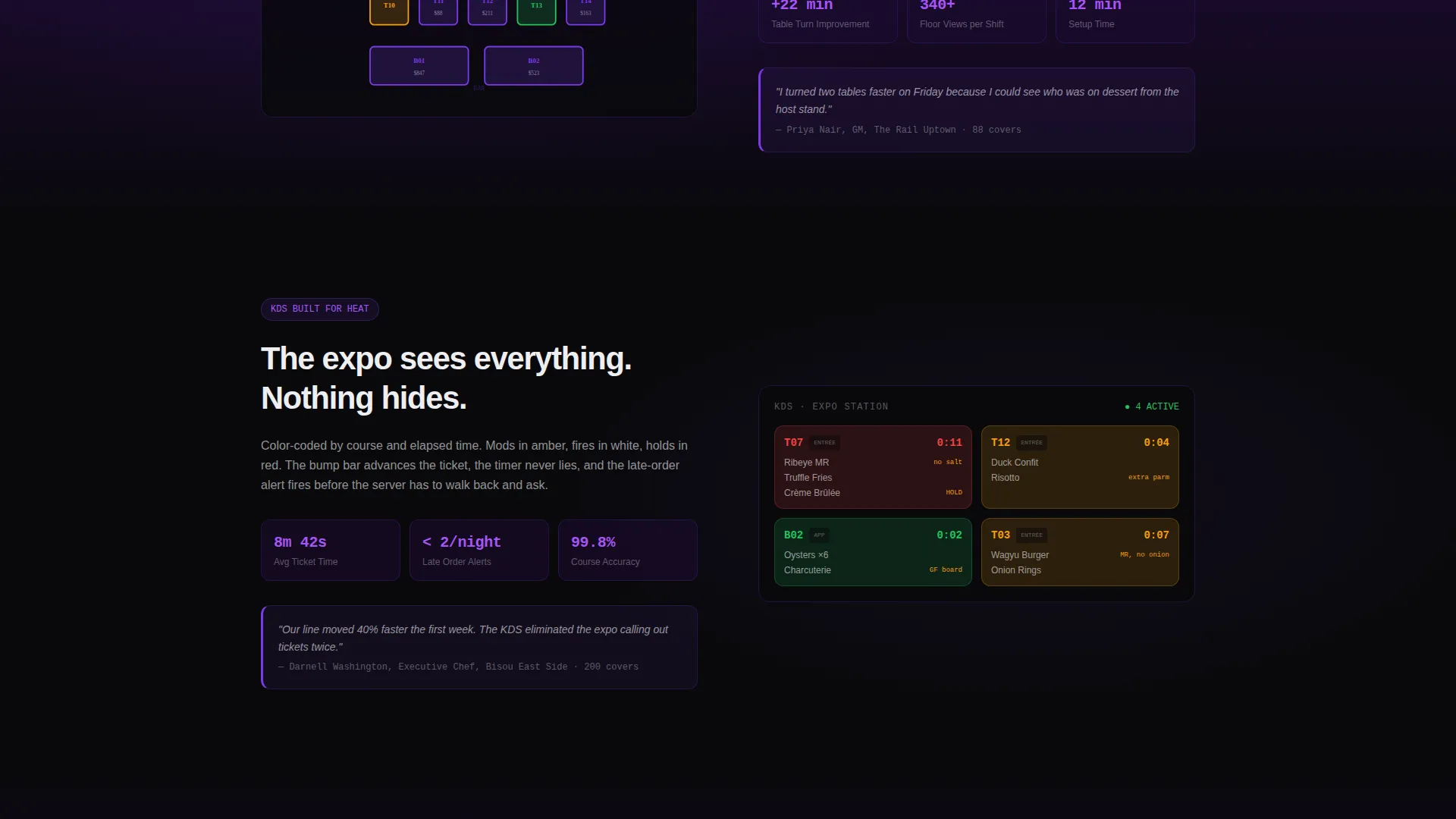
- Five spoke sections covering Order Flow, Floor Map, Kitchen Display, Reporting, and Integrations, each accessible via sticky anchor nav
- A device-selector download section supporting iPad, Android tablet, and Toast hardware migration, plus a sandboxed demo mode button
Feature list
This template is built around one organizing idea: earn the operator's trust before asking for the install. Every feature serves that logic.
Live Data Command Hero
The hero section renders a pitch-black full-bleed viewport with a restaurant dashboard in soft violet luminance. It displays real-time covers (187), average check ($47.20), labor percentage (28.3%), and a live ticket queue scrolling on the right edge. No photography. Pure data, rendered so precisely it feels like mission control.
Interactive Savings Calculator
Above the fold, before the visitor scrolls, a three-input calculator asks for average monthly revenue, current point-of-sale monthly cost, and number of terminals. It instantly returns projected savings, processing fee reduction, and payback period in glowing violet digits. This is the template's core conversion mechanism.
Hub and Spoke Anchor Navigation
A sticky navigation bar lets visitors jump between five spoke sections: Order Flow, Floor Map, Kitchen Display, Reporting, and Integrations. The nav feels like switching between active screens on the point-of-sale terminal itself, keeping orientation effortless during a long scroll.
Operator-Language Spoke Sections
Each of the five spoke sections alternates between dark-on-dark data visualizations and short, punchy copy written in operator language. The rhythm builds deliberately: feature, proof, feature, proof. By the final section, the case for the product compounds naturally.
Device-Specific Install Call to Action
The download section includes a device selector for iPad, Android tablet, and Toast hardware migration. A secondary "See It in Demo Mode" button opens a sandboxed interactive point-of-sale screen directly in the browser, letting operators test before they commit.
Terminal-Style Headline Animation
The hero headline types in like a terminal command, reinforcing the Data Command theme and setting the tone for the entire page. The phrase "Know your restaurant before the last table closes" grounds the value proposition in a single, operator-resonant line.
Page sections overview
| Section | Purpose |
|---|---|
| Hero Dashboard | Establish credibility with live-data visualization and terminal headline |
| Savings Calculator | Convert attention into engagement with personalized ROI inputs |
| Anchor Nav Bar | Orient visitors and enable fast access to each spoke section |
| Order Flow | Show how the system handles ticket routing under service pressure |
| Floor Map | Demonstrate real-time table management and cover tracking |
| Kitchen Display | Illustrate back-of-house ticket visibility and timing control |
| Reporting Section | Present cross-location and shift-level data in operator terms |
| Integrations Spoke | Outline how the system connects to existing restaurant tools |
| App Download call to action | Drive installs with device selector and sandboxed demo option |
Design & branding system
The visual identity is built on a Void and Violet color system. Every design decision reinforces the feeling of a back-office screen at midnight after close: dark, precise, and quietly compelling.
- Color palette: absolute void black (#09090B), deep terminal plum (#1A0A2E), electric violet (#7C3AED) for interactive elements and data highlights, and cool receipt-paper white (#EEEEF0) for typography and card surfaces
- No stock photography anywhere on the page; all visual content is data-driven user interface rendering and dashboard visualization
- Typography and card surfaces use the cool white tone to maintain readability against the dark backgrounds
Mobile & speed optimization
The template is structured for operators who check numbers on whatever screen is closest. A busy general manager does not wait for a slow page to load between covers.
- Sticky anchor navigation is designed to stay functional and accessible on smaller viewport widths
- The savings calculator and device selector are built for touch interaction on tablets and phones
- Dark background layouts reduce visual noise on mobile screens in low-light environments like a back office or a server station
How this template helps you convert
The entire page is structured as a compounding argument. Each section adds evidence, and each scroll brings the operator closer to the install decision with their own numbers already in hand.
- The savings calculator delivers personalized financial proof before the operator reads a single feature description, removing the most common objection early
- The spoke section rhythm of feature then proof builds credibility across five distinct operator pain points, so the download call to action feels earned rather than forced
- The sandboxed demo mode button gives hesitant operators a zero-commitment way to experience the product before they select a device and install
Other information about this template
This template is part of the broader restaurant software and point-of-sale system category. It is designed for operators who evaluate tools the same way they run a shift: quickly, practically, and with zero tolerance for wasted time.
- The template style is Hub and Spoke with anchor navigation, making it well-suited for point-of-sale software landing pages where multiple capability areas need equal coverage
- The Data Command theme and Void and Violet color system are distinct enough to stand out in a category dominated by bright, food-photography-heavy designs
- The creative direction is Calculator and Tool First, which means the interactive element drives engagement before any feature copy is read
- The primary call to action targets app download with a device selector, making it relevant for operators considering a transition from existing hardware or software setups
Theme
Data Command
Creative direction
Calculator/Tool First
Color system
Void & Violet
Style
Hub & Spoke (Anchor Nav)
Direction
App Download
Page Sections
Live Data Command Hero Section
Interactive Savings Calculator
Sticky Hub and Spoke Navigation
Operator-focused Spoke Sections
Device-selector Install Call to Action
Related questions
Who is the Ticket template designed for?
What makes the savings calculator important on this landing page?
Can operators try the product before downloading?
What devices does the download section support?
Does this template use photography?



