Strategic Multi-Unit Franchise Landing Page Template
Nexus is a Bold Brutalist franchise CRM landing page built for enterprise operators who manage hundreds of locations. The split-screen layout runs a side-by-side comparison of traditional franchise tools against Nexus at every scroll section. The design uses void black, holographic violet, and electric cyan to create a command-center feel that builds a compelling case with every section.
by Rocket studio
Quick summary
Nexus is a single-page franchise CRM template designed around a 50/50 split-screen comparison layout. It pits a generic franchise management approach against Nexus on five key battlegrounds: royalty tracking, pipeline management, franchisee health scoring, compliance workflows, and territory intelligence. The visual identity is Bold Brutalist with an iridescent color system built on void black and chrome.
Who this template is for
This template is built for teams selling franchise vertical software to senior operators who live inside complex multi-location systems. The buyer is analytical, skeptical, and pressed for time.
- Franchise development directors managing 200-unit expansion pipelines who need pipeline velocity data at a glance
- Multi-unit operators running five or more brands under one holding company who need cross-brand visibility
- Operations vice presidents who need location health data before the profit-and-loss report lands on their desk
What problem this template solves
Franchise operators at scale are drowning in fragmented tools. Royalty data lives in one system, pipeline stages in another, and compliance flags in a spreadsheet nobody trusts. The result is leakage, churn, and blind spots that show up too late.
- Scattered franchise CRM interfaces force too many clicks and too much context-switching for senior operators
- Generic landing pages fail to demonstrate the strategic gap between legacy tools and a purpose-built command platform
- Most software landing pages tell visitors what the product does rather than showing them exactly what they are losing right now
What you get with this template
You get a complete desktop-first franchise CRM landing page that builds its case section by section, like a prosecutor stacking evidence. Every scroll reveals a new comparison. Every stat sharpens the gap.
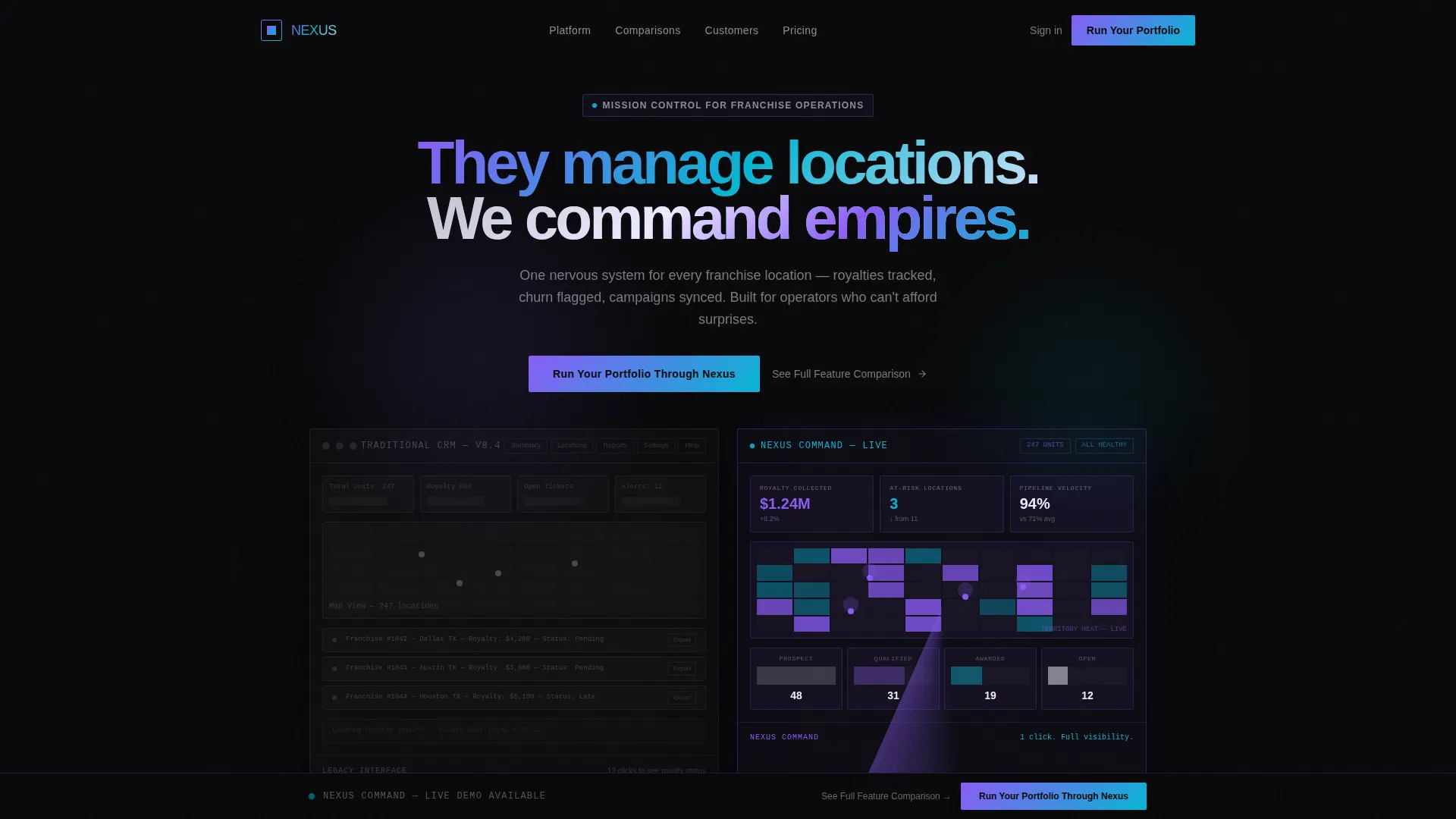
- A Dark Glass Panels hero with two frosted-glass dashboard panels, a parallax tilt effect on mouse movement, and a chrome headline
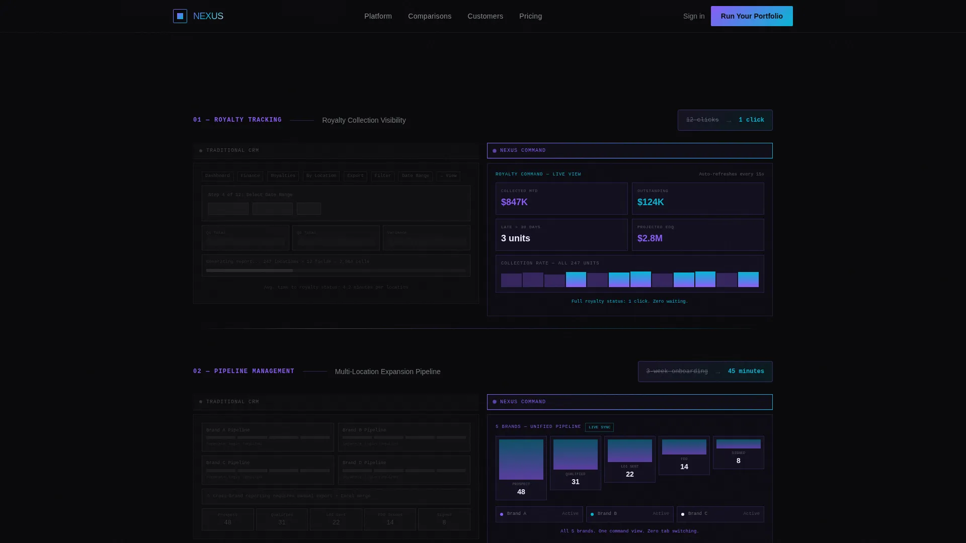
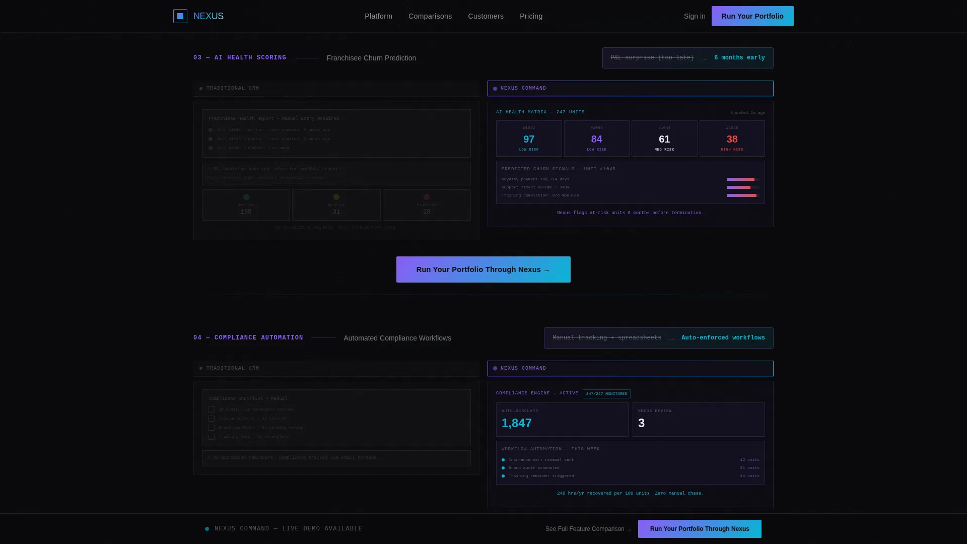
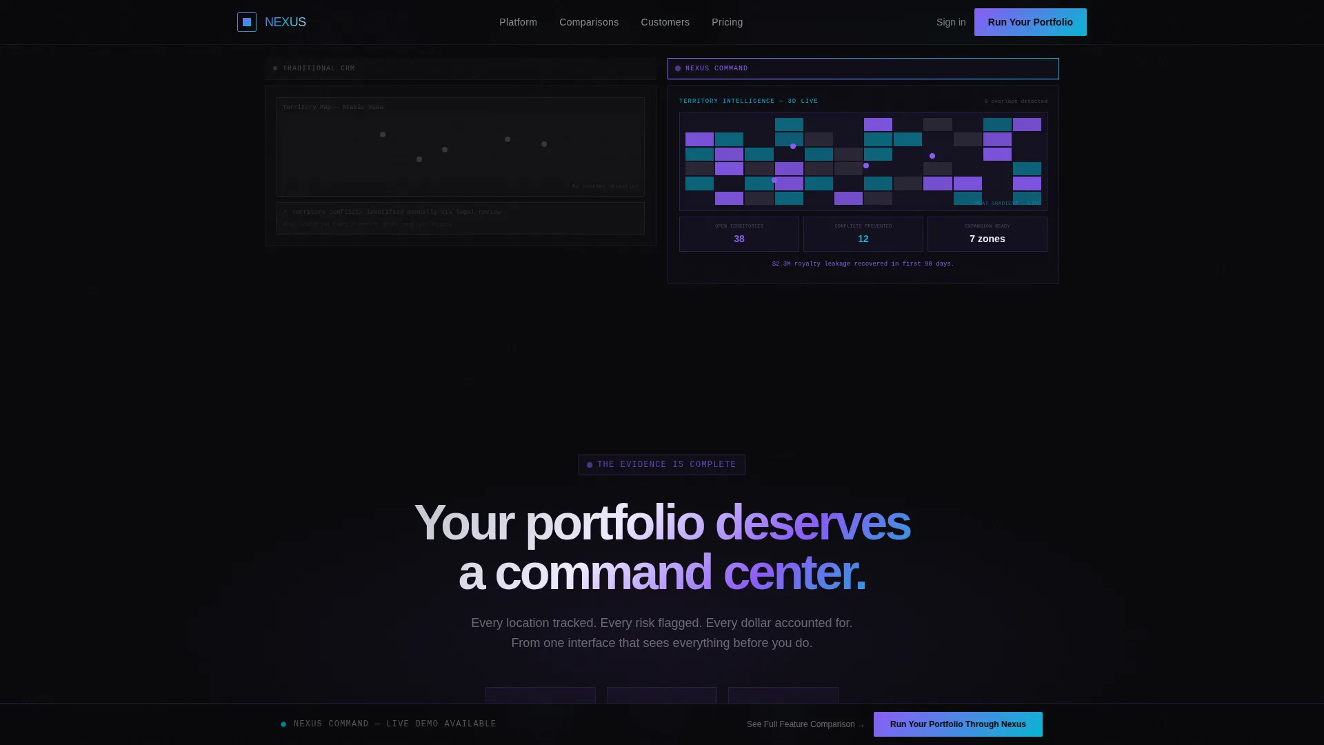
- Five sequential split-screen comparison sections covering royalty tracking, pipeline management, AI health scoring, compliance workflows, and territory intelligence
- A two-step primary conversion form with a unit-count slider, a competitor dropdown, and multi-select pain-point chips, plus a secondary PDF gate modal
Feature list
This section covers the core capabilities built into the Nexus template. Each one is grounded in the source brief and delivers a specific function for the page.
Split-Screen Comparison Layout
Every scroll section divides the viewport into two equal halves. The left side shows the traditional franchise CRM approach in muted chrome wireframes. The right side shows the Nexus equivalent in full iridescent detail. A brutalist horizontal rule and a single stat callout anchor each comparison row.
Dark Glass Panels Hero
The header splits the viewport into two frosted-glass rectangles floating over a pure black field. Each panel displays a different franchise dashboard view. Both panels respond to mouse movement with a subtle parallax tilt, creating the impression of physical glass cards hovering in space.
Two-Step Conversion Form
The primary call to action opens a two-step form. Step one captures franchise unit count via a slider from 10 to 1,000 or more, current CRM via a competitor dropdown, and biggest operational pain point via multi-select chips. Step two collects name, work email, and phone number.
Secondary PDF Gate Modal
Visitors who are not ready for a demo can click a secondary path to download a full feature comparison document. The modal requires only an email address, catching high-intent visitors earlier in their decision process.
Pinned Call-to-Action Bar
After the third comparison section, the primary call-to-action button pins to the bottom of the viewport. It stays visible as the visitor continues scrolling, keeping the conversion path accessible at every stage of the page.
Animated Scroll-Triggered Reveals
Scroll-triggered animations activate section content as it enters the viewport. Floating card parallax, spinning border beams, and marquee-style social proof scrollers are included. All animations rely on CSS transforms and Intersection Observer for smooth performance without heavy libraries.
Page sections overview
| Section | Purpose |
|---|---|
| Hero Glass Panels | Introduce the platform with two side-by-side frosted-glass dashboard previews and a bold chrome headline |
| Royalty Tracking Comparison | Show 12-click legacy flow versus one-click Nexus royalty tracking with a brutalist stat callout |
| Pipeline Management Comparison | Contrast scattered tab-based pipeline management with monolithic column pipeline stages |
| AI Health Scoring | Compare churn-prediction wireframes with live franchisee health score blocks |
| Territory Intelligence | Set a generic pin map against a heat-gradient 3D territory overlay |
| Primary call to action Form | Capture leads with a two-step form after the third comparison row |
| PDF Gate Secondary Path | Catch mid-funnel visitors with a downloadable feature comparison behind an email gate |
| Footer | Display a linear single-row footer pattern |
Design & branding system
The visual identity follows a Bold Brutalist theme with an AI Iridescent color system. The palette is designed to feel like the hood of a concept car in a dark showroom: surfaces that shift between purple and teal depending on the angle, set against matte black that absorbs everything around it.
- Core colors: void black (#09090B) as the dominant background, liquid chrome (#C0C4CC) for structural typography and dividers, holographic violet (#8B5CF6) shifting into electric cyan (#06B6D4) on gradients and hover states, and iridescent white (#F0EAFF) for key data callouts
- Typography: Manrope for large display headlines and DM Sans for body copy and interface labels; text is white or chrome, never soft gray
- Backgrounds stay in the void; chrome and iridescence appear on borders, data highlights, and interactive elements only
Mobile & speed optimization
The template is built desktop-first, reflecting the reality that franchise directors and operations vice presidents work at large screens where complex dashboards require full real estate. The animation and interaction layer is designed to stay performant under that constraint.
- All animations use CSS transforms only, avoiding heavy JavaScript libraries that would slow initial load
- Scroll-triggered section reveals use Intersection Observer, keeping the page responsive as content enters the viewport
- The pinned call-to-action bar and two-step form are structured for clean desktop interaction without layout breakage
How this template helps you convert
The Nexus template is built around a Comparison/Versus conversion strategy. Every design decision pushes the visitor toward one conclusion: the gap between legacy tools and this platform is too large to ignore.
- The five sequential comparison sections build cumulative pressure, with each row adding a new stat that makes the status quo less defensible and the switch more urgent
- The pinned call-to-action button stays in view from the third comparison section onward, so the moment a visitor reaches their decision point, the next step is already visible
- The secondary PDF gate captures visitors who need more evidence before committing to a demo, turning a soft exit into a qualified lead with a single email
Other information about this template
This template is designed for B2B software-as-a-service companies in the franchise vertical. It reflects an enterprise command-center aesthetic suited to high-stakes sales conversations with senior decision-makers.
- The template includes role-specific social proof in a marquee scroller format, with metric-backed testimonials such as $2.3 million in royalty leakage recovered in 90 days
- The page follows a linear single-row footer pattern as specified in the layout brief
- The localization is set to English, United States dollar formatting, and United States date format
- Typography and color choices are intentionally high-contrast and assertive, reinforcing the platform's positioning as a command-and-control tool rather than a friendly dashboard
Theme
Bold Brutalist
Creative direction
Feature Matrix
Color system
AI Iridescent
Style
Split Screen (50/50)
Direction
Comparison/Versus
Page Sections
Split-screen Comparison Layout
Dark Glass Panels Hero
Two-step Conversion Form
Secondary PDF Gate Modal
Pinned Call-to-action Bar
Animated Scroll-triggered Reveals
Related questions
Who is this landing page template designed for?
What conversion paths does the template include?
Is this template suitable for a desktop-first audience?
How many comparison sections are included in the page?
Can I adapt this template for a different software category?



