Instant Telecom Solutions Landing Page Template
Portal is a self-service telecom management landing page template built for B2B SaaS teams targeting IT directors and operations managers. It combines an animated dashboard hero, a three-column comparison table, a flip-card feature strip, a live ROI calculator, and a progressive lead form into one high-converting single-page experience designed to replace carrier hold queues and spreadsheet chaos.
by Rocket studio
Quick summary
Portal is a single-page, lead generation landing page template for telecom software companies. It positions a self-service portal product against legacy carrier portals and manual spreadsheet tracking through a structured comparison table layout. The page guides IT directors and operations managers from curiosity to demo request, using animated data visuals, flip-card feature callouts, and a progressive three-field lead capture form.
Who this template is for
This template is purpose-built for telecom software vendors and SaaS teams whose customers manage large numbers of mobile lines inside complex organizations. The landing page speaks directly to the people who feel the daily friction of carrier hold queues and fragmented billing reports.
- IT Directors overseeing 200 or more mobile lines across distributed field teams who need one screen to manage every user account, every plan tier, and every billing cycle without calling a carrier agent.
- Operations Managers tracking data overages in spreadsheets, who need real time visibility into voice, SMS, and data consumption across every department.
- Procurement Leads who need a clear approval process for hardware upgrades before quarterly budget cycles close, and who evaluate vendors based on ROI evidence before booking a demo.
What problem this template solves
Telecom software landing pages often fail because they lead with feature lists instead of contrast. End users visiting a generic product page cannot immediately see why the self-service portal beats what they already use. This template solves that by making the comparison the hero of the page.
- Legacy carrier portals and spreadsheet management hide the cost of manual work. This landing page surfaces that cost visually, so visitors can determine the value gap before they ever speak to a sales agent.
- IT teams often land on a software site and leave without converting because no single screen shows them what changes. The animated dashboard mock and flip-card feature strip give end users a concrete preview of the portal experience, reducing the gap between curiosity and demo request.
- The progressive lead form reduces form friction by asking only three fields: line count, current carrier, and work email. This structure helps the business qualify visitors by category without overwhelming a new user on first contact.
What you get with this template
This portal self service telecom management landing page template delivers a fully structured, single-page layout with six purpose-built sections. Every section has a defined role in moving visitors from awareness to action. The self-service portal product is the hero at every scroll depth.
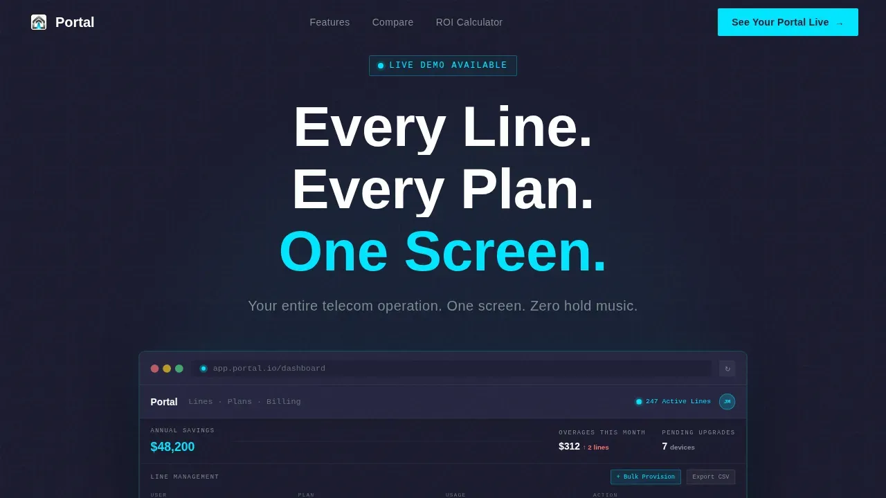
- An animated hero section with a browser-frame dashboard mock rendered at 80 percent scale, complete with animated cursor interactions, a usage bar that fills in real time, and a cost-savings counter that ticks upward as the page loads.
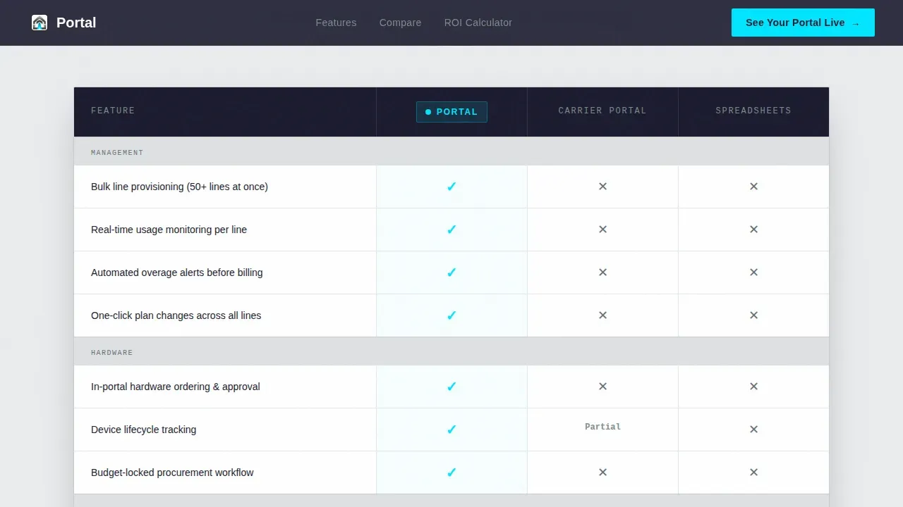
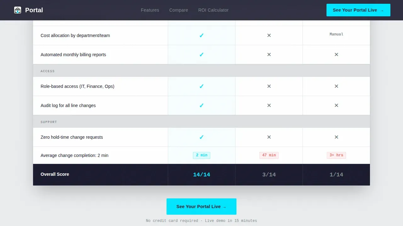
- A three-column comparison table pitting the self-service portal experience against legacy carrier portals and spreadsheet management, with cyan checkmarks for portal capabilities and muted titanium marks for gaps in the alternatives.
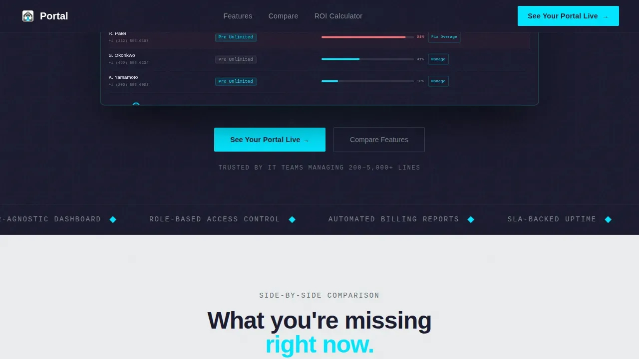
- A horizontal flip-card feature strip, an ROI calculator with animated savings output, a progressive three-field lead form with a secondary PDF call-to-action path, and a sticky bottom bar that keeps the primary call to action visible after visitors scroll past the comparison table.
Feature list
This template packages a set of core features that work together to convert informed IT buyers. Each section earns the next click by building on the evidence presented before it.
Animated Dashboard Hero
The hero section displays a functioning mock of the self-service portal dashboard inside a browser frame at 80 percent scale. An animated cursor toggles a line from one plan tier to another. A usage bar fills in real time. A cost-savings counter animates upward. End users see the portal in motion before reading a single word of copy, which makes the value of the self-service experience immediately tangible. No stock photography, no illustration. The product itself is the hero on this landing page.
Three-Column Comparison Table
The comparison table is the structural centerpiece of this landing page. It places the self-service portal directly beside legacy carrier portal experiences and manual spreadsheet management. Cyan checkmarks mark portal capabilities. Muted titanium markers identify gaps in the alternatives. This layout lets IT directors and operations managers evaluate the full gap in self-service options at a glance, without relying on marketing language. The table is the proof layer that earns the call-to-action click.
Flip-Card Feature Strip
Below the comparison table, a horizontal feature strip scrolls across the screen. Each card displays a single self-service capability: bulk line provisioning, real time overage alerts, one-click hardware orders. On hover, each card flips to reveal a supporting stat, for example "Avg. 14 min saved per change request." This format keeps momentum moving and gives end users concrete performance signals tied to real workflow improvements, rather than abstract feature descriptions.
Live ROI Calculator
The ROI calculator invites visitors to input their line count and current carrier, then animates a projected annual savings figure upward in real time. This interactive section connects the self-service portal value proposition directly to the visitor's own organization. IT stakeholders and procurement leads can see a cost projection tied to their specific data before they commit to a demo. The calculator output serves as implicit social proof built from the visitor's own inputs.
Progressive Lead Capture Form
The lead form uses a three-step progressive structure. The first field asks for company line count via a dropdown covering 50 to 100, 100 to 500, and 500 or more lines. The second field captures the visitor's current carrier. The third captures a work email. This sequence qualifies every lead by category before a sales agent ever makes contact. A secondary call-to-action path offers a gated PDF guide for visitors who are not ready to book a demo, keeping self-service options available for every stage of the buyer journey.
Sticky Call-to-Action Bar
After visitors scroll past the comparison table, a sticky bottom bar appears and stays fixed on screen. The primary call to action reads "See Your Portal Live." This persistent element ensures that any visitor who reaches the ROI calculator or lead form section can immediately access the demo request path without scrolling back to the top of the landing page. The sticky bar disappears cleanly on mobile to preserve screen space.
Page sections overview
| Section | Purpose |
|---|---|
| Animated Hero Dashboard | Display the portal in motion inside a browser frame to create immediate product understanding |
| Comparison Table | Contrast self-service portal against legacy carrier portals and spreadsheet tracking |
| Flip-Card Feature Strip | Deliver rapid self-service capability cards with hover-reveal performance stats |
| Live ROI Calculator | Let visitors input their line count and watch projected savings animate in real time |
| Progressive Lead Form | Capture qualified leads across three fields with a secondary PDF download path |
| Sticky call to action Bar | Keep the primary demo request call to action visible after the comparison table scroll point |
Design & branding system
The visual identity follows a Startup Velocity theme built on a Monochrome Steel color system. The aesthetic is deliberately machined and functional. Every color has a fixed role. Decoration is removed. The result feels like the inside of a precision-engineered device, which aligns the brand perception of the self-service portal product with the expectations of IT buyers who trust systems that look like they were built to perform.
- Color roles: Forge black (#1A1A2E) for primary backgrounds, panel white (#EAECEE) for alternating section breaks, brushed titanium (#7F8C8D) for subheadings and divider lines, and electric cyan (#00E5FF) reserved exclusively for interactive states, call-to-action buttons, comparison table checkmarks, and the sticky bar primary action.
- Typography: DM Sans handles all display and body text. JetBrains Mono is used for data values, stats, calculator outputs, and code-style numbers throughout the portal landing page, reinforcing the data-first identity that IT users expect.
- Dark mode visual register: The forge black primary background gives the landing page a dark mode feel by default. Alternating panel white sections create hard visual breaks, and the cyan accent fires only when an element is live or clickable, training the user's eye to locate actions without cognitive effort.
Mobile & speed optimization
This landing page is built desktop-first, reflecting the primary audience of IT directors working at workstations. However, the layout includes a mobile responsive fallback that preserves the full self-service portal message across screen sizes. Mobile-first responsive design is a recognized standard for telecom product pages because many end users review services on smartphones before escalating decisions to desktop.
- Desktop-first layout with responsive fallback: The animated dashboard hero, comparison table, and flip-card strip are optimized for large screens. On smaller screens, the layout reflows to preserve readability and keep the call-to-action path accessible.
- Performance architecture: Static sections use Server Components for fast initial render. Interactive elements including the ROI calculator, flip cards, and progressive form use Client Components to isolate interactivity without affecting static content load.
- Sticky bar behavior on mobile: The sticky call-to-action bar is conditionally hidden on very small screens to protect screen real estate, ensuring end users on mobile devices can still read and scroll the landing page without a persistent overlay consuming usable space.
How this template helps you convert
This landing page is structured around a conversion logic sequence: show the product, prove the gap, quantify the value, then capture the lead. Each section earns the next. Visitors do not reach the form until they have already seen the comparison evidence and calculated their own projected savings.
- The comparison table earns the click. By the time visitors reach the sticky call-to-action bar, they have already evaluated the self-service portal against legacy carrier services and spreadsheet workflows. The decision is largely made before a form field appears. This structure reduces the sales resistance that generic software landing pages create when they lead with forms.
- The ROI calculator creates personal investment. When a visitor inputs their own line count and watches projected annual savings animate upward, the portal's cost advantage becomes specific to their organization. This personalized output gives IT stakeholders a number they can share with their own department heads and budget stakeholders before the demo call.
- The secondary PDF path keeps self-service options open. Not every visitor is ready to book a demo. The gated "IT Director's Switching Guide" PDF offer captures contact details from visitors earlier in the decision cycle, expanding the addressable lead pool without compromising the primary conversion path.
Other information about this template
This template is designed to support the full lifecycle of a new portal launch campaign. From the first planning and requirements gathering stage through design, prototyping, development and testing, deployment and launch, and ongoing maintenance, the landing page structure can align with each phase of a self-service portal rollout. The page is built to serve as a robust self-service landing page that deflects inbound calls from human agents, reducing support volume from day one.
- The template's knowledge base section integration points enable teams to surface a quick search bar and link out to knowledge base articles, so end users and existing users can find answers independently without contacting a support agent.
- The financial overview section mock inside the hero dashboard displays recent invoice amounts, due dates, and a visible 'Pay Now' button, giving potential customers a realistic preview of the portal's billing management capabilities. Dynamic usage dashboards show visual charts for voice, SMS, and data consumption, reinforcing the self-service portal's role as a centralized command center.
- Role-based personalization signals in the copy and dashboard mock address both IT administrators managing hundreds of lines and individual end users managing a single user account, helping the page connect with every visitor type. The portal's active subscriptions summary, service health status indicators for network and voice, and the quick search bar are all represented in the dashboard mock to communicate the breadth of self-service options available.
- Security signals including references to Single Sign-On (SSO) and Multi-Factor Authentication (MFA) can be incorporated into the portal description sections, reassuring buyers that sensitive customer data is handled with appropriate access controls. The template's copy framework is designed to help telecom companies differentiate from competitors by making self-service capability the central proof point of every section on the landing page.
- AI-powered virtual agent capabilities and ticket routing logic can be referenced in the knowledge base and support sections of the portal landing page, covering how automated ticket creation, agent-assist features, and smart categorization of requests reduce manual work for help desk teams. Automation triggers that handle repetitive tasks allow the team to focus on more complex issues, and referencing self-service help center data showing 20 percent or greater support volume reduction gives visitors a credible benchmark.
- The template supports modern user interface principles throughout, with a minimalist interface designed to reduce cognitive load. The modern ui approach, combined with the Monochrome Steel color system and DM Sans typography, creates a portal site that feels engineered rather than decorated. The new portal landing page experience can be deployed quickly, making it suitable for teams that need to go live before a product launch or quarterly sales cycle begins.
Theme
Startup Velocity
Creative direction
Launch Energy
Color system
Monochrome Steel
Style
Comparison Table
Direction
Lead Generation
Page Sections
Animated Dashboard Hero Section
Three-column Comparison Table
Flip-card Feature Strip
Live ROI Calculator
Progressive Three-field Lead Form
Sticky Call-to-action Bar
Related questions
Who is this landing page template designed for?
Does this template include the ROI calculator functionality?
Can I adapt the comparison table for my own portal's features?
What happens to visitors who are not ready to request a demo?
Is this landing page optimized for both desktop and mobile users?



