Complete Dental Software Cost Estimator Website Template
Chairside is a dental project management landing page template built for practices that run on case volume and chair time. It leads with a live metrics header and a functional ROI calculator, then earns trust through a detailed comparison table. The two-field signup form keeps friction low. Every section is designed around the real workflows of dental operations teams.
by Rocket studio
Quick summary
Chairside is a single-page landing page template purpose-built for dental project management software. It opens with an animated stats dashboard, drops visitors immediately into a personalized ROI calculator, and flows into a feature-by-feature comparison table. The design is surgical and minimal. The conversion path is deliberate and low-friction.
Who this template is for
This template speaks directly to dental operations professionals who live inside practice management workflows every day. It is built for teams where case visibility and chair utilization are measured in dollars, not just minutes.
- Multi-location dental service organization (DSO) operations managers tracking lab cases across many chairs
- Solo practitioners replacing manual crown-track-deliver spreadsheets with a cleaner system
- Office managers who have patched together generic tools and still lose cases in the handoff gaps
What problem this template solves
Dental practices lose revenue when lab cases slip, chairs sit idle, and no single view shows what is happening across every operatory. Generic project management tools do not speak the language of dental workflows. This template is designed to show potential users exactly how that gap costs them money, before asking them to sign up.
- Spreadsheet-dependent tracking creates blind spots in multi-chair and multi-location practices
- Generic software tools lack the specific workflow rows that dental teams actually need
- Visitors need to see their own numbers before they trust a new platform enough to try it
What you get with this template
This template delivers a complete, structured landing page layout designed around a clear conversion sequence. Every section earns the next one, and the design system keeps nothing on screen that does not serve the visitor.
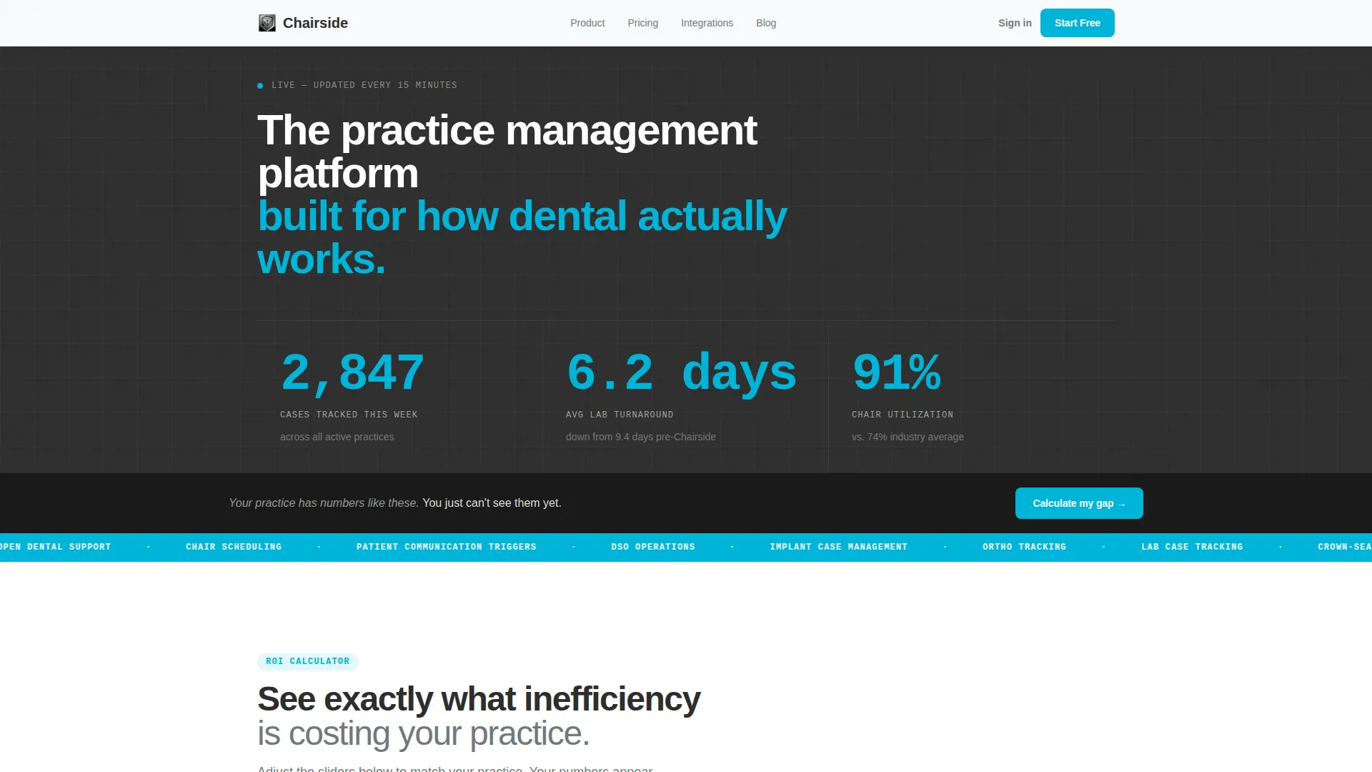
- An animated metrics header with live-style statistics rendered in oversized monospaced type
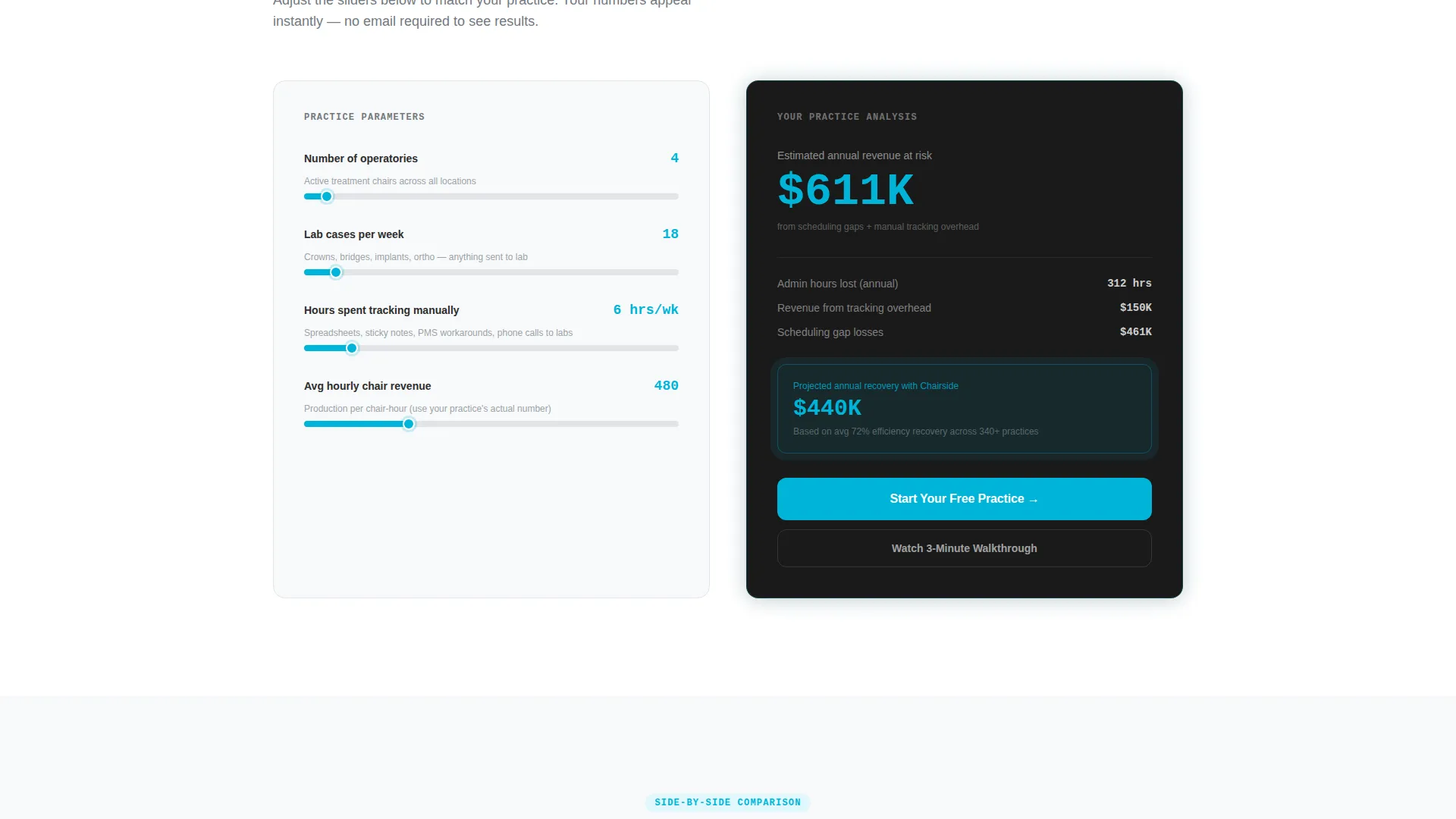
- A fully structured ROI calculator section with three inputs and a personalized output panel
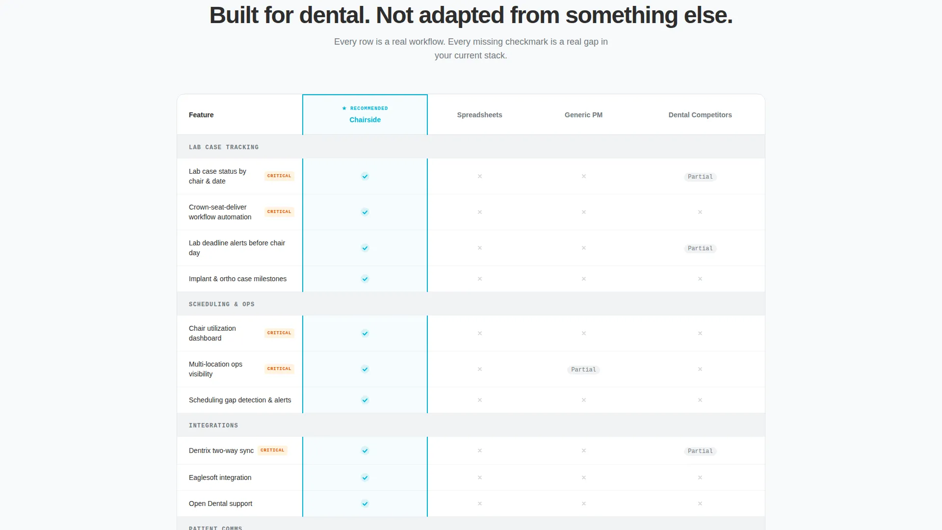
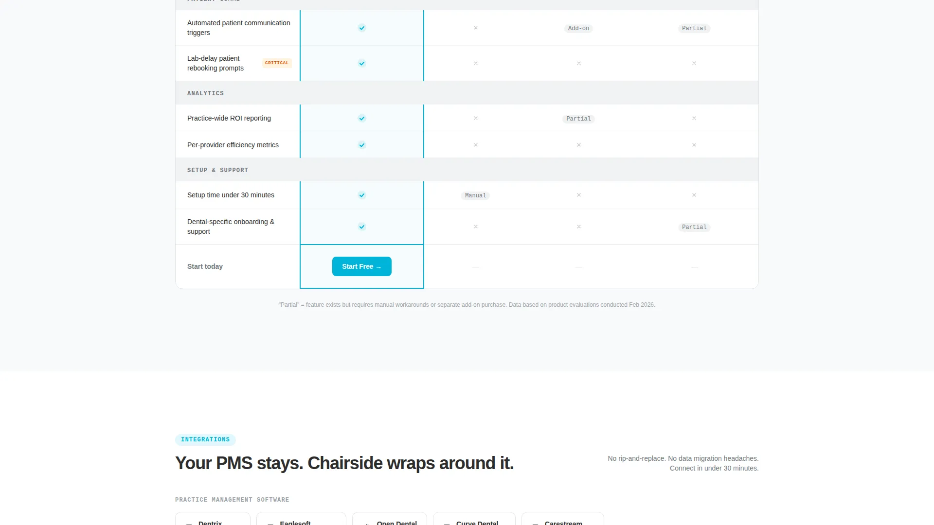
- A feature comparison table covering real dental workflow rows with clear visual checkmarks
- A two-field freemium signup form and a secondary gated-video call to action
Feature list
This template includes purpose-built sections and design elements grounded in the specific demands of dental practice operations.
Animated Stats Dashboard Header
The header displays three key performance metrics in real time: cases tracked, average lab turnaround in days, and chair utilization percentage. Numbers tick upward with subtle easing animations, rendered in oversized monospaced type against a dark autoclave charcoal background. No stock photography. No illustrations. Just live data.
Interactive ROI Calculator
Before asking for anything, the page drops visitors into a calculator with three inputs: number of operatories, average cases per week, and estimated hours spent on manual tracking. The tool returns a personalized lost-revenue figure and a projected efficiency gain. The primary call to action appears directly inside the results panel, next to the visitor's own number.
Detailed Comparison Table
The comparison table is the structural centerpiece of the page. It stacks checkmarks across four columns: Chairside, spreadsheets, generic project management tools, and dental-specific competitors. Each row maps to a real workflow need, including lab case tracking, patient communication triggers, multi-location visibility, and practice management software integration.
Freemium Signup Form
The primary conversion form asks for only two pieces of information: email address and current practice management software selection from a dropdown. No credit card is required. This keeps the barrier to entry as low as possible while capturing the one data point needed to personalize onboarding.
Gated Video Secondary call to action
A secondary call to action labeled "Watch a 3-Minute Walkthrough" captures visitors who are not yet ready to sign up. Access is gated behind an email field, giving the platform a second conversion path for mid-funnel visitors who need more context before committing.
Monochrome Steel Visual System
The entire page uses a four-tone color palette of surgical steel, autoclave charcoal, composite white, and a single curing-light blue accent. Blue is reserved strictly for interactive elements, active states, and primary calls to action. The result is a layout that reads as organized and credible without any visual noise.
Page sections overview
| Section | Purpose |
|---|---|
| Stats Dashboard Header | Display live-style practice metrics to establish immediate platform credibility |
| ROI Calculator Panel | Let visitors calculate their own revenue loss and efficiency gain before seeing any sales message |
| Calculator Results Panel | Deliver personalized output and surface the primary signup call to action in context |
| Comparison Table | Show feature-by-feature advantages across four product columns using dental workflow rows |
| Freemium Signup Form | Convert ready visitors with a two-field, no-credit-card form |
| Gated Video call to action | Capture mid-funnel visitors through a short walkthrough video behind an email gate |
Design & branding system
The visual identity follows a Startup Velocity theme expressed through a Monochrome Steel color system. Every design decision reinforces the feeling of a clean, zeroed-out instrument tray: organized, purposeful, and nothing wasted.
- Four-tone palette: surgical steel (#71797E), autoclave charcoal (#2D2D2D), composite white (#F8F9FA), and curing-light blue (#00B4D8)
- Curing-light blue is reserved exclusively for interactive elements, active states, and primary calls to action
- Oversized monospaced typography carries the header metrics, reinforcing the dashboard aesthetic throughout
Mobile & speed optimization
The layout is structured to render cleanly at every common screen size, from desktop dashboards to mobile devices used chairside during a patient appointment.
- The calculator inputs and results panel are laid out to reflow cleanly on smaller screens
- The comparison table is structured to scroll horizontally on mobile without losing column context
- The minimal color system and absence of decorative imagery keep the visual load light across all viewports
How this template helps you convert
The conversion architecture in this template is sequenced intentionally. Each section earns the visitor's attention before the next asks for anything in return.
- The animated metrics header creates immediate credibility by showing real operational numbers rather than marketing claims, so the visitor arrives with context rather than skepticism.
- The ROI calculator personalizes the value proposition before any product pitch appears. By the time the visitor sees the comparison table and signup form, they have already calculated their own number.
- The dual call-to-action structure serves two visitor types at once: those ready to start a free practice account and those who want a short walkthrough first, reducing drop-off at both ends of the decision curve.
Other information about this template
This template is built as a single landing page and does not include multi-page navigation or an internal blog structure. It is designed for a software product operating on a freemium or free-trial acquisition model.
- The template style is a Comparison Table landing page under the Startup Velocity theme
- The header concept is a Stats and Metrics dashboard with animated number counters
- The creative direction is Calculator and Tool First, placing the interactive element above the product pitch
- The landing page direction is Freemium and Trial, with the primary call to action reading "Start Your Free Practice"
- The color system is Monochrome Steel with a single blue accent, consistent with clinical and technical software aesthetics
- This template is well suited to dental software products that need to demonstrate workflow specificity and operational ROI to a skeptical, spreadsheet-dependent audience
Theme
Startup Velocity
Creative direction
Calculator/Tool First
Color system
Monochrome Steel
Style
Comparison Table
Direction
Freemium/Trial
Page Sections
Animated Metrics Dashboard Header
Interactive ROI Calculator
Feature Comparison Table
Two-field Freemium Signup Form
Gated Video Secondary Call to Action
Related questions
Does this template include a working ROI calculator section?
How many fields does the signup form include?
Is this template suitable for a multi-location dental group?
What does the secondary call to action do?
Is Chairside a single landing page or a full website?



