Live API Docs Landing Page Template
Endpoint is a dark-mode API documentation landing page template built for developer-facing products. It pairs a live request builder with a modular card grid layout, letting visitors test real endpoints before signing up. The Electric Indigo color system and monospace typography give it the feel of a precision dev tool from the first scroll.
by Rocket studio
Quick summary
Endpoint is a single-page landing page template for REST API documentation platforms. It opens with a credibility-building logo ribbon, drops visitors straight into a live API request builder, then fans out into a modular card grid showcasing key capabilities. The design feels like a dark-mode IDE: fast, focused, and built to convert developers into signups.
Who this template is for
This template is built for teams and founders who ship developer-facing products and need a docs landing page that earns trust immediately. If your onboarding drop-off happens on the documentation page, this template addresses that directly.
- Backend engineering leads at mid-stage startups shipping public APIs
- DevRel teams at infrastructure companies moving away from static Markdown files
- Solo founders whose user drop-off is tied to a weak or confusing docs experience
What problem this template solves
Most API documentation pages are walls of static text. Developers arrive, scan for a working example, find nothing interactive, and leave. This template replaces that pattern with a live, hands-on first impression.
- Static docs fail to show developers what your API actually does in practice
- High onboarding drop-off caused by docs pages that require signup before showing value
- No clear conversion path from "curious visitor" to "committed user" on typical docs sites
What you get with this template
You get a fully structured, single-page landing page template designed specifically for REST API documentation platforms. Every section is modular and purpose-built for developer audiences.
- A live API request builder card that lets visitors send mock requests without signing up
- A modular card grid presenting versioning, code samples, changelog automation, and SDK generation as animated mini-demos
- A two-step progressive lead capture form anchored in a sticky bottom bar that appears after tool interaction
Feature list
This template ships with a tightly composed set of interactive and visual components. Each one is grounded in the brief and designed to serve a developer-first audience.
Live API Request Builder
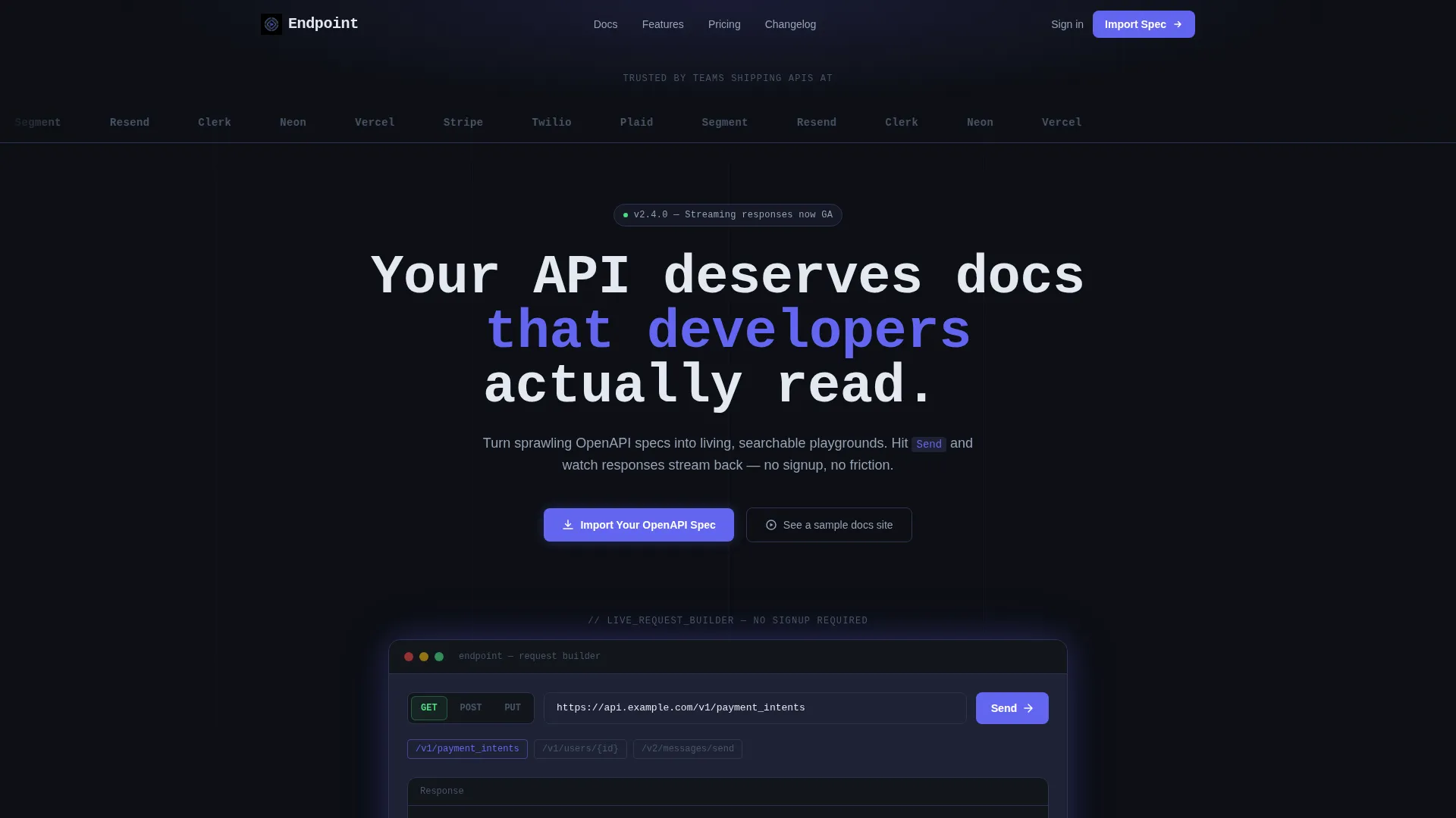
The first card below the header is a functional request builder. Visitors paste a sample endpoint, choose a method from a pill selector (GET, POST, or PUT), and watch a mock response render with syntax highlighting and latency timing. No signup is required to interact.
Logo Bar with Parallax Scroll
The header opens with a horizontal ribbon of API-first company logo silhouettes scrolling with subtle parallax momentum. Each logo dissolves into its own endpoint snippet on hover, establishing platform credibility in under one second.
Modular Capability Card Grid
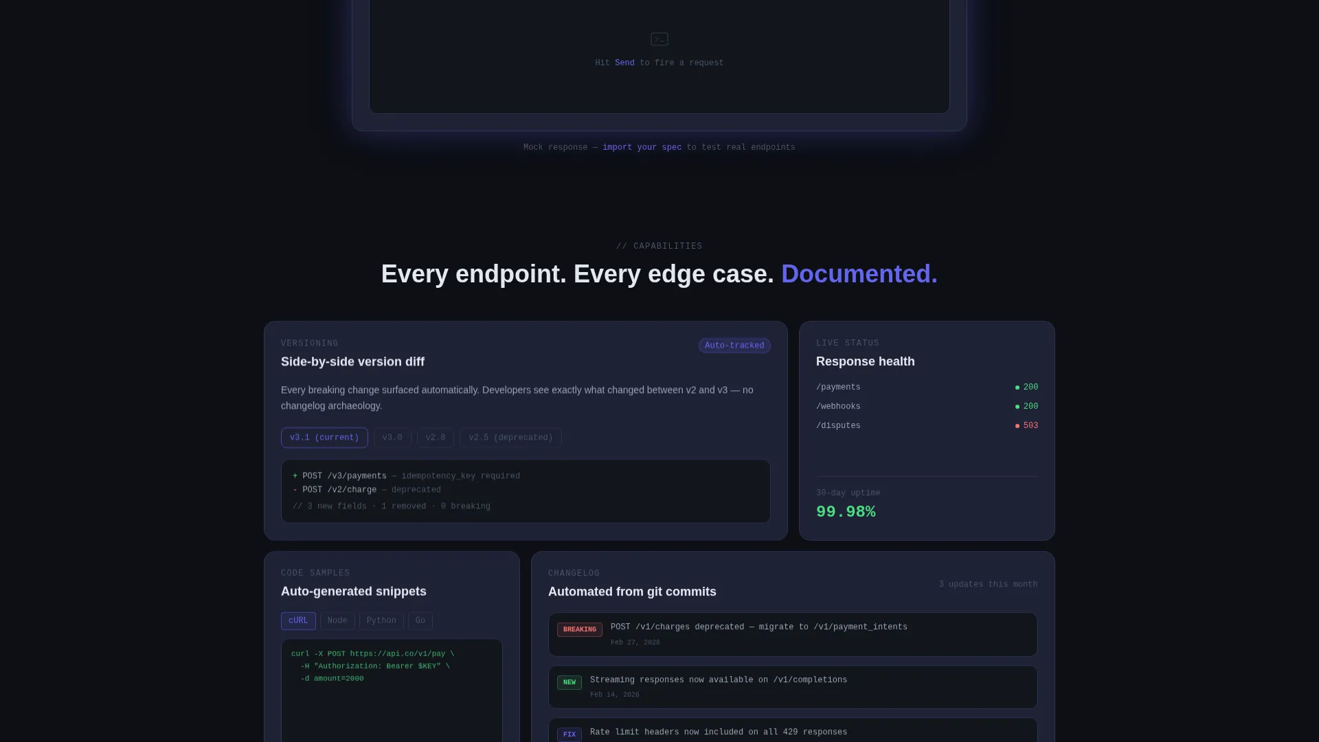
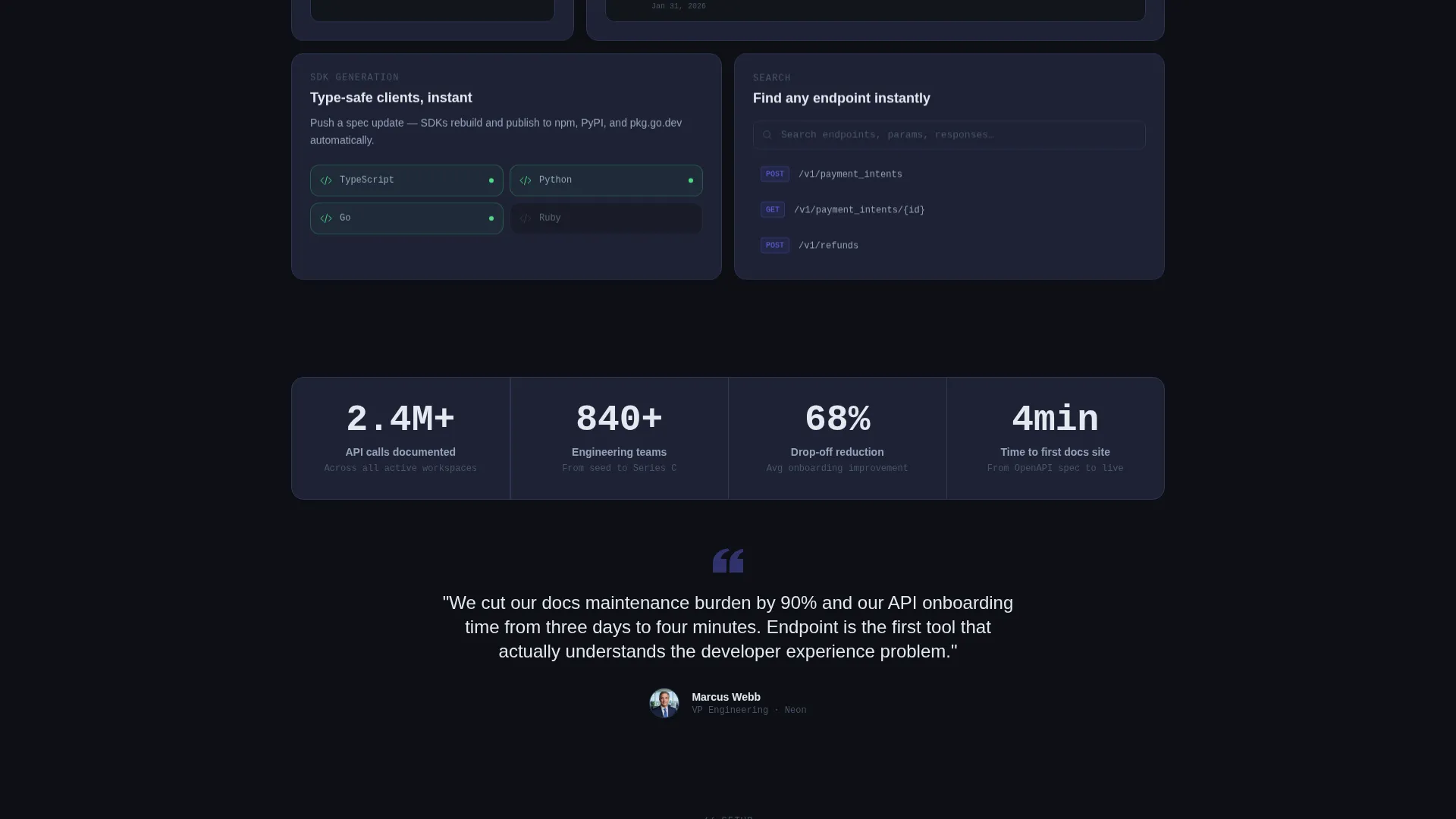
Below the request builder, a card grid presents individual capabilities as mini-demos. Cards tilt on hover, response bodies typewrite in, and status badges pulse, giving each feature its own animated micro-interaction.
Sticky Progressive Lead Capture
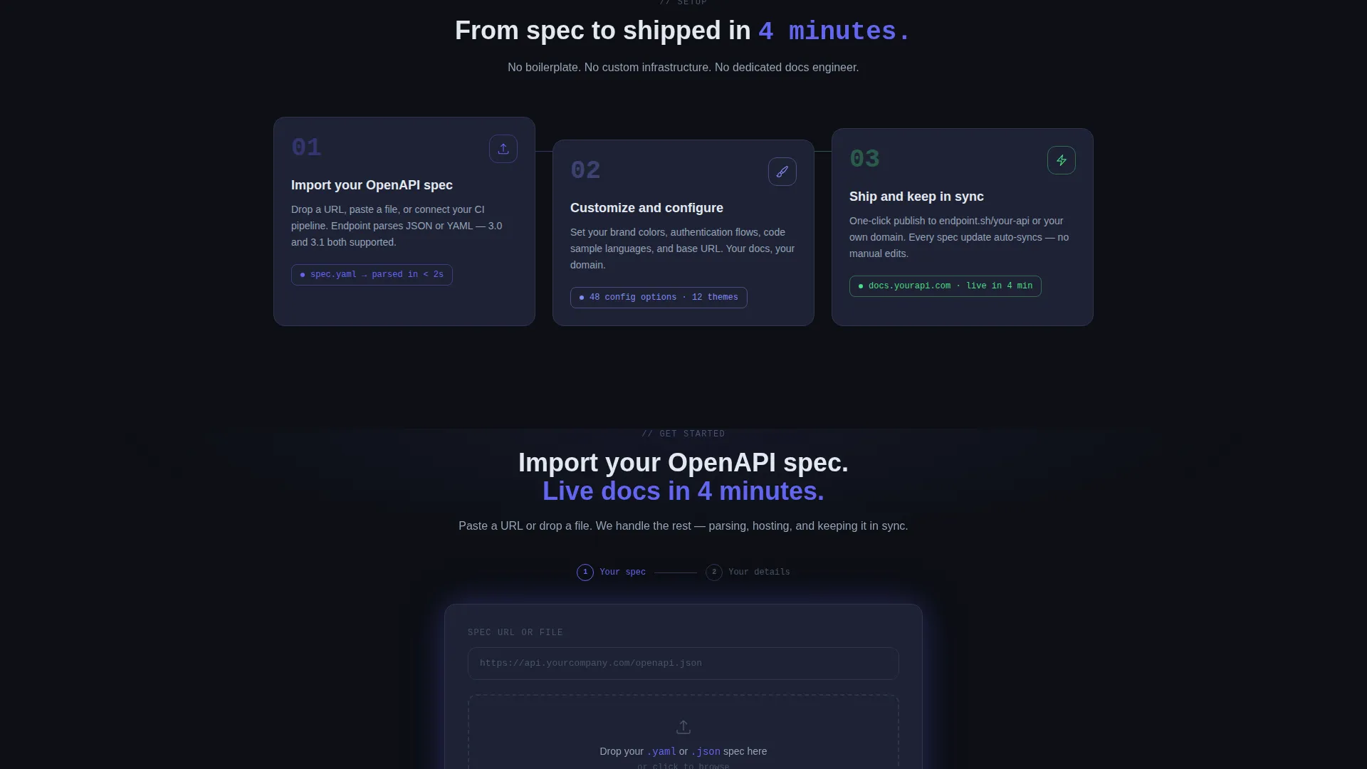
A sticky bottom bar anchors the primary call to action: "Import Your OpenAPI Spec." It appears after the visitor interacts with the live tool. The form uses two-step progressive disclosure, first collecting a spec URL or file upload, then asking for work email, company name, and endpoint count.
Secondary Conversion Path
A "See a sample docs site" link offers a no-form demo for visitors not ready to commit. This path captures retargeting intent without friction, giving hesitant visitors a way to stay engaged.
Monospace Dark-Mode Typography
The headline and all code-adjacent text use a monospace typeface. Combined with the void black background and electric indigo interactive surfaces, the typographic system reinforces the tool-first identity of the platform at a glance.
Page sections overview
| Section | Purpose |
|---|---|
| Logo Bar Ribbon | Establish API-first credibility with recognizable brand silhouettes and hover endpoint reveals |
| Hero Headline | Reframe the docs problem with a single monospace statement before the visitor scrolls |
| Live Request Builder | Let visitors test a mock API call with method selection, syntax highlighting, and latency output |
| Capability Card Grid | Showcase versioning, code samples, changelog automation, and SDK generation as animated demos |
| Sticky call to action Bar | Surface the primary "Import Your OpenAPI Spec" action after tool interaction |
| Progressive Lead Form | Collect spec URL or file upload first, then work email and company details in step two |
| Secondary Demo Link | Offer a no-form sample docs site for visitors not ready to submit a spec |
Design & branding system
The visual identity follows a Dynamic Motion theme built around an Electric Indigo color system. Every color choice has a specific function, keeping the interface precise and free of visual noise.
- Void black (#0D0F14) as the primary background, cool slate (#1E2235) for card faces, and electric indigo (#6366F1) on every interactive surface and hover state
- Phosphor green (#4ADE80) used exclusively for success-state response codes and live status indicators, never decoratively
- Monospace typography throughout headline and code-adjacent text to reinforce the terminal-like, tool-first identity
Mobile & speed optimization
The modular card grid layout is built to reflow cleanly across screen sizes. Interactive components are scoped to their card containers, keeping the layout predictable on smaller viewports.
- Card grid columns collapse progressively so capability demos remain readable on mobile screens
- The sticky bottom bar repositions cleanly at the base of the viewport on all device sizes
- Animated micro-interactions are contained within individual cards, avoiding layout-level reflow on scroll
How this template helps you convert
This template is structured around a "try before you sign up" philosophy. Every section moves the visitor one step closer to submitting their spec or requesting a demo.
- The live request builder creates an immediate hands-on moment, making the product's value tangible before any form appears
- The sticky call to action bar surfaces only after interaction, so the ask feels earned rather than interrupting
- The secondary demo link keeps hesitant visitors engaged by offering a zero-friction path that still builds familiarity with the platform
Other information about this template
This template sits at the intersection of the Documentation and Support category, the API Documentation subcategory, and the REST API Docs niche. It is built for lead generation and uses a Calculator and Tool First creative direction to prioritize hands-on discovery over feature lists.
- Template style is Card Grid (Modular), making it straightforward to reorder or extend capability cards as the product evolves
- The header concept is a Logo Bar, which is a proven credibility pattern for developer tools and API-first platforms
- The theme is Dynamic Motion, expressed through card tilt, typewriter response bodies, and pulsing status badges rather than background animations
- This template is well suited to platforms that want to position themselves alongside recognized API-first tools like Stripe, Twilio, Plaid, and Segment in the minds of developer visitors
Theme
Dynamic Motion
Creative direction
Calculator/Tool First
Color system
Electric Indigo
Style
Card Grid (Modular)
Direction
Lead Generation
Page Sections
Live API Request Builder Card
Parallax Logo Bar Header
Animated Capability Card Grid
Sticky Two-step Lead Capture
Zero-friction Demo Path
Related questions
Does the live request builder require a real backend to work?
Can I add more capability cards to the grid?
What is the two-step progressive form and why does it work that way?
Who should use this template instead of a standard product landing page?
Can the sticky call to action bar label and destination be changed?



