Micro-SaaS & Developer Tools Reviews Website Template
Endpoint is a modular card-grid landing page template built for API documentation generator tools. It pairs a Dashboard Pro theme with a Teal Catalyst color system to showcase live stats, rendered endpoint previews, and progressive feature cards. The layout is engineered to move backend developers and platform teams from first scroll to a single-click signup.
by Rocket studio
Quick summary
Endpoint is a single-page, card-grid landing page template designed for API documentation generator products. It opens with a live stats header, walks visitors through a spec-sheet-style feature walkthrough, and closes with a friction-minimal call to action. The visual identity runs on deep terminal black, active teal, and bright white card surfaces.
Who this template is for
This template is built for developer tool founders and teams who need to present an API documentation generator to a technical audience without losing them in marketing fluff.
- Backend leads at mid-stage startups shipping multiple releases per week
- Platform teams at enterprises managing large collections of internal microservices
- Solo founders whose undocumented API is the last barrier before their first integration partner
What problem this template solves
Most developer tool landing pages either over-promise or under-show. Technical buyers want evidence, not copy. This template solves that gap by making rendered output the centerpiece of every card, so visitors see real documentation before they read a single claim.
- Visitors leave before reaching the call to action because nothing concrete is shown early enough
- Generic layouts fail to communicate the difference between a basic doc generator and a production-ready tool
- High-friction signups with long forms lose developers who are evaluating quickly between tabs
What you get with this template
You get a fully structured, modular landing page that presents your API documentation product the way developers want to see it: as a working system with measurable outputs and a clear path to trying it.
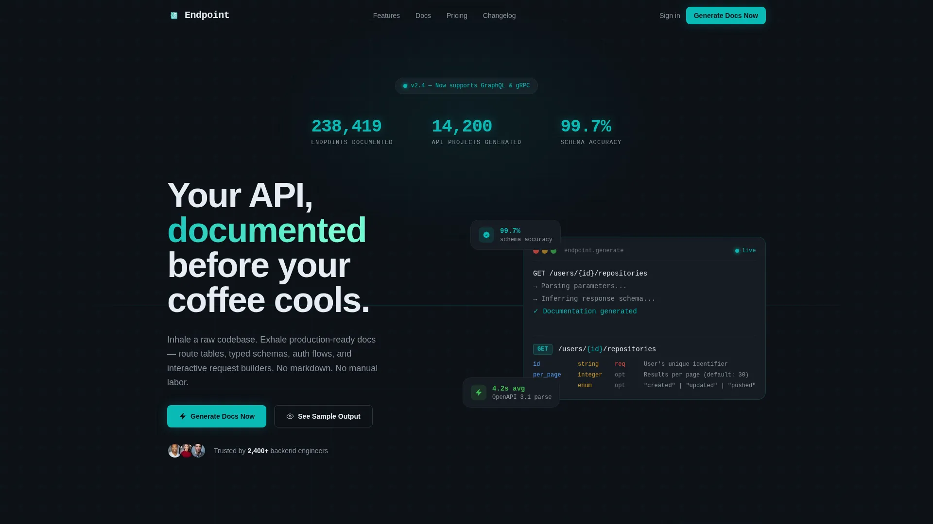
- A live stats header with animated counters and a rendered endpoint card that types itself into view
- A progressive card grid where each row escalates from ingestion through intelligence to output, with real rendered fragments in every card
- A persistent bottom call-to-action bar and a secondary "See Sample Output" path that opens a demo in a new tab
Feature list
This template delivers six purpose-built components drawn directly from the product brief. Each one serves a specific role in converting a skeptical technical visitor into an active trial user.
Live Stats and Metrics Header
The header opens with a dark viewport displaying three animated counters: endpoints documented, API projects generated, and schema accuracy percentage. Numbers render in monospace type, teal on black, and increment with subtle easing animation. Below the counters, a REST endpoint card renders live, complete with method badge, route path, parameter table, and a curl example.
Progressive Spec-Sheet Card Grid
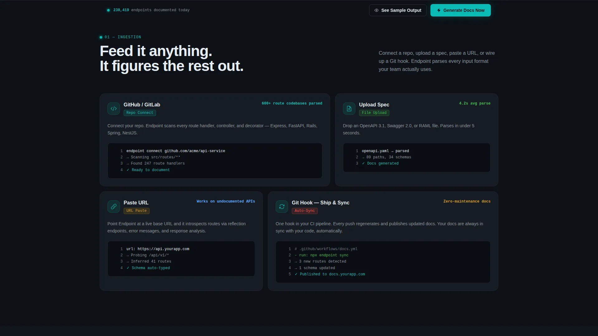
Each modular card is structured as a specification block with input format on the left and output on the right. A key metric anchors every card, for example "Parses OpenAPI 3.1 specs in 4.2s avg." Card rows escalate from basic ingestion through intelligent inference all the way to full output delivery, proving the tool handles complex, undocumented codebases.
Rendered Output Fragments Per Card
Every card in the grid contains a real rendered documentation fragment rather than a placeholder illustration. By the time a visitor reaches the bottom, they have already seen their future documentation across multiple card states, removing the need to take a leap of faith.
Persistent Bottom Call-to-Action Bar
A fixed bottom bar keeps the primary call to action visible throughout the scroll. The button, labeled "Generate Docs Now," is styled in teal on black and routes to a free-tier signup using GitHub OAuth, reducing signup friction to a single authentication step.
Secondary Demo Path
A secondary call to action, labeled "See Sample Output," opens an interactive demo documentation site in a new tab. This gives skeptical leads a way to verify output quality before committing, without any form or additional friction on the main page.
Ingestion-to-Output Flow Layout
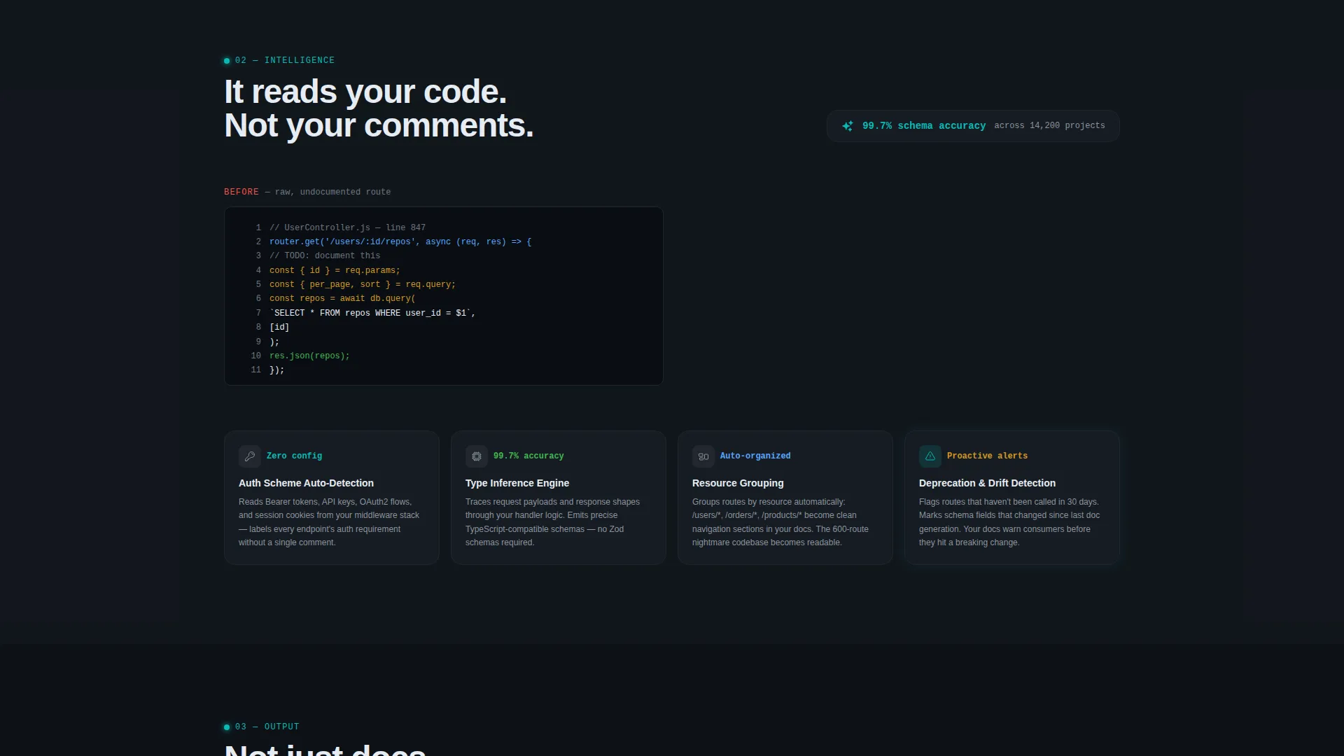
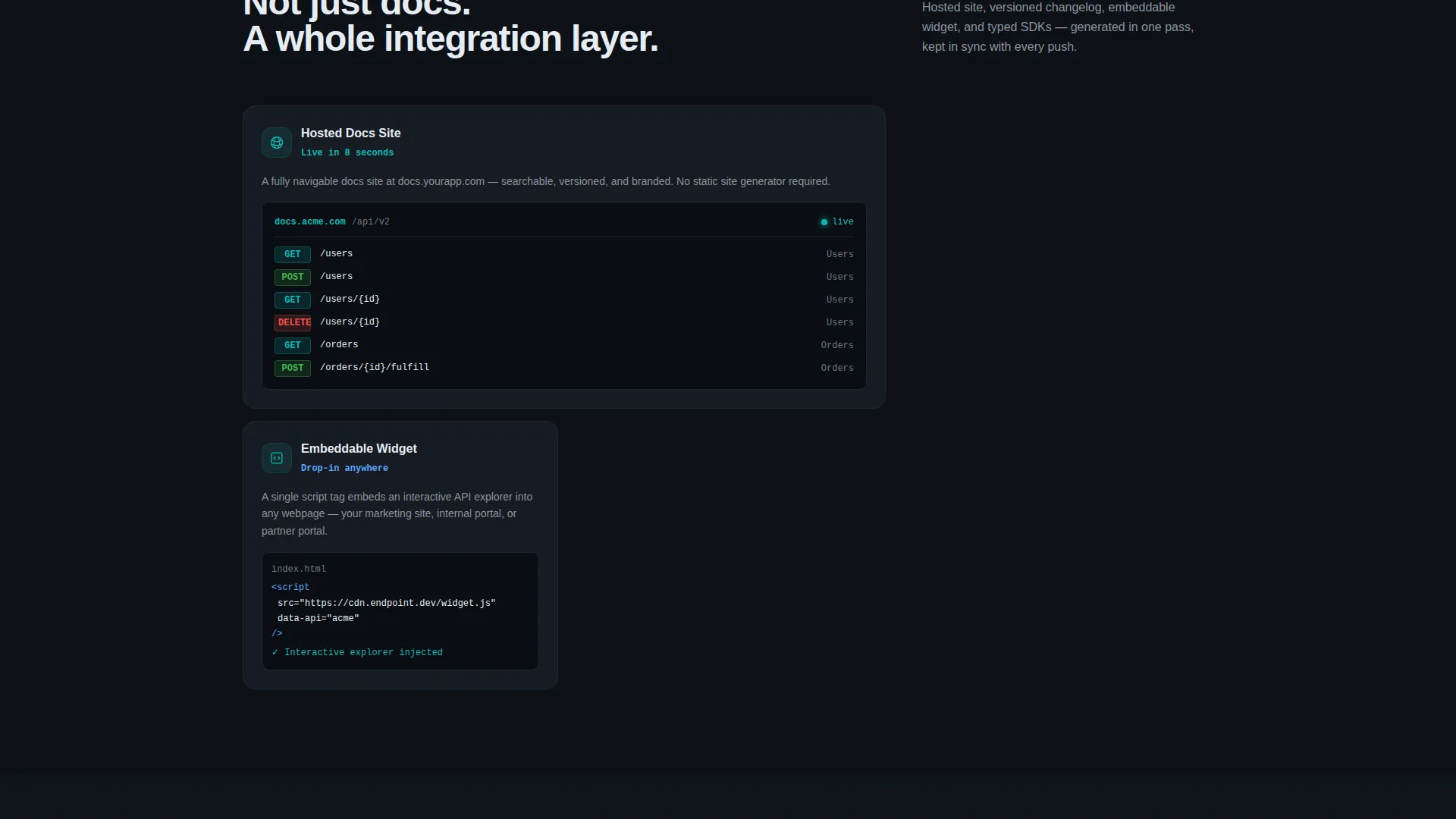
The card grid narrative follows a deliberate three-stage flow. Stage one covers ingestion, including connecting a repository, uploading a spec, or pasting a URL. Stage two covers intelligence, including auto-detection of authentication schemes, type inference, and resource grouping. Stage three covers output, including hosted documentation, versioned changelogs, and embeddable widgets.
Page sections overview
| Section | Purpose |
|---|---|
| Stats Header Viewport | Opens with animated counters and a live-typed endpoint card |
| Live Endpoint Card | Shows a rendered REST endpoint with method badge and curl example |
| Ingestion Feature Cards | Introduces repo connect, spec upload, and URL paste inputs |
| Intelligence Feature Cards | Demonstrates auth detection, type inference, and resource grouping |
| Output Feature Cards | Presents hosted docs, changelogs, and embeddable widget outputs |
| Bottom call to action Bar | Keeps "Generate Docs Now" persistently visible during scroll |
| Sample Output Link | Secondary path to an interactive demo doc site in a new tab |
Design & branding system
The template uses a Dashboard Pro theme built on the Teal Catalyst color system. The palette is designed to feel like a well-configured development environment: dark enough to work in for hours, with teal accents that direct attention precisely.
- Deep terminal black (#0D1117) as the full-page background, active teal (#0ABAB5) for interactive states and key metrics, muted slate (#8B949E) for secondary text and borders, and bright catalyst white (#E6EDF3) for card surfaces and primary type
- Cards sit on the black field like floating panels in a developer dashboard, with white surfaces and teal highlights drawing the eye to the numbers that matter
- Monospace typography in the header stats section reinforces the technical identity and keeps the tone consistent with a real documentation environment
Mobile & speed optimization
The modular card grid is structured to adapt across screen sizes without sacrificing the visual hierarchy that makes the spec-sheet walkthrough legible. Cards reflow gracefully so the input-output layout remains clear on smaller viewports.
- Card grid columns collapse cleanly to single-column stacks on mobile, preserving the ingestion-to-output narrative sequence
- The persistent bottom call-to-action bar remains anchored on mobile, keeping the primary conversion path accessible at every scroll depth
How this template helps you convert
This template earns the click by showing rather than promising. The entire page architecture is built around reducing doubt before the visitor reaches any decision point.
- The animated stats header establishes immediate credibility with specific, real-feeling numbers and a live-rendered endpoint example, so the product feels proven from the first second on the page.
- The progressive card grid walks visitors through the exact workflow they care about, from pasting a URL to seeing a fully structured documentation output, matching the mental model of a backend developer evaluating a new tool.
- The persistent call-to-action bar and frictionless GitHub OAuth path mean that when a visitor is ready to act, nothing stands between their intent and the first session.
Other information about this template
This template is categorized under Technology, specifically within the Micro-SaaS and Developer Tools subcategory, with a primary niche focus on API documentation generator products. It is built as a single-page, section-led landing page rather than a multi-page website, which keeps the visitor journey linear and conversion-focused.
- The template style is Card Grid (Modular), making it straightforward to add, remove, or reorder feature cards as the product evolves
- The header concept is Stats and Metrics, a pattern that works particularly well for developer tools where quantified proof outperforms descriptive claims
- The creative direction follows a Spec Sheet format, which mirrors how technical buyers already think about evaluating a tool
- The landing page direction is Click-Through, meaning no form appears on this page and the entire goal is routing qualified visitors to a free-tier signup
Theme
Dashboard Pro
Creative direction
Spec Sheet
Color system
Teal Catalyst
Style
Card Grid (Modular)
Direction
Click-Through
Page Sections
Animated Stats Metrics Header
Live-typed Endpoint Preview
Spec-sheet Card Grid Layout
Persistent Click-through Call to Action Bar
Secondary Sample Output Path
Dashboard Pro Visual Theme
Related questions
Who is this landing page template designed for?
Does this template include a signup form?
Can I change the stats numbers shown in the header?
How many cards does the feature grid include?
What makes this template different from a generic SaaS landing page?



