API Management Technology Booking Website Template
Endpoint is a dashboard-style landing page template built for API management consulting services. It combines an interactive API Health Score calculator, animated before-and-after comparison grids, and a conversion-focused audit form. The design uses a midnight navy and electric cyan palette that feels like a live network operations console, built to turn technical credibility into booked audits.
by Rocket studio
Quick summary
Endpoint is a single-page template designed for API management consultancies. It leads with an interactive health score calculator, shifts into a data-driven before-and-after comparison section, and closes with a dual-path conversion flow. The dark console aesthetic signals deep technical authority from the first scroll.
Who this template is for
This template is built for consultancies and specialists who sell clarity into complex API ecosystems. It speaks directly to the technical decision-makers who hold the budget and feel the pain.
- CTOs and VP Engineering hires at mid-market SaaS companies managing undocumented or fragmented endpoint layers
- Platform leads at fintech companies navigating partner API compliance and gateway migrations
- Independent API consultants and boutique firms positioning against generic software agencies
What problem this template solves
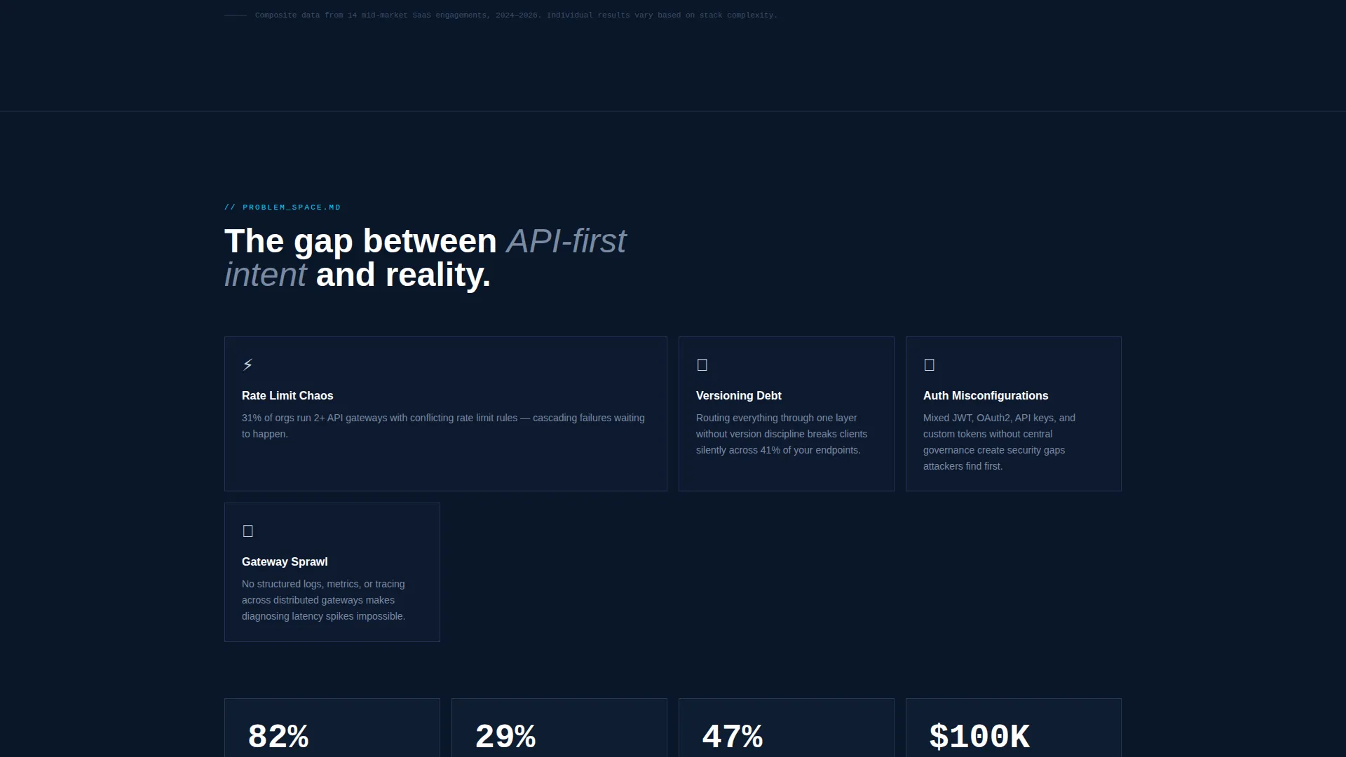
Engineering teams rarely struggle with capability. They struggle with legibility. Rate limit chaos, versioning debt, and undocumented gateway configurations slow integrations from days to quarters. This template gives a consultancy the right visual language to make that problem visible and position their audit as the fix.
- Visitors arrive skeptical and time-poor, so the calculator engages them before they read a single paragraph
- No clear before-and-after story means prospects cannot quantify what good looks like
- Generic agency templates do not signal the deep, terminal-level technical credibility this audience demands
What you get with this template
The template delivers a complete, section-led landing page that moves a technical buyer from curiosity to conversion in one scroll. Every layout decision serves the goal of making a complex service feel immediately trustworthy and actionable.
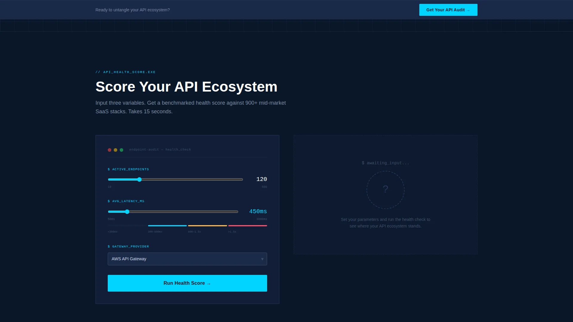
- An interactive API Health Score calculator with animated radial gauge output and benchmarked results
- Animated comparison data grids showing before-and-after metrics with scroll-triggered cyan pulse effects
- A dual-path conversion section with a primary audit request form and a secondary gated benchmark report download
Feature list
This template includes purpose-built components that reflect how technical buyers actually evaluate a consulting offer.
Interactive API Health Score Calculator
Visitors enter their number of active endpoints, average latency, and gateway provider via a dropdown. The tool returns a benchmarked score visualized as an animated radial gauge, making the gap between their current state and industry medians immediately visible.
Animated Before-and-After Comparison Grids
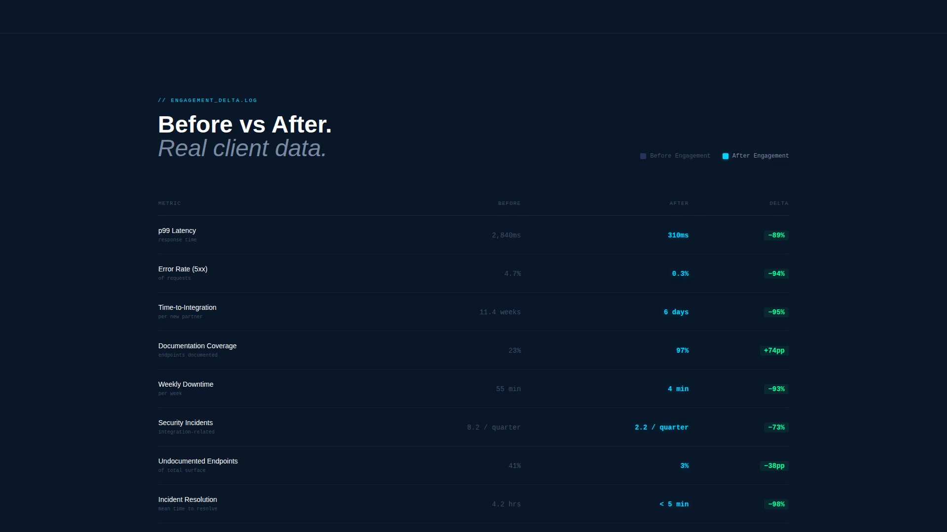
Side-by-side data grids display "Before Engagement" and "After Engagement" metrics including error rates, p99 latency, time-to-integration, and documentation coverage. Numbers animate on scroll and each row pulses cyan on viewport entry, creating a live-telemetry feel.
Dual-Path Conversion Flow
The primary path is a structured audit request form collecting work email, company name, and a multi-select of pain points. The secondary path offers a gated benchmark report behind email-only capture, giving hesitant visitors a lower-commitment entry point.
Logo Bar Header with Motion
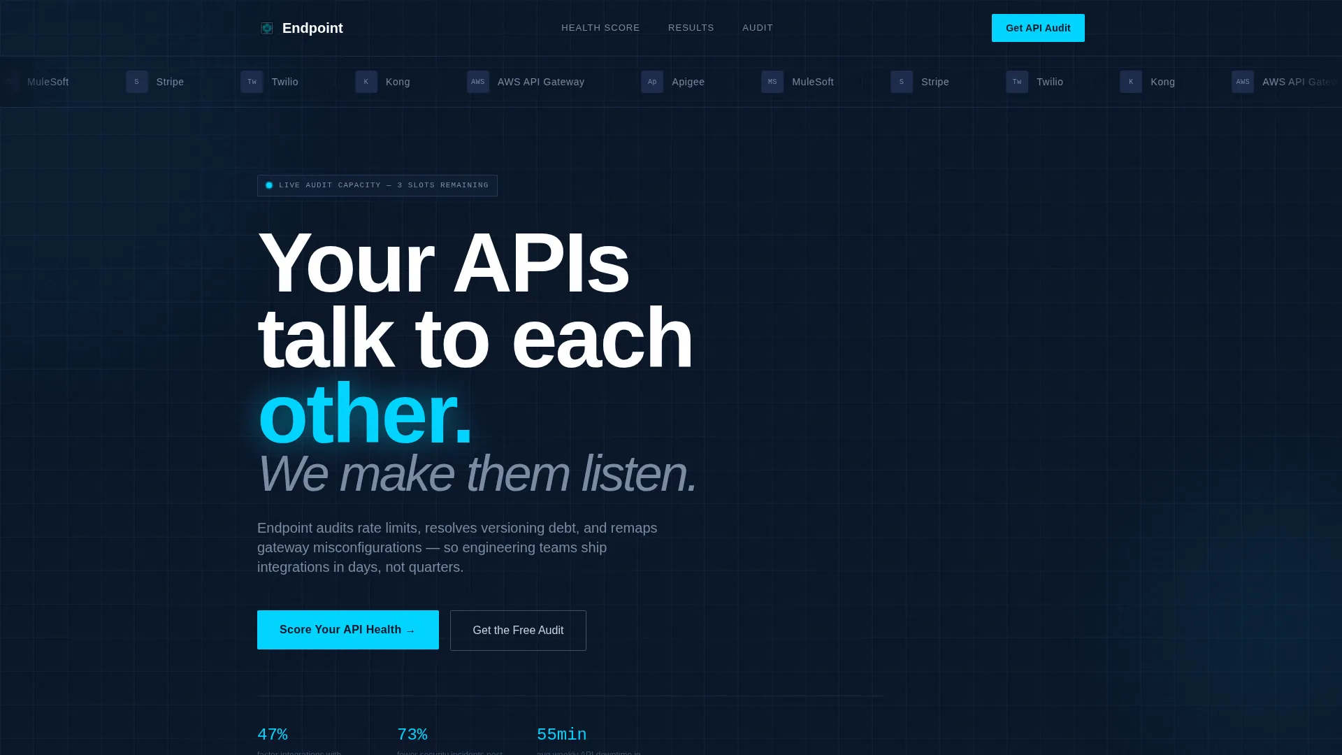
A horizontal scroll of monochrome silver API provider and gateway logos pulses left to right across the top of the page. The motion pattern mimics data packets in transit, establishing credibility within the first second of a visit.
Sticky Bottom call to action Bar
A slim call-to-action bar pins to the bottom of the viewport after the comparison section. It keeps the primary conversion action visible without interrupting the reading flow above it.
Scroll-Triggered Data Animations
Metric values across the comparison grids animate into their final numbers as each section enters the viewport. The motion reinforces the narrative that the consultancy brings order to chaos, not just a static pitch deck.
Page sections overview
| Section | Purpose |
|---|---|
| Logo Bar Header | Establish API provider credibility instantly |
| Headline and Tagline | Frame the core problem in one line |
| Health Score Calculator | Engage visitors with personalized benchmark output |
| Radial Gauge Result | Visualize the gap from industry medians |
| Before versus. After Grids | Contrast client metrics to show transformation |
| Primary Audit Form | Capture qualified leads with pain-point context |
| Benchmark Report Gate | Convert research-stage visitors via email capture |
| Sticky call to action Bar | Keep the audit action persistent on scroll |
Design & branding system
The visual identity follows a Dynamic Motion theme built on a Midnight Blue color system. Every design choice references the aesthetic of a network operations center running at full capacity.
- Background uses void-dark navy (#0A1628) as the primary canvas, with satellite blue (#1B2A4A) for card surfaces and grid cells to create depth without visual noise
- Electric cyan (#00D4FF) drives all interactive elements, live data lines, and animated highlights so every glowing detail signals something active
- Cool silver (#CBD5E1) handles body text, floating cleanly against the dark field and keeping long technical copy readable without eye strain
Mobile & speed optimization
The template is structured so its dashboard components remain clear and usable at smaller viewport widths. Dense data grids reflow to preserve readability without losing the live-console visual tone.
- The comparison grids adapt to single-column stacking on mobile so metric rows stay scannable without horizontal scrolling
- Scroll-triggered animations are tied to viewport entry, meaning they fire correctly regardless of device scroll speed or screen size
How this template helps you convert
The conversion architecture is deliberate. Every section earns the next click rather than demanding it upfront.
- The calculator creates a personalized moment of recognition. When a visitor sees their API health score sitting below the industry benchmark, the audit feels like a logical next step, not a sales ask.
- The animated comparison grids quantify the outcome. Prospects can see specific metric improvements across error rates, latency, and documentation coverage before they ever fill in a form field.
- The dual-path form structure removes friction for undecided buyers. Visitors who are not ready to book an audit can still enter the funnel via the benchmark report download, keeping them in reach for a follow-up.
Other information about this template
This template is designed to work as a standalone landing page for an API management consulting practice. It is equally suited to a new consultancy building its first web presence or an established firm refreshing a dated site with a more credible, data-forward identity.
- The template style is Dashboard and Data Grid, reflecting the monitoring-console aesthetic its target audience lives in daily
- The pain-point multi-select in the audit form covers versioning chaos, latency spikes, gateway migration, and documentation gaps, making lead qualification automatic
- The page is built for a niche intersection of API management technology and consulting services, where buyers are technical and trust signals must be engineering-native
- Gateway providers referenced visually in the logo bar include Stripe, Twilio, Kong, AWS API Gateway, Apigee, and MuleSoft, covering the most recognized names in the partner API and gateway space
Theme
Dynamic Motion
Creative direction
Calculator/Tool First
Color system
Midnight Blue
Style
Dashboard/Data Grid
Direction
Comparison/Versus
Page Sections
Interactive API Health Score Calculator
Animated Before-and-after Comparison Grids
Dual-path Lead Capture Forms
Sticky Bottom Call-to-action Bar
Scrolling Logo Bar with Motion
Scroll-triggered Data Animations
Related questions
Who is this landing page template designed for?
Can I customize the calculator inputs and benchmark values?
Does the template support two different conversion paths?
What makes this different from a generic agency or SaaS template?
Can an independent consultant use this template, or is it only for firms?



