API-First DAM Landing Page Template
Endpoint is a hub-and-spoke landing page template built for headless digital asset management platforms. It pairs a dark terminal aesthetic with a Problem-to-Solution scroll structure, guiding engineering leads and product teams from pain point to proof in a single, focused page. Three frosted glass API panels open the page, and every section earns trust through real request-and-response demonstrations before asking for a click.
by Rocket studio
Quick summary
Endpoint is a single-page, anchor-nav landing page template designed for API-first digital asset management tools. The Dashboard Pro theme sets a deep terminal navy palette, while a Problem-to-Solution Arc drives the scroll. Each section opens on a specific pain point, then resolves it with a product demonstration. The result is a page that earns developer trust before asking for any commitment.
Who this template is for
This template is built for technical founders and go-to-market teams promoting headless infrastructure products. It speaks directly to buyers who make architecture decisions, not marketing decisions.
- Engineering leads at mid-stage SaaS companies who need a credible, code-forward product page
- Product teams at media companies managing large, untagged asset libraries at scale
- Agency technical leads who maintain one asset source feeding multiple client properties
What problem this template solves
Most product landing pages rely on adjectives and screenshots. Developer audiences reject that immediately. They want to see the call, the response, and the latency before they read a single feature headline.
- Generic hero sections fail to communicate what an API-first product actually does
- Scattered page structures break the logical flow from problem recognition to product proof
- Pages without real syntax examples force technical buyers to leave for the documentation
What you get with this template
You get a complete, production-ready landing page layout that puts evidence ahead of claims. Every scroll section is structured to move a skeptical technical buyer from problem to proof.
- A sticky anchor navigation bar with four pain-point labels that link directly to matching content sections
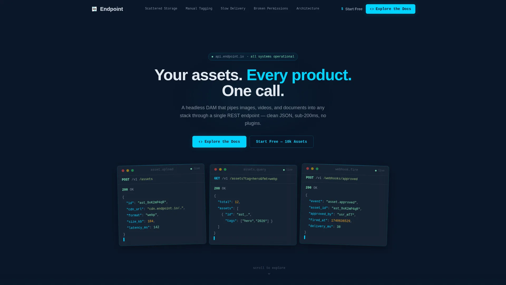
- Three frosted Dark Glass Panel cards in the header, each showing a styled live-API response
- A full Problem-to-Solution Arc across four spokes, ending in an architecture diagram section
- Two conversion touchpoints: a persistent "Explore the Docs" button in the nav and a secondary "Start Free" call to action after the architecture section
Feature list
This section describes the core built-in components and layout capabilities included in the template.
Dark Glass Panel Header
Three translucent, frosted cards float over the deep navy background. Each card displays a styled API response: an asset upload returning a CDN URL, a metadata query filtering by tag and format, and a webhook payload firing on asset approval. A faint cyan edge-light runs along each panel.
Hub-and-Spoke Anchor Navigation
A sticky navigation row labels each content spoke with a pain point: "Scattered Storage," "Manual Tagging," "Slow Delivery," and "Broken Permissions." Clicking any label glides the visitor smoothly to the matching section. A persistent "Explore the Docs" button sits inside the nav at all times.
Problem-to-Solution Scroll Sections
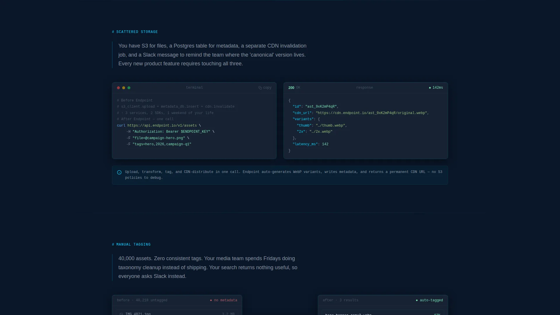
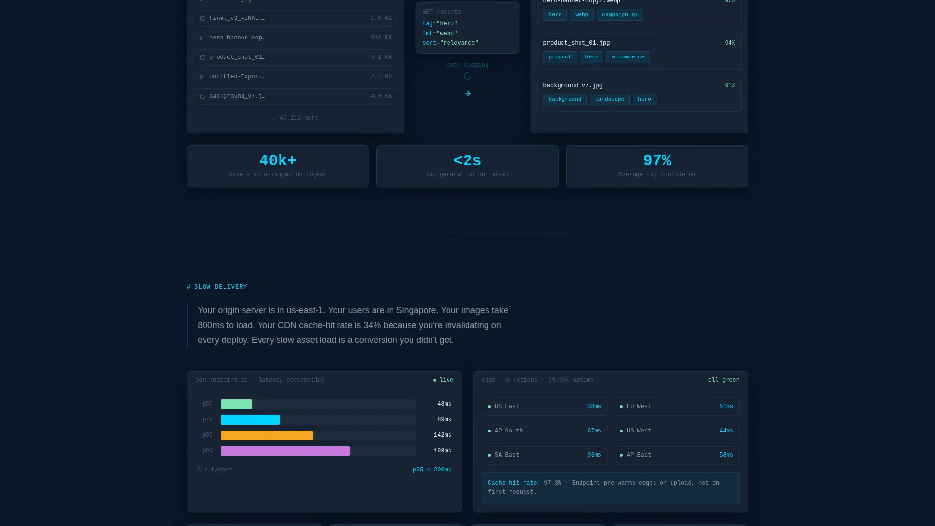
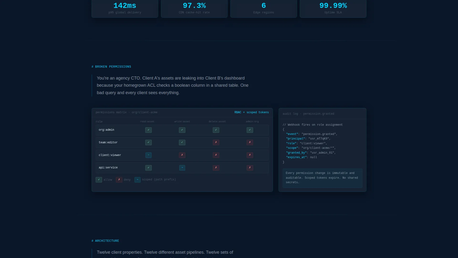
Each of the four spokes opens with a short, blunt problem statement in steel gray, then immediately transitions to a product demonstration. Demonstrations include an animated code snippet, a throughput chart, and a permissions matrix rendered as a dark-glass card.
Architecture Diagram Section
The fourth spoke pivots from problem to proof at a higher level. It presents a live architecture diagram showing the platform as the single node connecting every downstream channel. This section sets up the secondary call to action naturally.
Dual Call-to-Action System
The primary call to action, "Explore the Docs," appears in the header and repeats persistently in the anchor nav. It routes visitors to interactive API documentation where they can make a real call without signing up. The secondary call to action, "Start Free - 10k Assets," appears after the architecture diagram and asks only for a work email.
Code-Syntax Accent System
Electric cyan is reserved exclusively for interactive states, anchor-nav highlights, and code-syntax accents throughout the page. This keeps the visual hierarchy clean: everything recedes except the signal. Real request-and-response pairs appear throughout to build syntax familiarity before any conversion ask.
Page sections overview
| Section | Purpose |
|---|---|
| Header with Glass Panels | Show live API responses and primary call to action above the fold |
| Sticky Anchor Nav | Let visitors jump directly to the pain point most relevant to them |
| Scattered Storage Spoke | Open on fragmented storage pain, resolve with an animated code snippet |
| Manual Tagging Spoke | Highlight the cost of untagged assets, resolve with a metadata demonstration |
| Slow Delivery Spoke | Show latency pain, resolve with a throughput chart |
| Broken Permissions Spoke | Present access-control risk, resolve with a permissions matrix card |
| Architecture Diagram Section | Show the platform as the single source of truth for all downstream channels |
| Secondary call to action Block | Capture work email with a low-friction "Start Free" offer |
Design & branding system
The visual identity follows the Dashboard Pro theme built on a Midnight Blue color system. The palette is intentionally minimal so that every interactive element reads immediately as a signal against the dark background.
- Background: deep terminal navy (#0A1628) as the primary canvas, with desaturated slate (#1B2838) for all card surfaces
- Text hierarchy: white or near-white for headlines, cold steel (#8892A0) for secondary text and problem statements
- Accent color: electric cyan (#00D4FF) reserved strictly for interactive states, anchor-nav highlights, and code-syntax details
Mobile & speed optimization
The template layout is structured for readability across screen sizes. The anchor nav collapses cleanly at narrower viewports, and the glass panel cards restack vertically without breaking the information hierarchy.
- The sticky anchor nav adapts to smaller screens so visitors can still jump between spokes without scrolling back to the top
- Dark Glass Panel cards reflow from a horizontal three-column row to a vertical single-column stack on mobile viewports
How this template helps you convert
This template is built around the idea that a technical buyer who has already seen the syntax is far more likely to click. Every design and content decision serves that logic.
- The anchor nav surfaces pain points immediately, so each visitor self-selects their most urgent problem and navigates to the matching proof before losing interest
- Real request-and-response pairs appear in every spoke section, building syntax familiarity so the "Explore the Docs" call to action feels like a natural next step rather than a leap of faith
Other information about this template
This template is well suited for developer-focused product launches, headless platform landing pages, and API-first SaaS go-to-market pages. It is built on a single-page, section-led structure rather than a multi-page site architecture.
- The template style is Hub and Spoke with sticky anchor navigation, following a Problem-to-Solution creative direction
- The lp_direction is Click-Through, meaning both calls to action route visitors toward an action rather than a form-heavy lead capture flow
- The theme is Dashboard Pro with the Midnight Blue color system, making it directly usable for any dark-mode developer tool or infrastructure product
- The header concept, Dark Glass Panels, is reusable for other API-first products where showing real output above the fold is more convincing than a product screenshot
Theme
Dashboard Pro
Creative direction
Problem→Solution Arc
Color system
Midnight Blue
Style
Hub & Spoke (Anchor Nav)
Direction
Click-Through
Page Sections
Dark Glass Panel Header
Hub-and-spoke Anchor Navigation
Problem-to-solution Scroll Arc
Architecture Diagram Spoke
Dual Call-to-action System
Code-syntax Accent System
Related questions
Who is the Endpoint template designed for?
Can I adapt the code snippets and API response panels to my own product?
What calls to action are included in the template?
Does the template work for products outside of digital asset management?
How many sections does the landing page include?



