API-First Supply Chain Landing Page Template
Endpoint is a dashboard-style landing page template built for API-first supply chain platforms. It features a Feature Tab Switcher header, a Stats-First layout rhythm, and a Carbon Fiber color system. Designed for technical buyers, it showcases live data feeds, webhook logs, and real response payloads to drive signups without a form in sight.
by Rocket studio
Quick summary
Endpoint is a single-page landing page template for API-first supply chain software. It leads with hard numbers, renders the product as the hero, and guides integration engineers directly into a sandbox signup. The visual theme mimics a live monitoring terminal, built in deep carbon black and telemetry green.
Who this template is for
This template is built for technical teams and product marketers launching platforms where the API is the product. It speaks directly to buyers who evaluate software by reading payloads, not sales decks.
- Integration engineers at mid-market manufacturers connecting legacy warehouse management systems to modern data pipelines
- Logistics technology leaders replacing brittle Electronic Data Interchange connections with real-time webhook infrastructure
- Operations leads at third-party logistics providers who need unified visibility across multiple carrier APIs
What problem this template solves
Supply chain software platforms often struggle to communicate technical depth without losing their audience. Generic hero images and vague value propositions fail to earn trust from engineers who want proof before they commit.
- There is no clear way to demonstrate live API behavior, latency numbers, or real payload output on a standard marketing page
- Technical buyers abandon pages that ask for a form submission before showing any product evidence
- Dashboard-heavy products look flat and generic when forced into a conventional hero-and-features template
What you get with this template
You get a fully structured, single-page layout built around a Data Command visual theme and a Stats-First content rhythm. Every scroll depth opens with a concrete metric before any explanatory copy arrives.
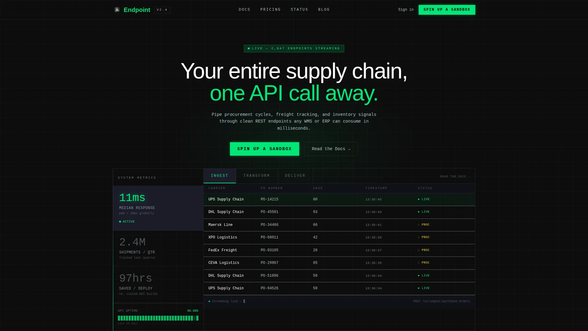
- A Feature Tab Switcher header with three interactive tabs labeled "Ingest," "Transform," and "Deliver," each revealing a distinct live-rendered dashboard panel
- A persistent "Spin Up a Sandbox" call-to-action locked to the bottom-right corner after first scroll, plus inline "Read the Docs" secondary calls-to-action beside each feature tab
- Stat-to-proof section pairs throughout the page, including shipment tracking figures, response time metrics, and integration efficiency numbers
Feature list
This template is organized around components that make technical proof visible and conversion frictionless.
Feature Tab Switcher Header
Three horizontal tabs sit above a live-rendered dashboard panel. "Ingest" displays a real-time purchase order feed with carrier names, SKU counts, and ticking timestamps. "Transform" shows a node graph mapping raw Electronic Data Interchange payloads to normalized JSON objects with animated field connections. "Deliver" reveals a webhook log with response codes, latency in milliseconds, and destination endpoints.
Stats-First Section Rhythm
Every major section opens with a hard number before any supporting explanation. Metrics such as median response time, quarterly shipment volume, and hours saved per deployment each appear before their corresponding proof element. This stat-then-proof cadence repeats across scroll depths to build cumulative technical credibility.
Persistent Sandbox Call-to-Action
A "Spin Up a Sandbox" button anchors to the bottom-right corner after the first scroll. It stays visible without interrupting reading flow. The click leads to a lightweight signup that asks only for a work email and company name, keeping the conversion path short for qualified buyers.
Dashboard Grid Background Motif
The entire page uses a dashboard grid texture as a persistent background element. This makes each content section feel like a panel inside a single monitoring interface rather than a sequence of disconnected marketing blocks. The motif reinforces the platform's API-first identity throughout the scroll.
Inline Secondary Call-to-Action
A "Read the Docs" link appears beside each feature tab for engineers who need full API specification before committing. This secondary path captures buyers at the research stage without redirecting them away from the primary conversion flow.
Real Payload and Latency Display
The page shows actual response payloads and latency figures as visible proof elements. These are not screenshots or mockups in the traditional sense; they are rendered as part of the live dashboard panels within each tab, giving technical visitors evidence they can evaluate directly.
Page sections overview
| Section | Purpose |
|---|---|
| Feature Tab Header | Showcases Ingest, Transform, and Deliver tabs with live dashboard panels |
| Headline Block | Anchors the page with "Your entire supply chain, one API call away" |
| Stats Impact Row | Opens each proof section with a hard metric before explanation |
| Architecture Diagram | Explains the 11ms median response time with a visual system layout |
| Shipment Tracking Stats | Presents quarterly shipment volume before customer logos |
| Customer Logo Row | Provides social proof following the shipment tracking figure |
| Case Study Teaser | Delivers integration efficiency stat before the case study link |
| Persistent call to action Button | Keeps "Spin Up a Sandbox" visible after first scroll, bottom-right |
| Inline Docs Links | Places "Read the Docs" beside each feature tab for spec-first buyers |
Design & branding system
The Carbon Fiber color system creates an environment that feels like the inside of a server rack at 2 AM. Every color choice is functional, with no decorative elements competing for attention.
- Backgrounds stay in the deep carbon black (#0D0D0D) to woven graphite (#1A1A2E) range, while telemetry green (#00E676) activates only on live data points, success states, and primary interactive elements
- Cool alloy silver (#B0BEC5) handles secondary text, axis labels, divider lines, and ghost text inside input fields, keeping the interface readable without breaking the dark-terminal atmosphere
Mobile & speed optimization
The template layout is structured to maintain its dashboard-grid identity across screen sizes. The Data Command theme and tab-based header are designed to translate from desktop monitoring views to compact mobile displays.
- The Feature Tab Switcher and persistent call-to-action button are built to remain functional and visible on smaller viewports
- The Stats-First section rhythm keeps content scannable on mobile by leading each section with a short, bold number before longer explanatory text
How this template helps you convert
This template earns clicks by replacing marketing claims with visible technical evidence. Every layout decision reduces friction for a buyer who already knows what they need.
- The Feature Tab Switcher puts real API behavior in the header, so the first thing a visitor sees is the product working, not a sales pitch
- The persistent "Spin Up a Sandbox" call-to-action stays in view throughout the entire scroll, capturing intent at the exact moment a technical buyer feels convinced
Other information about this template
This template is a strong fit for teams building or marketing platforms that handle supply chain data management, real-time freight tracking, and procurement automation through programmatic interfaces.
- The template style is classified as a Dashboard and Data Grid layout, making it well suited for platforms that surface live operational data as their primary value demonstration
- The landing page direction is Click-Through, meaning the page does not host a form and instead routes qualified visitors to a separate signup flow
- The theme and creative direction are purpose-built for the API-first enterprise software category, where buyers are engineers evaluating technical capability rather than general features
- Teams using tools such as Framer will find the component-based tab switcher and grid motif straightforward to customize with real platform data and brand-specific payload examples


Theme
Data Command
Creative direction
Stats-First Impact
Color system
Carbon Fiber
Style
Dashboard/Data Grid
Direction
Click-Through
Page Sections
Feature Tab Switcher Header
Stats-first Section Rhythm
Persistent Sandbox Call-to-action
Dashboard Grid Background Motif
Inline Docs Secondary Call-to-action
Real Payload and Latency Display
Related questions
Does this template include a contact form or lead capture form?
Can I replace the sample metrics with my platform's real numbers?
Who is this landing page template designed for?
What does the Feature Tab Switcher header display?
Is there a path for buyers who are not ready to sign up?


