Dynamic Family Marketing Landing Page Template
The Naptime Family First Content Marketing Landing Page Template is a modular card-grid landing page built for parent-entrepreneurs who sell online courses. It combines a Persona Selector hero, real student story cards, instructor profiles, and a marigold-accented "Save My Seat" registration flow. The result is a high-converting landing page that feels personal, warm, and built for people who create content between bath time and bedtime.
by Rocket studio
Quick summary
This is a single-page, card-grid landing page designed for an online course aimed at parent-entrepreneurs. It uses an Electric Indigo color system, a Persona Selector hero, and a community-style student story grid to build trust fast. The page guides visitors toward one clear desired action: registering for a course seat. Every section earns the conversion before asking for it.
Who this template is for
This landing page template was built for course creators, freelancers, and small business owners who serve a parent-entrepreneur audience. If you are launching or promoting a content marketing online course for time-strapped parents, this template gives you a ready-made structure that speaks directly to their reality.
- Parent-entrepreneurs running freelance businesses or small online stores from home
- Course creators who teach content strategy, digital marketing, or business systems
- Couples co-running a home business while managing kids, schedules, and short paragraphs of free time
What problem this template solves
Most generic landing page templates were not built for this audience. They feel corporate, cold, or cluttered. Parent-entrepreneurs browse in distracted bursts and have an attention span of less than eight seconds. A landing page that does not connect emotionally within that window loses the registration. This template solves the mismatch between standard page design and the lived experience of a parent trying to grow a business.
- Visitors feel overwhelmed by course pages that list modules instead of telling real stories
- Generic forms and cold copy fail to build trust with a community-minded, peer-driven audience
- Standard landing page designs ignore the mobile-first reality of parents scrolling during nap time
What you get with this template
You get a fully structured, modular landing page ready to customize for your course registration campaign. Landing page templates like this one are ready-made pages that include text zones, image slots, buttons, and other elements. This template goes further by delivering a narrative-driven layout built around real parent pain points, student proof, and a crystal clear registration path.
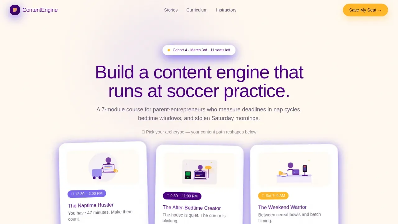
- A Persona Selector hero section with three illustrated archetype cards and a dynamic headline
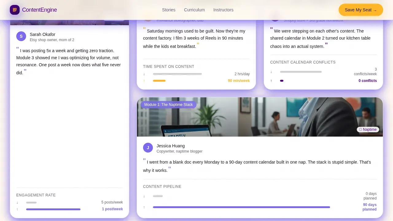
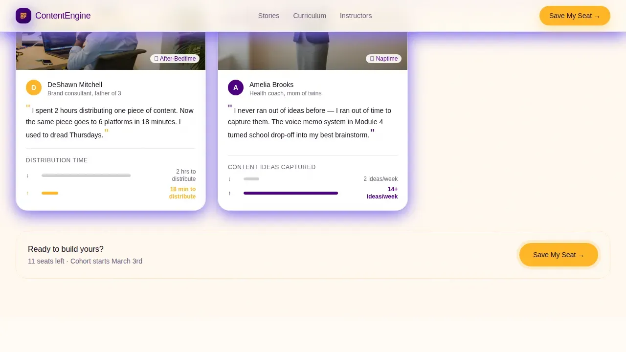
- A student story card grid that acts as a community bulletin board with faces, quotes, and before-and-after proof
- A two-step registration form with a segmentation question and a secondary free workshop path
Feature list
This landing page template includes the following built-in sections and interaction design components.
Persona Selector Hero with Dynamic Headline
Three illustrated archetype cards float on a warm parchment background. Visitors pick their card and the headline reshapes to match their situation. The selection also reorders curriculum modules below to lead with their most relevant pain point. This interactive element immediately makes the page feel personal rather than generic.
Student Story Card Grid
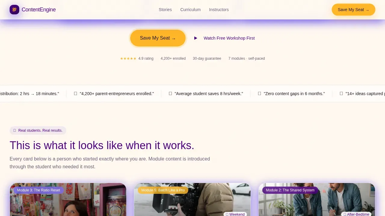
The modular card grid works like a community bulletin board, not a syllabus. Each card introduces a module through a real student story, complete with a face, a quote, and before-and-after analytics. This approach to social proof is one reason landing pages with testimonials consistently outperform those without. Research shows that 36% of top-performing landing pages include testimonials, and this template makes them the backbone of the scroll.
Instructor Profile Cards
Mid-scroll, the grid shifts to instructor cards shown in real home environments: kitchens, home offices, and backyard setups. This normalizes the chaos of building a business alongside kids and builds trust through authenticity rather than polish. Instructor images help prospective customers feel like they are learning from someone who truly understands their situation.
Two-Step Registration Form
The primary call to action is a "Save My Seat" button in marigold. Clicking it opens a two-step form: step one collects email and first name; step two asks one segmentation question with four radio options. Keeping the form fields minimal is a proven best practice. Forms containing five fields or fewer consistently produce higher conversion rates, and this template follows that principle by design.
Free Workshop Gateway
A secondary path offers visitors access to a 12-minute recorded workshop. This free guide option lowers the barrier for cold visitors who are not ready to register. The workshop ends with its own registration prompt, creating a second conversion opportunity without adding multiple links or distractions to the main page flow.
Marigold Call-to-Action System
The marigold call to action button appears after the persona selector and repeats after every third card row. Keeping the call to action button visible and high-contrast throughout the scroll is a core best practice for high converting landing pages. Landing pages with a single focused call to action convert 1.6% better than those with competing options, and this template keeps every call to action pointed at one goal: seat registration.
Page sections overview
| Section | Purpose |
|---|---|
| Hero Persona Selector | Archetype card choice reshapes headline |
| Student Stories Grid | Real proof through community card layout |
| Instructor Profile Cards | Authenticity through home environment shots |
| Curriculum Module Grid | Modules introduced via student pain points |
| Save My Seat call to action | Two-step form drives seat registrations |
| Free Workshop Path | Secondary path for undecided visitors |
| Footer | Horizontal flow with contact details and links |
Design & branding system
The page design uses the Electric Indigo color system to create the feeling of a creative workspace after the kids are asleep. The palette is intentionally warm and calm, reinforcing trust and a sense of quiet momentum. A visually appealing page in this niche should feel like a sticky note on your monitor that says "you've got this."
- Deep digital indigo (#4B0082) for primary backgrounds and heading text, soft iris (#7B68EE) for accents, and warm parchment (#FFF8F0) as the page background
- Bright marigold (#FFB627) reserved exclusively for call to action buttons and progress indicators, keeping the desired action crystal clear at every scroll point
- Plus Jakarta Sans for headings and DM Sans for body text, creating a clean layout with generous white space between card rows
Mobile & speed optimization
This landing page is designed mobile-first. Parent-entrepreneurs are often on their phones during nap time, between school pickups, or after bedtime. Over 53% of web traffic comes from mobile devices, so mobile optimization is not optional here. The template uses a single-column layout that prevents horizontal scrolling and reduces friction on smaller screens.
- Thumb-friendly card layouts and large call to action buttons make the page easy to navigate without pinching or zooming
- The two-step opt-in forms are stacked vertically so they work cleanly on mobile devices without layout breaks
- The free workshop video path is accessible on mobile, giving visitors a seamless experience whether they are on a phone, tablet, or laptop
How this template helps you convert
A well-designed landing page can increase conversion rates by as much as 400%. This template is built around proven conversion principles applied specifically to the parent-entrepreneur mindset. The page earns the registration by showing people, not promises, throughout the entire scroll.
- The Persona Selector creates immediate emotional relevance. Visitors self-identify and the page adapts, which makes the call to action feel like a natural next step rather than a sales push. This is how you convert visitors who would otherwise bounce from a generic page.
- The student story grid and instructor cards stack social proof continuously. Trust builds card by card until the curriculum feels inevitable. Landing pages have a 160% higher conversion rate than standard signup forms precisely because they create this kind of focused, single-goal experience.
- The marigold call to action button is pinned after the hero and repeated after every third row, keeping the registration path crystal clear. Combined with minimal form fields and a segmentation question, this structure helps generate leads at a higher rate than standard course enrollment pages.
Other information about this template
This template is a great example of a landing page built for a specific niche rather than a generic audience. Creating an effective landing page for family-first, naptime-themed content requires blending empathy for tired parents with a high-conversion, distraction-free design. This template does both. It is also an excellent example of how card-grid modular templates can deliver both storytelling depth and registration focus on a single page.
- The naptime family first content marketing landing page template is a strong starting point for course creators who want design inspiration without starting from scratch. Landing page templates save significant time in design and development, and this one can be customized to fit your brand in a fraction of the time it would take to build from zero.
- Navigation menus are intentionally removed from the header to keep visitors focused on the single conversion goal, which aligns with best practices for high converting landing pages used in paid ads campaigns and email marketing funnels.
- The footer follows a Vercel Horizontal Flow pattern and includes contact details, helping to build trust with visitors who want to verify the legitimacy of the course before they sign up. Sharing information clearly in the footer is a simple trust signal that prospective customers and potential customers often look for before committing.
- The template supports email marketing integration through its opt-in forms, making it easy to connect your registration flow to your existing email list and follow-up sequences. This is particularly useful for course launches promoted through digital marketing channels.
- Whether you are running paid ads to a cold audience or sending a warm email to your existing list, this landing page template gives you the structure to generate leads and drive registrations. Nearly 50% of marketers build a new landing page for each campaign, and this modular template makes that process fast and repeatable.
- The drag and drop editor available on the platform means you can customize this template without any coding knowledge. The drag and drop interface lets you swap images, update copy, adjust colors, and rearrange card rows in minutes. A free plan is available for those who want to explore the template before committing to a paid tier.
- This template is categorized under Education and Training, Online Skill Courses, making it easy for course creators to find through platform search. Templates are organized by industry and use case, so the right landing page templates surface quickly when you know what you are building.
- The page is an effective landing page example for SaaS companies, coaches, or educators who want to move beyond a basic splash page and into a full conversion-optimized experience. The modular card grid makes it easy to add or remove sections as your course evolves, and the warm Family First visual identity travels well across email marketing assets and social graphics.
- The free plan lets you preview and edit the template before publishing, and upgrading gives you access to custom domains, additional forms, and publishing features. A free guide to getting started is available within the platform to help new users launch their first landing page quickly.
Theme
Family First
Creative direction
Team & People
Color system
Electric Indigo
Direction
Event Registration
Page Sections
Persona Selector Hero with Dynamic Headline
Modular Student Story Card Grid
Instructor Profile Cards in Real Environments
Two-step Marigold Registration Form
Free Workshop Secondary Path
Repeating Call to Action Button Cadence
Related questions
Can I customize the persona cards and student story cards?
Do I need coding skills to use this landing page template?
How does the two-step registration form work?
Can I use this template for paid ads campaigns?
Is a free plan available to try this template before publishing?



