Restaurant Software Comparison Website Template
The Inbox Bold Brutalist Restaurant Email Marketing Landing Page Template is a single-page, comparison-table landing page built for restaurant email marketing apps. It combines a Bold Brutalist design style with an AI Iridescent color system, an interactive "You Today versus. You on Inbox" table, a live campaign simulator, and a pinned download call to action that pushes visitors toward sending their first campaign free.
by Rocket studio
Quick summary
This landing page template is purpose-built for a restaurant email marketing platform. It uses a Bold Brutalist design style, dark glass panel headers, and an interactive comparison table to show visitors exactly how much revenue they are leaving behind. The page drives one action: app download. Everything on the page earns that tap.
Who this template is for
This template is designed for teams and founders in the restaurant technology space who need a high-converting landing page that communicates performance data at a glance. The brutalist web design style fits brands that want to stand out, not blend in.
- Independent restaurant owners who need fast, credible proof of return on investment
- Marketing managers running email promotions across multiple locations who need a page that scales
- Ghost kitchen operators with no storefront who rely entirely on digital outreach to drive covers
What problem this template solves
Generic email marketing landing pages fail restaurant operators. They are slow to load, cluttered with polished imagery, and they bury the performance gap. Restaurant owners on their phones during service need a page that communicates raw impact in seconds, not minutes.
- Low open-rate visibility: operators cannot see how badly their current campaigns underperform until the comparison table shows it cell by cell
- No attribution clarity: the page makes revenue-per-send the centerpiece, removing ambiguity about what a campaign is actually worth
- Weak download motivation: a pinned brutalist call-to-action button keeps the next step visible without the visitor having to scroll back up
What you get with this template
You get a fully structured, single-page landing page with high interactivity and a clear conversion flow. The design approach is functional and deliberate. Every section serves the audience, and nothing decorates without signaling intent.
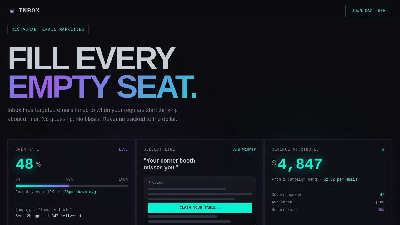
- A three-panel dark glass header showing live campaign metrics mid-flight
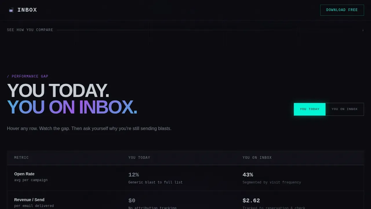
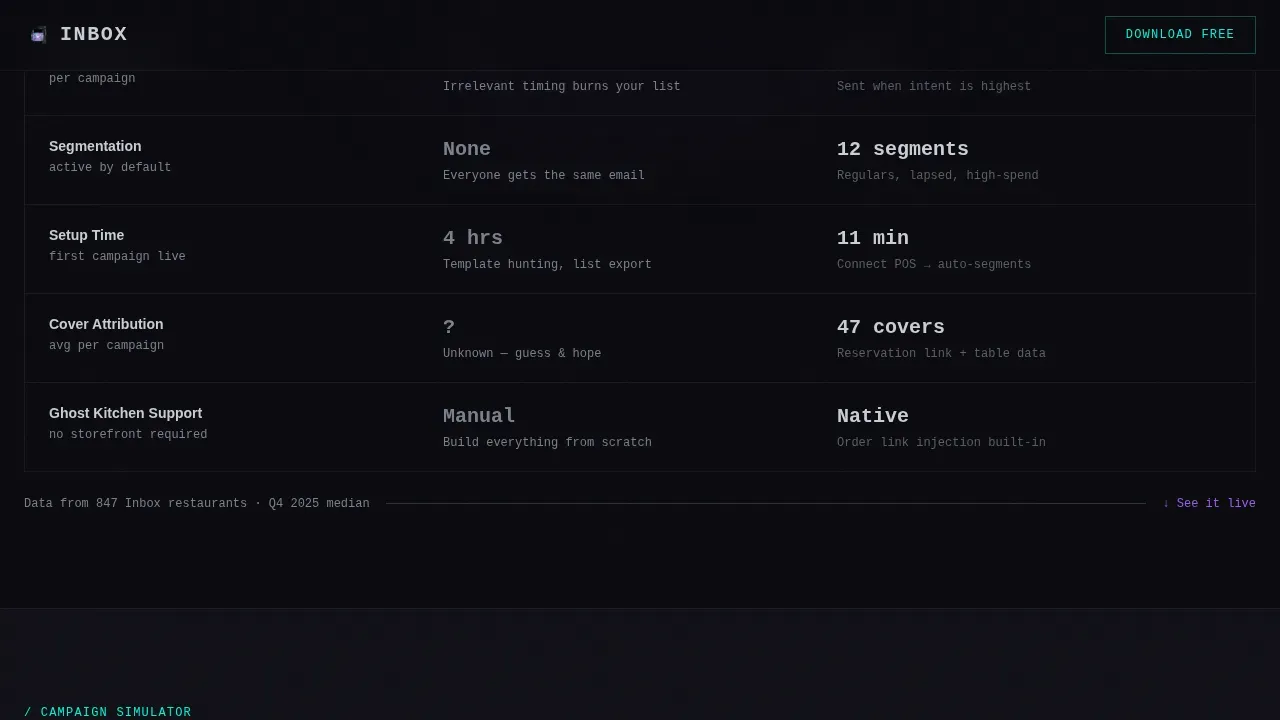
- An interactive "You Today versus. You on Inbox" comparison table with cell-by-cell hover animations
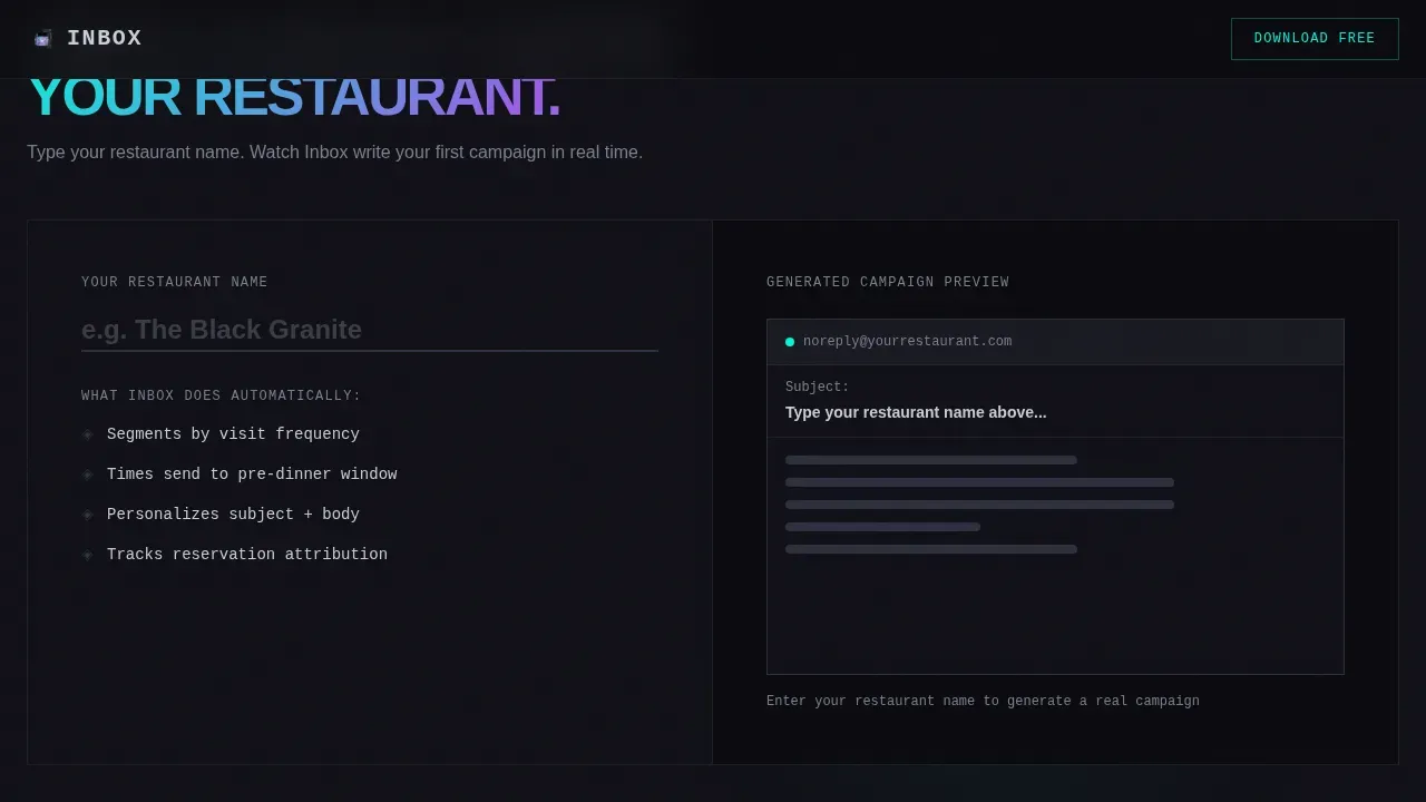
- A campaign simulator where visitors type their restaurant name and see a mock email preview
Feature list
This template is characterized by a tight set of purpose-driven components. Each element exists to move the visitor one step closer to downloading the app. The design draws inspiration from the raw, concrete-heavy world of brutalist architecture, then translates that energy into web design.
Dark Glass Panel Header
Three translucent, smoke-tinted cards float over a void-black field. Each card shows a different campaign metric in flight: an open-rate gauge, a subject line preview on a phone screen, and a revenue number ticking upward in iridescent teal. No hero image is needed. The product data is the hero.
Interactive Comparison Table
Visitors toggle between two states: their current performance and their performance on Inbox. Metrics transform cell by cell. Brutalist borders snap into iridescent highlights on hover. The table makes the performance gap feel concrete and embarrassing, which is exactly the idea.
Campaign Simulator
Visitors type their restaurant name and watch a mock email auto-generate with their branding applied. This component reinforces that the app already understands their world before they even download it. It is one of the most functional interactive elements on the page.
Pinned Download Call to Action
After a visitor interacts with any table row, a heavyweight brutalist button pins to the bottom of the viewport. Desktop users see a flanking QR code. A single-field SMS input reading "Text me the link" serves as a secondary path. The button stays visible so the conversion moment is never lost.
AI Iridescent Color System
The visual identity uses void black, liquid chrome, holographic violet, and iridescent teal. Violet and teal only appear when something is active: a hovered row, a pulsing metric, a winning data point. Nothing decorates for its own sake. Every color is a signal.
Bold Brutalist Typography System
Headings use DM Sans at heavy weights. Data and metrics render in JetBrains Mono, a monospaced typeface that makes numbers feel precise and authoritative. Bold typography and high contrast color schemes ensure the page communicates at a glance, even on a small phone screen in a busy kitchen.
Page sections overview
| Section | Purpose |
|---|---|
| Dark Glass Header | Show live campaign metrics in three floating panels |
| Comparison Table | Toggle between current and Inbox performance |
| Campaign Simulator | Preview a branded email with the visitor's name |
| Social Proof Block | Display revenue-per-send and open-rate lift data |
| Pinned Download call to action | Keep the app download action visible at all times |
| Superhuman Footer | Deliver minimal closing navigation and legal links |
Design & branding system
The design system is grounded in brutalist web design principles. The style is characterized by raw, unpolished aesthetics, sharp square edges, and high contrast color schemes. There are no gradients on static surfaces, no rounded corners, and no unnecessary decorative elements. The graphic design language translates directly from the visual grammar of brutalist architecture: steel-edged, concrete-solid, and deliberate.
- Colors: void black (#0B0B0F) as background, liquid chrome (#C8CDD5) for typography and dividers, holographic violet (#9B5DE5) for structural accents, iridescent teal (#00F5D4) for active states and data highlights
- Typography: DM Sans for headings at bold weights, JetBrains Mono for all metric and data display, creating striking contrasting colors between editorial and numerical content
- Borders and edges: sharp, square, brutalist style with no softening; animated borders snap to iridescent highlights on hover to signal interactivity
Mobile & speed optimization
The landing page is built mobile-first. Restaurant owners check their phones constantly during service, so every section must load fast and read clearly on a small screen. The template uses only CSS transforms for all animations, keeping the page lightweight and the experience smooth.
- Animations are powered by CSS transforms only, avoiding heavy JavaScript rendering that would slow the site
- The pinned call-to-action button is designed for thumb reach on mobile, with the SMS input field as a low-friction secondary path
- The comparison table reflows for narrow viewports, keeping each row readable without horizontal scrolling
How this template helps you convert
The page is structured as an escalating argument. Visitors move from seeing the gap, to believing the data, to touching the product. Each stage lowers resistance and raises intent. Brutalist web design focuses on usability and function over form, which means every element on this landing page exists to support conversion rather than to decorate the page.
- The comparison table creates the problem. Visitors see their current open rates and revenue attribution side by side with Inbox numbers. The gap does the persuading. Users who interact with even one row are already invested.
- The campaign simulator creates ownership. Typing a restaurant name into the simulator and watching a branded email appear makes the product feel personal before any commitment. That sense of ownership is a powerful driver toward download.
- The pinned download button closes the loop. It appears only after interaction, so it arrives when intent is highest. The QR code and SMS field give desktop and mobile visitors two additional paths to act, meaning no visitor has to navigate back to find the next step.
Other information about this template
This template sits at the intersection of restaurant technology and brutalist web design. The design movement has its origin in brutalist architecture, which drew heavily on raw concrete and exposed raw materials. The french word "béton brut," meaning raw concrete, gave brutalism its name. In web brutalism, that same idea translates into honest, functional layouts that strip away the conventional polish of standard web design. Designers who practice this style often draw inspiration from stark structural forms rather than soft graphic design conventions.
The brutalist website format is an ideal match for a restaurant email marketing platform because the aesthetic itself makes a statement: performance over pretense. Web designers working in this style tend to reject the crowd-pleasing defaults and instead create pages that are bold, raw, and impossible to ignore. The template supports a portfolio of restaurant clients ranging from single-location independents to multi-location groups. It can also support ghost kitchen operators who need resources to compete without a physical storefront.
From a broader web design perspective, bold brutalist layouts can improve accessibility for users with visual impairments through bold typography and high contrast color schemes. The unconventional aesthetics encourage users to explore the page and engage with its content. However, designers should be aware that raw aesthetics can feel intimidating for users who prefer polished, conventional web design. This template commits fully to the brutalist style because the target audience, time-poor operators chasing revenue, responds to directness over decoration. Examples like Brutø, a Michelin Star-winning restaurant that explores brutalism through food and design, show that the brutal aesthetic can stand alongside prestige in the food world. Similar studio-built examples such as 'Resto Kayang' and 'KAIZEN' demonstrate how bold grids and striking visual hierarchy work effectively for restaurants.
- The template style is Bold Brutalist with an AI Iridescent color system
- London-based and USA-based studio teams building restaurant tech products will find this format immediately usable
- Tags useful for categorizing this template include: restaurant email marketing, brutalist landing page, comparison table, app download, restaurant software, email campaign
Theme
Bold Brutalist
Creative direction
Interactive Explorer
Color system
AI Iridescent
Style
Comparison Table
Direction
App Download
Page Sections
Dark Glass Panel Header
Interactive Comparison Table
Campaign Simulator
Pinned Brutalist Download Call to Action
AI Iridescent Color System
Bold Brutalist Typography System
Related questions
Who is this landing page template built for?
Can I use this template without coding experience?
What makes the comparison table different from a standard feature table?
Does the template work well on mobile devices?
Is this template suitable for ghost kitchen operators?



