Smart Insurance Marketing Landing Page Template
Underwrite is a scroll-reveal landing page template built for insurance email marketing platforms. It combines a glassmorphic dark design, a live-feeling dashboard hero, and progressive feature panels to move independent agency owners, MGAs, and carrier marketing directors toward a demo booking. No hard sell, no noise, just a landing page that earns the click.
by Rocket studio
Quick summary
Underwrite is a single-page, scroll-reveal landing page template designed for insurance email marketing software. It leads with a full-width dashboard hero image behind frosted glass, moves visitors through a progressive feature matrix, and closes with a dual call-to-action section. Every section is built to guide visitors toward a live demo, making the insurance landing page feel like a product they are already using.
Who this template is for
This template speaks directly to teams who know that generic email marketing platforms were not built with insurance workflows in mind. If you manage a book of policies and need automation that understands renewal timing, compliance requirements, and policy-type segmentation, this is your starting point.
- Independent insurance agents running books of one thousand to five thousand policies who need automation without compliance risk
- Managing General Agents (MGAs) building distribution networks and deploying compliant email campaigns at scale
- Carrier marketing directors who need a polished insurance landing page live before the next rate filing drops
What problem this template solves
Most insurance businesses try to adapt generic email marketing tools to fit their workflows. The result is clunky sequences, missed renewal windows, and campaigns that treat a life insurance prospect the same as an auto insurance shopper. This template gives you a landing page that communicates exactly why a purpose-built insurance email platform solves those pain points.
- Visitors arrive skeptical that any software truly understands the cadence of insurance; the dashboard hero image and live metrics strip answer that doubt immediately
- Insurance agents often struggle to show prospects and clients a clear value proposition without resorting to a hard sell; this template leads with real performance data instead
- Without a focused design, landing pages risk overwhelming visitors with too many choices, reducing conversion rates before they even reach the call to action
What you get with this template
This landing page template is a fully structured, single-page build with every section pre-planned to move a visitor through the sales funnel logically. You get a design system, motion logic, and content architecture that reflects real insurance email marketing examples, not placeholder assumptions.
- A hero section with a full-width, angled dashboard preview behind a frosted glass card, including cursor-reactive parallax and pulsing teal send indicators
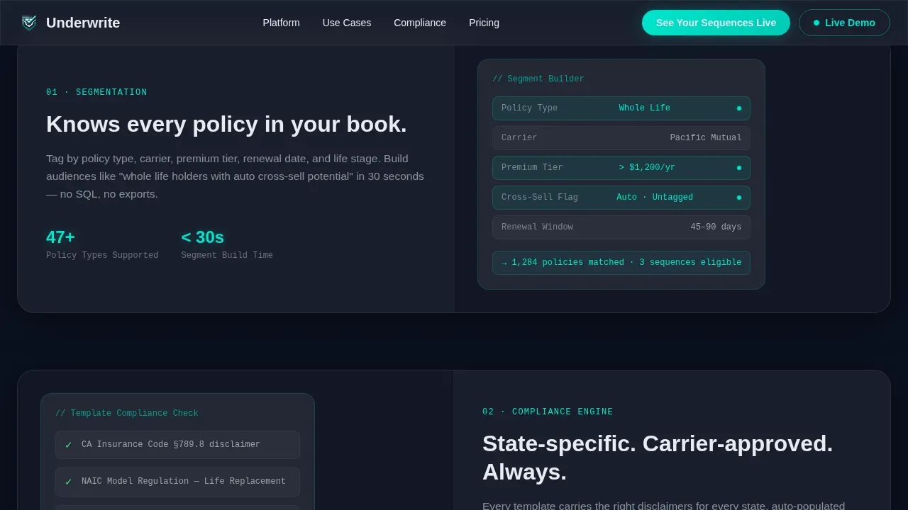
- A progressive Feature Matrix with scroll-triggered glass panel reveals, each panel covering a distinct insurance email capability such as policy-type segmentation, compliance-ready templates, carrier co-op tracking, and renewal automation logic
- A dual call-to-action section with a primary "See Your Sequences Live" demo button and a secondary "Download the Insurance Playbook" lead capture asking only for email and book size
Feature list
This template ships with a tightly defined set of capabilities drawn directly from the project brief. Each feature serves a specific role in the insurance email marketing sales funnel.
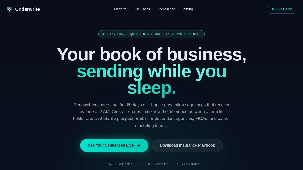
Dashboard Preview Hero with Parallax Motion
The hero image spans the full page width at a slight angle, showing a live-feeling campaign dashboard behind a frosted glass card. Visible on screen are a renewal sequence at 47.3 percent open rate, a lapse prevention workflow with 1,247 emails queued, and a real-time policy-type tagging feed. A subtle cursor parallax effect makes the dashboard feel three-dimensional, so visitors feel like they are already inside the platform from the first second.
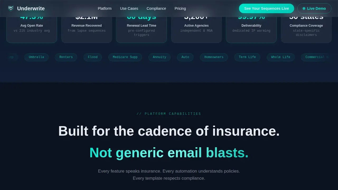
Progressive Scroll-Reveal Feature Matrix
Each scroll trigger reveals a new glass panel sliding into frame with motion easing. Panels cover the platform's key features in sequence: segmentation by insurance policy type, compliance-ready templates with state-specific disclaimers, carrier co-op tracking, and renewal automation logic. Earlier panels dim slightly as new ones arrive, creating the sensation of drilling into deeper layers of platform intelligence. Motion is purposeful and mirrors the feeling of workflows executing in order.
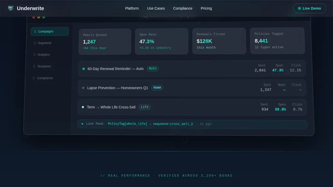
Live Metrics Performance Strip
A dedicated strip below the hero image displays real-time-feeling performance numbers: open rates, emails queued, and renewals closed. This section answers the first buyer question, does it actually work, with specific figures rather than generic claims. Insurance email marketing examples grounded in real numbers keep users engaged and build trust faster than copy alone.
Dual Call-to-Action Section
The primary call to action, "See Your Sequences Live," appears first as a floating glass button after the third scroll reveal, then anchors persistently in the navigation bar. A secondary call to action, "Download the Insurance Playbook," captures email and book size from visitors not yet ready to demo. Together they cover both ends of the decision stage without overwhelming visitors with too many form fields, the lead capture asks only two things, keeping friction low.
Compliance-Aware Template Architecture
The feature matrix panel dedicated to compliance surfaces state-specific disclaimers and compliant messaging structures directly in the design. Trust and privacy are key in insurance marketing, and this section signals to insurance agents and carrier teams that the platform was built with compliance in mind from the start. Clear and transparent communication shown inside the template's glass panels reinforces credibility at every scroll point.
Glassmorphic Motion Design System
The full design system uses a deep policy navy base at hex #0B1120, frosted glass panels at rgba(255,255,255,0.08) with 12-pixel blur, electric teal accents at hex #00E5CC, and soft premium white body text at hex #E8ECF1. Scroll-triggered reveals, staggered panel animations, and pulsing active-send indicators are GPU-accelerated for smooth performance. The aesthetic communicates a modern, data-alive platform without requiring the visitor to read a single line of marketing copy before they feel the product.
Page sections overview
| Section | Purpose |
|---|---|
| Hero Dashboard Preview | Establishes platform credibility with live-feeling dashboard data and cursor parallax |
| Live Metrics Strip | Answers "does it work?" with real open rate, queue, and renewal numbers |
| Feature Matrix Panels | Progressive scroll reveals covering segmentation, compliance, co-op tracking, renewal logic |
| Social Proof Results | Named testimonials with policy book sizes, open rates, and revenue recovery figures |
| Dual Call-to-Action | Routes warm visitors to demo, captures cooler leads with playbook download |
| Footer Linear Row | Minimal single-row footer with links and branding |
Design & branding system
The design language feels like watching a dashboard through a rain-streaked office window at night. Data glows behind translucent layers. Every panel floats, every number pulses. The aesthetic is not decorative, it communicates that the platform is alive and working.
- Color palette: deep policy navy #0B1120 as the base layer, frosted glass panels at rgba(255,255,255,0.08) with 12-pixel blur, electric teal #00E5CC for live data accents and hover states, and soft premium white #E8ECF1 for body text
- Typography: Manrope at weights 700 and 600 for headings, JetBrains Mono for data and metric displays, and DM Sans for body copy, a combination that reads as technical, premium, and trustworthy without feeling cold
- Motion system: all animations are scroll-triggered via Intersection Observer, GPU-accelerated using CSS transforms only, with passive scroll listeners to keep the page responsive, white space between panels is intentional and gives each glass card room to breathe on arrival
Mobile & speed optimization
The template is built desktop-first, matching where independent agency owners and MGA operations teams spend their working hours. That said, mobile users are fully supported through responsive layout adjustments and touch-friendly interaction patterns.
- GPU-accelerated CSS transforms power every animation, avoiding layout recalculations that slow mobile rendering, a one-second delay in page load can reduce conversions by 7 percent, so every motion choice is performance-conscious
- Intersection Observer handles all scroll reveals with passive scroll listeners, keeping the main thread clear on both desktop and mobile devices
- Tappable call-to-action buttons are sized appropriately for touch interaction, and the lead capture form asks only for email and book size, keeping the experience frictionless for mobile users arriving from email campaigns or paid ads
How this template helps you convert
This insurance landing page is engineered around a single conversion goal: get the visitor into the live demo sandbox. Every design choice, every motion cue, and every metric shown inside the glass panels serves that goal.
- The hero dashboard preview removes the biggest objection before the visitor reads a word, the platform looks real, alive, and already working on their behalf, which makes the "See Your Sequences Live" call to action feel like a continuation rather than a leap of faith
- Progressive disclosure through the feature matrix keeps users engaged across multiple scroll depths, revealing segmentation, compliance, and renewal automation logic in sequence, visitors who reach the dual call-to-action section have already seen enough proof to act
- The secondary "Download the Insurance Playbook" option captures new leads who are not yet demo-ready, asking only two questions to minimize friction, this widens the top of the sales funnel without adding a second competing goal to the primary landing page experience
Other information about this template
This section covers additional context relevant to insurance email marketing, landing page strategy, and the broader use cases this template can support.
- The Underwrite intelligent insurance email marketing landing page template is built specifically for the insurance email marketing niche, where generic templates consistently underperform because they lack policy-type awareness and compliance structure
- Insurance email marketing returns an average of $36 for every $1 spent, making it one of the highest-returning channels available to insurance companies and independent agencies
- Segmenting email lists by policy type and buyer stage can generate up to 760 percent more revenue compared to generic blasts, the feature matrix panels in this template communicate exactly that capability to visiting prospects
- Personalized emails improve click-through rates by as much as 41 percent; showing personalization logic inside the dashboard hero image makes that stat tangible for the visitor rather than abstract
- A good insurance landing page keeps forms short, ideally under three fields, to reduce user friction; the playbook lead capture here asks only for email and book size, following that best practice directly
- Companies using dedicated landing pages generate 55 percent more new leads than those relying on homepages or general marketing pages, which reinforces why a single-focus page like this outperforms broader site pages for campaign traffic
- Welcome emails and follow up sequences shown in the platform dashboard signal to visitors that the software handles the full customer journey, from onboarding through policy renewal and cross-sell
- The landing page supports use cases across multiple insurance product lines: life insurance policies, health insurance, auto insurance, home insurance, travel insurance, and pet insurance campaigns can all be represented through the policy-type segmentation panel
- Insurance providers who run carrier co-op programs will find the co-op tracking feature panel directly relevant to their distribution and reporting needs
- The template does not require coding skills to customize, layout, copy, and color tokens are accessible to marketing teams without a development background
- A clear visual hierarchy, strategic use of white space, and bullet points inside glass panels help guide visitors who scan content rather than read thoroughly, which is the default behavior for busy insurance agents on a desktop at midday
- Using social proof through named testimonials with specific policy book sizes and open rate metrics is one of the fastest ways to build credibility on an insurance landing page, the Social Proof section is purpose-built for that role
- The persistent floating call-to-action in the navigation means the demo entry point is always visible, reducing the chance that a visitor loses the thread after engaging deeply with the feature matrix
- Feedback email and customer feedback data from real agency owners, displayed as testimonials with specific numbers, reinforce that the platform delivers measurable outcomes rather than vague promises
- Industry awards or certifications displayed near the dual call-to-action section can further strengthen trust signals for first-time visitors evaluating multiple email marketing platforms
- Quick tips inside feature panels, displayed in JetBrains Mono as data-style callouts, give visitors helpful information in a format that feels native to the dashboard aesthetic rather than bolted on
- The marketing message throughout the page stays focused on outcomes: open rates climbing, renewals closing, lapse sequences recovering revenue, not on feature lists for their own sake
- Insurance marketing teams that run paid ads to this landing page will benefit from the tight message match between ad creative and the hero section's dashboard aesthetic, since the tone, hero image, and subject line framing are all consistent
- The page earns repeat business interest by showing that the platform handles the full lifecycle: welcome emails for new customers, renewal reminders at sixty days out, lapse prevention at 2 AM, and cross-sell drips calibrated by policy type
- Helpful tools like the playbook lead capture and the interactive demo route serve different stages of buyer readiness, making this a versatile insurance landing that works across cold traffic and warm retargeting alike
- A/B testing different subject line variants and call-to-action copy is straightforward on a focused single-page layout like this, because there are fewer variables competing for attention
- Insurance businesses that need right campaigns deployed quickly before a rate filing or open enrollment window will find the pre-structured section order saves significant production time
- The template supports exclusive discounts or promotional messaging blocks that can be dropped into the metrics strip or the dual call-to-action section for seasonal campaigns
- For a health insurance landing page or a health insurance landing built around open enrollment, the section layout and compliance panel are directly applicable with copy swaps only
- Similar savings claims and coverage options comparisons can be introduced inside the social proof section using the existing glassmorphic card format without redesigning the layout
- Quick call prompts can be added to the dual call-to-action section as a third option for visitors who prefer a phone conversation before booking a full demo
- The right coverage messaging for life insurance, auto insurance, or car insurance products can be incorporated into the feature matrix panels through the policy-type segmentation row
- Insurance options and insurance needs addressed in the feature matrix establish the platform as a knowledgeable solution rather than a generic tool, which is critical for positioning among policy sellers evaluating multiple email marketing platforms
Theme
Dynamic Motion
Creative direction
Feature Matrix
Color system
Glassmorphic
Style
Scroll Reveal (Progressive)
Direction
Click-Through
Page Sections
Dashboard Preview Hero with Parallax
Progressive Scroll-reveal Feature Matrix
Live Metrics Performance Strip
Dual Call-to-action Section
Compliance-aware Template Panels
Glassmorphic Motion Design System
Related questions
Does this template include pre-written insurance email copy?
Can I customize the template without coding skills?
Is this template suitable for a health insurance landing page or other product lines?
How does the floating call-to-action button behave during scroll?
What does the secondary lead capture form ask for?


