Healthcare Software Complete Directory Website Template
Dispatch is a hub-and-spoke landing page template built for healthcare volunteer management platforms. It pairs a dark glassmorphic visual system with an anchor-navigated feature matrix, guiding nonprofit directors and outreach managers from shift-scheduling and credential tracking through to a confident app download. Every section is designed to replace spreadsheet chaos with calm, organized clarity.
by Rocket studio
Quick summary
Dispatch is a single-page, anchor-navigated landing page template for healthcare volunteer management apps. It uses a dark glassmorphic design system, a scrollable feature matrix, and a persistent app-download call to action. The template speaks directly to coordinators managing certified volunteers across free clinics, disaster relief sites, and rural health fairs.
Who this template is for
This template is built for teams that coordinate medical volunteers at scale. If your days involve matching credentials to shifts and chasing expiration dates, this layout was designed around your reality.
- Nonprofit health directors managing 200 or more volunteers across rotating sites
- Hospital community outreach managers tracking credential and certification expiration dates
- Disaster response leads who need certified volunteers confirmed within hours
What problem this template solves
Volunteer coordinators in healthcare settings often rely on spreadsheets to track shifts, credentials, and availability. That approach breaks down fast when sites multiply, volunteers rotate, and certification records go stale.
- No single view connects volunteer availability, site schedules, and credential status at once
- Coordinators waste critical time manually matching volunteers to open shifts
- Urgent coverage gaps become emergencies when there is no system built for rapid response
What you get with this template
This template delivers a complete, production-ready landing page layout for a healthcare volunteer management app. Every section is purposeful, and the design works from first scroll to final download tap.
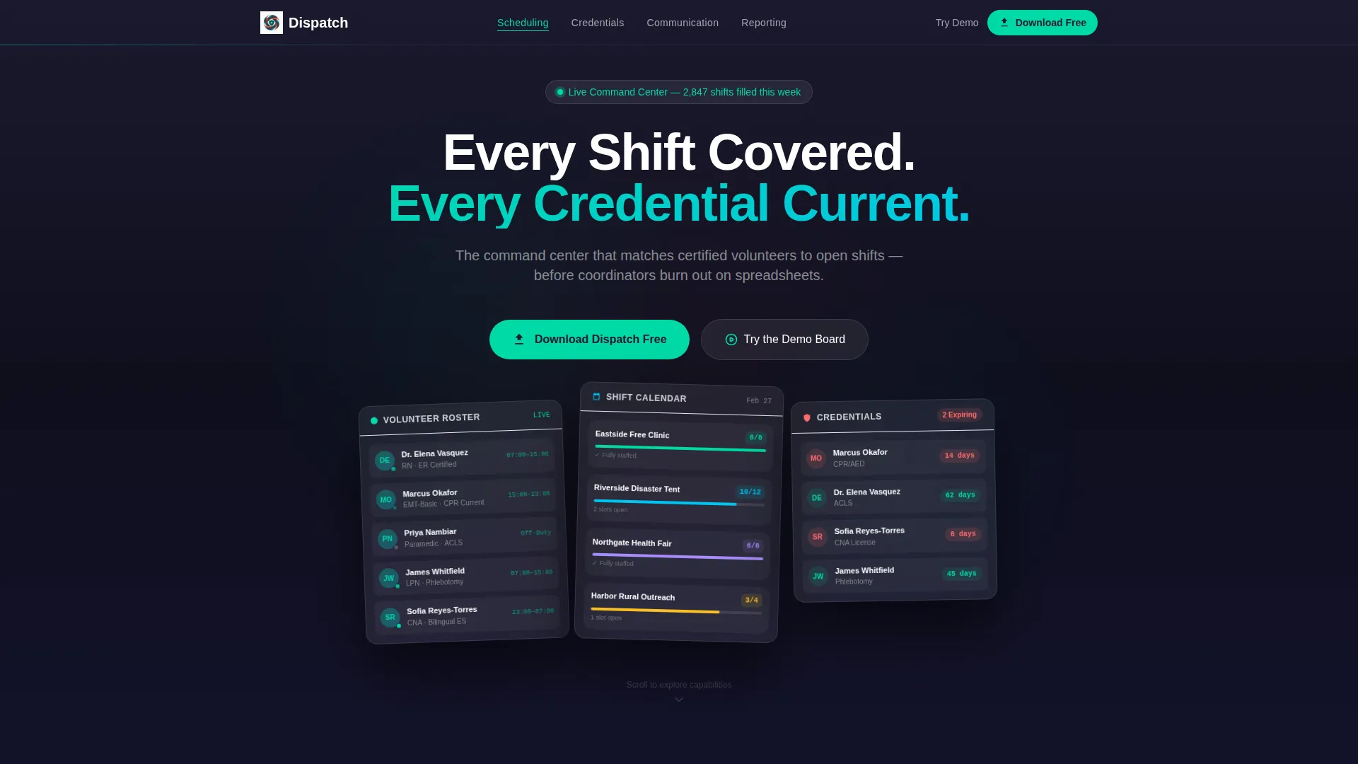
- A dark glassmorphic header with three floating data panels showing roster, schedule, and credential states
- A hub-and-spoke anchor navigation driving visitors through four capability clusters: Scheduling, Credentials, Communication, and Reporting
- A sticky frosted-glass app download bar with paired primary and secondary calls to action
Feature list
This template covers every capability a healthcare volunteer management platform needs to showcase. The feature matrix structure lets visitors explore depth at their own pace, building confidence before committing to a download.
Anchor-Navigated Feature Matrix
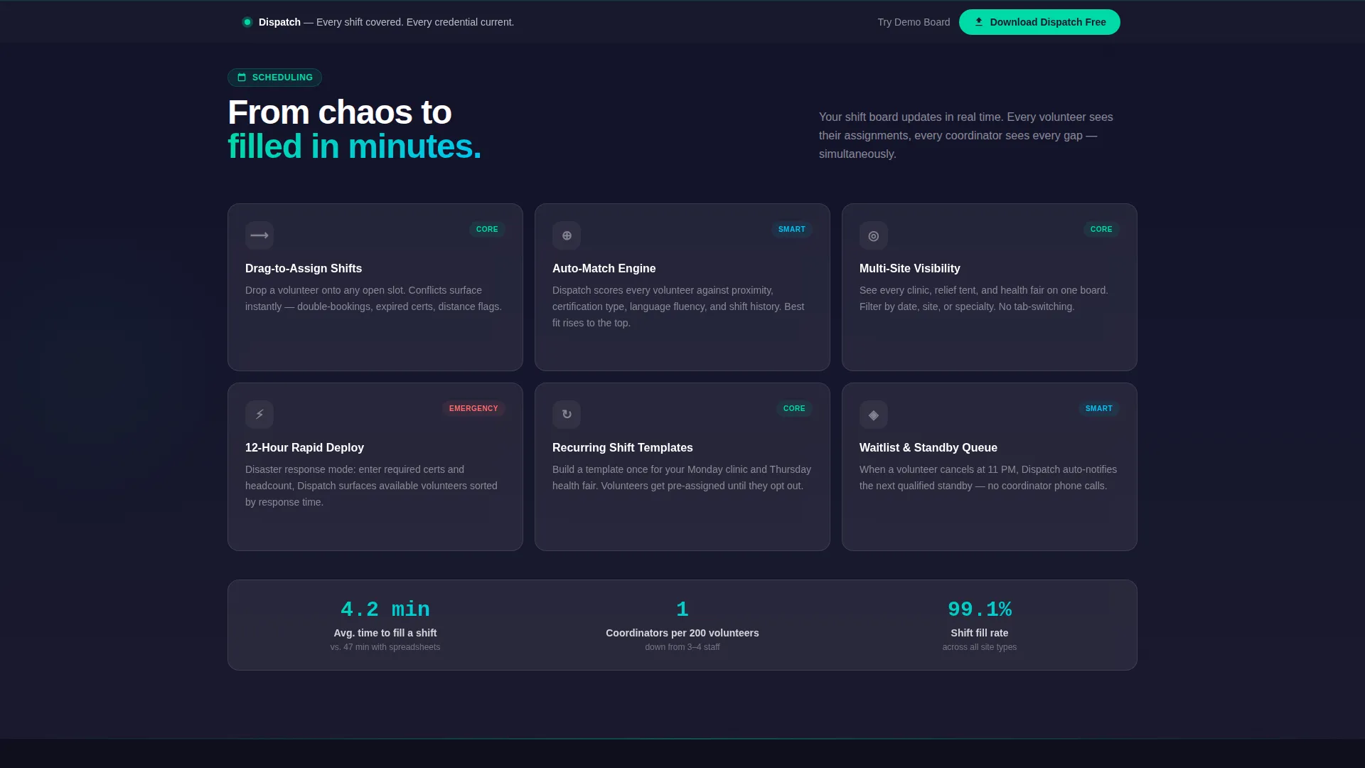
The page uses a hub-and-spoke structure with anchor navigation linking to four spoke sections: Scheduling, Credentials, Communication, and Reporting. Each spoke expands into a frosted glass card grid displaying teal checkmarks and short feature descriptions. Complexity escalates naturally from simple drag-to-assign scheduling to advanced auto-matching by proximity, certification type, and language fluency.
Glassmorphic Dark Panel Header
The header presents three translucent cards floating over a deep charcoal background. Each panel shows a different live-data state: a volunteer roster with green availability indicators, a color-coded shift calendar, and a credential tracker with coral expiration countdown badges. Micro-animations pulse the teal dots slowly, reinforcing the sense of a system that is always quietly active.
Sticky App Download Bar
A frosted-glass call-to-action bar follows the visitor along the bottom of the viewport throughout the entire page scroll. The primary action reads "Download Dispatch Free" with App Store and Google Play buttons. A secondary path offers "Try the Demo Board," requiring only an email to access a browser-based interactive preview.
Credential Tracker Display
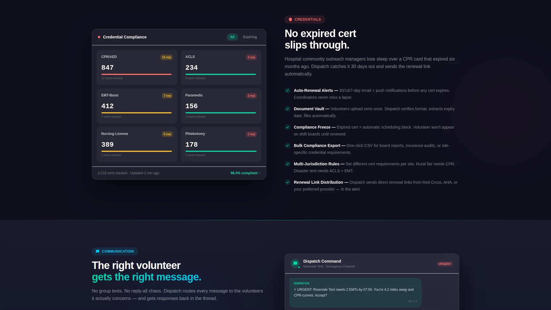
The credential tracker panel surfaces expiration countdown badges using the alert coral accent color. This visual language makes urgency immediately readable without requiring visitors to dig for context. It demonstrates the platform's ability to keep certification records current for volunteers such as retired nurses, Emergency Medical Technician students, and off-duty paramedics.
Shift Scheduling Interface Preview
The scheduling spoke previews drag-to-assign shift management alongside auto-match logic that factors in volunteer proximity, certification type, and language fluency. This escalating complexity walk-through helps coordinators visualize replacing their manual processes with a purpose-built tool.
Page sections overview
| Section | Purpose |
|---|---|
| Header with panels | Introduces platform with three live-data glassmorphic cards |
| Anchor navigation hub | Links visitors to each capability spoke section |
| Scheduling spoke | Showcases shift assignment and auto-match features |
| Credentials spoke | Highlights certification tracking and expiration alerts |
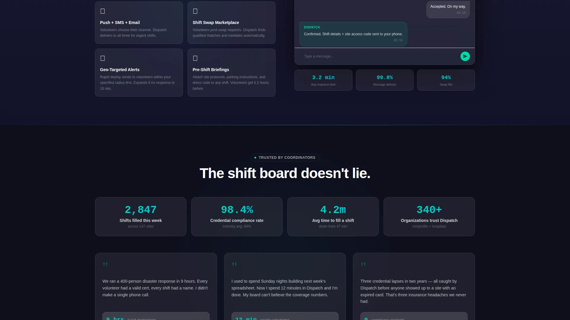
| Communication spoke | Presents volunteer outreach and notification capabilities |
| Reporting spoke | Displays oversight and coverage reporting features |
| Sticky download bar | Persists app download and demo calls to action across full scroll |
Design & branding system
The visual identity follows a Dashboard Pro theme built on a glassmorphic color system. The result feels like viewing a vitals monitor through a frosted ICU window at night: dark, layered, and alive with quiet data.
- Deep surgical charcoal (#1A1A2E) as the base background, frosted glass panel white at 12% opacity (#FFFFFF1F) for translucent cards, and pulse-monitor teal (#00D9A6) as the primary accent color
- Alert coral (#FF6B6B) reserved exclusively for notification badges and urgent-state indicators such as credential expiration countdowns
- Clean white sans-serif headline typography materializing between the dark glass panels for immediate visual hierarchy
Mobile & speed optimization
The template is structured for a smooth experience across device sizes. The sticky download bar and anchor navigation are both designed to remain functional and readable on smaller viewports.
- The hub-and-spoke layout keeps scroll paths short and purposeful on mobile, reducing navigation friction
- Frosted glass card components are contained and self-sufficient, making them straightforward to adapt for narrower screen widths
How this template helps you convert
The page earns the download before asking for it. Every structural decision prioritizes visitor confidence over immediate conversion pressure.
- The feature matrix lets visitors explore Scheduling, Credentials, Communication, and Reporting at their own pace, so they arrive at the download bar already convinced the platform replaces their spreadsheet workflow.
- The secondary "Try the Demo Board" path lowers commitment for visitors who are not ready to install, capturing their email through an interactive preview instead of losing them entirely.
Other information about this template
Dispatch is built as a single landing page using a hub-and-spoke anchor navigation structure. It is categorized under Technology and Healthcare Software, targeting the healthcare volunteer management niche. The template style and intersection context were matched at a score of 13, reflecting a strong alignment between the visual system, creative direction, and audience intent.
- Template style: Hub and Spoke with Anchor Navigation
- Theme: Dashboard Pro with a Glassmorphic color system
- Creative direction: Feature Matrix with escalating complexity per spoke
- Primary call-to-action direction: App Download with paired App Store and Google Play buttons
- Header concept: Dark Glass Panels with three distinct live-data states
Theme
Dashboard Pro
Creative direction
Feature Matrix
Color system
Glassmorphic
Style
Hub & Spoke (Anchor Nav)
Direction
App Download
Page Sections
Anchor-navigated Hub and Spoke Layout
Dark Glassmorphic Header Panels
Persistent App Download Bar
Credential Expiration Tracker Display
Escalating Feature Matrix
Related questions
Who is this landing page template designed for?
What makes the header design distinctive?
Can I adapt the color system to a different brand?
How does the sticky download bar work?
Does the template support only app download goals?



