Premium School Landing Page Template
Torque is a single-page engineering school landing page template built around a personalized quiz, scrollable case study comparison table, and a low-friction lead capture flow. Designed for high-school programs targeting ambitious juniors, it guides parents and students from curiosity to enrollment inquiry using warm geometric visuals, real student narratives, and a clear "Find Their Track" call to action.
by Rocket studio
Quick summary
Torque is a premium engineering school landing page template that opens with an interactive quiz, moves through a three-student comparison table narrative, and closes with a near-zero-friction lead generation form. The Playful Geometric design feels technical without feeling cold, making it ideal for hands-on programs that need to earn trust from both students and parents quickly.
Who this template is for
This template is built for engineering programs and workshop-campus schools that enroll high-school students. It works best when your audience includes both the student and a parent making the final decision.
- High-school engineering camps and intensive summer programs looking to stand out from academic alternatives
- STEM-focused schools that want to show real student outcomes rather than just listing course names
- Admissions teams that need a single page to capture parent leads and move families toward enrollment
What problem this template solves
Most engineering school pages describe what they teach. Torque shows what students actually become. Parents and guidance counselors need proof, not promises, and the template is structured to deliver that proof in a format that feels personal rather than institutional.
- Students and parents scroll past generic program pages because they see no one who looks like them in the content
- Enrollment forms with too many fields create drop-off before the lead is captured
- Programs with strong outcomes lose prospective families because there is no clear next step after reading
What you get with this template
You get a fully designed, single-page layout with every section built and ready to populate with your program's content. The structure moves visitors from curiosity to commitment through three clearly sequenced stages.
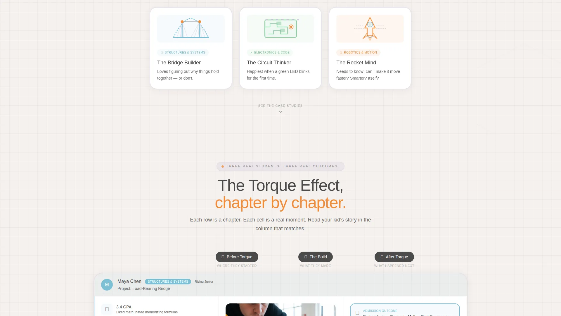
- An animated Quiz Starter header with three illustrated answer cards that personalize the page experience
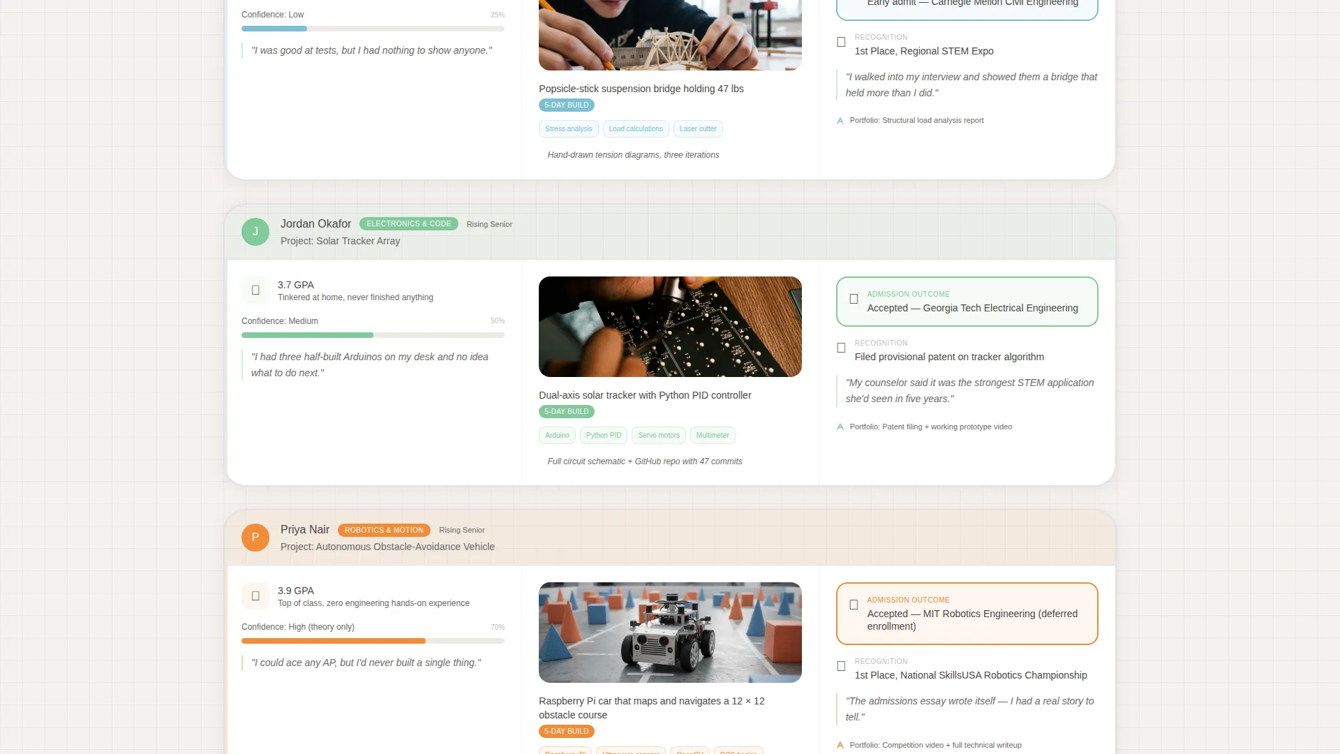
- A scrollable three-column comparison table featuring "Before Torque," "The Build," and "After Torque" narrative rows
- A sticky "Find Their Track" call-to-action bar, a slide-up lead form, and a secondary gated PDF download path
Feature list
This section covers the core built-in components that make Torque work as a conversion-focused engineering school landing page.
Personalized Quiz Starter Header
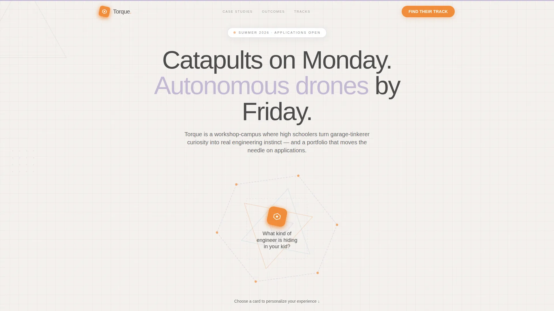
The header presents a single bold question inside an animated frame of rotating polygons and interlocking triangles. Visitors choose from three illustrated cards representing a bridge, a circuit board, and a rocket nozzle. The selected card colors the comparison table experience that follows, making the rest of the page feel personally relevant.
Case Study Comparison Table
Three real student journeys are displayed side by side across three rows labeled "Before Torque," "The Build," and "After Torque." Each cell is a mini-card with a geometric accent border that matches the quiz answer chosen. The progression moves from a bridge project to a solar tracker to a competition-winning autonomous vehicle, building stakes as the visitor scrolls.
Sticky "Find Their Track" Call to Action
A persistent bottom bar appears after the first scroll and stays visible throughout the page. A second full-width version appears after the final case study. Both trigger the same slide-up lead form so no scroll position is left without a clear next step.
Low-Friction Slide-Up Lead Form
The form collects three inputs in sequence: grade level via toggle buttons, the quiz card selection or area of interest pre-filled from the earlier interaction, and a parent email address. No phone number or last name is requested, keeping friction as low as possible.
Gated Project Catalog Download
A secondary call to action offers a downloadable Project Catalog as a gated PDF. This path targets parents who are researching but not yet ready to submit a lead form, giving the program a second chance to capture contact information from hesitant visitors.
Hover Parallax Card Interactions
Each illustrated quiz answer card tilts on hover with a soft parallax shadow effect. This interaction reinforces the hands-on, workshop feel of the program before a visitor has read a single word of body copy.
Page sections overview
| Section | Purpose |
|---|---|
| Quiz Starter Header | Personalizes the page experience through an illustrated card selection |
| Animated Geometric Frame | Sets the workshop-campus visual tone on first arrival |
| Comparison Table Rows | Presents three student journeys across before, build, and outcome columns |
| Case Study Cards | Delivers photo and schematic evidence within each table cell |
| Sticky call to action Bar | Keeps the lead form accessible throughout the entire scroll |
| Full-Width call to action Section | Reinforces the primary call to action after the final case study |
| Slide-Up Lead Form | Captures grade level, interest area, and parent email in three steps |
| PDF Download Path | Offers a lower-commitment alternative for undecided parents |
Design & branding system
The template uses a Soft Mist color system that feels like graph paper left on a spring windowsill. The palette is precise but never clinical, warm but never unfocused.
- Four core colors: cloud-white (#F4F1EE) and morning-fog lavender (#C4B8D4) for backgrounds, drafting-pencil graphite (#4A4A4A) for all body text, and signal tangerine (#F28C38) reserved exclusively for buttons, badges, and interactive highlights
- The Playful Geometric theme runs through every visual layer, with rotating polygon frames, interlocking triangle motifs, and geometric accent borders on each comparison table card
- Quiz card selection dynamically applies the matching geometric accent color to the comparison table, creating a thread of visual personalization through the full scroll
Mobile & speed optimization
The layout is designed to translate naturally from a wide desktop comparison view to a stacked single-column experience on smaller screens. The quiz card interaction and sticky call-to-action bar are both built with touch navigation in mind.
- The three-column comparison table reflows to a vertically stacked card format on narrow viewports so no row content is hidden or truncated
- The slide-up lead form uses toggle buttons instead of dropdowns, which are easier to tap accurately on a phone screen
- The sticky bottom bar remains anchored on mobile so the lead capture entry point is always within reach without scrolling back to the top
How this template helps you convert
The page is structured to reduce hesitation at every stage, from first impression to form submission. Each design and copy decision is aimed at moving a visitor one step closer to filling out the lead form or downloading the Project Catalog.
- The quiz creates immediate personal investment. Visitors who choose a card are more likely to keep reading because the page now reflects their own interest back at them, rather than presenting a generic program overview.
- The case study table replaces abstract claims with concrete outcomes. Seeing an admission letter, a patent filing, and a competition trophy in the final row answers the parent's real question before they have to ask it.
- Two separate conversion paths capture leads at different readiness levels. The "Find Their Track" form targets families ready to act now, while the Project Catalog download captures parents who are still comparing options.
Other information about this template
This template is categorized under Education and Training, specifically within the College and University subcategory with a focus on the Engineering School niche. It was built at the intersection of a Comparison Table template style, a Case Study Narrative creative direction, a Quiz Starter header concept, and a Lead Generation landing-page direction. All of these intersection fields were matched and confirmed in the source brief.
- The template style is a Comparison Table, making it a strong fit for programs that need to differentiate between tracks, student profiles, or program tiers on a single page
- The Quiz Starter header concept is particularly effective for audiences with varied entry points, such as students interested in civil, electrical, or mechanical engineering, because it lets each visitor self-select into the most relevant content thread
- The Soft Mist color system and Playful Geometric theme were chosen to signal technical rigor while avoiding the sterile, institutional feel that causes younger audiences to disengage
Theme
Playful Geometric
Creative direction
Case Study Narrative
Color system
Soft Mist
Style
Comparison Table
Direction
Lead Generation
Page Sections
Personalized Quiz Starter Header
Case Study Comparison Table
Sticky Find Their Track Call to Action
Low-friction Slide-up Lead Form
Gated Project Catalog Download
Hover Parallax Card Interactions
Related questions
Can I change the quiz card topics to match my program's tracks?
Does the comparison table support more than three student case studies?
What information does the lead form collect?
Is the Project Catalog download a separate page?
Who is the primary audience this landing page is designed to reach?



