Community College Landing Page Template
Enroll is a single-page community college landing page template built around honest financial storytelling. It opens with an animated savings counter, walks visitors through three side-by-side comparison tables, and funnels them toward a personalized tuition estimator. The design speaks directly to working adults, single parents, and career-changers who need proof that college is affordable before they share a single detail.
by Rocket studio
Quick summary
Enroll is a lead generation landing page template for community colleges. It leads with a live savings counter, moves through cost comparison tables, and closes with two clear conversion paths: a personalized tuition estimator and a downloadable family guide. The layout is built for visitors who are skeptical about cost and need concrete numbers before they trust an institution.
Who this template is for
This template is designed for community colleges that serve non-traditional students and want to compete directly with four-year institutions on value. It speaks to admissions teams, enrollment coordinators, and marketing staff who need a page that converts cautious, cost-conscious visitors.
- Community college marketing and admissions teams
- Enrollment coordinators targeting working adults and career-changers
- Institutions promoting nursing, allied health, or vocational retraining programs
What problem this template solves
Many prospective students quietly talk themselves out of enrolling before they ever contact a school. They assume college is unaffordable. They worry about childcare, scheduling, and whether their situation is too complicated. This template confronts those fears directly using real data and structured comparisons.
- The "I can't afford this" assumption stops many qualified adults from applying
- Prospective students lack a simple, honest cost breakdown they can trust
- Single parents and career-changers need proof of practical support before they commit
What you get with this template
You get a fully structured single-page layout built around financial transparency and emotional resonance. Every section is designed to move a hesitant visitor one step closer to submitting their information.
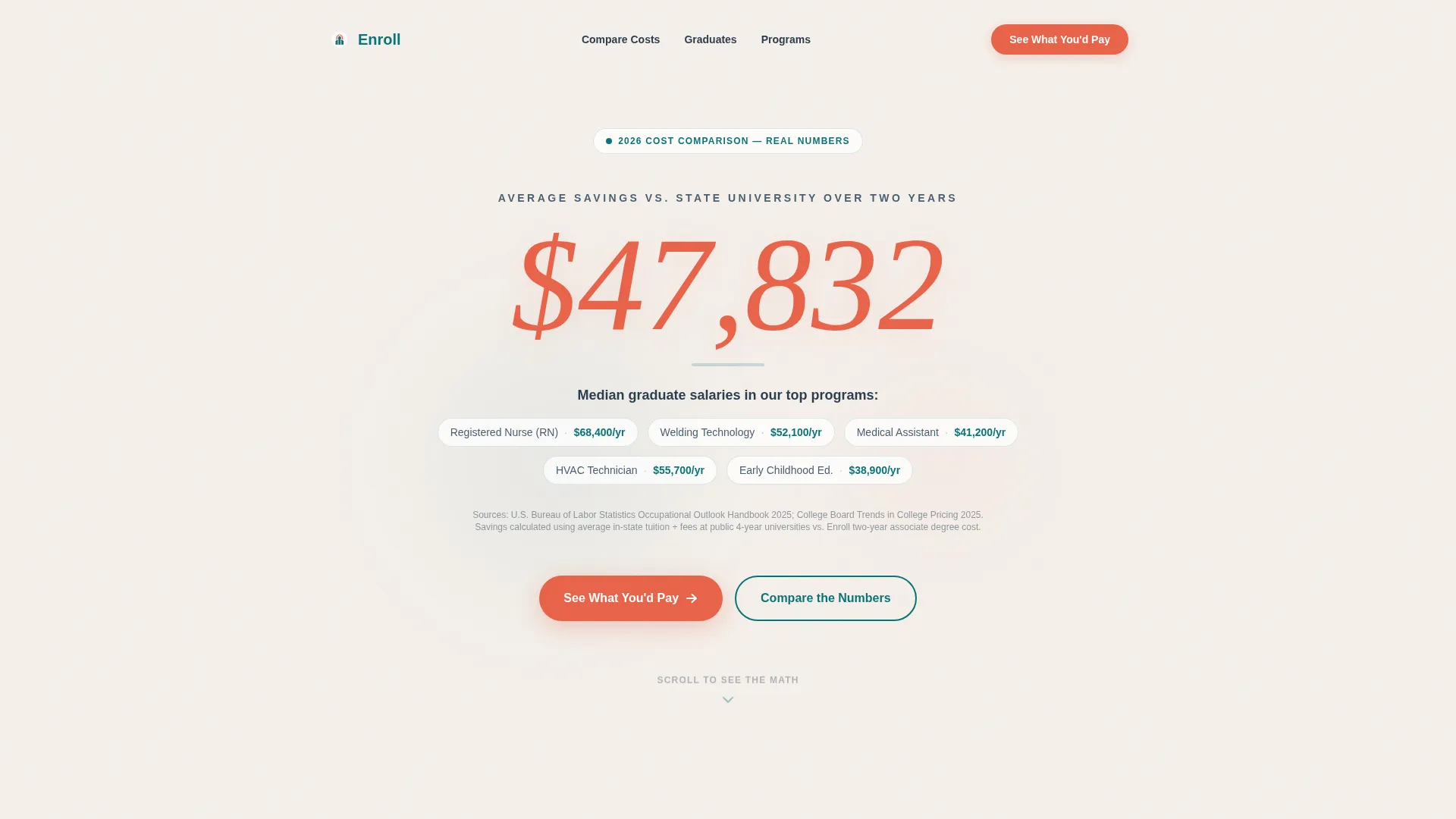
- An animated header counter showing cost savings versus a state university
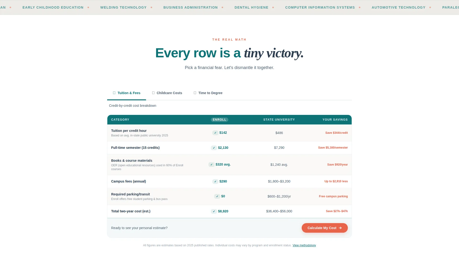
- Three vertical comparison tables covering tuition, childcare, and time-to-degree
- An inline tuition estimator and a gated PDF download as two distinct conversion paths
Feature list
This template includes purposeful components that match the real concerns of community college prospects. Each feature earns its place by reducing a specific friction point.
Animated Savings Counter
The header opens with a single counter animating from $0 to $47,832, representing average savings versus a state university over two years. A second line fades in beneath it showing median graduate salary across the college's top five programs. A small source citation grounds both figures in credibility.
Three-Panel Comparison Tables
Three tabbed comparison tables stack vertically and address the three biggest financial fears: tuition per credit hour versus four-year schools, childcare cost with and without the campus program, and time-to-degree for working adults versus traditional students. Each table row functions as a concrete, visual proof point.
Video Testimonial Block
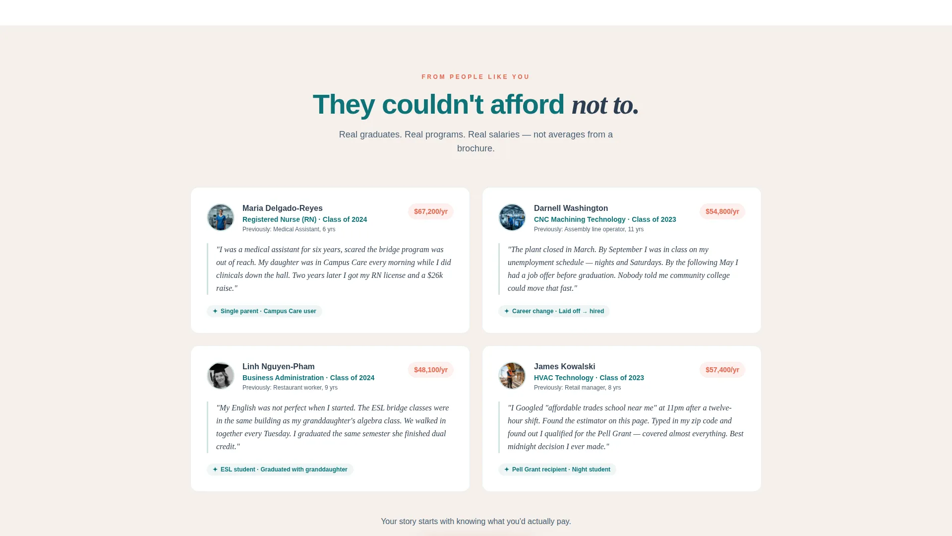
Short video testimonials from graduates appear below the comparison tables. Each testimonial is tagged with the graduate's program, graduation year, and current salary. The section is designed to reflect the visitor's own profile and shift the emotional tone from doubt to possibility.
Inline Tuition Estimator
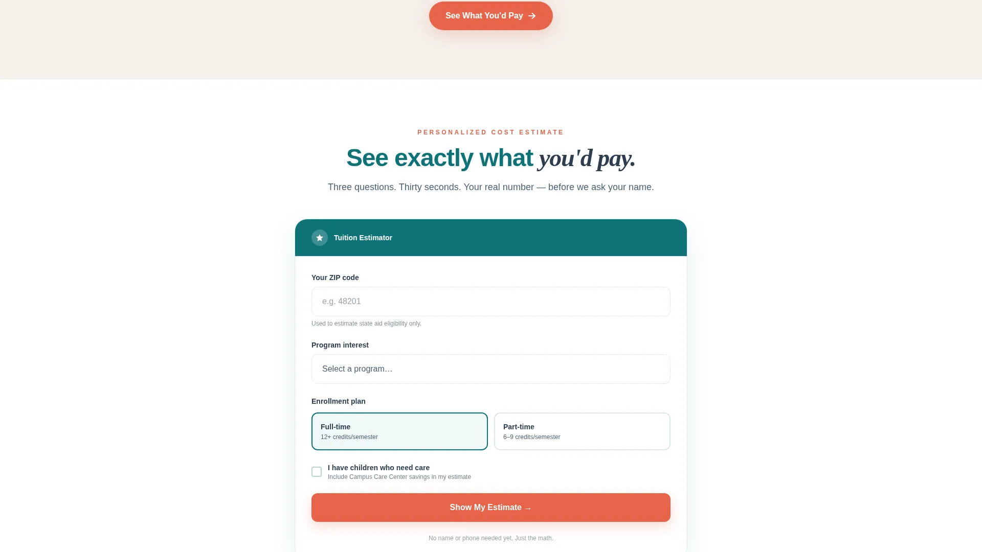
The primary call to action opens an inline estimator that asks only for zip code, program interest, and enrollment status (full-time or part-time). It returns a personalized cost estimate before requesting a name or phone number, earning trust before asking for commitment.
Gated Family Guide Download
A secondary conversion path offers a downloadable PDF covering childcare options, evening schedules, and financial aid. It is gated behind an email address only, keeping the barrier low for visitors who are not yet ready to speak with admissions.
Problem-to-Solution Scroll Arc
The page is structured so every scroll moves the visitor from financial anxiety to confident possibility. The comparison tables open the tension. The testimonials and estimator resolve it. The arc is deliberate and supported by the section order built into the template.
Page sections overview
| Section | Purpose |
|---|---|
| Animated savings header | Opens with cost data to anchor attention immediately |
| Tuition comparison table | Compares credit-hour costs versus four-year schools |
| Childcare comparison table | Shows cost difference with and without campus childcare |
| Time-to-degree table | Contrasts completion timelines for working versus traditional students |
| Graduate video testimonials | Builds trust through recognizable, salary-tagged graduate stories |
| Inline tuition estimator | Delivers a personalized cost estimate before requesting contact details |
| Family guide download | Provides a low-friction secondary path for hesitant visitors |
Design & branding system
The visual identity follows a Family First theme built on the Teal Catalyst color system. The palette is intentionally warm and institutional at once, designed to feel trustworthy without feeling cold or bureaucratic.
- Deep institutional teal (#0D7377) anchors headers and navigation for authority and calm
- Warm charcoal (#2C3E50) carries body text at a tone that reads like a trusted advisor
- Soft eggshell (#F5F0EB) fills background panels so the page breathes and stays readable
- Catalyst coral (#E8634A) appears exclusively on call-to-action buttons and cost-savings figures to draw the eye toward action
Mobile & speed optimization
The layout is designed with single-column readability in mind, which translates naturally to smaller screens. Visitors using phones at midnight after a shift should be able to scan the page and tap into the estimator without friction.
- Centered, wide-space layout adapts cleanly to narrow viewports
- The tuition estimator requires only three inputs, keeping mobile interaction brief
- The PDF download path asks for one field only, reducing tap-and-type effort on small screens
How this template helps you convert
The conversion strategy is built on a single principle: prove affordability with hard numbers before asking for anything personal.
- The animated counter and comparison tables answer the cost question upfront, reducing the most common reason visitors leave without acting.
- The inline tuition estimator returns a personalized figure using just three inputs, giving visitors a reason to stay and a specific number to act on.
- The family guide download provides a lower-commitment path for visitors who need more time, capturing an email address while delivering immediate value.
Other information about this template
This template sits at the intersection of financial transparency and human storytelling. It is especially effective for institutions that serve students who are balancing work, family, and education simultaneously.
- The template style is a comparison table landing page, suited for institutions competing on measurable value
- The header concept is Data Storytelling, leading with a number rather than a photograph
- The creative direction follows a Problem to Solution Arc across the full scroll
- The color system is Teal Catalyst and the theme is Family First, both designed to feel professional and approachable together
- The template fits the community college niche within the broader Education and Training category
Theme
Family First
Creative direction
Problem→Solution Arc
Color system
Teal Catalyst
Style
Comparison Table
Direction
Lead Generation
Page Sections
Animated Cost Savings Counter
Three Vertical Comparison Tables
Graduate Video Testimonials
Inline Tuition Estimator
Gated Family Guide Download
Problem-to-solution Scroll Structure
Related questions
Who is the ideal visitor this landing page is designed for?
What are the two main ways a visitor can convert on this page?
Can the comparison tables be updated with a college's own data?
Why does the estimator ask for only three inputs before showing a cost estimate?
Does this template include actual video content or just the layout?



