Bold Brutalist School Programs Landing Page Template
The Enroll Bold Brutalist School Programs Landing Page Template is a data-grid landing page built for schools that need to display every program, schedule, and price in one place. It uses a raw neo brutalism aesthetic with electric indigo, charcoal, and magenta to put information center stage. Parents scan, compare, and reserve spots without making a single phone call.
by Rocket studio
Quick summary
This landing page gives schools a bold, scannable hub for every program they offer. Parents see program names, age ranges, schedules, capacity, and pricing the moment they arrive. The design draws from brutalist aesthetics, raw, direct, and built around function. Nothing is hidden. Every row is a clickable unit that routes straight to registration.
Who this template is for
This template was designed with a specific group of users in mind. It serves anyone who needs a school's full program catalog published as a live, readable inventory rather than a buried PDF.
- Parents of school-age children who need fast answers about schedules, pricing, and open spots before registration closes
- Admissions coordinators who want one shareable web link instead of answering the same twelve questions daily
- After-school program directors who need a clean, functional web presence that routes families directly to enrollment
What problem this template solves
Most school program pages bury the details. Parents land on a site and find vague descriptions, outdated PDFs, and a "contact us to learn more" dead end. That friction increases the bounce rate and sends families to competitors.
- Pricing, schedules, and spot availability are hidden or missing entirely from the school's website
- Admissions staff spend hours fielding repeat questions that a well-structured page could answer automatically
- Existing pages lack the visual clarity needed for users comparing multiple programs at once
What you get with this template
This template delivers a complete, single-page enrollment hub built on a bold brutalist dashboard structure. Every section has a defined function, and every component earns its place through raw utility.
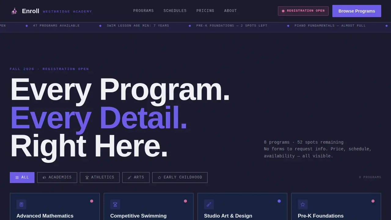
- An interactive bento tile grid above the fold with category filters, program names in oversized type, age ranges, schedule lines, and pulsing availability indicators
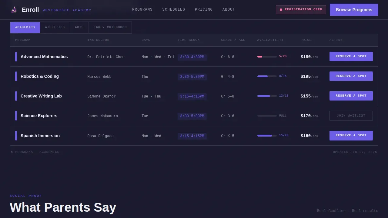
- A full spec grid per category showing program, instructor, schedule days, time block, grade or age range, spots remaining, semester price, and a "Reserve a Spot" call-to-action column
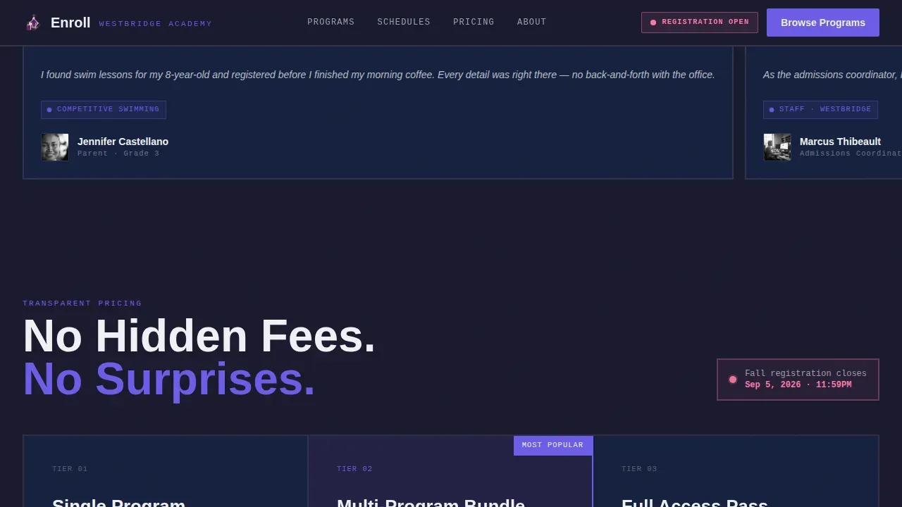
- A stats trust bar, horizontal-scroll parent testimonial cards, a transparent pricing registration card, and a footer in the Vercel Horizontal pattern
Feature list
This template is built around a set of concrete, purposeful features. Each one reflects a deliberate web design choice rooted in brutalism in web design: information first, decoration never.
Interactive Bento Tile Grid Header
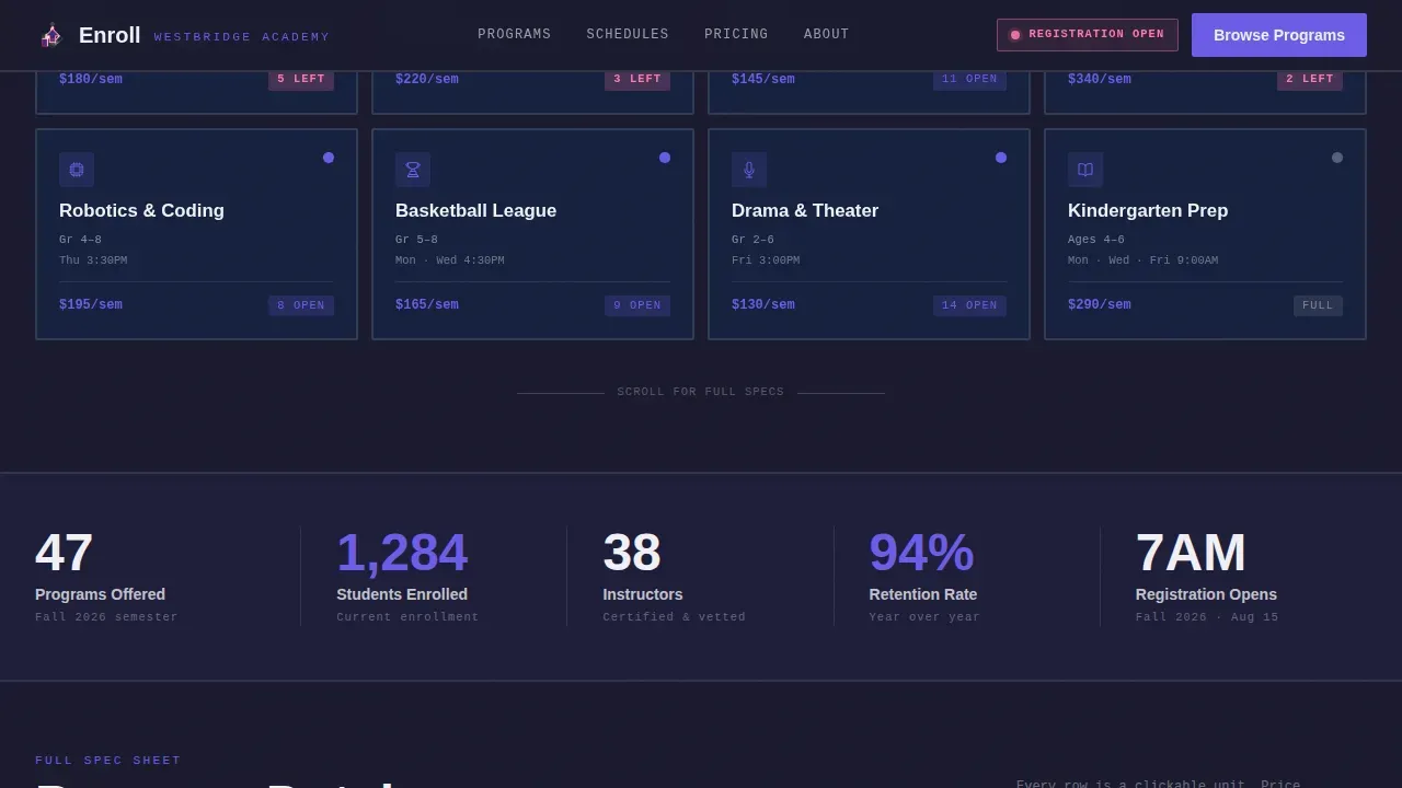
The header is a live, clickable grid of program cards visible above the fold. Each tile shows a program name in oversized slab-serif bold typography, an age range, a single-line schedule, and a pulsing indigo availability dot. Category filter buttons, Academics, Athletics, Arts, Early Childhood, rearrange the grid instantly using snap transitions with no easing or fade. Users interact with the page before they scroll a single pixel.
Eight-Column Spec Data Grid
Below the header, each program category expands into a full data table. Columns cover program name, instructor, days, time block, grade or age range, spots remaining, and semester price. The final column is always a "Reserve a Spot" call-to-action in electric indigo. Monospaced typography renders every data point with the visual weight of a system readout, reinforcing the raw, structured brutalist web design aesthetic. Rows shift from indigo to magenta as availability drops, giving users an immediate urgency signal.
Snap Filter Transitions with Category Navigation
Filter controls sit at the top of the grid and use abrupt, brutalist snap transitions, no fade, no easing. This design style is a defining characteristic of web brutalism: the interface moves like a physical filing system, not a polished animation reel. The result is a fast, tactile feel that rewards decisive users and keeps the focus on data, not decoration.
Sticky Mobile Comparison Bar
A sticky bottom bar appears on mobile screens. It displays the active filter count and a secondary call-to-action: "Compare Selected Programs." This feature supports parents toggling between swim levels or music tracks on a phone at 7 AM during registration. Mobile-first design is critical for this use case, and the sticky bar ensures the core action is always reachable with one thumb.
Trust Metrics Stats Bar
A dedicated stats section surfaces enrollment counts, program totals, instructor numbers, and retention rates as bold, oversized figures. These metrics function as social proof without requiring the user to read a testimonial. The raw, grid-aligned layout keeps numbers in focus and supports the brutalist philosophy of letting data do the persuading.
Transparent Pricing Registration Card
The registration call-to-action section uses a pricing ticket card that shows cost details before the user clicks anything. No "contact us" prompts, no hidden fees. The primary "Reserve a Spot" button is prominently placed in a high-contrast color, consistent with how call-to-action elements function across brutalist websites: rectangular, direct, and impossible to miss.
Page sections overview
| Section | Purpose |
|---|---|
| Hero Tile Grid | Interactive program overview with category filters and availability dots |
| Spec Data Grid | Full eight-column program table per category with row-level calls to action |
| Stats Trust Bar | Key enrollment metrics displayed as oversized bold figures |
| Testimonial Cards | Horizontal-scroll parent quotes referencing specific programs |
| Registration call to action | Transparent pricing card with primary reserve button |
| Footer | Vercel Horizontal pattern with site-wide navigation links |
Design & branding system
The visual identity channels the raw energy of brutalist architecture, think exposed structures, industrial grids, and bold type scaled to demand attention. The color system draws from neo brutalism adapted for a school enrollment context, using high contrast color schemes that create immediate visual impact without relying on photography or illustration.
- Deep slab charcoal (#1A1A2E) for card backgrounds and section dividers; electric indigo (#6C5CE7) as the primary action color; chalk white (#F0F0F5) for body text and data labels; hot signal magenta (#FD79A8) reserved for low-availability badges and urgency row states
- Manrope for headings with heavy grotesque weight; JetBrains Mono for all data fields, reinforcing a dashboard feel rooted in sans serif typefaces and monospaced raw data display
- Asymmetrical layouts within the grid structure, snap transitions, staggered row reveals, and pulsing availability dots create a visually striking design that feels alive without relying on polished visual effects
Mobile & speed optimization
The template is built mobile-first because the primary audience is parents opening registration on a phone. The brutalist design approach naturally supports speed: fewer heavy assets, minimal styling overhead, and static data rendering mean the page loads fast under real-world conditions.
- Large, thumb-friendly clickable tiles and row targets sized for mobile interaction; sticky bottom bar keeps the comparison and reserve actions accessible without scrolling back to the top
- Client-side filter state management handles category switching without full page reloads; static data structure avoids server-side rendering overhead, keeping the site lightweight and responsive
How this template helps you convert
Brutalism in web design earns conversions through radical transparency. This template puts every piece of enrollment data in front of the user before they need to ask a question. The data is the persuasion.
- Every program row shows price, schedule, spots remaining, and a direct "Reserve a Spot" button in the final column, so users move from scanning to deciding without leaving the page or contacting staff
- The magenta urgency state on near-full rows creates a natural deadline signal that motivates users to act before a program closes, reducing hesitation and lowering the bounce rate on high-demand registrations
- The "Compare Selected Programs" sticky bar lets mobile users shortlist options without losing their place, reducing friction for parents weighing two or three programs before committing
Other information about this template
This template reflects a broader shift in today's web design toward honesty and utility. Brutalism in web design has roots in the early days of the internet, when websites were raw and focused on function over form. Web brutalism has since evolved into a deliberate design approach, and neo brutalism refines those raw materials into something more intentional without losing the directness.
Designers who want to create something that breaks traditional expectations will find this template a solid foundation. It rejects the smooth, predictable feel of polished designs in favor of bold typography, high contrast, and geometric components that put information first. Many brutalist websites rely on solid color backgrounds and exposed structures to communicate authenticity, and this template follows that same logic applied to school enrollment.
The brutalist movement in architecture peaked with brutalist buildings defined by raw concrete forms and honest material expression. Architectural brutalism influenced the broader architectural movement that later inspired web brutalism as a visual metaphor for online transparency. The term traces back to "béton brut," meaning raw concrete in French, and the parallel to web design is deliberate: show the structure, expose the data, and trust the user to make a decision.
This template suits creative agency studios building sites for schools, as well as independent web designers developing educational resources for institutions that want a strong web presence. It supports creative portfolios of work aimed at the younger generation of school administrators and parents who respond to bold, functional aesthetics. Web designers working across social media platforms can use this template as a reference point for how neo brutalism handles data-dense, high-stakes enrollment use cases.
The design style draws from examples of successful brutalist websites that demonstrate how an eye catching style can also be an extremely simplistic and minimalist approach. Many brutalist websites use bright colors and vibrant colors against dark backgrounds to achieve high contrast without illustration. This template is a powerful tool for any school or academy that needs a web presence as bold and direct as the programs it offers. Used with careful consideration, it can create a unique experience that keeps users on the page, reduces confusion, and helps families commit with confidence.
- This template is best suited for schools with multiple program categories needing a scannable, data-forward enrollment hub
- The Electric Indigo color system and brutalist aesthetics make this an appropriate choice for institutions willing to move beyond conventional educational web design
- Examples of higher education institutions like the Yale School of Art and The New School have adopted neo brutalist aesthetics, showing that this design style works in serious academic contexts
- Studio Push, Kurt Champion, and Jeremy Baxter are examples of brutalist websites that showcase how brutalist elements can be used with intention and clarity
- The template supports easily steal-free originality through its specific color system, typography pairing, and section architecture
Theme
Bold Brutalist
Creative direction
Spec Sheet
Color system
Electric Indigo
Style
Dashboard/Data Grid
Direction
Click-Through
Page Sections
Interactive Bento Tile Grid Header
Eight-column Spec Data Grid
Snap Category Filter Transitions
Sticky Mobile Comparison Bar
Trust Metrics Stats Bar
Transparent Pricing Registration Card
Related questions
Is this template suited for schools with many different program types?
Does the template show pricing and availability without requiring a login?
Can a non-technical school administrator update the program details?
How does the urgency system work for nearly full programs?
Is this template appropriate for a school that prefers a traditional look?



