Enroll - Dynamic School Finder Landing Page Template
Enroll is a comparison table landing page built for school-choice thank you pages. It greets newly registered families with a personalized confirmation banner, a sortable school comparison table, and algorithmically matched school recommendations. The Electric Indigo visual system and Dark Glass Panel header make it feel like a live school-choice fair, vivid, trustworthy, and built to drive app downloads.
by Rocket studio
Quick summary
Enroll is a single-page comparison table landing page designed for school and academy thank you pages. It meets families right after they submit an inquiry form and guides them toward a confident school decision. The page combines a personalized confirmation banner, a filterable school directory table, and a clear app download call to action, all wrapped in a bold Electric Indigo visual identity.
Who this template is for
This template is built for school districts, education platforms, and enrichment program networks that need to convert inquiry submissions into deeper engagement. It speaks directly to the parents and students standing at a school-choice crossroads right after registering.
- Parents comparing multiple schools or academies after submitting an initial inquiry form
- Families relocating mid-year who need to evaluate bilingual, Montessori, or specialty programs quickly
- Teenagers or guardians researching summer conservatories, STEM academies, or arts enrichment programs with open enrollment windows
What problem this template solves
After a family submits an inquiry form, most thank you pages go quiet. They confirm receipt and offer nothing more. That silence is a missed opportunity. Families are most motivated to act in the minutes right after they register, and a static confirmation page wastes that window entirely.
- Families leave the thank you page without discovering other relevant programs in their district
- Decision fatigue sets in because there is no structured way to compare tuition, enrollment status, or program focus in one place
- The app or next-step tool never gets introduced, so re-engagement depends entirely on follow-up emails
What you get with this template
You get a fully designed, single-page landing page that transforms the post-inquiry moment into an active school discovery experience. Every section is purpose-built to move a family from confirmation to comparison to conversion.
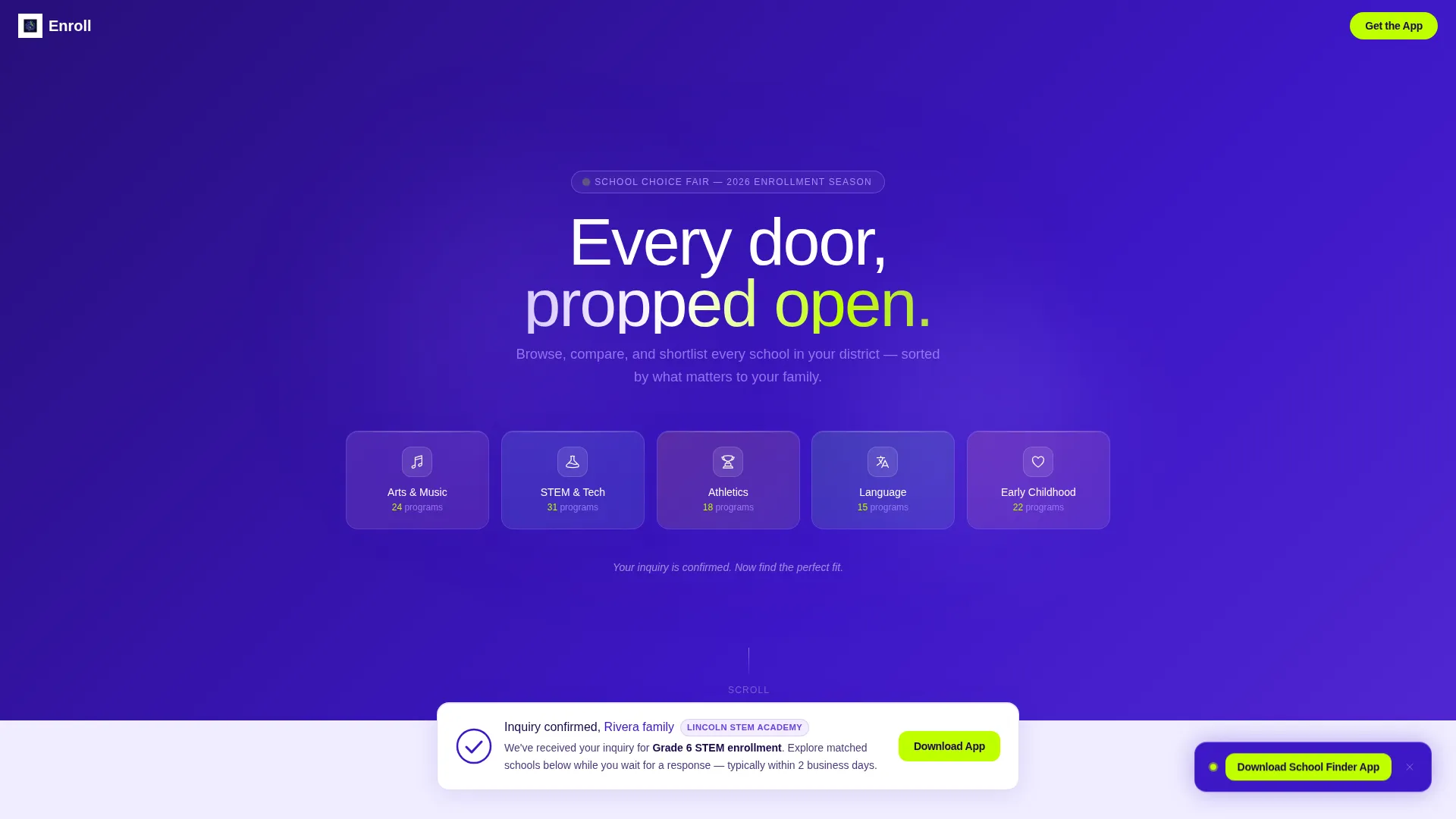
- A Dark Glass Panel header with glowing school-category icons and live program counts per category
- A personalized confirmation banner with the family's name, the inquired program, and a checkmark animation
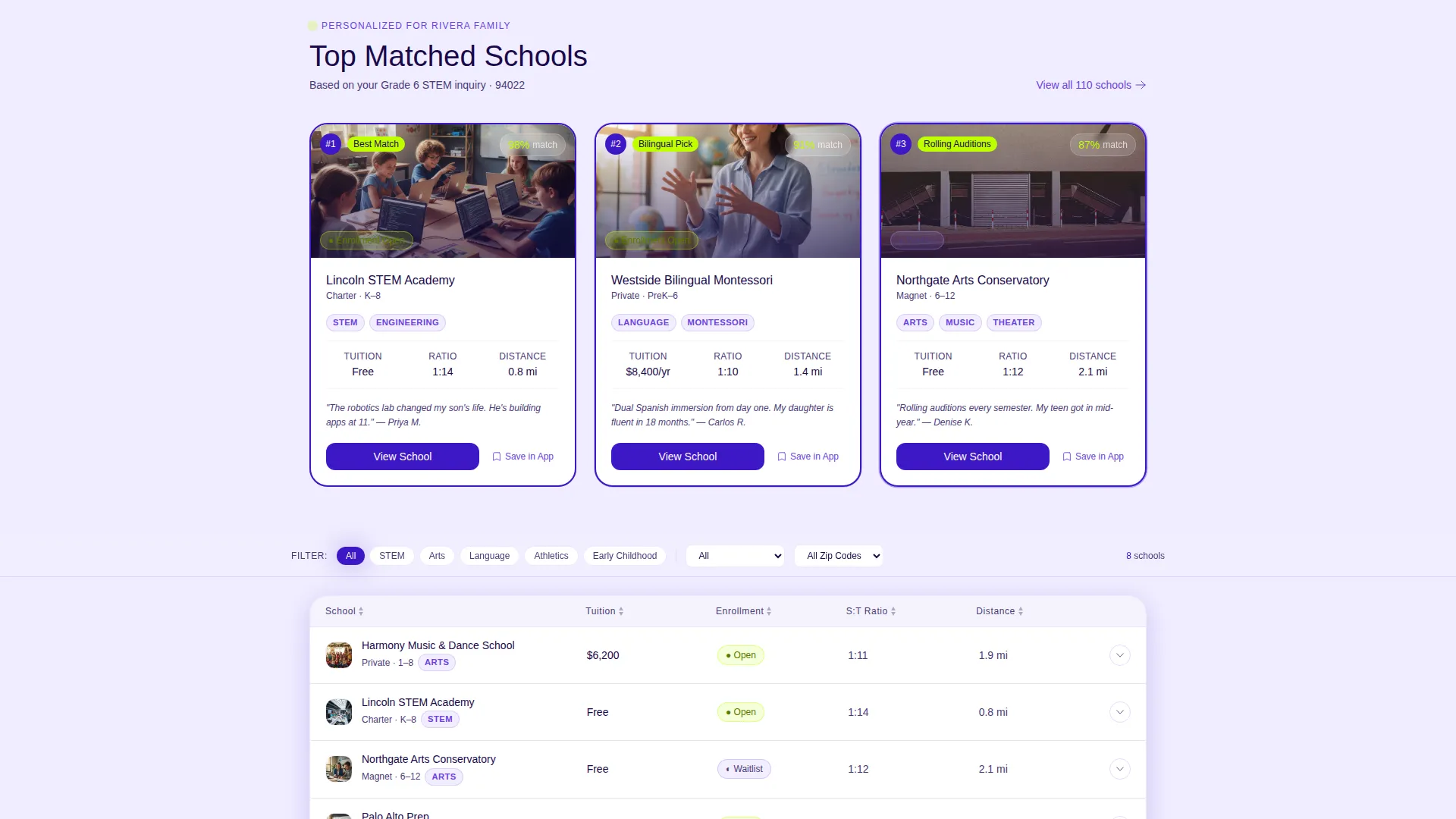
- A sortable comparison table with expandable rows, sticky filter bar, and a "Top Matched" recommendation section
Feature list
This template delivers a focused set of visual and interactive components drawn directly from its Directory and Discovery theme. Each feature reinforces the moment-of-decision experience the brief describes.
Dark Glass Panel Header
Five frosted, translucent header panels float over a slow-moving indigo-to-violet gradient. Each panel represents a school category, Arts, STEM, Athletics, Language, and Early Childhood, with a glowing icon and a live count of programs inside. The panels tilt subtly on cursor movement, giving the header a tactile, dimensional feel.
Personalized Confirmation Banner
A pulsing banner greets the visitor with their name and the program they inquired about. A checkmark animation resolves in under one second, immediately signaling that the submission was received. The banner also places the primary "Download the School Finder App" call to action in electric chartreuse on an indigo button.
Sortable Comparison Table
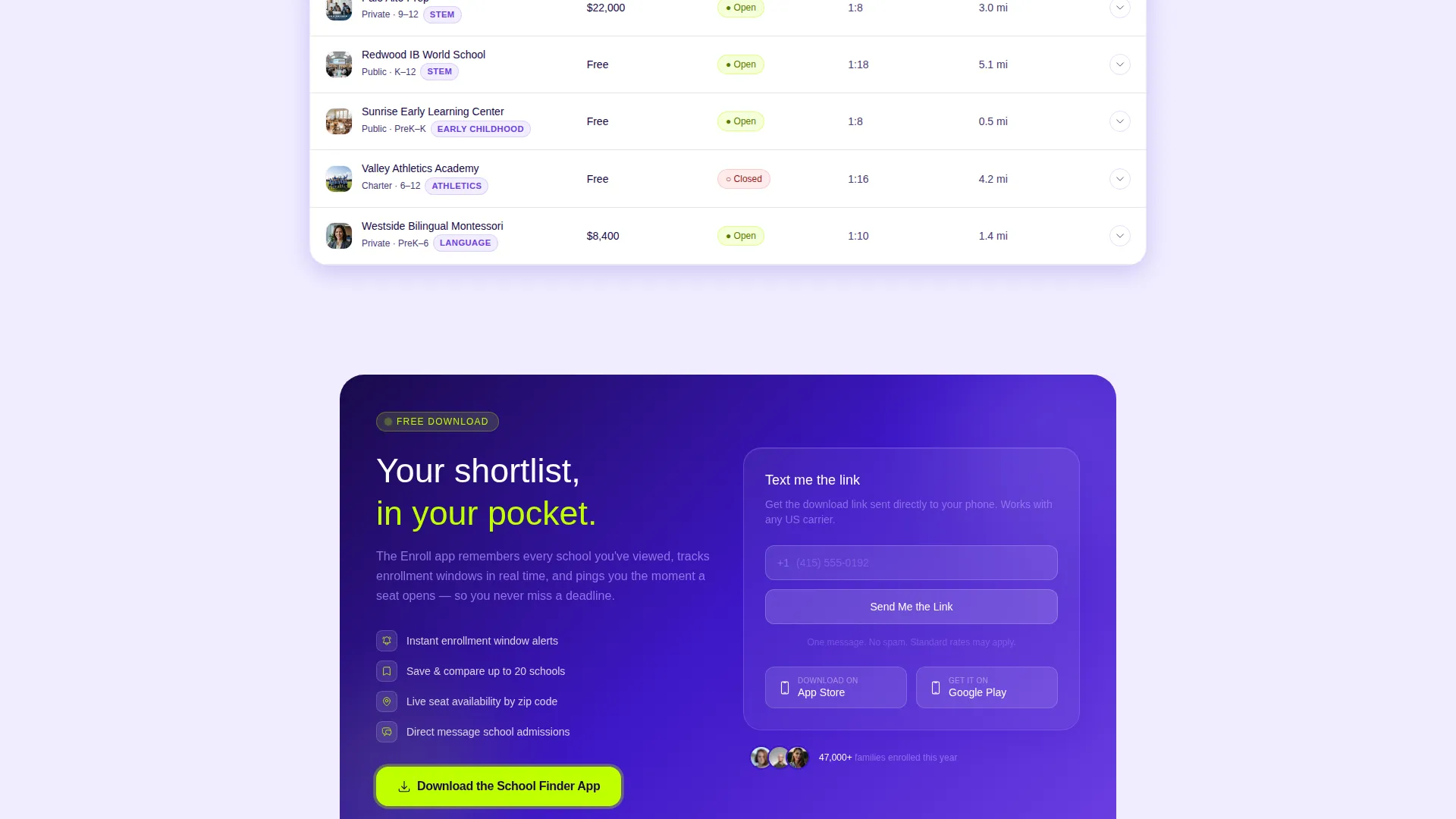
The core of the page is a structured table comparing schools across tuition range, enrollment status, student-teacher ratio, and program focus. Each row is expandable to reveal a mini-profile with a campus photo and a parent-review snippet. The table background uses near-white ice for easy reading across all lighting conditions.
Sticky Filter Bar
As the visitor scrolls past the header, a filter bar locks to the top of the viewport. It lets families narrow results by zip code, age group, and discipline without losing their place in the table. Active filter states use charged violet to signal which filters are live.
Top Matched Recommendations
A dedicated section uses the inquiry data submitted at registration to surface three algorithmically recommended schools. These cards display pulsing indigo borders to distinguish them from the standard table rows, making the most relevant options visually prominent without requiring extra interaction.
Persistent App Download Button
A floating "Download the School Finder App" button appears after the visitor first interacts with the comparison table. It stays visible as a secondary conversion anchor throughout the scroll. A micro-conversion option below it offers "Text Me the Link" with a single phone-number field for families who prefer mobile delivery.
Page sections overview
| Section | Purpose |
|---|---|
| Dark Glass Header | Introduces school categories with glowing panels and program counts |
| Confirmation Banner | Personalizes the thank you moment and surfaces the primary app download call to action |
| Comparison Table | Lets families sort and compare schools by tuition, enrollment status, ratio, and focus |
| Expandable Row Profiles | Reveals campus photo and parent-review snippet per school on click |
| Sticky Filter Bar | Keeps zip code, age group, and discipline filters accessible during scroll |
| Top Matched Section | Highlights three algorithmically recommended schools based on inquiry data |
| Floating Download Button | Provides a persistent app download prompt after first table interaction |
| Text Link Micro-conversion | Captures a phone number to deliver the app download link by text message |
Design & branding system
The visual identity follows a Directory and Discovery theme powered by an Electric Indigo color system. Every color choice is intentional: deep indigo anchors authority, violet signals interactivity, and electric chartreuse cuts through for calls to action. The overall effect feels like a tablet screen glowing in a dim auditorium, readable at a glance and sophisticated enough to signal trustworthy data.
- Deep screen-glow indigo (#3D17C6) anchors headers and table column highlights; charged violet (#6C3FE2) activates on hover states and live filters; luminous periwinkle (#A78BFA) marks secondary badges and category tags; near-white ice (#F0EDFF) fills the table background for legibility
- Electric chartreuse (#BFFF00) is used exclusively for "Enrollment Open" status indicators and download call-to-action buttons, making the most actionable elements immediately distinct
- Text in the glass panel header appears etched rather than printed, reinforcing the premium open-house atmosphere the brief describes
Mobile & speed optimization
The template is designed with a scroll-driven, single-page structure that keeps interaction fluid on smaller screens. The sticky filter bar and floating download button are both sized and positioned to work naturally on touch devices, ensuring that mobile visitors can filter, expand rows, and trigger the app download without frustration.
- The comparison table is horizontally scrollable on narrow viewports so column data remains intact rather than collapsing into an unreadable format
- The personalized confirmation banner and checkmark animation are lightweight components designed to resolve quickly, keeping the opening moment of the page feeling snappy rather than delayed
- The floating app download button and "Text Me the Link" field are touch-friendly targets that remain accessible throughout the full mobile scroll experience
How this template helps you convert
The page is structured around a single conversion principle: earn the app download by demonstrating value before asking for it. Every interaction the visitor completes builds their trust in the tool they are being asked to download.
- The personalized confirmation banner with the family's name and inquired program establishes immediate relevance, making the visitor feel recognized rather than redirected to a generic page
- Each filter interaction, expanded row, and matched recommendation ends with a contextual nudge, "Save this school in the app" or "Get waitlist alerts on your phone", so the app pitch feels like a natural extension of what the visitor is already doing
- The persistent floating download button and the "Text Me the Link" micro-conversion give the visitor two low-friction paths to act, whether they prefer to download immediately or receive a reminder on their phone
Other information about this template
This template sits at the intersection of education technology and school-choice decision support. It is categorized under School and Academy Website Templates with a specific focus on the thank you page niche, making it one of the few templates purpose-built for the post-inquiry moment rather than the pre-inquiry marketing funnel.
- The template style is a Comparison Table, making it suitable for any platform or district that needs to present structured school data in a scannable, side-by-side format
- The creative direction is called Launch Energy, which describes the scroll pacing: the page escalates from a calm confirmation moment to an active, filtered discovery session
- The header concept is Dark Glass Panels, a design motif that can be adapted to reflect any set of program categories relevant to the district or platform using the template
- The landing page direction is App Download, meaning the entire page architecture is oriented toward getting a family to install the companion school-finder application
Theme
Directory & Discovery
Creative direction
Launch Energy
Color system
Electric Indigo
Style
Comparison Table
Direction
App Download
Page Sections
Dark Glass Panel Header
Personalized Confirmation Banner
Sortable Comparison Table
Sticky Filter Bar with Live States
Top Matched Recommendations
Persistent App Download Prompt
Related questions
Who is this landing page template designed for?
Can I customize the school categories shown in the header panels?
What columns does the comparison table include?
How does the Top Matched section work?
Is there a secondary conversion option besides the app download button?



