College & University Reviews Website Template
Enroll is a single-page landing page template built for online universities. It guides prospective students through a clear enrollment path using a step-by-step scroll, a program comparison table, rotating student profiles, and a live lecture preview. Two conversion paths capture visitors at different commitment levels, from a free class sign-up to a curriculum PDF download.
by Rocket studio
Quick summary
Enroll is a focused landing page template designed for online universities recruiting working adults and career-changers. It uses a step-by-step scroll structure to walk visitors from program comparison to free class sign-up. The Electric Indigo color system and Playful Geometric theme give it scholarly credibility with the energy of a modern digital experience.
Who this template is for
This template is built for online universities and digital education programs that need to convert skeptical, busy prospects into enrolled students. It speaks directly to audiences who research carefully before committing time or money.
- Working parents and mid-career professionals exploring flexible degree options
- Online university marketing teams launching or refreshing a program recruitment page
- Education entrepreneurs offering certificate, bachelor's, or master's level programs
What problem this template solves
Prospective online students face a real trust gap. They cannot walk a physical campus or sit in a class before enrolling. This template closes that gap before the first ask.
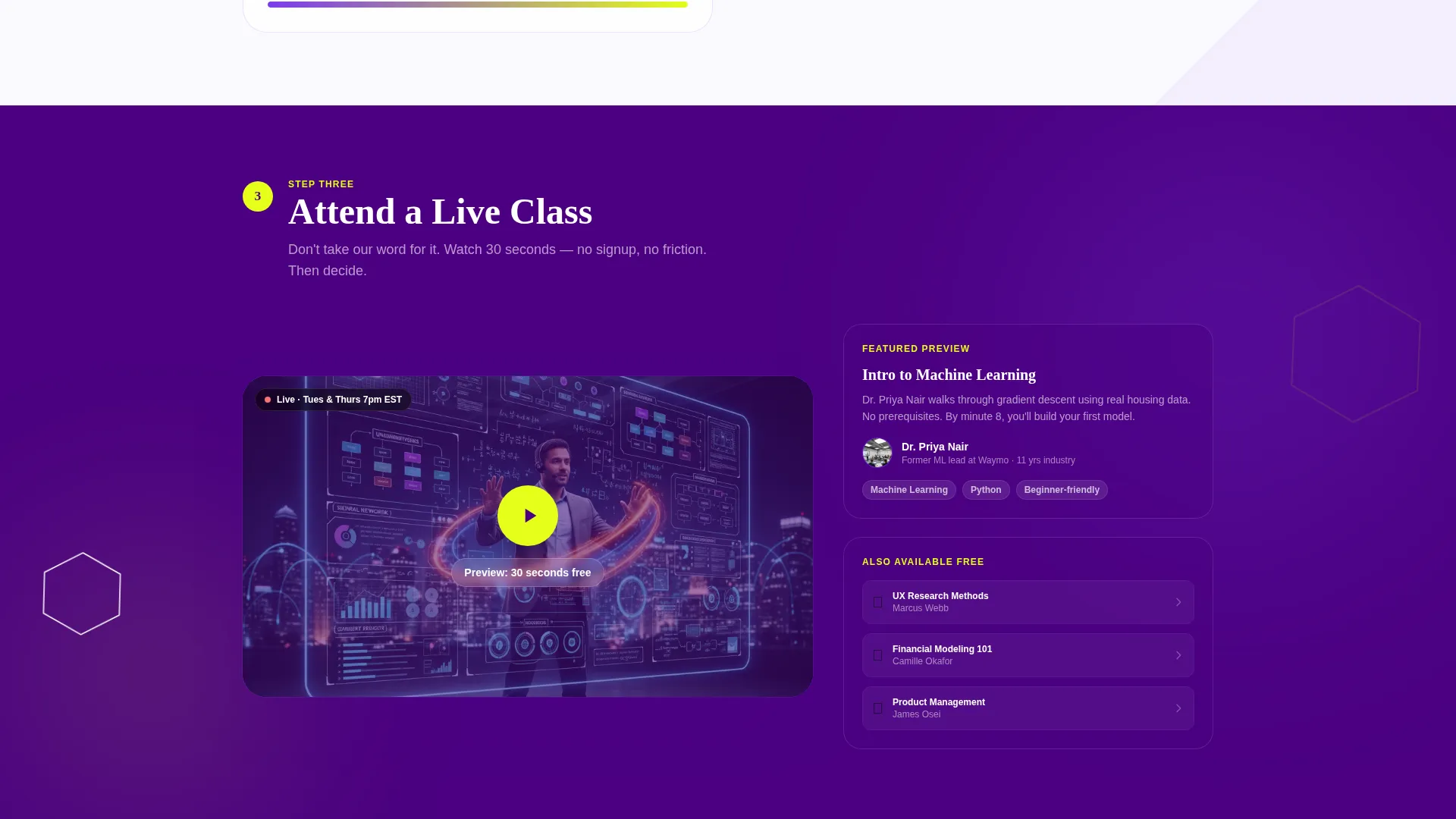
- Visitors cannot evaluate program quality without proof, so the template embeds a live lecture snippet that plays thirty seconds ungated
- Side-by-side program tiers are hard to compare without a structured layout, so a clear comparison table covers duration, tuition, live-class hours, and career services
- Two-step conversion funnels confuse undecided visitors, so the template offers both a free class path and a curriculum PDF path to match different readiness levels
What you get with this template
This is a fully designed, single-page layout with every major section pre-built and ready to customize. The structure follows a logical enrollment journey from first impression to sign-up.
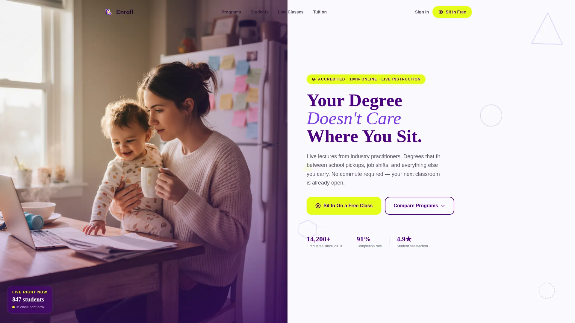
- A split header with a bold geometric headline and space for a real student photograph
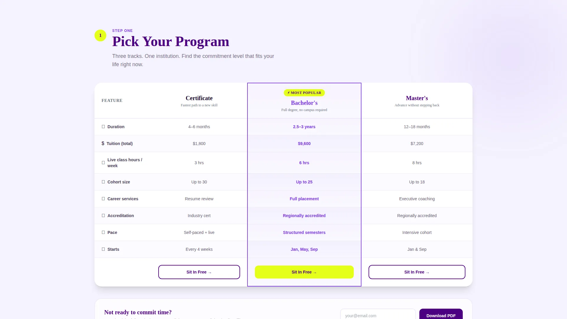
- A three-column program comparison table covering certificates, bachelor's degrees, and master's degrees
- A rotating student card section, an embedded lecture preview block, and three strategically placed call-to-action moments
Feature list
This template delivers a complete set of purpose-built sections and interactive components. Each piece is grounded in the conversion goal of turning a curious visitor into an enrolled student.
Step-by-Step Enrollment Scroll
The page is structured as a numbered journey. Visitors move through "Pick Your Program," "Meet Your Cohort," and "Attend a Live Class" in sequence. Each step is wrapped in a progressively complex geometric shape, from circle to triangle to hexagon to starburst, so the scroll itself feels like advancing through a curriculum.
Three-Tier Comparison Table
A clean comparison table sits at the heart of the page. It displays certificate, bachelor's, and master's programs across rows for duration, tuition, live-class hours, and career services. This gives prospective students the side-by-side clarity they need to self-qualify before reaching out.
Dual Conversion Path Design
The template captures two types of visitors at once. A primary call-to-action, "Sit In On a Free Class," appears in the header, pinned after the comparison table, and again at the page bottom. A secondary path below the table offers a curriculum PDF download gated behind email only, for visitors who want to compare programs offline before committing.
Free Class Sign-Up Modal
Clicking the primary call-to-action opens a lightweight modal. It asks only for first name, email, and a dropdown to select one of five sample lectures. The low friction of three fields keeps drop-off minimal and makes the sign-up feel like unlocking more of something already proven.
Embedded Lecture Preview Block
An ungated thirty-second lecture snippet plays directly on the page. It proves instructor quality and production value before any sign-up is required. This removes the "gambling on a promise" hesitation that often blocks enrollment decisions.
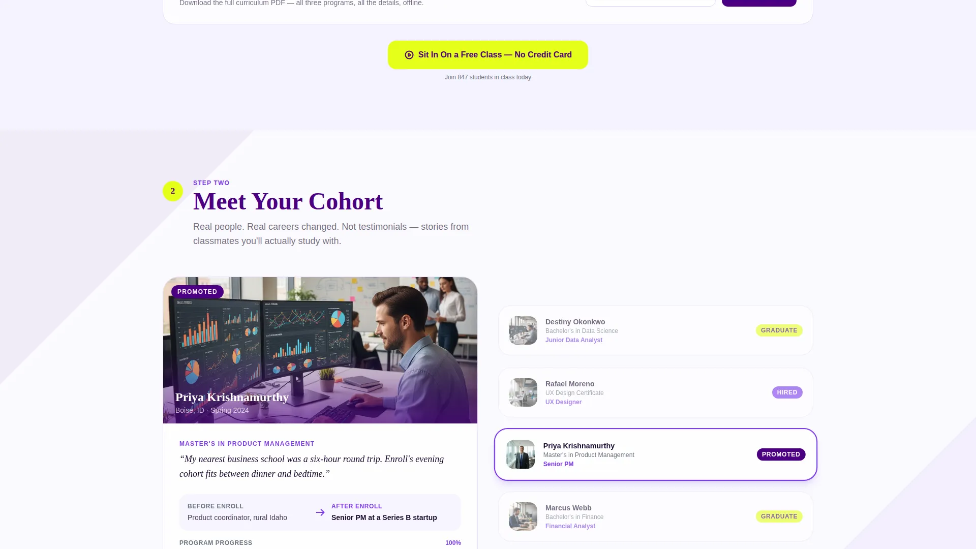
Rotating Student Card Section
A "Meet Your Cohort" section features rotating student profile cards. These humanize the online experience and help prospective students see themselves in the program. The cards reinforce that real, relatable people are succeeding in this format.
Page sections overview
| Section | Purpose |
|---|---|
| Split header block | Introduce headline and primary call to action |
| Pick Your Program | Host the three-tier comparison table |
| Comparison table call to action | Pin the free class call to action after table |
| Meet Your Cohort | Display rotating student profile cards |
| Attend a Live Class | Embed ungated lecture preview snippet |
| Free class modal | Capture name, email, and lecture choice |
| Curriculum PDF gate | Capture email for offline program comparison |
| Page bottom call to action | Close the page with final enrollment prompt |
Design & branding system
The visual identity follows a Playful Geometric theme built on an Electric Indigo color system. The palette balances scholarly authority with youthful energy, making the page feel trustworthy and exciting at the same time.
- Deep indigo (#4B0082) anchors headers and navigation; electric violet (#7C3AED) activates buttons and hover states; soft lavender mist (#EDE9FE) washes across section backgrounds
- Sharp citron yellow (#E4FF1A) marks accent badges, progress indicators, and "most popular" tags to guide the eye toward priority actions
- Translucent geometric shapes in triangles, circles, and hexagons float behind headline text with a gentle parallax drift on scroll, reinforcing the step-by-step leveling-up metaphor
Mobile & speed optimization
The template is designed with a mobile-first audience in mind. Working parents and busy professionals browse on phones between commitments, so every section is built to perform on smaller screens.
- The split header reflows cleanly on mobile, keeping the photograph and headline readable without horizontal scrolling
- The comparison table is structured to scroll horizontally on narrow screens so no program data is hidden or truncated
- The free class modal is sized and spaced for thumb-friendly tap targets, keeping sign-up friction low on touchscreens
How this template helps you convert
Every design and copy decision in this template is built around one goal: moving a hesitant visitor toward a confident first step. The page earns trust before it asks for anything.
- The ungated thirty-second lecture snippet plays first, proving real value before the visitor sees a sign-up form, so the free class call to action feels like a natural next step rather than a cold ask.
- The comparison table gives self-directed researchers the structured data they need to make a decision on their own terms, reducing the need for a sales conversation to get started.
- Three placements of the primary call to action, in the header, after the table, and at page bottom, meet visitors at whichever moment they feel ready, without repeating the same pressure three times in a row.
Other information about this template
This template was designed specifically for the online university niche within the broader education and training category. It is well suited for any program positioning itself as accessible, flexible, and credible.
- The template style is a Comparison Table layout, making it ideal for programs with multiple tiers or tracks that need side-by-side evaluation
- The Freemium/Trial landing page direction means the page is optimized around low-commitment entry points rather than hard sales pressure
- The Half-Page Photo and Text header concept supports authentic storytelling by pairing a real student image with a bold, direct headline
- The step-by-step creative direction makes the enrollment process feel approachable and sequential rather than overwhelming
- This template works well for certificate programs, undergraduate degrees, and graduate programs that recruit non-traditional students
Theme
Playful Geometric
Creative direction
Step-by-Step Guide
Color system
Electric Indigo
Style
Comparison Table
Direction
Freemium/Trial
Page Sections
Step-by-step Enrollment Scroll
Three-tier Comparison Table
Dual Conversion Path Design
Lightweight Free Class Modal
Ungated Lecture Preview Block
Rotating Student Card Section
Related questions
Can I customize the programs shown in the comparison table?
How does the free class modal work?
Can I use this template if I only offer one type of degree?
Is the lecture preview video hosted inside the template?
Who is the target visitor this template is designed for?



