AI for Higher Education Education Website Template
Enroll is a split-screen landing page template built for higher education AI chatbot products. It pairs a dark-glass hero with scroll-triggered comparison rows that show the before-and-after of every enrollment question. Designed for enrollment management VPs and registrar offices, it moves B2B buyers from skepticism to demo request through evidence-stacked, side-by-side storytelling.
by Rocket studio
Quick summary
Enroll is a single-page, split-screen landing page template for a higher education AI chatbot platform. It uses a head-to-head comparison structure to show enrollment teams exactly what changes when students and parents get instant answers instead of hold music. Every scroll section builds a case for the product through real scenarios, not adjectives.
Who this template is for
This template is built for B2B technology teams selling AI-powered tools to universities and colleges. The layout speaks directly to the people who own enrollment outcomes and institutional technology decisions.
- Enrollment management VPs and registrar directors who track yield, retention, and summer melt
- IT directors at mid-size state universities evaluating new student-facing platforms
- EdTech product and marketing teams positioning a higher education AI chatbot for institutional buyers
What problem this template solves
University enrollment offices field the same two hundred questions every August. Students wait on hold. Parents navigate phone trees. Advisors answer emails at 11 PM. A standard product page cannot communicate that pain quickly enough to move a VP toward a demo. This template solves that communication gap.
- Visitors feel the frustration of the current system before they see the solution
- Each comparison row escalates from convenience to retention numbers to enrollment yield data
- The call to action arrives only after the evidence makes the outcome obvious
What you get with this template
The template delivers a fully structured, single-page layout with high interactivity and a clear buyer journey from hero to conversion. Every section is purpose-built for a B2B higher education audience.
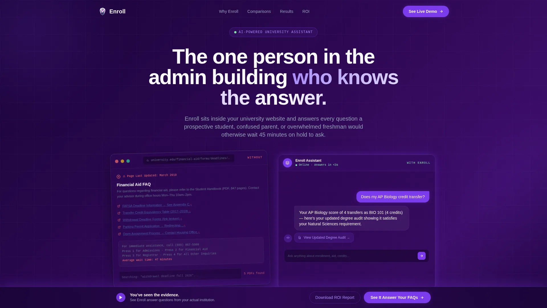
- A dark-glass split-screen hero with a broken FAQ panel on the left and a live chat demo panel on the right
- Five scroll-triggered comparison rows progressing from student convenience through institutional yield data
- Two conversion paths: a primary live demo call to action and a gated return-on-investment report download
Feature list
This template covers the full set of components described in the source brief. Each feature below reflects a specific design or structural decision built into the layout.
Dark Glass Panel Hero
Two frosted translucent cards float over a deep indigo gradient. The left panel shows a cluttered, outdated FAQ page. The right panel shows a sleek chat interface mid-conversation with a typing indicator pulsing below the bot's last answer. Edge lighting mimics phone screens in a dark lecture hall.
Scroll-Triggered Comparison Rows
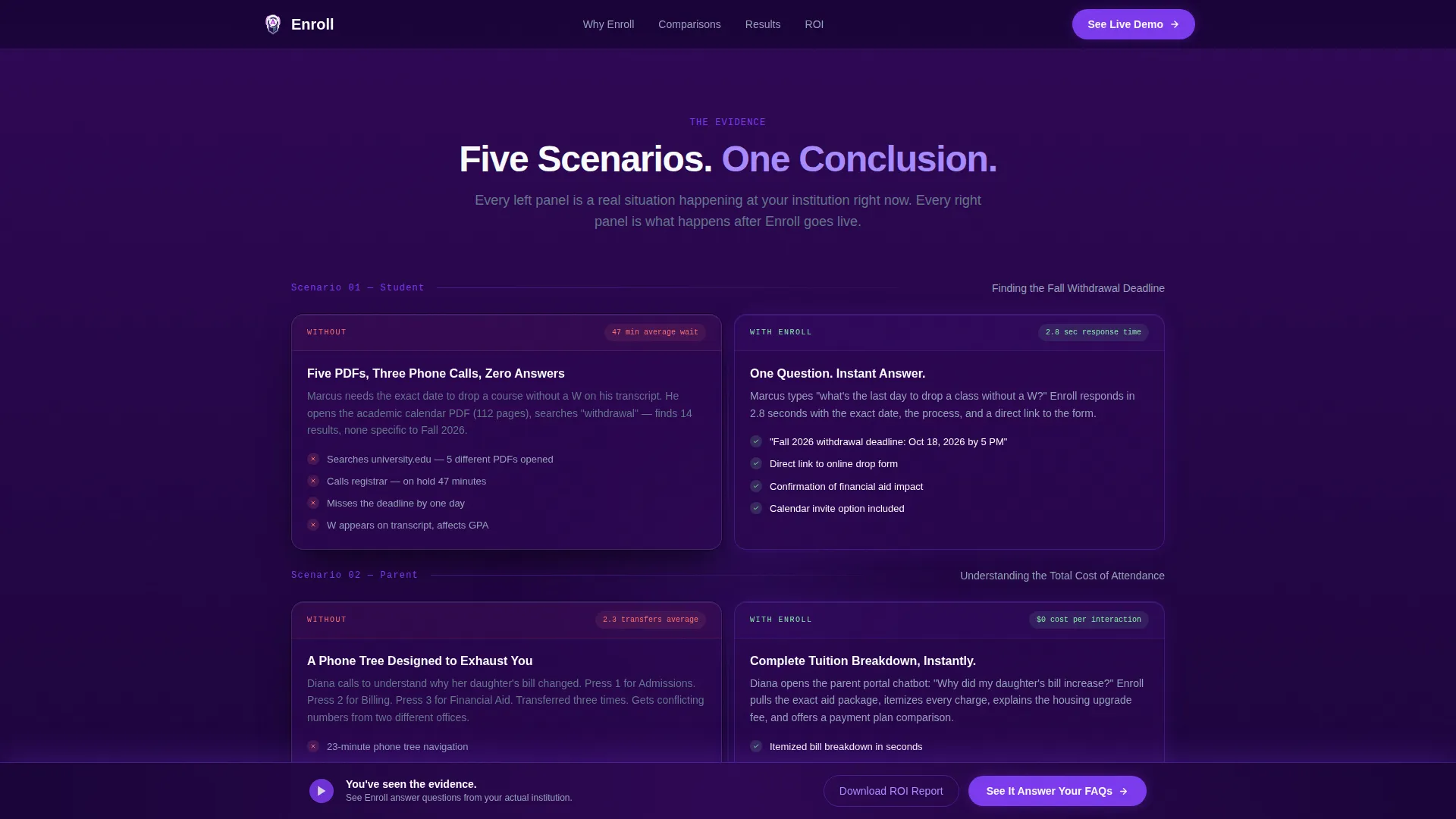
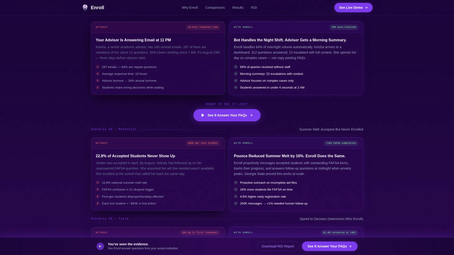
Five side-by-side comparison sections are revealed on scroll. Each row labels the left side "Without" and the right side "With." Scenarios progress from a student searching PDFs for a deadline to an advisor handling overnight email volume, escalating stakes with every row.
Dual Conversion Path Layout
The primary call to action, "See It Answer Your FAQs," appears after the third comparison row and repeats as a sticky bar after the fifth. A secondary path offers a gated return-on-investment report download requiring only institution name, role title, and enrollment size.
ROI Report Gated Modal
A lightweight modal collects three fields: institution name, role title, and enrollment size. No email address is required until the report is ready to send. This lowers friction for early-stage buyers while qualifying leads by role and institution size.
Sticky Conversion Bar
A fade-in sticky bar appears after the visitor passes the fifth comparison row. It reinforces the primary call to action without interrupting the scroll experience. The bar keeps the demo prompt visible during the final sections of the page.
Terminal Typography System
Headings use Manrope for clean authority. Data points, chat snippets, and code-style callouts use JetBrains Mono to signal technical precision. The combination reinforces the product's positioning as an intelligent, always-on campus tool.
Page sections overview
| Section | Purpose |
|---|---|
| Hero Split Screen | Contrast old FAQ with live chat demo |
| Comparison Row 1 | Student PDF search versus. instant answer |
| Comparison Row 2 | Parent phone tree versus. tuition breakdown |
| Comparison Row 3 | Advisor email versus. overnight bot coverage |
| Primary call to action Block | Drive live demo request after row 3 |
| Comparison Row 4 | Retention numbers side by side |
| Comparison Row 5 | Enrollment yield data comparison |
| Sticky call to action Bar | Persistent demo prompt after row 5 |
| ROI Report Gate | Collect role and institution for report |
| Footer Row | Single-row linear footer |
Design & branding system
The visual identity follows a Directory and Discovery theme built around an Electric Indigo color system. The palette reads like a campus at night: deep, intelligent, and quietly energized.
- Deep terminal indigo (#2E0854) anchors backgrounds; electric violet (#7C3AED) drives interactive elements and hover states; cool slate (#1E293B) frames body text panels; enrollment white (#F8FAFC) provides contrast surfaces
- Manrope handles all headings for authority and readability; JetBrains Mono appears on chat snippets, terminal callouts, and data elements for technical credibility
- Frosted glass card effects, scroll-triggered reveals, and hover states on comparison cards create a high-animation experience suited to desktop-first buyers
Mobile & speed optimization
The template is built desktop-first, matching the buying behavior of enrollment VPs and IT directors reviewing proposals on large screens. Mobile responsive behavior is included to handle secondary access scenarios.
- Split-screen comparison rows reflow into stacked single-column layouts on smaller viewports
- Static sections use server components to keep the base page lightweight; interactive elements like the chat demo and ROI modal load as client components
- The sticky conversion bar and scroll-triggered animations are optimized to activate cleanly without disrupting reading flow on any screen size
How this template helps you convert
The page is structured as a Comparison and Versus conversion experience. Every layout decision serves a single goal: moving a skeptical institutional buyer from recognition of pain to confident demo request.
- The hero immediately establishes the contrast between the old experience and the new one, so buyers feel the problem before reading a single feature claim.
- Each comparison row adds a new layer of evidence, moving from student-level convenience to advisor efficiency to institutional yield data, building an undeniable case by the time the call to action appears.
- The two-path conversion system captures both high-intent buyers ready for a demo and research-stage buyers who need ROI justification before they can take the conversation to leadership.
Other information about this template
This template is purpose-built for the higher education technology market, particularly for teams selling AI chatbot platforms to mid-size state universities. It reflects real institutional buyer psychology and the decision-making structure of enrollment offices.
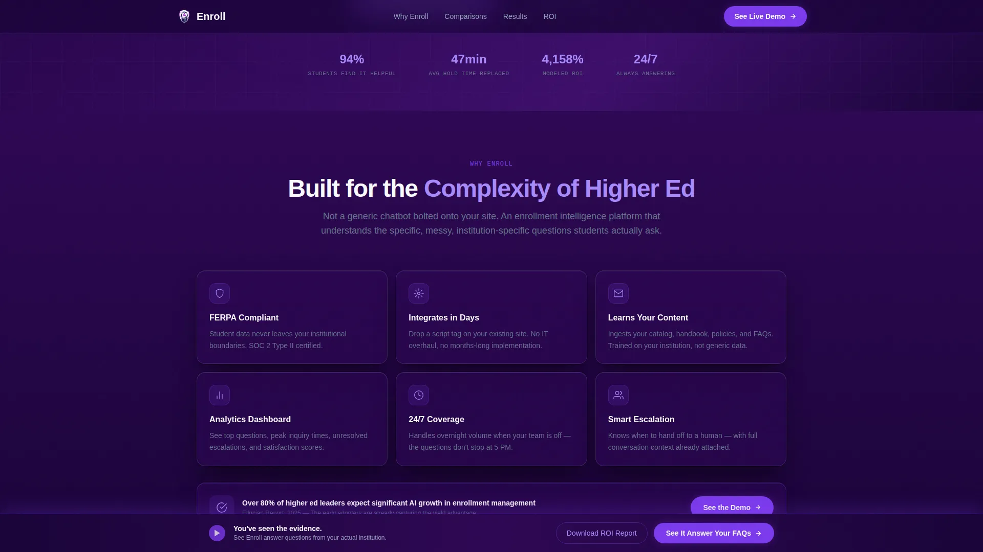
- The social proof signals referenced in the brief include a 94% student helpfulness rate, a $1.9 million tuition recovery figure from Long Beach City College, and a 4,158% return-on-investment model, making the template framework ready to carry credible third-party evidence
- The layout style is classified as Spec Sheet creative direction, meaning persuasion comes from stacked evidence rather than headline adjectives
- The template is compatible with higher education AI chatbot product contexts including tools similar to Georgia State University's Pounce chatbot case study, where AI-driven student engagement contributed to measurable enrollment gains
Theme
Directory & Discovery
Creative direction
Spec Sheet
Color system
Electric Indigo
Style
Split Screen (50/50)
Direction
Comparison/Versus
Page Sections
Dark Glass Split-screen Hero
Five Scroll-triggered Comparison Rows
Dual Conversion Path System
Sticky Conversion Bar
Terminal Typography Pairing
Gated ROI Report Modal
Related questions
Who is this landing page template designed for?
What makes the comparison row layout effective for this product?
Can the ROI report gate be customized for different gating logic?
Is this template built for a single product or a multi-feature platform?
Does the template include the interactive chat demo or just the visual shell?



