Enroll - Powerful Education ERP Landing Page Template
Enroll is a dashboard-style education ERP landing page template built for institutions ready to replace disconnected tools with one unified system. It combines animated data panels, an interactive feature comparison grid, and a two-step conversion form into a single, kinetic page. The Slate and Sky color system gives it an authoritative, institutional feel that moves fast and reads clearly.
by Rocket studio
Quick summary
Enroll is a single-page education ERP landing page template designed around a dashboard and data grid layout. It covers admissions, attendance, grading, fee collection, timetabling, and parent communication in one unified visual flow. The Dynamic Motion theme keeps every element live and legible, with animated counters, scroll-triggered charts, and a competitor comparison grid at its core.
Who this template is for
This template is built for organizations that manage complex, multi-function school or university operations and need to present their platform with authority and clarity.
- School principals and administrative leads tired of managing separate tools for every operational function
- University registrars overseeing large student cohorts across multiple campuses who need to communicate scale and control
- Education technology operations leads tasked with digitizing legacy institutions and building an internal case for switching platforms
What problem this template solves
Most education platforms struggle to show prospective buyers the full picture in a single visit. The page typically either overwhelms with feature lists or undersells with vague claims. Enroll solves this by making the product itself the visual centerpiece.
- Institutions lose credibility when their marketing page looks less organized than the problem they claim to solve
- Buyers comparing multiple platforms need a clear, side-by-side view rather than a list of bullet promises
- Decision-makers at large institutions need concrete data points and real use-case evidence before they will act
What you get with this template
You get a fully structured, section-led landing page that guides institutional buyers from awareness through to a conversion action. Every section serves a specific persuasion role, and the layout is built to reflect the sophistication of the product it represents.
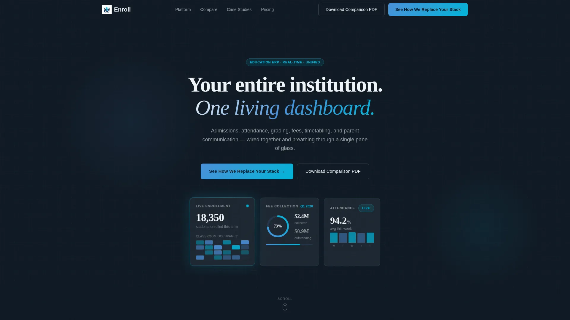
- A frosted-glass header with three live metric panels, scroll-triggered animated statistics, and a bold opening headline
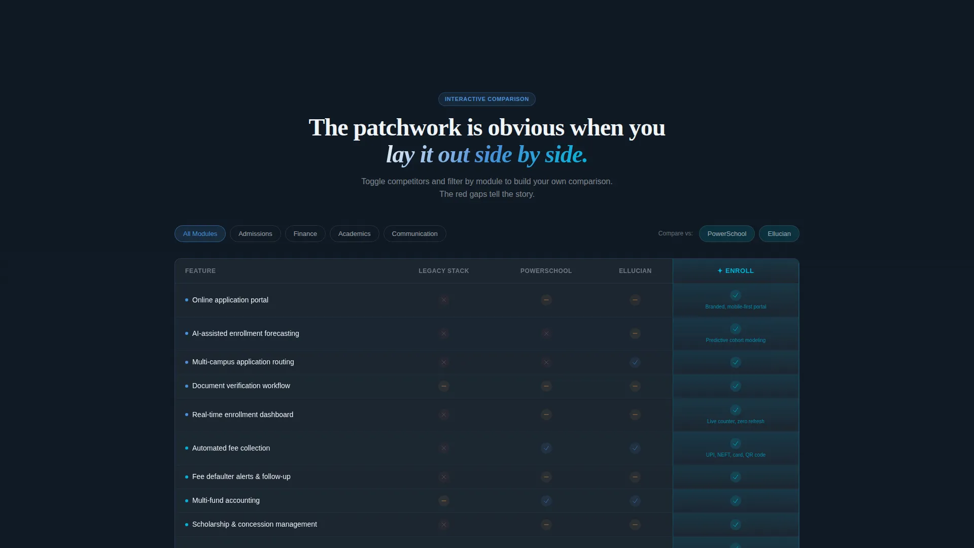
- An interactive feature comparison grid with toggle controls for competitor columns and module-level filters
- A two-step gated conversion form and a secondary PDF download path for researchers not yet ready for a demo
Feature list
This section describes the core built-in components and layout capabilities included in the Enroll template.
Animated Dark Glass Header Panels
Three translucent, frosted-glass user interface cards float against a near-black background, each displaying a different live metric. The panels include a real-time enrollment counter, a fee-collection progress ring, and a classroom occupancy heatmap. Subtle parallax drift on mouse movement and a faint cerulean edge glow bring the header to life without a single photograph.
Scroll-Triggered Statistics Section
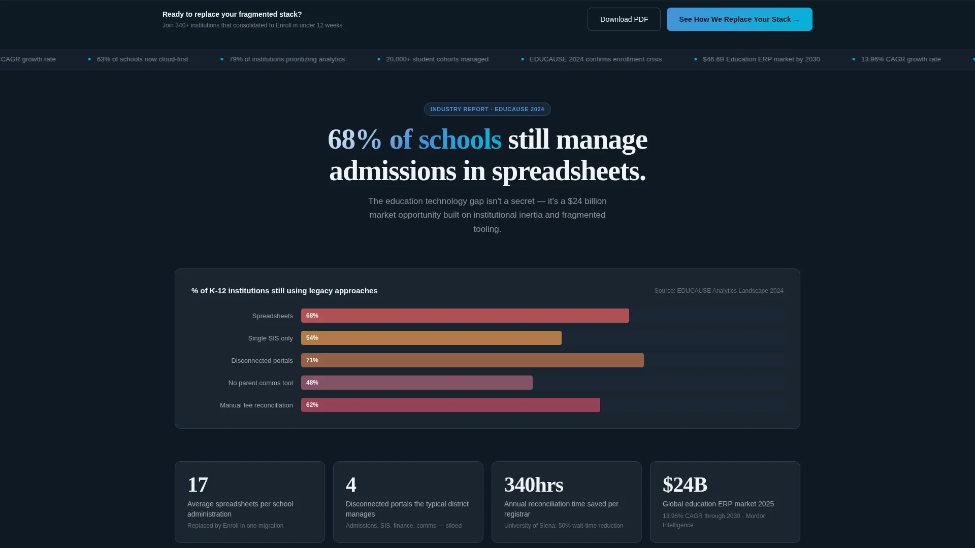
The first content section opens with a bold industry statistic drawn from a credible source, paired with an animated bar chart that draws itself as the visitor scrolls. This approach grounds the platform's value in a recognizable, data-backed reality before asking for any action.
Interactive Feature Comparison Grid
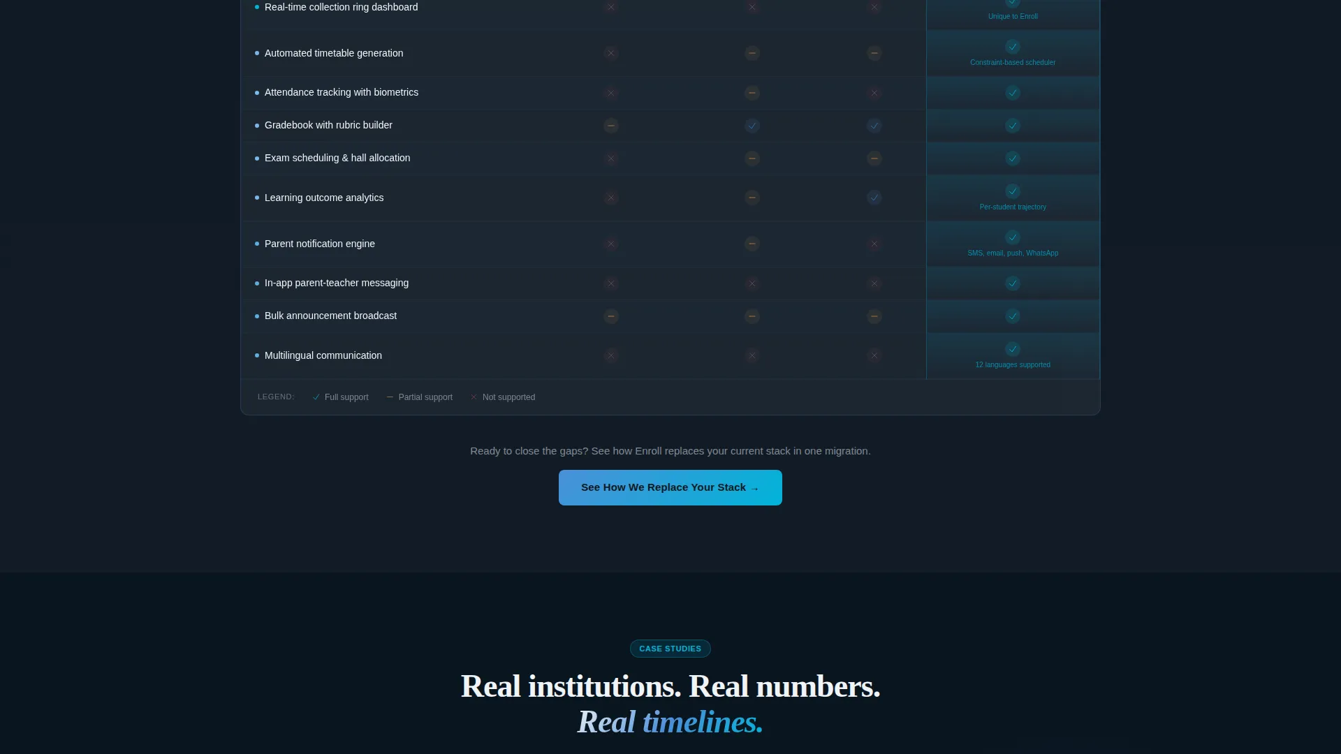
The centerpiece of the page is a structured data grid comparing the platform against legacy stacks and named competitors. Rows represent each operational module, and columns carry checkmarks, partial-support indicators, and visible gaps. Visitors can toggle competitors in and out and filter rows by module category, including admissions, finance, academics, and communication.
Case Study Mini-Dashboard Carousel
Section four presents real institution results as mini-dashboard cards rather than traditional testimonial blocks. Each card shows actual numbers and timelines, giving prospective buyers a format that matches the product's own reporting style and reinforces credibility.
Two-Step Gated Conversion Form
The primary call to action opens a two-step form. Step one captures institution type and student count via a slider. Step two collects current tool usage via checkboxes and a preferred demo date. This progressive structure reduces friction while gathering qualified lead context.
Sticky Bottom Conversion Bar
After the first scroll, a sticky bar appears at the bottom of the viewport carrying the primary call to action. It persists as the visitor moves through the page, ensuring the conversion path is always within reach without interrupting the reading flow.
Page sections overview
| Section | Purpose |
|---|---|
| Dark Glass Header | Introduce live metrics and headline |
| Statistics Drop | Anchor need with industry data |
| Comparison Engine | Show platform context visually |
| Feature Grid | Compare modules against alternatives |
| Case Study Carousel | Demonstrate real institutional results |
| Primary call to action Block | Drive demo form completion |
| PDF Download Gate | Capture early-stage researchers |
| Sticky call to action Bar | Persist conversion path on scroll |
Design & branding system
The Slate and Sky color system gives Enroll a tone that feels both authoritative and forward-moving. The palette references institutional environments without feeling dated, using depth and contrast to guide the eye through a data-heavy layout.
- Base tones use deep administrative slate and chalkboard charcoal for backgrounds and structural elements, with chalk-white card surfaces providing clean typographic contrast
- Interactive highlights and live data pulses use open-sky blue and alert cerulean, ensuring active elements stand out clearly against the dark foundation
- The Dynamic Motion theme applies kinetic behavior consistently: counters increment, charts draw on scroll, panels slide into view, and nothing on the page is ever fully static
Mobile & speed optimization
The template is structured to remain legible and functional across screen sizes. The data-heavy layout is organized into sections that stack and reflow without losing their hierarchy or visual intent.
- The comparison grid and dashboard panels are designed to remain navigable on smaller screens, with touch-friendly toggle controls for module filtering
- Scroll-triggered animations are tied to viewport entry points, so they fire reliably whether the visitor is on a desktop, tablet, or mobile device
How this template helps you convert
Enroll is built around two conversion paths and a persistent prompt, each matched to a different stage of the buying decision.
- The primary path, labeled "See How We Replace Your Stack," opens a two-step form that qualifies the lead by institution type, student count, and current tool usage before asking for a demo date, giving sales teams a warmer, more context-rich inquiry.
- The secondary path offers a downloadable comparison document gated behind an institutional email address, capturing researchers who are building an internal case and not yet ready for a live conversation.
Other information about this template
This template is a strong fit for education technology companies positioning their platform as a modern alternative to fragmented administrative tools. The Industry Report creative direction gives the page the credibility of a well-researched white paper while keeping the experience interactive and fast to scan.
- The template style is Dashboard and Data Grid, which mirrors the product's own interface language and reinforces buyer confidence that the platform delivers on its visual promise
- The Comparison and Versus landing page direction is built into the structure from the first section, making it well-suited for campaigns targeting buyers who are actively evaluating alternatives
- The header concept, Dark Glass Panels, is a distinctive visual signature that immediately separates this page from standard education software marketing pages
Theme
Dynamic Motion
Creative direction
Industry Report
Color system
Slate & Sky
Style
Dashboard/Data Grid
Direction
Comparison/Versus
Page Sections
Animated Dark Glass Header Panels
Scroll-triggered Statistics Section
Interactive Feature Comparison Grid
Case Study Mini-dashboard Carousel
Two-step Gated Conversion Form
Sticky Bottom Conversion Bar
Related questions
Who is the Enroll template designed for?
Can I use this template to run a competitor comparison campaign?
What conversion paths does this template include?
Does the page rely on stock photography?
How does the motion theme affect the page experience?



