Higher Education Digital Presence Education Website Template
Enroll is a scroll-reveal landing page template built for higher education mobile app providers. It targets provosts, CIOs, and enrollment VPs at mid-size universities. The layout opens with a Feature Tab Switcher header, builds trust through a progressive Feature Matrix, and drives leads with a persistent demo-request call to action and a gated integration spec sheet download.
by Rocket studio
Quick summary
Enroll is a single-page, scroll-reveal landing page template for a higher education mobile app. It consolidates class schedules, grade tracking, campus maps, financial aid status, and advisor messaging into one student interface. The design targets institutional buyers and drives leads through a persistent demo call to action and a gated spec sheet download.
Who this template is for
This template is built for teams selling a university mobile app to institutional decision-makers. It speaks directly to the people who evaluate, approve, and implement campus technology.
- Provosts and CIOs at mid-size universities managing disconnected legacy portals
- IT directors tired of supporting multiple student-facing systems and password-reset help desk tickets
- Enrollment VPs watching yield rates slip because admitted students cannot navigate registration
What problem this template solves
Universities run students through a tangle of separate portals. Financial aid lives in one place, class schedules in another, advisor messages somewhere else entirely. This template gives app vendors a landing page that proves they have solved that fragmentation at every level.
- Students waste time switching between systems instead of focusing on coursework
- Administrators field repetitive help desk requests that consume IT resources
- Admitted students drop off before orientation because the registration process is unclear
What you get with this template
You get a complete, conversion-focused landing page that moves institutional buyers from first impression to demo request. The layout is structured to build technical credibility as the visitor scrolls.
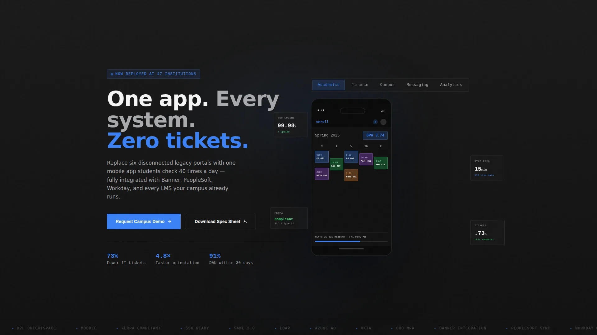
- A Feature Tab Switcher header with a realistic phone mockup showing five live module views
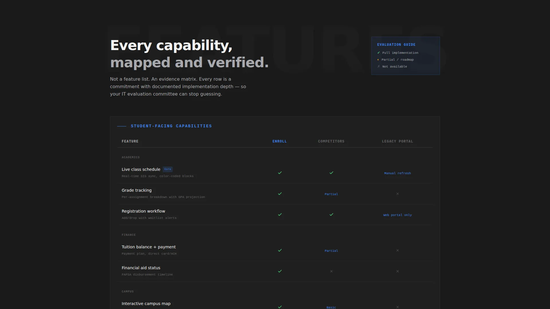
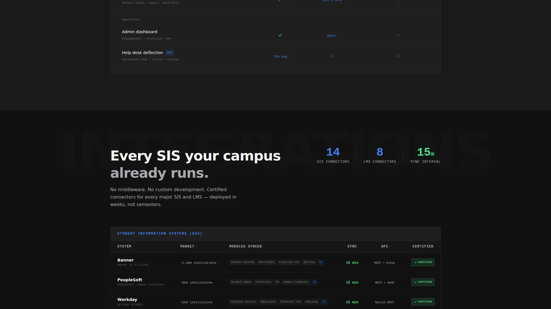
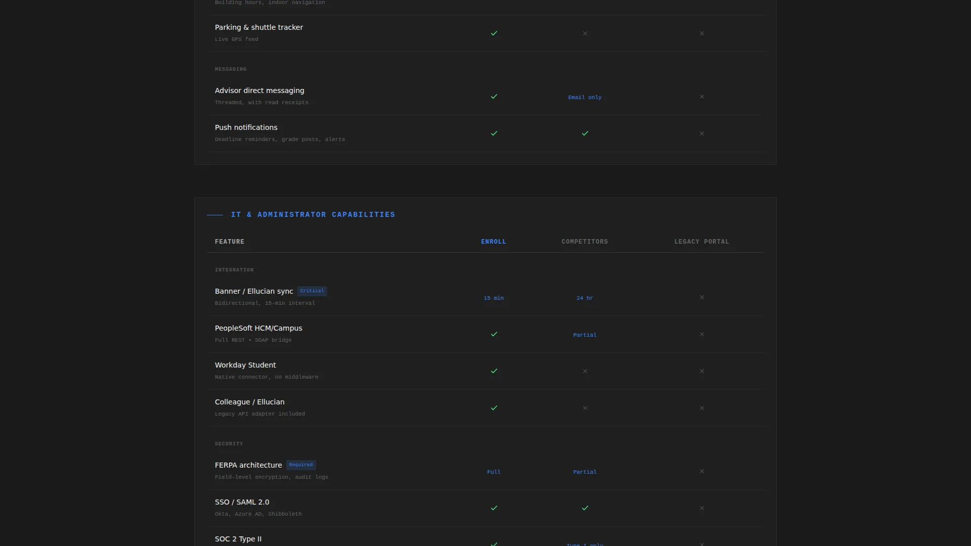
- A progressive Feature Matrix that reveals capability grids, integration specs, and compatibility details on scroll
- A dual conversion path: a persistent demo-request call to action bar and a gated integration spec sheet download form
Feature list
This template delivers a structured set of purposeful components. Each one is designed to serve a specific moment in the buyer's evaluation journey.
Feature Tab Switcher Header
A centered phone mockup sits beside the headline "One app. Every system. Zero tickets." Five labeled tabs sit above the phone: Academics, Finance, Campus, Messaging, and Analytics. Clicking each tab swaps the phone screen to a live user interface screenshot of that module, with the active tab glowing in signal-blue.
Progressive Scroll-Reveal Feature Matrix
As the visitor scrolls, capability grids animate into view row by row. The matrix starts with student-facing features and narrows to administrator concerns such as single sign-on (SSO) depth, learning management system (LMS) compatibility, student information system (SIS) sync frequency, and FERPA (Family Educational Rights and Privacy Act) compliance architecture.
Persistent Lead-Generation call to action Bar
After the header clears the viewport, a sticky top bar appears with the primary call to action: "Request a Campus Demo." The button stays visible throughout the scroll journey so the conversion path is never more than one click away.
Full-Width Demo Request Form
A full-width form at the page base captures qualified leads in a deliberate sequence. It asks for institution name first with IPEDS database auto-suggest, then current SIS provider via dropdown, enrollment size range, and work email.
Gated Spec Sheet Download
A secondary conversion path offers IT evaluators a downloadable integration spec sheet. This gate captures contacts who are not ready to book a call but need internal documentation to build a proposal.
Interactive Hover States on Matrix Cells
Every cell in the capability grid shifts from steel-gray to signal-blue on hover. This transforms static comparison data into an active, exploratory experience that keeps technical buyers engaged longer.
Page sections overview
| Section | Purpose |
|---|---|
| Sticky navigation bar | Keeps demo call to action visible after header scrolls past |
| Feature Tab Switcher | Introduces all five app modules with live screen previews |
| Student features grid | Highlights the core daily-use capabilities for students |
| Admin capability matrix | Shows SSO, LMS, and SIS integration depth for IT buyers |
| FERPA compliance row | Addresses data privacy architecture for institutional evaluators |
| Secondary call to action strip | Offers the spec sheet download as a softer conversion option |
| Full-width demo form | Collects qualified lead data with IPEDS-assisted institution lookup |
Design & branding system
The visual identity follows a Data Command theme built on a Monochrome Steel color system. The palette is cold, precise, and intentionally free of decorative warmth. Every color choice reinforces the sense of engineered reliability.
- Gunmetal base (#2D2D2D) and brushed aluminum (#A8A9AD) form the structural foundation of every section
- Interface white (#F4F4F4) maintains readability against dark backgrounds throughout the scroll experience
- Signal-blue (#3B82F6) appears exclusively on interactive elements, active tab states, hover highlights, and primary call to action buttons
Mobile & speed optimization
The template is designed as a scroll-reveal, section-led layout that performs well on the devices its target audience uses most. Each animation triggers progressively so the page never loads everything at once.
- Scroll-triggered row animations reveal matrix content only as the visitor reaches each section
- The phone mockup uses a parallax shadow effect that stays lightweight and does not block content on smaller screens
- The sticky call to action bar is built to remain functional and unobtrusive across viewport sizes
How this template helps you convert
The page is structured around Lead Generation from the first visible pixel. Every design and copy decision is intended to move an institutional buyer closer to booking a demo or downloading the spec sheet.
- The Feature Tab Switcher lets buyers self-qualify immediately by exploring only the modules relevant to their role, which filters for higher-intent visitors before the form ever appears.
- The progressive Feature Matrix builds accumulated technical proof as the visitor scrolls, replacing emotional storytelling with organized, verifiable evidence that every integration point has been considered.
- The dual conversion path captures both ready-to-talk buyers through the demo form and research-stage evaluators through the gated spec sheet, so no qualified visitor leaves empty-handed.
Other information about this template
This template is part of a broader set of higher education digital presence resources. A few additional details are worth noting for teams evaluating it for a full campaign rollout.
- The IPEDS auto-suggest on the institution name field signals to prospects that the form was built specifically for the higher education market
- The SIS provider dropdown includes Banner, PeopleSoft, Workday, Colleague, and an Other option, covering the most common platforms at mid-size universities
- The template style is Scroll Reveal (Progressive), meaning content appears in deliberate sequence rather than all at once, guiding the buyer's attention through a structured argument
- The header concept and Feature Matrix creative direction are matched to reinforce a Data Command theme throughout the full page experience
Theme
Data Command
Creative direction
Feature Matrix
Color system
Monochrome Steel
Style
Scroll Reveal (Progressive)
Direction
Lead Generation
Page Sections
Feature Tab Switcher with Live Module Previews
Scroll-reveal Progressive Feature Matrix
Persistent Demo Request Call to Action Bar
Ipeds-assisted Lead Capture Form
Gated Integration Spec Sheet Download
Related questions
Who is the primary buyer this landing page targets?
What does the Feature Tab Switcher actually show?
How does the dual conversion path work?
Why does the form ask for SIS provider before work email?
Can the capability matrix content be updated for specific integrations?



