Interactive History Exam Prep Landing Page Template
Epoch is a zigzag-style history exam prep landing page template built around interactive quizzes that adapt to what each visitor gets wrong. It targets high school students, college learners, and self-studiers cramming for exams. The Dopamine Pop color system and animated data header create an engaging, personalized experience that guides visitors straight to the "Build My Study Plan" call to action.
by Rocket studio
Quick summary
Epoch is a single-page history exam prep template with an alternating zigzag layout. Interactive inline quizzes profile each visitor's knowledge gaps as they scroll. Animated counters, bold geometric shapes, and a high-energy color palette keep attention locked. Two strategic calls to action convert engaged visitors into study plan sign-ups before they leave.
Who this template is for
This template is built for educators, course creators, and tutoring services that help students prepare for high-stakes history exams. It speaks directly to the learner's urgency and turns passive browsing into active participation.
- History exam prep services targeting AP World, IB, SAT Subject, or civil service test candidates
- Independent tutors and edtech founders who want a lead capture page that doubles as a study tool
- Self-study platform builders who need a landing page that feels alive rather than static
What problem this template solves
Most history exam prep pages look like the textbook a student is already avoiding. Long paragraphs, generic stock photos, and a single sign-up button do nothing to prove the service works. Visitors leave without trusting the offer.
- Students scroll past static pages because nothing connects to their specific knowledge gap
- Generic lead forms feel like commitment before the visitor has seen any value
- History content delivered as walls of text fails to create the moment of insight that earns a sign-up
What you get with this template
You get a fully structured, section-led landing page where each scroll step does deliberate work. The layout alternates quiz interactions with explanatory content, building a personalized result by the time the visitor reaches the bottom.
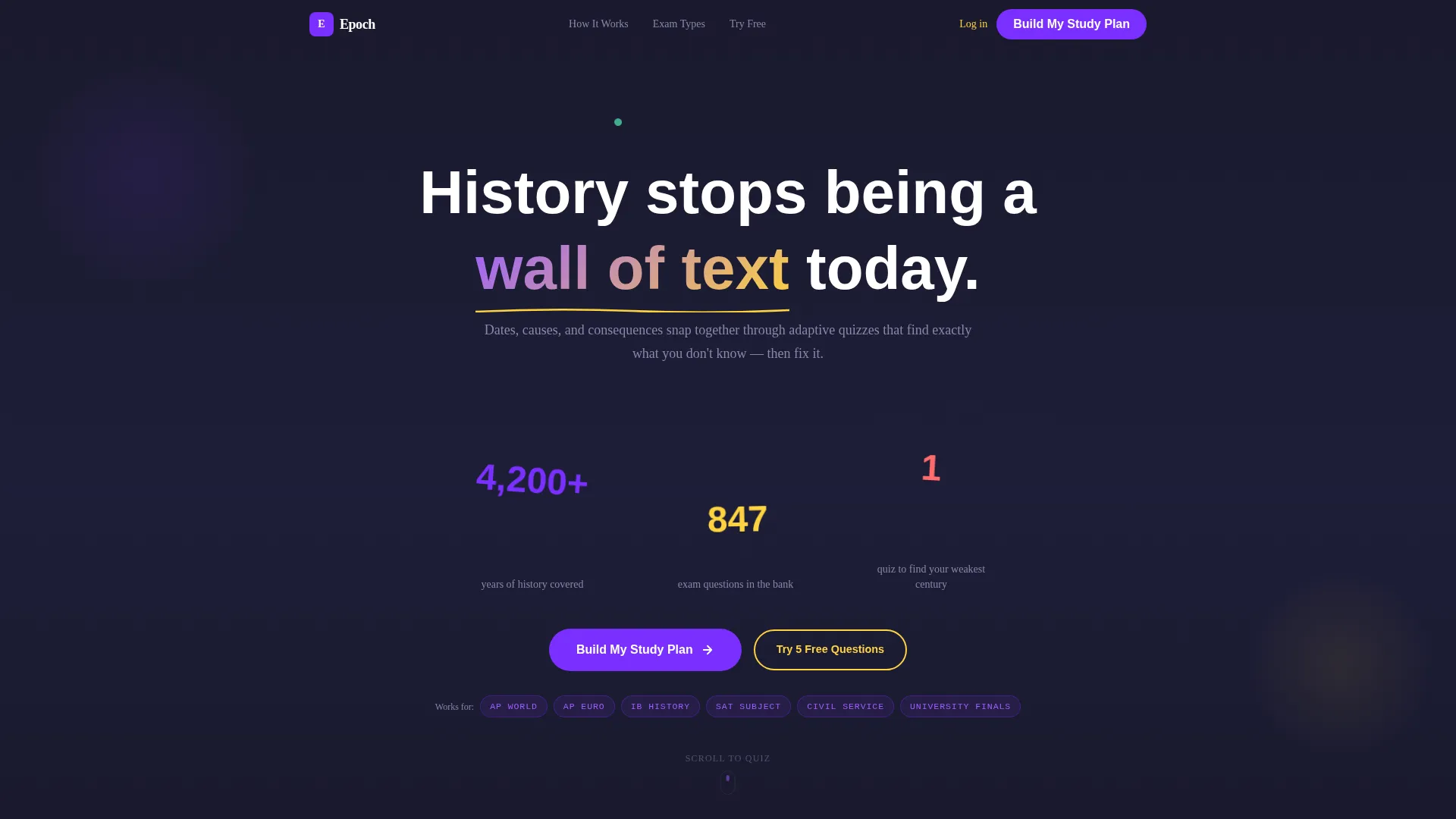
- An animated header section with kinetic stat counters and geometric shape arrangements
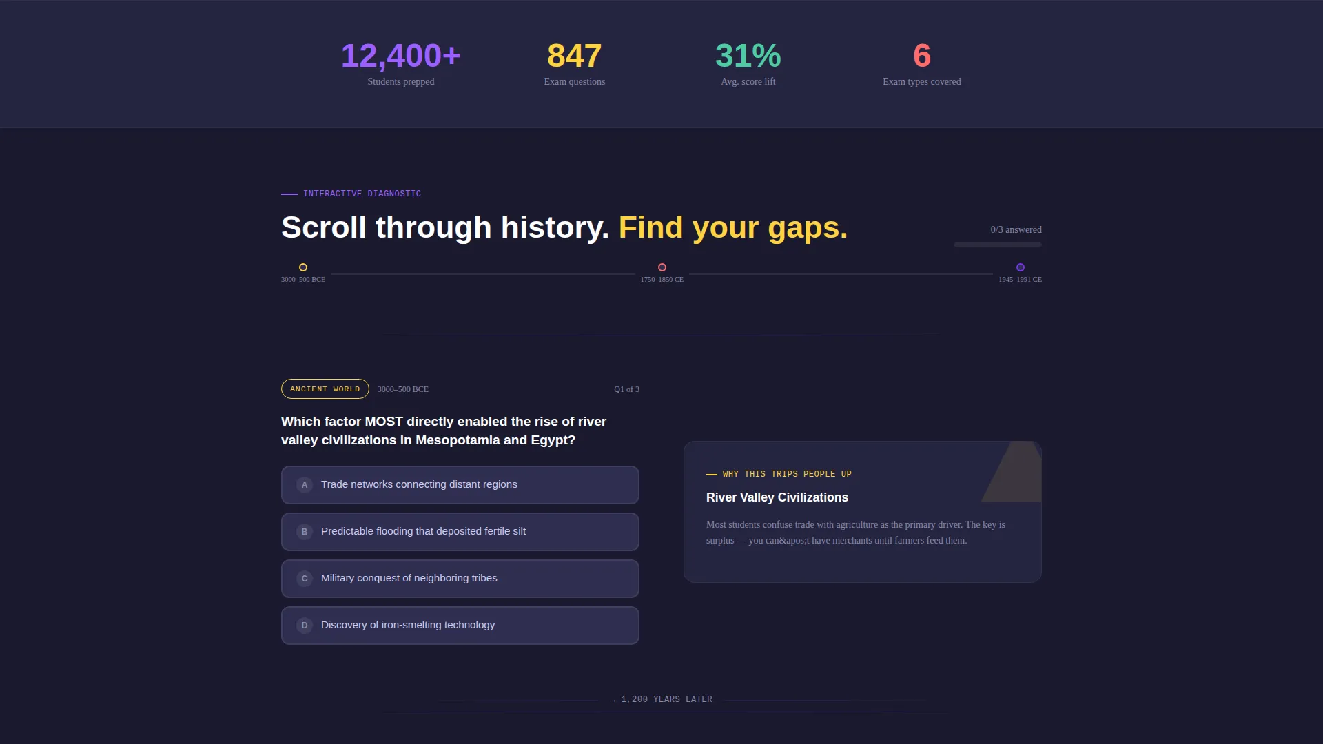
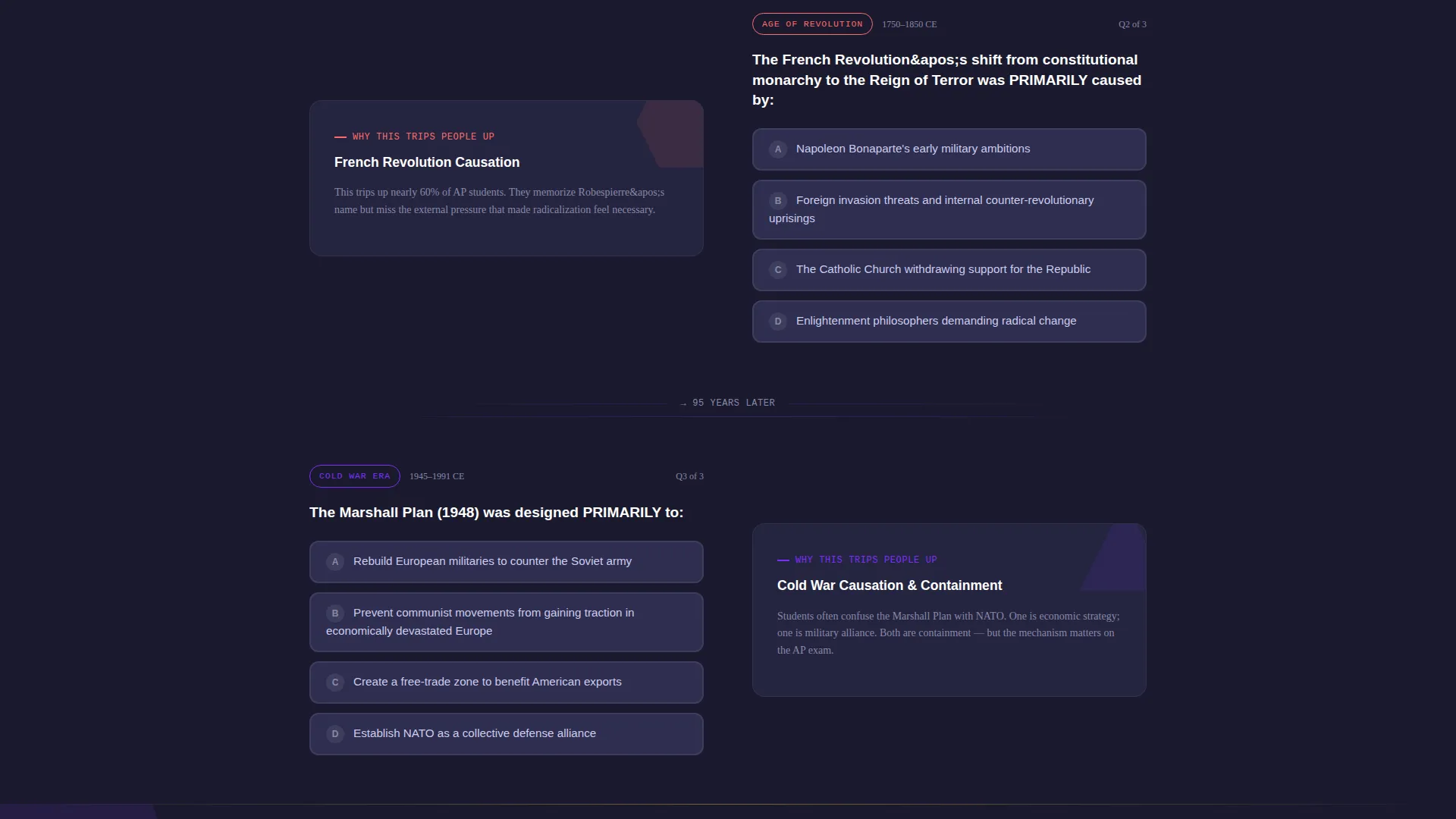
- A zigzag alternating body that pairs mini-quiz questions with contextual lesson previews
- Two conversion sections: a mid-page study plan form and a bottom personalized weakness summary with dual calls to action
Feature list
This template packs its conversion logic directly into the page structure. Every feature below is drawn from the source brief and built into the layout.
Animated Data Counter Header
The header opens with cycling statistics: total years of history covered, number of exam questions available, and a single quiz hook line. Each figure appears inside geometric shapes that rearrange like a tangram. Numbers are large, bold, and set against a deep chalkboard background with accents in electric violet and serotonin yellow.
Adaptive Inline Quiz Sections
Starting from the third viewport, each zigzag section presents a mini-quiz question on one side and a topic explanation on the other. A correct answer turns the coral shape yellow. An incorrect answer triggers a wobble animation and expands into a lesson preview. Each section covers a different historical era, so scrolling itself mirrors moving through a timeline.
Personalized Weakness Summary
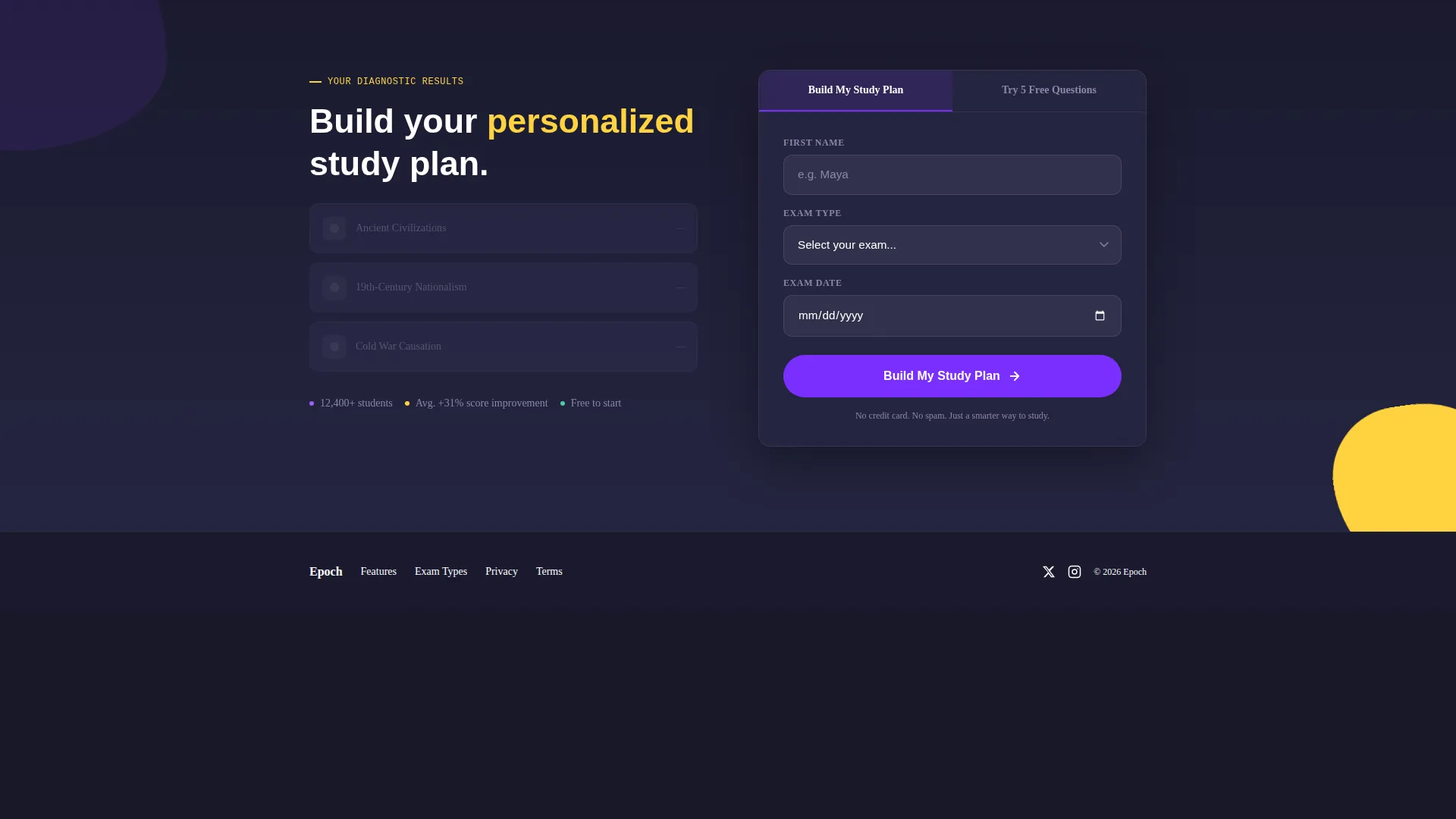
By the time a visitor reaches the bottom of the page, the quiz interactions have quietly built a profile. The final section reflects identified weak spots back to the visitor with specific era and topic callouts, creating a knowledge gap only the study plan can close.
Dual Call-to-Action Placement
The primary call to action, "Build My Study Plan," appears twice. The first placement follows the third quiz question at peak engagement. The second sits beside the personalized weakness summary at the bottom. This double placement captures both early converters and visitors who needed the full page experience.
Minimal Three-Field Lead Form
The sign-up form asks for first name, exam type, and exam date only. Exam type options include AP, IB, SAT Subject, Civil Service, and University Finals. The short form reduces friction while collecting the information needed to tailor a study plan.
Secondary Free-Trial Path
Visitors not ready to commit see a "Try 5 Free Questions" option that requires only an email address. This secondary path captures potential leads who need more trust-building before signing up for a full study plan.
Page sections overview
| Section | Purpose |
|---|---|
| Animated Data Header | Hooks visitors with kinetic stats and geometric shapes |
| Era Quiz One | First zigzag quiz paired with topic context |
| Era Quiz Two | Second alternating quiz block covering a new era |
| Mid-Page call to action | "Build My Study Plan" form at peak engagement |
| Era Quiz Three | Third quiz section triggering the secondary call to action path |
| Free Trial Path | "Try 5 Free Questions" email capture for cautious visitors |
| Weakness Summary | Personalized result reflecting the visitor's identified gaps |
| Bottom call to action Block | Final "Build My Study Plan" form beside the summary |
Design & branding system
The visual identity follows a Playful Geometric theme powered by the Dopamine Pop color system. Every color choice has a functional role, not just a decorative one.
- Electric violet (#7B2FFF) drives primary action elements including buttons and key stat figures; serotonin yellow (#FFD23F) marks progress indicators, correct-answer states, and breadcrumb highlights; bubblegum coral (#FF6B6B) signals wrong answers and urgency nudges
- Deep chalkboard (#1A1A2E) anchors all text-heavy backgrounds so bright accents stay readable without overwhelming the eye
- Typography uses a rounded bold typeface at large sizes for stat figures; geometric shapes including triangles, hexagons, and circles carry structural visual weight throughout
Mobile & speed optimization
The zigzag layout is designed to reflow cleanly across screen sizes so the quiz-and-explanation pairing stays readable on smaller viewports.
- Alternating sections stack vertically on mobile, keeping the quiz question above its paired explanation for natural reading order
- Large kinetic type and geometric shapes scale proportionally so the header's visual impact carries through on phone screens
How this template helps you convert
Epoch earns conversions by proving value before asking for anything. The page's structure builds trust through interaction, then closes with a personalized result the visitor cannot get anywhere else.
- The animated header stops the scroll with data-led storytelling, creating immediate curiosity about which century the visitor actually knows
- Each quiz interaction deepens investment: a correct answer feels rewarding while a wrong answer opens a lesson preview that makes the paid offer feel necessary
- The personalized weakness summary at the bottom creates a specific, named gap, and the "Build My Study Plan" call to action is positioned as the direct solution to that exact gap
Other information about this template
Epoch fits naturally into a broader history education ecosystem. The template style and creative direction make it useful beyond a single exam season.
- The template style is Zigzag/Alternating, making it easy to add or remove era-specific quiz sections as exam seasons change
- The lead generation direction supports two audience segments: high-intent visitors ready to commit and exploratory visitors who need a low-risk entry point
- Exam types supported by the form include AP World History, IB History, SAT Subject Tests, Civil Service exams, and University Finals
- The template sits in the Education and Training category under the History Education subcategory, serving the History Exam Prep Service niche
Theme
Playful Geometric
Creative direction
Quiz & Personalize
Color system
Dopamine Pop
Style
Zigzag/Alternating
Direction
Lead Generation
Page Sections
Animated Data Counter Header
Adaptive Inline Quiz Sections
Personalized Weakness Summary
Dual Call-to-action Placement
Minimal Three-field Lead Form
Secondary Free-trial Entry Path
Related questions
Who is this landing page template designed for?
Can I add or remove quiz sections for different exam topics?
How does the personalization feature work?
Do visitors need to create an account before trying the service?
What makes this template different from a standard sign-up page?



