Reinforcement Learning Platform Landing Page Template
Epoch is a modular card grid landing page template built for a reinforcement learning training and certification platform. It combines a dark dashboard aesthetic with stats-first content, a full-width product screenshot header, and a freemium conversion flow. The design guides machine learning engineers, robotics researchers, and quant developers from first scroll to free signup.
by Rocket studio
Quick summary
Epoch is a single-page, card grid landing page template designed for a reinforcement learning training and certification platform. It opens with a pixel-sharp dashboard screenshot and guides visitors through live-styled metrics, modular course cards, and outcome showcases. The freemium conversion model lets users start training immediately with no credit card required.
Who this template is for
This template is built for teams launching a technical education platform in the reinforcement learning space. It speaks directly to a technically fluent audience that values proof over promotion.
- Machine learning engineers who want to move beyond supervised learning into live training environments
- Robotics researchers prototyping sim-to-real transfer pipelines who need structured curriculum paths
- Quantitative developers building trading agents who need hands-on policy gradient experience
What problem this template solves
Most education platform pages lean on generic layouts that fail to communicate technical depth. Epoch solves the trust gap by leading with hard numbers and visual proof before any explanation appears.
- Visitors see live-styled metrics and reward curve visuals before reading a single marketing claim
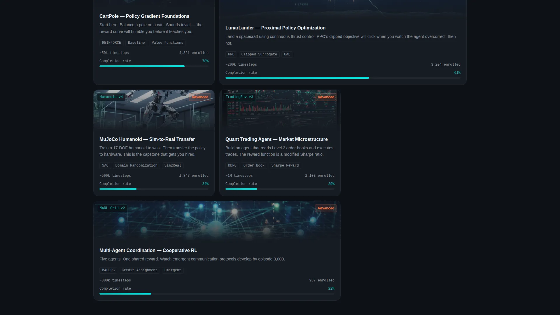
- Course cards display environment thumbnails, difficulty tiers, and completion progress rather than vague descriptions
- The freemium flow removes signup friction by offering three free environments and a sandbox dashboard upfront
What you get with this template
You get a fully structured, dark-themed landing page built around a modular card grid system. Every section is self-contained and purposeful, so the page reads like an escalating training run rather than a brochure.
- A full-width product screenshot header with headline, angled depth shadow, and terminal-black background
- A stats row showing three live-styled platform metrics, followed by tiered course cards and outcome showcases
- A sticky mobile call to action bar, a two-step signup flow, and an inline curriculum preview that expands without leaving the page
Feature list
This template comes with a tightly scoped set of visual and structural features grounded in the source brief. Each one serves a specific role in moving a technically minded visitor toward signup.
Full-Width Dashboard Screenshot Header
The header displays a pixel-sharp capture of the platform's training dashboard mid-run. It includes a reward curve climbing across 500,000 timesteps, a live agent visualization, hyperparameter panels, and a scrolling terminal log. The screenshot floats at a subtle angle over the terminal-black background with a depth shadow, and one headline sits above it.
Stats-First Metrics Row
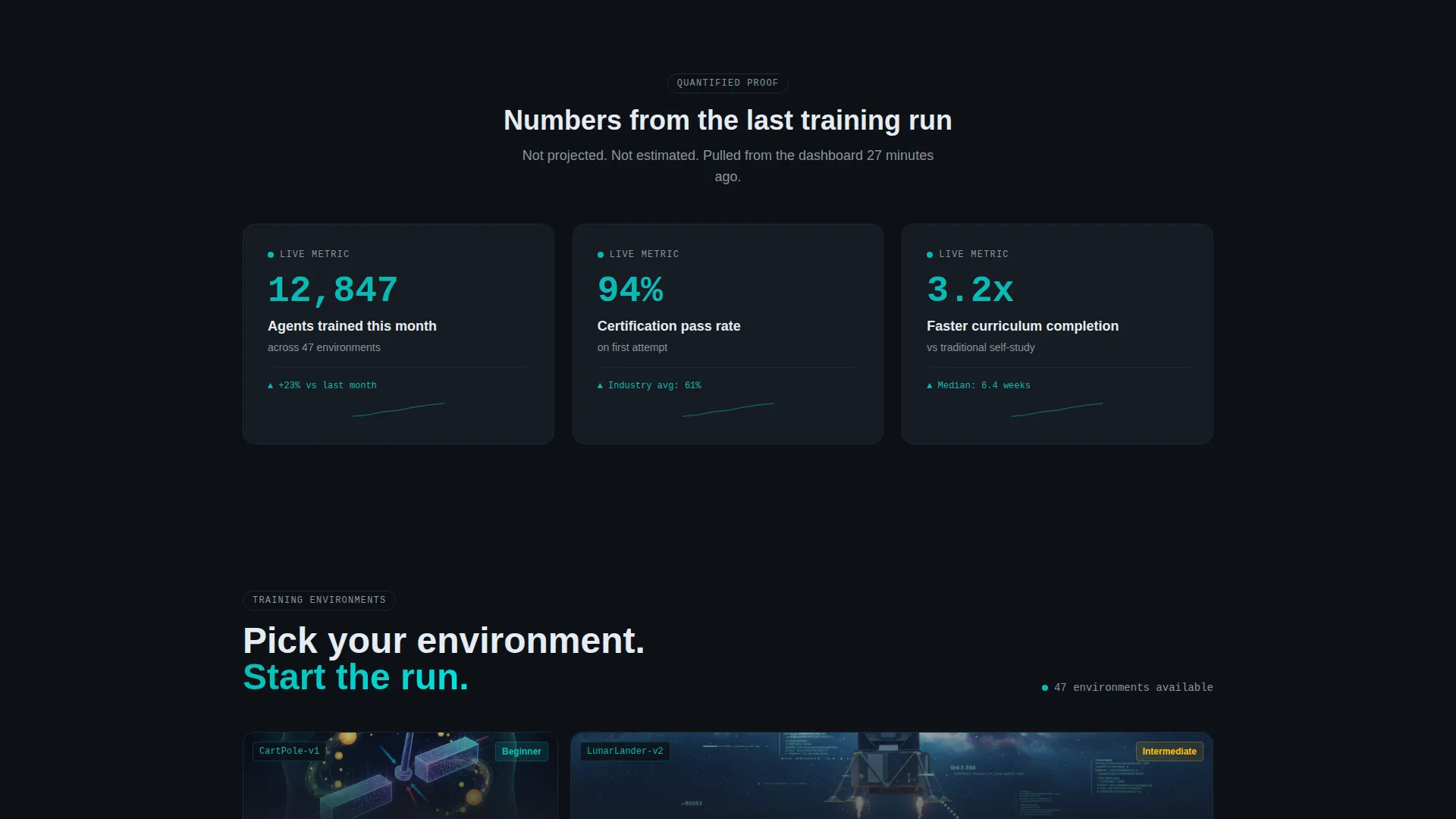
Three live-styled metric cards appear at the top of the content area: 12,847 agents trained this month, a 94 percent certification pass rate, and 3.2x faster curriculum completion versus self-study. This section establishes quantified proof before any course description appears.
Modular Course Card Grid
Each course card displays an environment thumbnail (CartPole, LunarLander, or a custom trading simulation), estimated training cycles, a difficulty tier label, and a live completion percentage bar in active teal. Cards are self-contained but arranged so the grid tells a story of escalating complexity.
Outcome and Showcase Cards
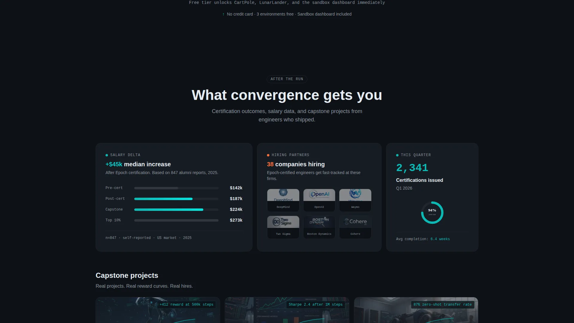
Deeper in the page, cards shift from courses to results. These blocks surface salary delta after certification, hiring partner logos, and capstone project showcases with embedded reward curves. They give prospective learners a concrete picture of what completing the curriculum leads to.
Two-Step Freemium Signup Flow
The primary call-to-action triggers a two-step modal: first, the user selects their experience level from three options; second, they enter an email and GitHub username. No credit card is required. The free tier immediately unlocks three environments and a sandbox dashboard.
Inline Curriculum Preview
A secondary call-to-action labeled "Preview the Curriculum" expands a full course map inline without navigating away from the page. This seeds commitment before the user decides to sign up, reducing drop-off at the decision point.
Page sections overview
| Section | Purpose |
|---|---|
| Screenshot Header | Anchors the page with a product-first visual and the core headline |
| Stats Metrics Row | Delivers quantified proof before any course explanation |
| Course Card Grid | Presents environments, difficulty tiers, and live progress bars |
| Outcome Showcase Cards | Connects course completion to real-world career results |
| Inline Curriculum Preview | Expands the full course map without leaving the page |
| Sticky Mobile call to action | Keeps the primary signup action visible on scroll for mobile users |
Design & branding system
The visual identity follows a Dashboard Pro theme built on the Teal Catalyst color system. Every color choice maps to a specific functional role, so the interface reads like a live monitoring dashboard rather than a marketing page.
- Deep terminal black (#0D1117) forms the base background, keeping focus on data and metrics
- Active teal (#0ABAB5) is used for progress bars, live indicators, and interactive highlights throughout the card grid
- Muted slate (#8B949E) handles secondary text and supporting labels, while catalyst orange (#FF6D3A) is reserved exclusively for calls-to-action and alert states
Mobile & speed optimization
The landing page is structured for clear readability and usability across screen sizes. The sticky bottom call to action bar ensures the primary conversion action remains accessible on mobile without interrupting the scroll experience.
- The card grid reflows responsively so course cards, metric blocks, and outcome showcases stack cleanly on smaller screens
- The sticky "Start Training Free" bar appears at the bottom of the mobile viewport, keeping the freemium entry point always within reach
- The two-step signup flow and inline curriculum preview are both designed to function without page navigation, reducing load friction on mobile
How this template helps you convert
Every structural choice in Epoch is oriented toward moving a skeptical, technically minded visitor into a free account. The page earns trust before it asks for anything.
- The stats row delivers three specific, credible metrics in the first content section, establishing platform legitimacy before any course is described
- The modular card grid unlocks complexity progressively, mirroring the learner's own journey and making the curriculum feel achievable rather than overwhelming
- The two-step freemium flow with no credit card requirement removes the single biggest barrier to technical audience signups, while the inline curriculum preview seeds commitment before the ask
Other information about this template
This template is categorized under Technology, with a subcategory focus on reinforcement learning technology. It is purpose-built for the reinforcement learning training and certification niche and reflects the specific vocabulary and visual expectations of that audience.
- The Dashboard Pro theme and Teal Catalyst color system are deliberately chosen to resonate with engineers who spend time in terminal windows and monitoring dashboards
- The card grid (modular) template style makes it straightforward to add, remove, or reorder course cards and outcome blocks as a platform's curriculum grows
- The page type is a single landing page, not a multi-page site, so all content and conversion flows exist within one scrollable experience

Theme
Dashboard Pro
Creative direction
Stats-First Impact
Color system
Teal Catalyst
Style
Card Grid (Modular)
Direction
Freemium/Trial
Page Sections
Dashboard Screenshot Header
Live-styled Stats Row
Modular Course Card Grid
Outcome Showcase Cards
Two-step Freemium Signup Flow
Inline Curriculum Preview
Related questions
Who is this landing page template designed for?
Does the template include the two-step signup flow?
Can I customize the course cards and metric values?
What does the inline curriculum preview do?
Is this template suitable for a dark-themed technical brand?



