Equilibrium - Data-Driven Wellness Landing Page Template
Equilibrium is a data-driven testimonials landing page for spa and wellness centers. Built on a Dashboard Pro theme with a Carbon Fiber color system, it replaces lifestyle photography with verified outcome metrics, filterable treatment cards, and a sticky comparison bar. Analytical clients can sort, filter, and compare recovery protocols before booking.
by Rocket studio
Quick summary
Equilibrium is a modular, card-grid testimonials landing page designed for performance-focused wellness centers. It surfaces verified client outcomes as scannable data tiles rather than emotional reviews. A sticky comparison bar lets visitors pit two treatments side by side, and every section rewards the analytical visitor who wants numbers before committing to a booking.
Who this template is for
This template is built for wellness businesses whose clients think in metrics. It suits operators who serve an evidence-driven audience and want their testimonials page to match that mindset.
- Infrared sauna, cryotherapy, and manual therapy studios that attract data-conscious clients
- Spa and wellness centers targeting tech professionals, postpartum mothers, and competitive athletes
- Wellness brands that have strong outcome data and want to put that proof front and center
What problem this template solves
Most testimonials pages display generic star ratings and feel-good quotes. That approach fails the analytical visitor who wants specific outcome data before booking. Equilibrium replaces vague social proof with structured, filterable evidence.
- Clients comparing treatment modalities have no easy way to evaluate them side by side on a standard reviews page
- Wellness centers with strong outcome data lose credibility when that data is buried in paragraph-style testimonials
- High-intent visitors who research thoroughly often leave without converting because the page never gives them a clear recommendation
What you get with this template
You get a fully structured, single-page layout that presents client testimonials as a performance dashboard. Every component is designed to hold structured outcome data and drive a booking decision.
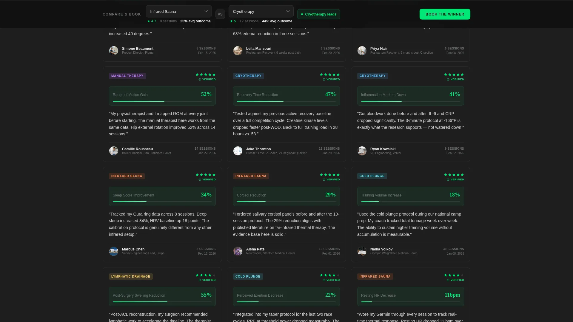
- A modular card grid where each tile shows treatment type, session count, outcome metric, star rating, and a two-sentence client quote
- A sticky bottom comparison bar with two treatment dropdowns, a dynamic mini comparison card, and a primary booking call to action
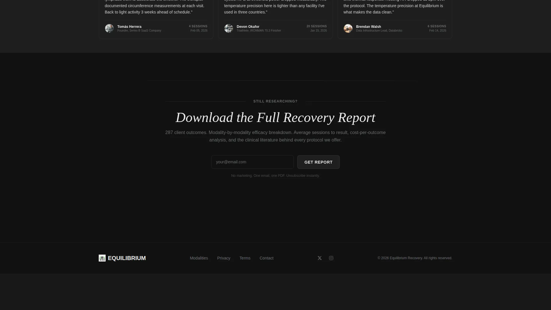
- A secondary lead capture path offering a downloadable recovery report in exchange for an email address
Feature list
This template ships with a focused set of components that serve one purpose: turning verified client outcomes into booked appointments.
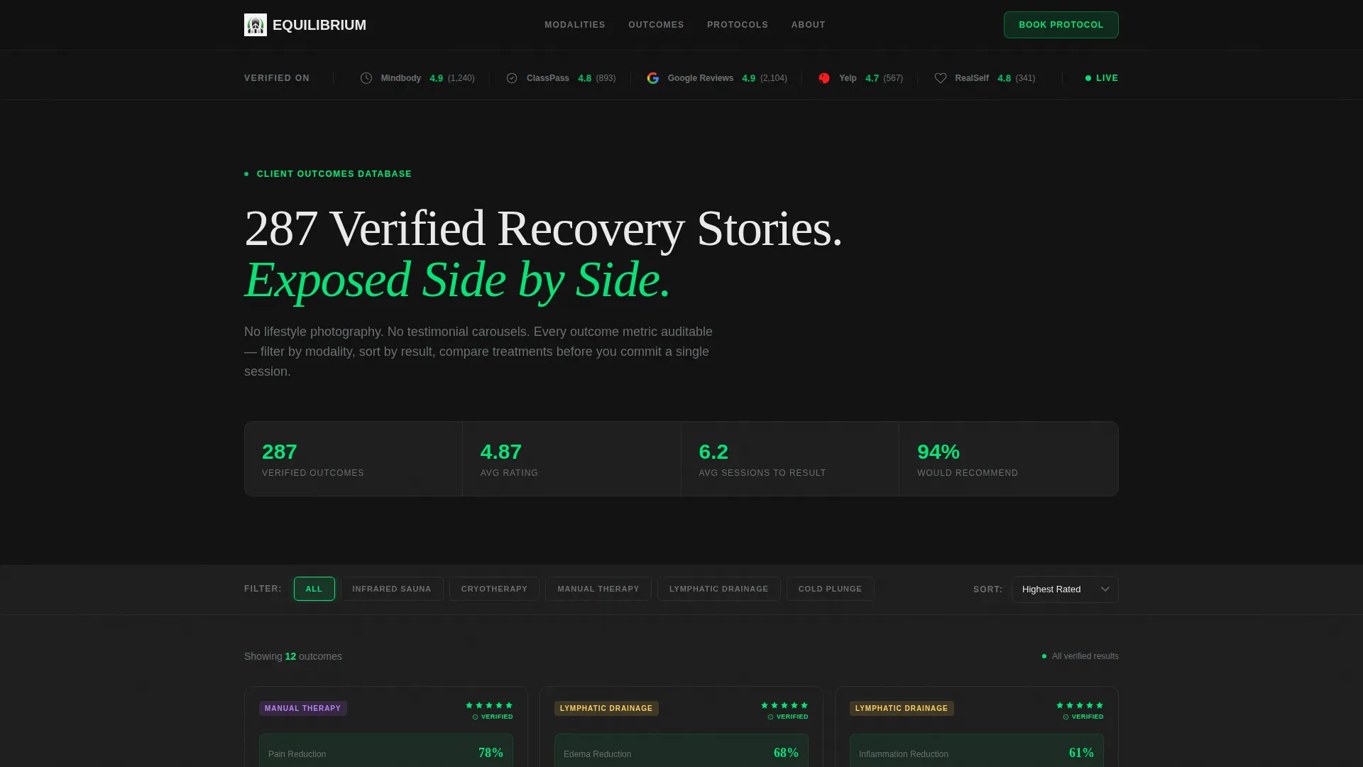
Logo Bar with Live Authority Scores
The header opens with a horizontal ribbon of wellness authority platform logos rendered in monochrome titanium. A biometric-green aggregate score sits beside each logo, giving visitors immediate third-party credibility before they read a single testimonial.
Filterable Modality Card Grid
Each testimonial card is a modular data tile. Visitors can filter cards by treatment modality, such as cryotherapy, infrared sauna, or manual therapy, and sort results by outcome metric to find the most relevant evidence for their situation.
Sticky Versus Comparison Bar
A persistent bar anchored to the bottom of the viewport holds two treatment dropdowns. Selecting a pair dynamically updates a mini card showing average rating, median sessions to result, and the top client quote for each treatment.
Dynamic Booking Modal with Pre-fill
The primary call-to-action button, "Book the Winner," opens a scheduling modal pre-filled with the higher-scoring treatment from the current comparison. This removes friction from the moment a visitor reaches a decision.
Email Lead Magnet Path
A quieter secondary link invites visitors who are still researching to download a full recovery report. This captures email addresses from high-intent visitors who are not yet ready to book, keeping them in the funnel.
Spec Sheet Creative Direction
Every card follows a structured spec-sheet layout. Outcome metrics, session counts, and self-reported improvements are displayed as clean data points rather than narrative copy, making the page feel like a comparison matrix rather than a review feed.
Page sections overview
| Section | Purpose |
|---|---|
| Logo Authority Bar | Display third-party platform scores in biometric green to establish instant credibility |
| Headline Block | Present the core proof statement in clinical white against cockpit black |
| Filterable Card Grid | Show modular testimonial tiles sortable by modality and outcome metric |
| Sticky Comparison Bar | Let visitors compare two treatments and reach a booking decision without scrolling back up |
| Booking Modal | Accept scheduling intent pre-filled with the higher-scoring treatment |
| Lead Magnet Link | Capture email from visitors who want more data before committing |
Design & branding system
The visual identity follows a Dashboard Pro theme built on a Carbon Fiber color system. The palette draws from the interior of a luxury electric vehicle at night: dark, textured, and information-dense, with matte surfaces everywhere except the data points that matter.
- Core colors are cockpit black (#121212), woven carbon gray (#1E1E1E), titanium mid-tone (#6B6E72), clinical white (#EAEAEA), and biometric green (#00E676) used exclusively for verified results, star ratings, and active comparison toggles
- Backgrounds alternate between black and carbon gray sections; testimonial cards float on subtle one-pixel titanium borders
- The biometric-green accent pulses on hover states to signal interactive elements without disrupting the clinical, data-focused atmosphere
Mobile & speed optimization
The modular card grid scales naturally across screen sizes. Each tile is self-contained, so the layout reflows cleanly without losing the data structure that makes the page useful on smaller viewports.
- The sticky comparison bar remains accessible at the bottom of the screen on mobile, keeping the booking path visible during scroll
- Card tiles are designed to be lightweight and text-forward, avoiding heavy imagery that would slow load times on mobile connections
How this template helps you convert
The page is engineered around a single insight: analytical visitors convert when data does the convincing, not emotional copy. Every structural decision serves that conversion logic.
- The logo bar and headline establish proof density before the visitor reads a single card, lowering initial skepticism and encouraging continued engagement with the grid below
- The filter and sort controls let visitors self-qualify by modality and outcome, so the testimonials they read are directly relevant to their own recovery goals
- The sticky comparison bar and "Book the Winner" call to action collapse the decision into a single tap once the visitor has found the treatment that fits their data
Other information about this template
This template is categorized under spa and wellness center website templates with a specific focus on the testimonials page use case. It is designed as a single-page layout within a broader spa and wellness center website context.
- The Card Grid (Modular) template style means individual testimonial tiles can be populated, reordered, or filtered without rebuilding the page structure
- The Comparison/Versus landing page direction is embedded in the layout logic, making this template particularly well suited to wellness centers that offer more than one treatment modality
- The absence of hero imagery is a deliberate design decision: the disruption of leading with data instead of photography is central to the template's positioning and should be preserved when customizing
- This template fits naturally within a spa and wellness center website that already has a service or booking page, serving as the high-trust, proof-heavy layer between discovery and conversion

Theme
Dashboard Pro
Creative direction
Spec Sheet
Color system
Carbon Fiber
Style
Card Grid (Modular)
Direction
Comparison/Versus
Page Sections
Logo Bar with Authority Scores
Filterable Modality Card Grid
Sticky Versus Comparison Bar
Spec Sheet Card Layout
Email Lead Magnet Path
Dashboard Pro Visual Theme
Related questions
Can I add or remove testimonial cards without breaking the layout?
Does the template include the comparison bar and booking modal layout?
Is this template suitable for a wellness center that offers only one treatment type?
Can the lead magnet link be connected to an email capture form?
What happens to the biometric-green accent if I want to change the brand color?



