Complete Economics Education Professional Website Template
Equilibrium is a zigzag landing page template built for economics online course platforms. It guides visitors through a structured, five-stage curriculum path using alternating illustrated sections, an interactive supply-demand widget, and two conversion touchpoints. The Corporate Precision design and Soft Mist color system make complex economic concepts feel approachable and credible at first glance.
by Rocket studio
Quick summary
Equilibrium is a single-page template designed for economics education platforms. It uses a zigzag, alternating layout to walk visitors through five curriculum stages, from Foundations to Applied economics. An interactive widget lets visitors test the teaching method before signing up. Two clear calls to action guide visitors toward downloading a curriculum map or trying a free lesson.
Who this template is for
This template is built for educators and course creators who need to communicate a structured economics curriculum clearly and confidently. It works especially well when your audience arrives with real stakes and limited patience for vague promises.
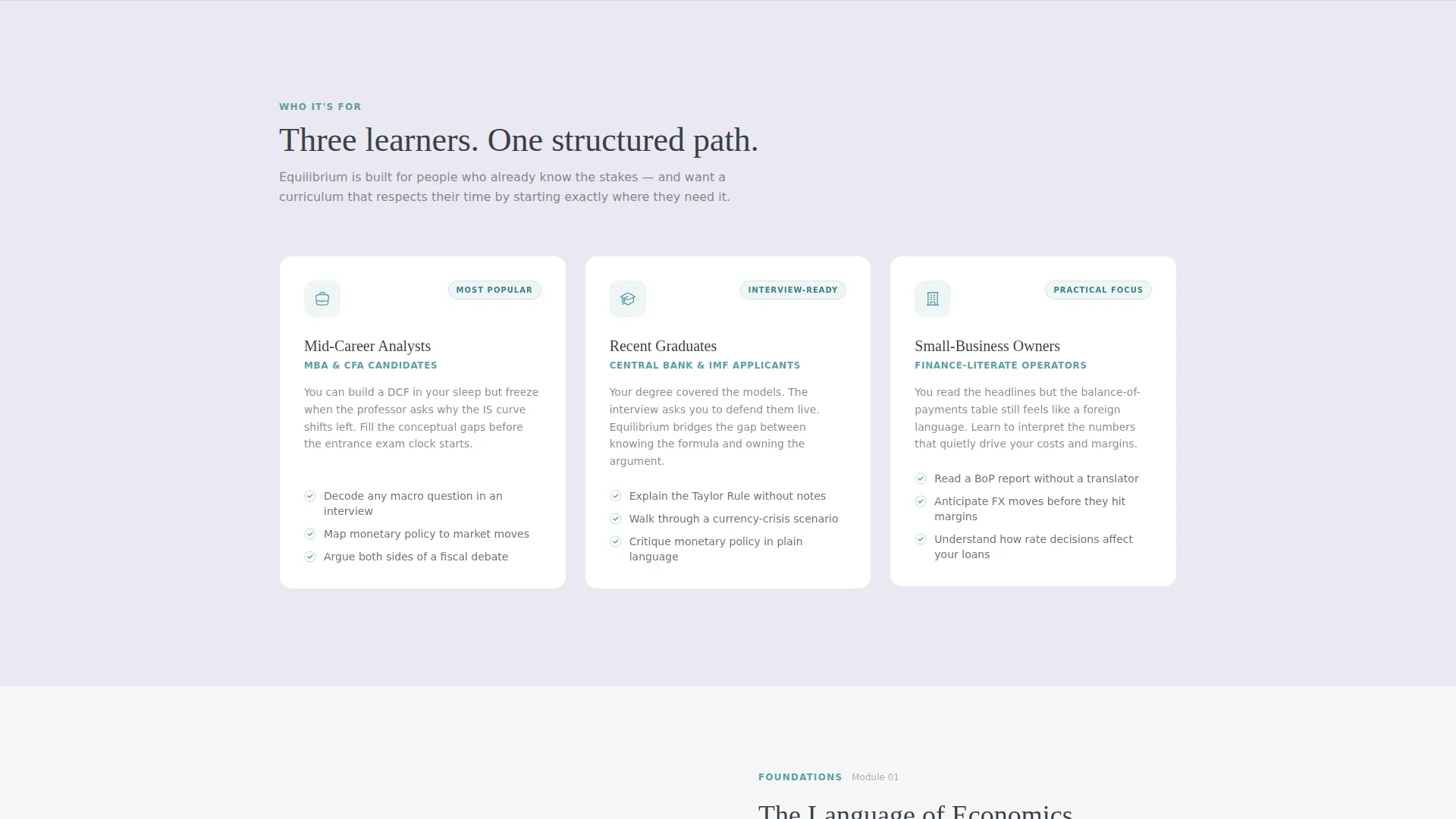
- Mid-career analysts preparing for MBA entrance exams who need a credible, well-organized course overview
- Recent graduates studying for central bank or financial institution interviews who want proof of depth before enrolling
- Small-business owners and self-taught learners who want practical economic literacy without academic jargon
What problem this template solves
Economics course pages often fail because they list topics without showing a learning path. Visitors cannot tell whether a course matches their level, and they leave before the value lands. Equilibrium solves this by making the curriculum itself the hero of the page.
- No clear learning progression: the zigzag structure maps each stage visually so the path from Foundations to Policy reads like a syllabus
- No proof of teaching quality: the embedded interactive widget demonstrates the method before asking for any commitment
- No sense of progress or belonging: left-margin breadcrumbs give visitors the feeling of already being enrolled
What you get with this template
Equilibrium delivers a complete, ready-to-adapt landing page built around an economics course curriculum. Every section is purposeful and connected to a visitor action or insight.
- A five-stage zigzag layout covering Foundations, Microeconomics, Macroeconomics, Policy, and Applied Economics, each with lessons, time estimates, and outcome statements
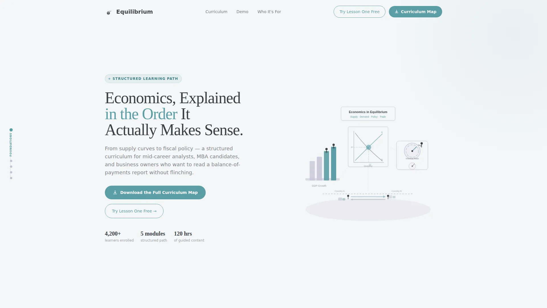
- A header section with a custom isometric illustration and a serif headline that sets tone immediately
- Two conversion touchpoints: a curriculum map download form and a free interactive lesson widget
Feature list
The template packages several purpose-built components into a single cohesive page flow.
Isometric Hero Illustration
The header features a wide, hand-drawn-style isometric scene. Tiny figures climb GDP bar charts, adjust interest-rate dials, and trade goods across a stylized border. A single teal accent pulses on the equilibrium point, grounding the entire visual identity in the subject matter.
Zigzag Curriculum Sections
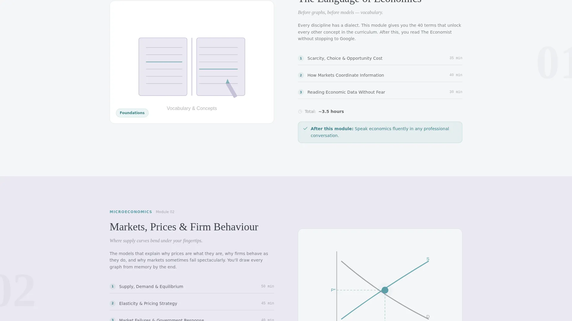
Five alternating sections each represent one learning stage. The left or right panel shows an illustrated concept snapshot. The opposite panel lists three concrete lessons, an estimated completion time, and a single outcome statement. The structure escalates from vocabulary and graph literacy to modeling inflation and critiquing fiscal budgets.
Interactive Supply-Demand Widget
A free embedded widget appears mid-page. Visitors drag a price slider and watch a supply-and-demand graph respond in real time. This proves the teaching approach before asking for any personal information or commitment.
Curriculum Map Download Form
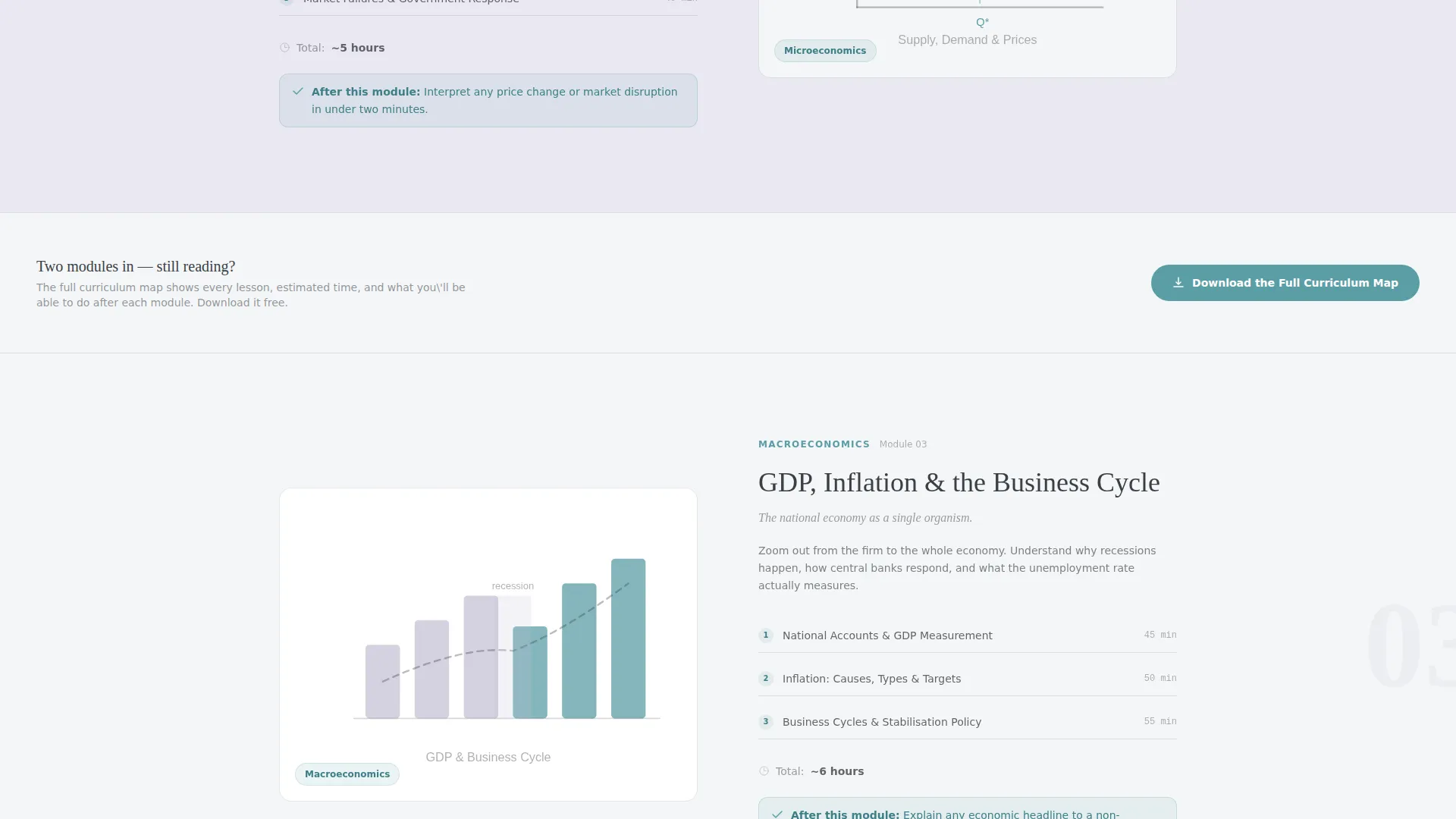
The primary call to action appears after the second zigzag module and repeats in the footer. Clicking opens a single-step form requesting a work email and a role selection from a dropdown. Role options include student, professional, educator, and self-taught.
Progress Breadcrumb Navigation
A breadcrumb trail runs along the left margin throughout the page. It shows visitors where they are in the five-stage curriculum map at all times. This creates a sense of active enrollment and keeps scroll momentum high.
Soft Mist Color System
The palette uses cloud white, pencil graphite, chalk-dust lilac, and margin-note teal. Backgrounds alternate between white and a light lilac wash. Teal appears only on links, progress indicators, and interactive highlights, keeping the design focused and distraction-free.
Page sections overview
| Section | Purpose |
|---|---|
| Hero Header | Introduce the course with a custom isometric illustration and a clarifying serif headline |
| Foundations Module | Open the curriculum path with vocabulary and graph-literacy outcomes |
| Microeconomics Module | Advance the learning path with price theory and market structure lessons |
| Curriculum Map call to action | Capture leads after two modules with a single-step email and role form |
| Macroeconomics Module | Deepen the path with GDP, inflation, and national accounts content |
| Interactive Lesson Widget | Demonstrate the teaching method via a live supply-demand price slider |
| Policy Module | Raise stakes with monetary policy and fiscal budget critique outcomes |
| Applied Economics Module | Close the curriculum path with real-world modeling and analysis skills |
| Footer call to action | Repeat the curriculum map download prompt with a final conversion opportunity |
Design & branding system
The visual identity follows a Corporate Precision theme. Every design choice supports legibility and calm authority, never decoration for its own sake.
- Color system uses four tones: cloud white (#F4F6F8) and chalk-dust lilac (#C5C1D6) alternate as section backgrounds; pencil graphite (#3B3F45) anchors all body text; margin-note teal (#5B9EA6) is reserved strictly for links, progress indicators, and interactive highlights
- Typography pairs a clean serif face for headlines with a readable sans-serif for body text, reinforcing the freshly printed textbook feeling described in the brief
- Illustration style uses thin, confident line weights with flat Soft Mist fills, keeping the visual tone quiet and professional rather than loud or playful
Mobile & speed optimization
The layout is structured to adapt cleanly to smaller screens without losing the curriculum flow or the interactive widget experience.
- Zigzag panels stack vertically on mobile so the illustration and the lesson list remain readable in sequence
- The left-margin breadcrumb trail repositions appropriately to maintain curriculum orientation on narrow viewports
- The interactive slider widget is built to function within the page without requiring external heavy assets that would slow the initial load
How this template helps you convert
Equilibrium earns conversions by giving genuine value before making any request. The page is designed so that trust is built incrementally across each scroll section.
- The interactive widget mid-page lets visitors experience the teaching method firsthand, removing doubt about course quality before any form appears
- The curriculum map download form appears only after two full modules have demonstrated depth and structure, so visitors already feel they understand what they are downloading
Other information about this template
This template is part of a broader set of education-focused templates built for course creators who need their page to do real persuasion work without relying on generic claims.
- The template style is Zigzag/Alternating, which suits structured, stage-based content like curricula, certification paths, or phased training programs
- The Content/Resource landing-page direction means the page leads with value and defers the gate until the visitor is already engaged
- The Step-by-Step Guide creative direction makes this template adaptable beyond economics to any multi-stage learning program where outcome clarity is critical
- The header concept uses a Custom Illustration, which can be replaced with subject-specific artwork while keeping the same isometric layout and teal accent logic
Theme
Corporate Precision
Creative direction
Step-by-Step Guide
Color system
Soft Mist
Style
Zigzag/Alternating
Direction
Content/Resource
Page Sections
Isometric Hero Illustration
Zigzag Curriculum Layout
Interactive Supply-demand Widget
Single-step Curriculum Map Form
Left-margin Progress Breadcrumbs
Soft Mist Color System
Related questions
Who is this template designed for?
Can I adapt the five curriculum stages to a different subject?
How does the interactive widget work on the page?
What does the curriculum map download form collect?
Where does the primary call to action appear?



