Certified Pest Control Services Landing Page Template
Exterminate is a Bold Brutalist hub-and-spoke landing page template built for pest control course and training platforms. It guides visitors through a Problem→Solution Arc, from unlicensed-operator failure stats to certification pathways, using a Dark Glass Panel header, anchor navigation, and a single focused call-to-action that drives free module previews.
by Rocket studio
Quick summary
Exterminate is a single-page, hub-and-spoke training platform landing page for pest control professionals. It opens with a high-contrast Dark Glass Panel header and moves visitors through five anchor-linked spoke sections. Each section pairs an industry failure point with a concrete platform solution, ending in a certification-focused call-to-action in chemical label yellow.
Who this template is for
This template is built for course creators and training operators in the pest control industry. It speaks directly to the people who run state-aligned licensing programs, continuing education providers, and field-skills bootcamps.
- Pest control business owners launching a technician training program
- Online course creators targeting apprentice technicians and career-switchers
- Continuing education providers who need to reach operators before license renewal deadlines
What problem this template solves
Pest control training programs often lose conversions because their pages fail to connect industry pain with platform proof. Visitors land, skim a generic course list, and leave without trusting the curriculum.
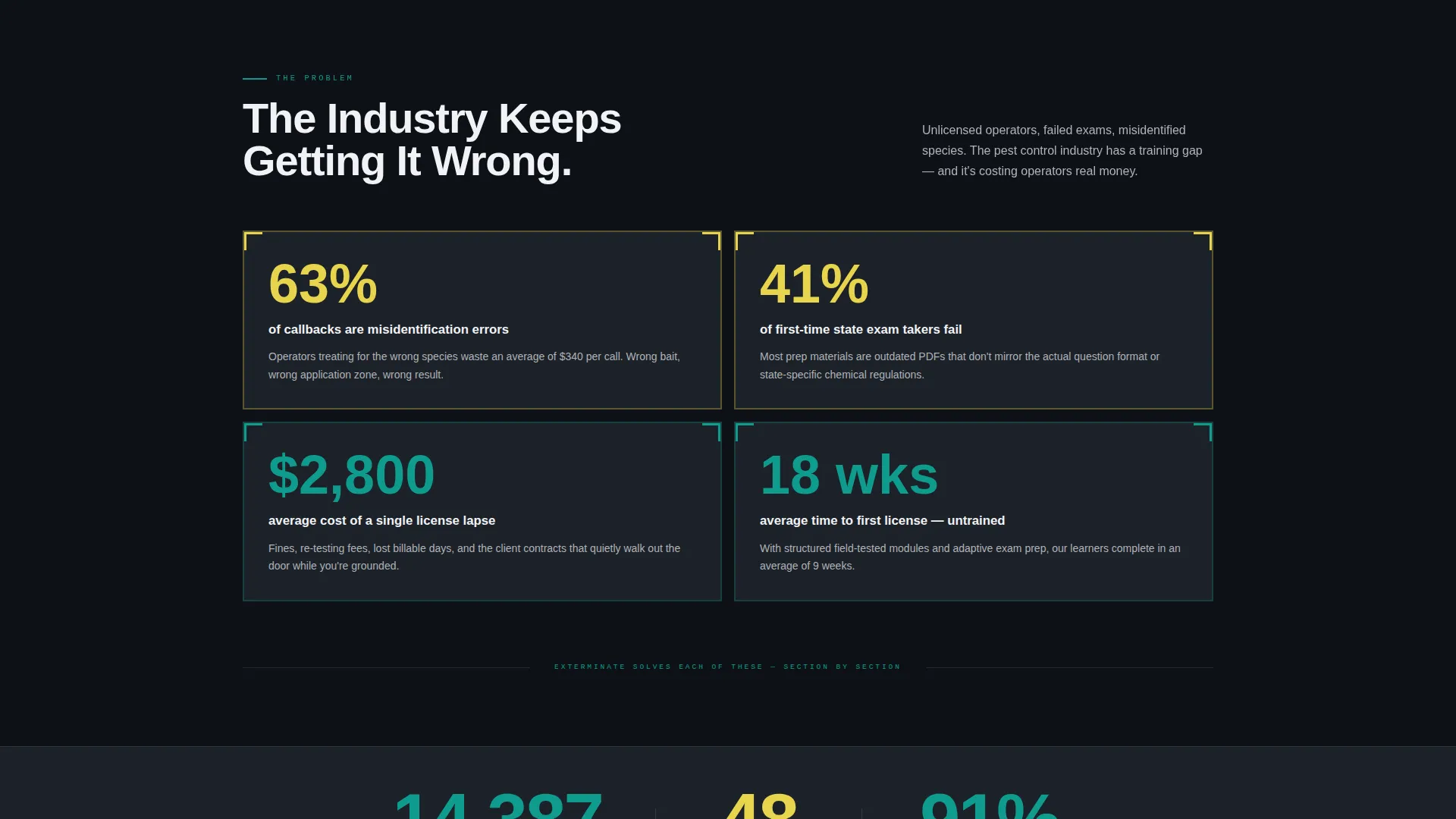
- Unlicensed operators fail inspections at high rates, yet most training pages ignore that stat entirely
- Misidentified species and wrong treatments cost companies thousands in callbacks, but course pages rarely address the cost of bad training
- Career-switchers and apprentice technicians need a page that speaks their language, not academic marketing copy
What you get with this template
You get a fully designed, single-page landing page layout structured around five anchor-linked content spokes. Every section is purposeful and prompt-driven, with no decorative filler.
- A Dark Glass Panel header with macro pest photography, a brutalist headline, and a teal subline
- Five anchor-nav spoke sections covering Courses, Field Labs, Exam Prep, Licensing Path, and Pricing
- Three trust elements: a real-time license counter, a state regulatory logo bar, and a video testimonial block
Feature list
This section describes the core built-in layout and design features delivered by this template.
Dark Glass Panel Header
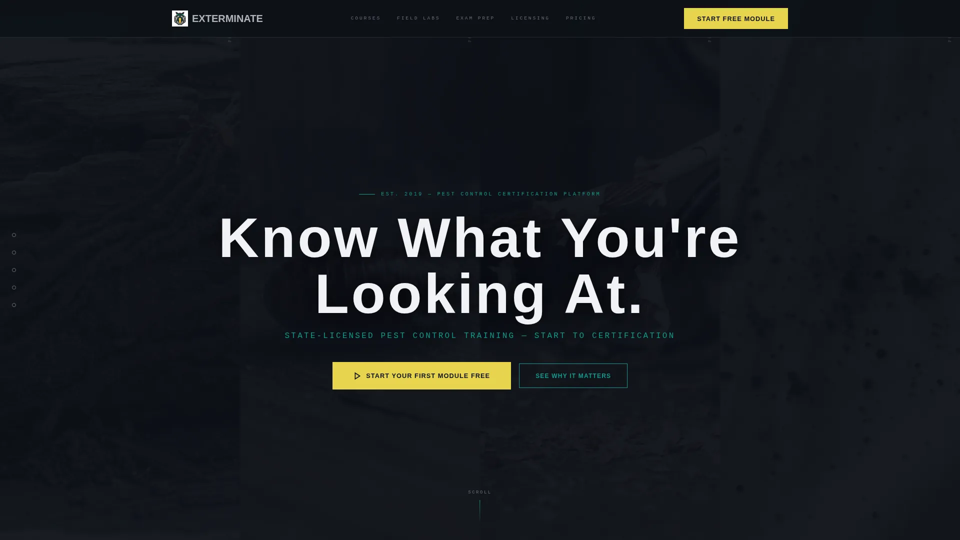
Four tall, narrow viewport-width rectangles each contain a macro pest photograph beneath tinted glass. On hover or scroll, opacity drops and the images sharpen into clinical focus. The headline "Know What You're Looking At" punches through in heavy brutalist type, with a teal subline below it.
Hub and Spoke Anchor Navigation
A fixed spoke rail sits on the left side of the page with five labeled nodes: Courses, Field Labs, Exam Prep, Licensing Path, and Pricing. Each node scrolls directly to its section. Active nav states use industrial teal to signal position.
Problem Stats Card Block
The first scroll section presents industry failure statistics inside thick-bordered brutalist cards. Each card lands a single punch stat, failed inspections, callback costs, misidentification rates. The layout creates immediate tension that the spoke sections then resolve.
Adaptive Exam Prep Section
The Exam Prep spoke section features a layout built around the adaptive practice engine concept. It visually communicates state-specific question pool alignment and mirrors the real test structure, directly answering the failed-exam failure point raised above.
Course Catalog Preview Strip
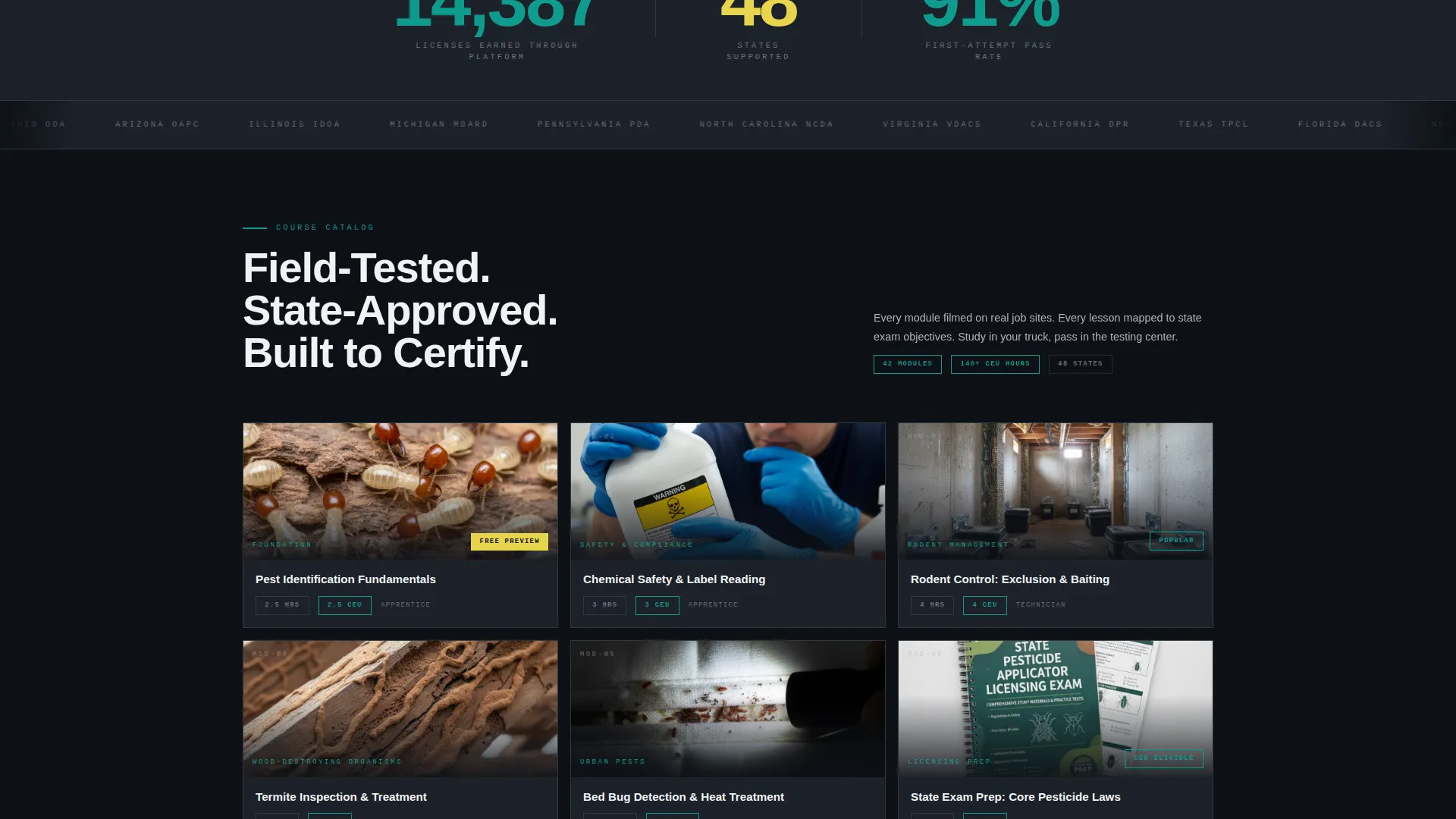
The final spoke section includes a course catalog preview showing module thumbnails, completion times, and continuing education unit credit counts. It sits alongside the primary call-to-action button to push visitors into the free course preview.
Trust Signal Stack
Three proof elements are laid out in sequence: a real-time counter showing licenses earned through the platform, a horizontal scrolling bar of state regulatory logos, and a single video testimonial from a technician who passed the state exam on the first attempt.
Page sections overview
| Section | Purpose |
|---|---|
| Dark Glass Header | Hook visitors with high-contrast macro imagery and the primary headline |
| Problem Stats Cards | Present industry failure statistics to create urgency and relevance |
| Anchor Nav Rail | Give visitors persistent, fixed navigation across all five spoke sections |
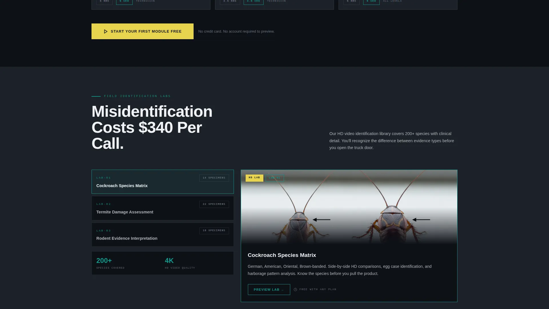
| Courses Spoke | Show the HD video identification library as the answer to misidentification |
| Field Labs Spoke | Demonstrate live identification labs as hands-on skill builders |
| Exam Prep Spoke | Position the adaptive practice engine against failed-exam failure points |
| Licensing Path Spoke | Guide visitors through the state-by-state certification roadmap |
| Pricing Spoke | Present plan options with continuing education unit credit counts visible |
| Trust Signal Stack | Deliver social proof via license counter, logo bar, and video testimonial |
| Final call to action Block | Anchor the free module call-to-action with course catalog preview thumbnails |
| Mobile call to action Bar | Repeat the primary call-to-action as a fixed bottom bar on mobile devices |
Design & branding system
The visual identity follows a Bold Brutalist theme using the Teal Catalyst color system. Every color is assigned a function and used nowhere outside that role.
- Deep crawlspace black (#0D1117) bleeds edge-to-edge behind content blocks; industrial teal (#0F9B8E) dominates section headers and active navigation states
- Chemical label yellow (#E8D44D) fires only on warnings, earned badges, and the primary call-to-action button; poured concrete gray (#B0B3B8) holds paragraph text and horizontal dividers
- Typography is heavy brutalist with wide letter-tracking on headlines; nothing decorative survives the layout
Mobile & speed optimization
The template layout is built to stay functional and readable at every screen width. Mobile users get a purpose-built experience rather than a scaled-down desktop version.
- The primary call-to-action repeats as a fixed bottom bar on mobile so the conversion point is always reachable
- The anchor nav spoke rail adapts to mobile breakpoints, keeping all five section nodes accessible without disrupting scroll flow
How this template helps you convert
This template is structured around a single conversion goal: getting visitors to click through to the free course preview. Every layout decision serves that goal.
- The Problem→Solution Arc creates tension in the opening scroll and resolves it spoke by spoke, so visitors arrive at the call-to-action already convinced the platform addresses their specific failure point
- Trust is earned before the click through the license counter, regulatory logo bar, and video testimonial, removing the friction that kills sign-ups on generic course pages
- The primary call-to-action in chemical label yellow appears at the header base, anchors the final spoke section, and repeats as a fixed mobile bar, making the next step impossible to miss at any scroll depth
Other information about this template
This template is categorized under Technology with a subcategory focus on pest control digital presence. It was designed specifically for the pest control course and training platform niche.
- The template style is Hub and Spoke with anchor navigation, making it suitable for training platforms that need to present multiple distinct subject areas on one page
- The creative direction follows a deliberate Problem→Solution Arc, meaning the copy structure and layout order are as important as the visual design
- The Intersection Match Score for this template is 13, indicating a high alignment between the Bold Brutalist theme, Teal Catalyst color system, Dark Glass Panel header concept, and Click-Through landing page direction
- This template is optimized as a click-through landing page with no on-page signup form; the call-to-action button links out to the platform's registration and course selector
Theme
Bold Brutalist
Creative direction
Problem→Solution Arc
Color system
Teal Catalyst
Style
Hub & Spoke (Anchor Nav)
Direction
Click-Through
Page Sections
Dark Glass Panel Header
Hub and Spoke Anchor Navigation
Problem Stats Card Block
Course Catalog Preview Strip
Trust Signal Stack
Fixed Mobile Call to Action Bar
Related questions
Does this template include a signup or registration form?
Can I use this template for a continuing education platform rather than a full licensing course?
How does the anchor navigation work on this template?
What trust elements are built into this template?
Is this template suitable for reaching career-switchers and apprentice technicians?



