Heavy Construction Landing Page Template
Dispatch is a construction help desk and ticketing landing page template built for commercial contractors, superintendents, and project engineers. It uses a dark Tech Glass visual style with a Void and Violet color system to display live-simulated dashboard metrics, modular capability cards, and a tiered pricing grid, all designed to move visitors directly toward a product demo.
by Rocket studio
Quick summary
Dispatch is a single-page construction ticketing and help desk landing page template. It opens with a simulated live-data dashboard and moves through a tight spec-sheet grid of capability modules. The design runs dark and precise, with violet accents on every active state. No forms, no stock photos, the product interface does all the selling.
Who this template is for
This template is purpose-built for software teams and founders selling construction workflow tools to field-facing buyers. It speaks directly to the people losing hours every week to disorganized issue tracking.
- General contractors, superintendents, and project engineers managing multiple active jobsites
- Facilities managers handling tenant repair requests across campus or portfolio properties
- Specialty subcontractors who must document response-time compliance for service-level agreements
What problem this template solves
Construction teams lose critical time chasing requests scattered across group texts, email threads, and voicemails. There is no single screen showing what is open, who owns it, and when it must be resolved. This template shows buyers that a centralized ticketing platform solves exactly that problem.
- Open requests, punch list items, and warranty callbacks buried across disconnected channels
- No visible audit trail when a trade misses a response deadline or a ticket falls through the cracks
- Difficulty proving service-level agreement compliance to clients or general contractors
What you get with this template
You get a fully structured, single-page landing page built around a dashboard-first visual approach. Every section is a discrete data module, not a traditional marketing block.
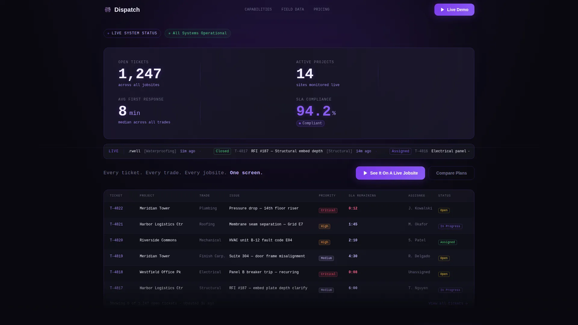
- A simulated live-data header showing ticket counts, response times, and a pulsing compliance badge
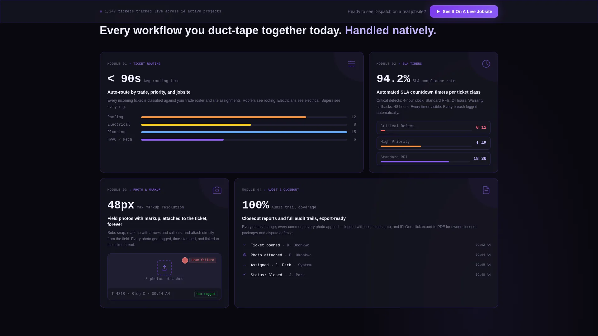
- Four spec-sheet feature modules covering routing, timers, field attachments, and closeout reporting
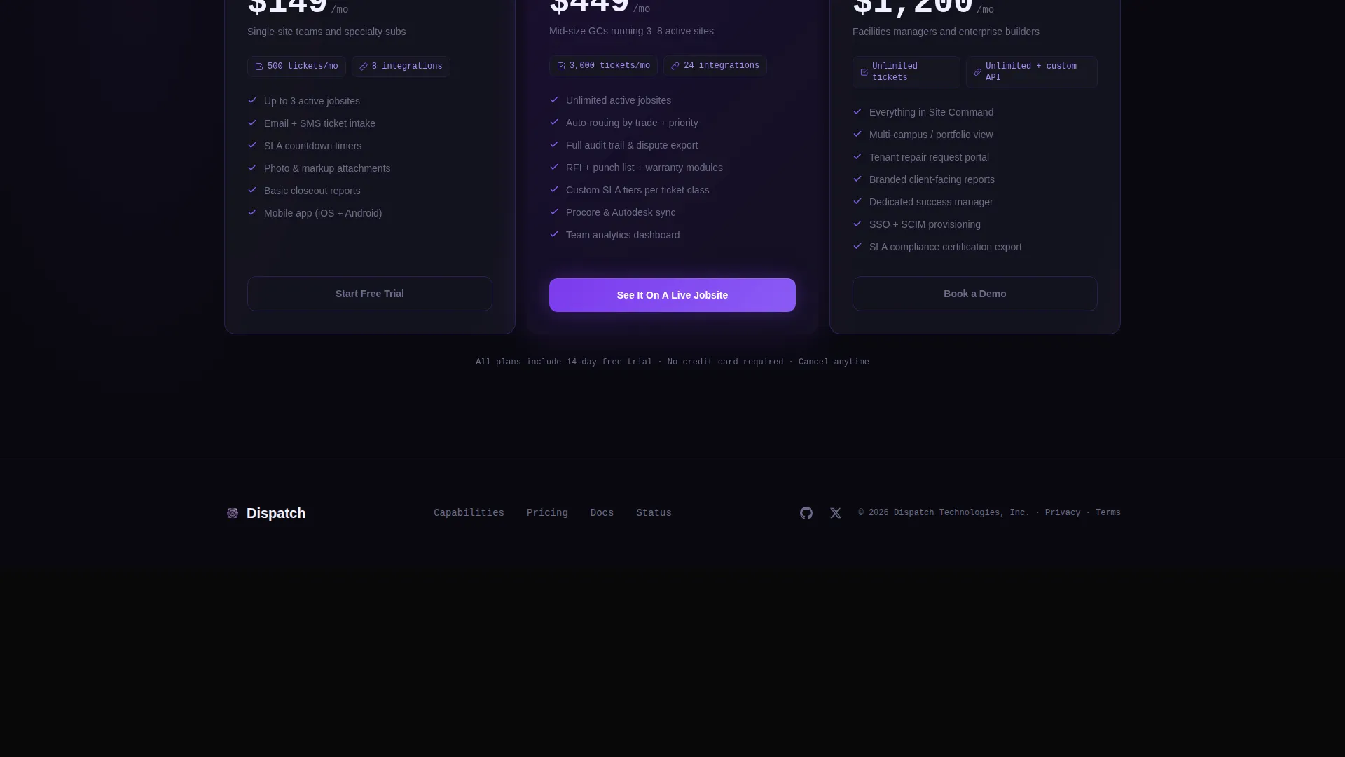
- A three-tier pricing grid with ticket volume limits, plus a sticky repeat of the primary call to action
Feature list
This template includes carefully structured sections and visual components drawn directly from the source brief. Each module is built to inventory platform capability, not to narrate a brand story.
Live Dashboard Header with Simulated Metrics
The header displays a simulated data environment: 1,247 open tickets across 14 active projects, an average first-response time of 8 minutes, and a 94.2% service-level agreement compliance badge pulsing in violet. A real-time ticker shows recently resolved tickets with building and timestamp details. Large monospaced numbers are separated by thin glass-edged divider lines.
Ticket Routing by Trade and Priority
The first capability module communicates how tickets are automatically directed to the right trade at the right priority level. The card format mirrors the product's own grid interface, with a headline metric, a one-line capability statement, and a supporting detail line.
Automated Service-Level Agreement Countdown Timers
The second module shows how the platform tracks open response windows against contractual deadlines. Buyers in specialty contracting immediately recognize this as a direct solution to compliance documentation and dispute prevention.
Photo and Markup Attachments from the Field
The third module surfaces the ability to attach field photos and markups directly to a ticket record. This closes the gap between what a site crew observes and what gets documented in the system of record.
Closeout Reporting and Audit Trails
The fourth module covers automated closeout documentation and full ticket history. This section speaks to project engineers and facilities managers who need a clean paper trail for warranty callbacks and project handoff reviews.
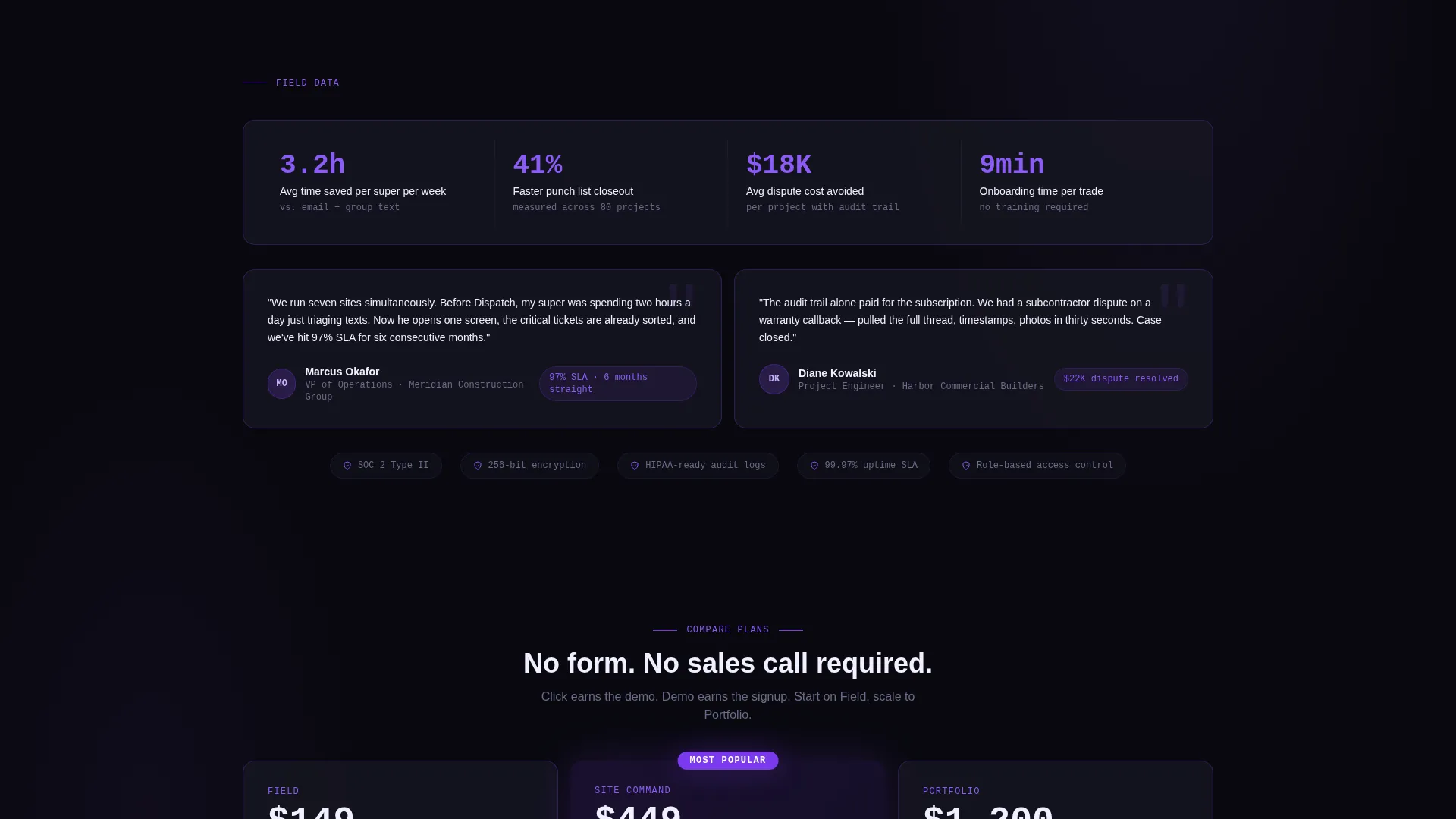
Three-Tier Pricing Grid with Volume Limits
The bottom of the page anchors a pricing comparison grid across three service tiers. Each tier displays ticket volume limits and integration counts, giving buyers a direct comparison point without requiring a sales call.
Page sections overview
| Section | Purpose |
|---|---|
| Live Dashboard Header | Simulates active ticket data to lead with product proof |
| Tagline Text Line | Anchors the value proposition in one declarative sentence |
| Ticket Routing Module | Shows trade-and-priority dispatch capability |
| SLA Countdown Module | Communicates automated deadline tracking |
| Field Attachments Module | Demonstrates photo and markup documentation |
| Closeout Reporting Module | Highlights audit trail and project handoff support |
| Sticky call to action Bar | Repeats primary call to action after third module |
| Pricing Comparison Grid | Displays three tiers with volume and integration counts |
| Secondary call to action Anchor | Directs bottom-of-page visitors to plan comparison |
Design & branding system
The visual identity follows a Tech Glass theme designed to feel like looking through a tinted partition into an operational control room. Everything is backlit and purposeful, with violet as the only warm signal in an otherwise dark interface.
- Color system: absolute void black (#09090F) for backgrounds, deep panel gray (#161622) for card surfaces, electric violet (#7C3AED) for active states and primary accents, frosted lilac (#C4B5FD) for secondary labels and muted data points, and iris violet (#8B5CF6) on hover states
- Typography uses large monospaced numbers for metrics, creating an instrument-panel aesthetic distinct from typical construction marketing
- Interactive elements pulse on hover, and the compliance badge animates in violet to draw attention without distracting from the data grid
Mobile & speed optimization
The template is structured as a vertically stacked single-page layout. Each data module is self-contained, which means the grid adapts cleanly to narrower viewports without losing the dashboard aesthetic.
- Discrete module blocks reflow naturally from a horizontal grid to a single-column stack on smaller screens
- The sticky call-to-action bar remains present across scroll positions, keeping the primary conversion path accessible on any device
- No hero images or stock photography means the layout stays lean; the visual weight comes entirely from the data display itself
How this template helps you convert
This template is built around a no-form, demo-first conversion strategy. Every design decision removes friction between a skeptical construction buyer and proof that the platform works.
- The header dashboard leads with product evidence rather than a marketing claim, establishing credibility in the first scroll position before a visitor reads a single word of copy
- The spec-sheet module format lets buyers scan and self-qualify quickly, confirming that their specific workflow gaps are addressed natively rather than through workarounds
- The primary call to action, "See It On A Live Jobsite," links to an interactive demo pre-loaded with realistic construction data, and the sticky bar repeats it after the third module to catch visitors who are ready to act mid-scroll
Other information about this template
This template sits at the intersection of construction software and field operations tooling. It is suited for any team building or marketing a construction help desk, ticketing platform, or field issue-tracking product.
- The template style is a Dashboard and Data Grid layout, which matches the interface language construction buyers already use in project management software
- The creative direction is Spec Sheet, meaning visitors are expected to scan and compare rather than read linearly
- The header concept is Stats and Metrics, replacing a traditional hero section with a live-data simulation that makes the product the visual centerpiece
- The landing page direction is Click-Through, with no embedded form; conversion happens through a demo link, not a lead capture field
- This template is categorized under Technology, with a subcategory of Construction Software and a niche focus on Construction Help Desk and Ticketing workflows
Theme
Tech Glass
Creative direction
Spec Sheet
Color system
Void & Violet
Style
Dashboard/Data Grid
Direction
Click-Through
Page Sections
Simulated Live Dashboard Header
Spec-sheet Feature Module Grid
Click-through Demo Call to Action
Three-tier Pricing Comparison Grid
Tech Glass Visual Identity System
Related questions
Does this template include a contact form or lead capture field?
Can I update the simulated dashboard numbers in the header?
What does the sticky call-to-action bar do?
Who is the target buyer for a landing page built on this template?
How does the three-tier pricing section work?



