Luxury Property Landing Page Template
Parcel is a real estate analytics landing page template built for the investor who needs hard numbers before the pitch ends. It pairs a split-screen dashboard preview with a spec-sheet scroll structure, a monochrome steel palette, and a freemium conversion flow. The result is a focused, data-forward page that turns serious buyers into signed-up users fast.
by Rocket studio
Quick summary
Parcel is a split-screen landing page template designed for a real estate analytics dashboard product. It surfaces deal metrics like cap rate, cash-on-cash return, and price-per-door in a terminal-style interface. The layout follows a spec-sheet scroll pattern, driving visitors from a bold dashboard preview straight to a frictionless email-only signup.
Who this template is for
This template is built for teams and individuals who evaluate real estate deals using real data. It speaks directly to users who live inside spreadsheets and need a product page that matches their mindset.
- Acquisitions analysts at mid-market real estate syndicators who need fast, credible deal screening
- Solo investors running deep-dive property research sessions and comparing rental comps
- Property managers benchmarking rent rolls against shifting micro-market conditions
What problem this template solves
Most real estate software landing pages lead with lifestyle imagery and vague value claims. Serious investors tune that out immediately. This template solves the credibility gap by presenting the product exactly as it works: metric by metric, module by module, no filler.
- Visitors arrive and see a live-fidelity dashboard instead of abstract marketing language
- Analysts can self-qualify instantly by scanning the spec-sheet feature rows before committing
- The freemium flow removes friction by asking for an email only, no credit card required
What you get with this template
You get a complete single-page layout structured around a dashboard product. Every section is purposeful, and the visual system is fully defined from typeface weight to accent color usage rules.
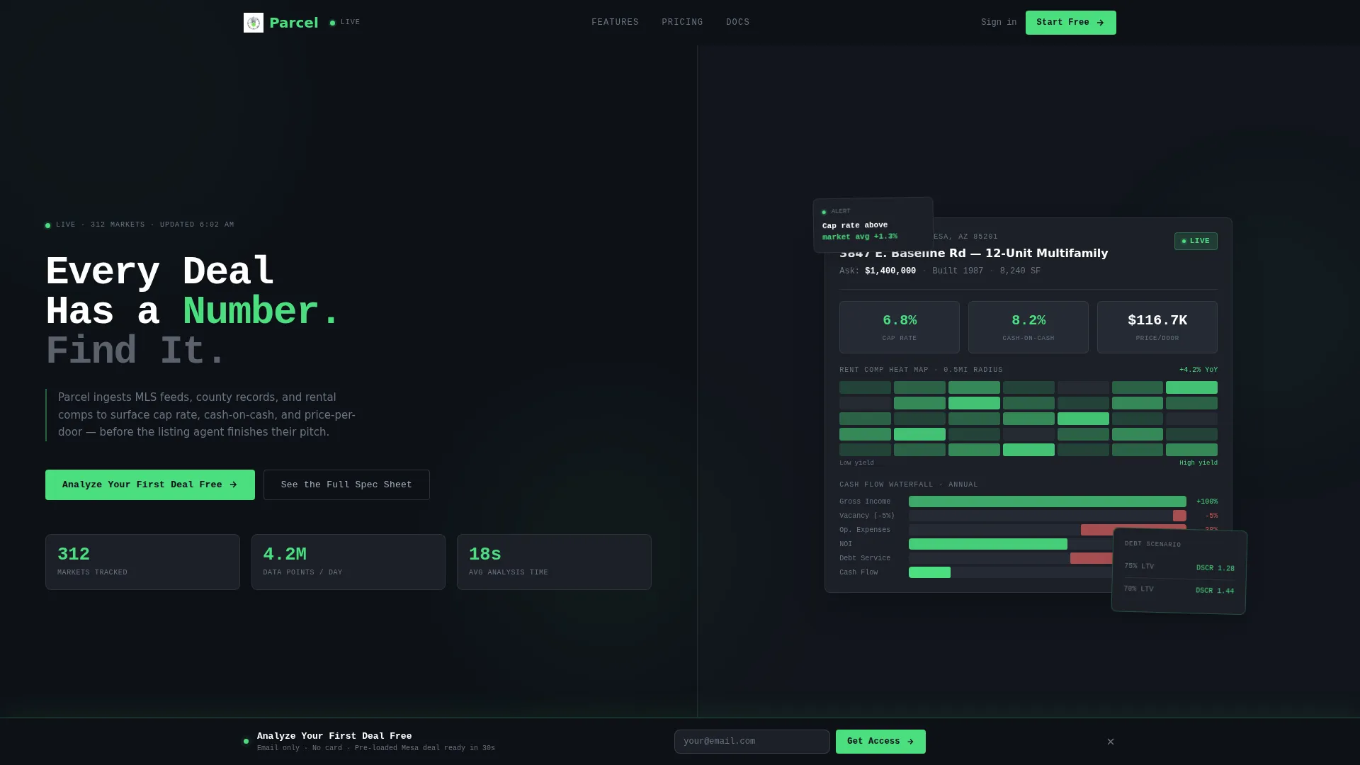
- A header split 50/50 between a bold headline with animated stat counters and a realistic dashboard screenshot showing a 12-unit multifamily deal in Mesa, AZ
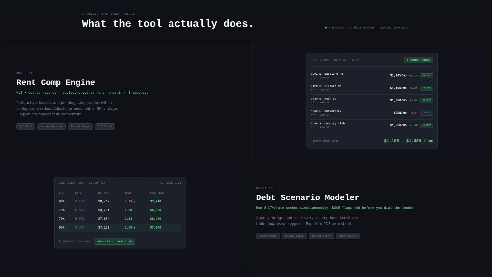
- A spec-sheet scroll section with isolated feature rows, each pairing a module name and one-line explanation with an active user interface panel on the right
- A dual-call to action conversion system: a primary button in the header and a sticky bottom bar that activates after the third spec row, plus a ghost-button secondary call to action anchoring to a Free versus. Pro comparison table
Feature list
This template includes a set of purpose-built layout components and interaction patterns designed specifically for a data-heavy analytics product.
Split-Screen Dashboard Header
The header divides the viewport cleanly down the middle. The left side holds a tight mono-grotesk headline, "Every Deal Has a Number. Find It.", stacked above three animated stat counters that tick upward on page load. The right side shows a high-fidelity dashboard screenshot mid-workflow, complete with a cap rate card, rent comps heat map, and a cash flow waterfall chart rendered in realistic data.
Spec-Sheet Scroll Layout
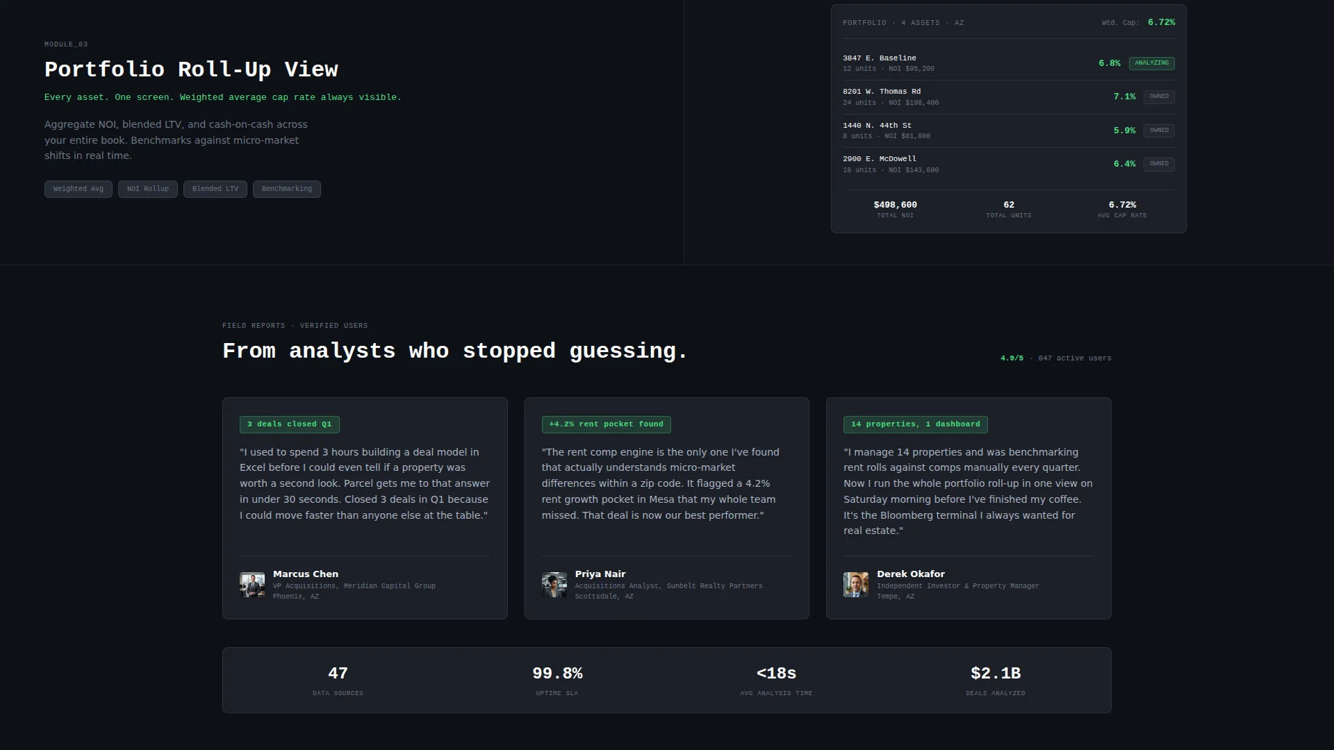
The scroll section is structured like a product datasheet. Each feature occupies its own split-screen row: the module name and a single explanatory line on the left, the actual interface in action on the right. Modules shown include the Rent Comp Engine, Debt Scenario Modeler, and Portfolio Roll-Up View.
Freemium Conversion System
The primary call to action, "Analyze Your First Deal Free", appears in electric green on terminal black. It is placed once in the header and once in a sticky bottom bar that activates after the visitor passes the third spec row. Signup requires an email address only and drops the user into a pre-loaded sample deal.
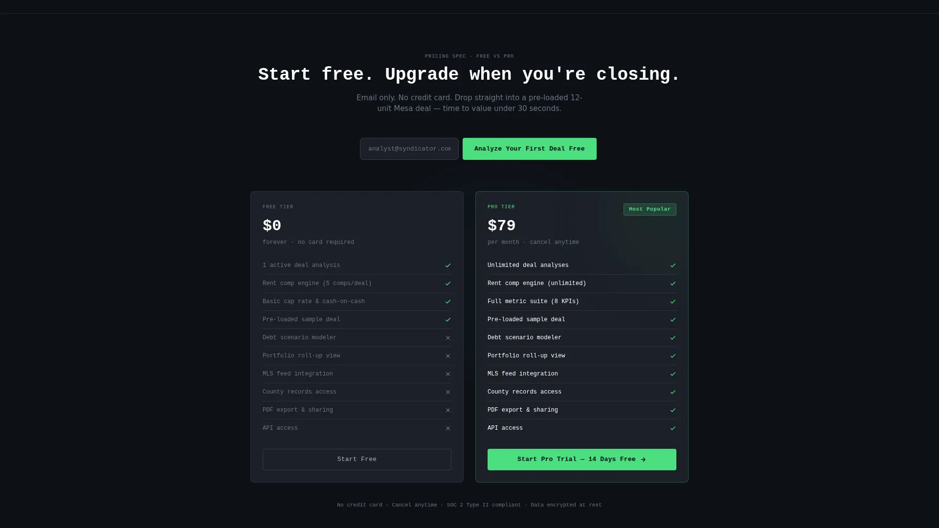
Free versus. Pro Comparison Table
A secondary ghost-button call to action labeled "See the Full Spec Sheet" anchors down to a comparison table near the footer. The table lets power users self-qualify by reviewing the difference between the Free and Pro tiers before committing to anything.
Animated Stat Counters
Three key product metrics tick upward on page load: markets tracked, data points refreshed daily, and average analysis time in seconds. These counters reinforce product credibility at first glance without requiring the visitor to read a single paragraph.
Page sections overview
| Section | Purpose |
|---|---|
| Header Split Screen | Headline, stat counters, and dashboard screenshot above the fold |
| Stat Counter Row | Three animated metrics that establish product scale on load |
| Rent Comp Engine | Spec row showcasing the rental comparables module |
| Debt Scenario Modeler | Spec row showing financing and leverage scenario tooling |
| Portfolio Roll-Up View | Spec row displaying multi-asset aggregation capability |
| Sticky call to action Bar | Bottom conversion bar that activates after the third spec row |
| Free versus. Pro Table | Tier comparison anchored by the secondary ghost-button call to action |
Design & branding system
The visual identity follows a Monochrome Steel color system that feels intentionally cold and precise. Every color decision earns its place by representing data that matters.
- Core palette: terminal black (#0E1117) for backgrounds, panel gray (#1C2028) for card surfaces, and brushed steel (#A8B2C1) for secondary text and borders
- Electric green (#4ADE80) is reserved exclusively for positive metrics, live status indicators, and all primary call-to-action surfaces
- Typography is set in a tight mono-grotesk face, reinforcing the terminal aesthetic and keeping headlines dense and readable at large sizes
Mobile & speed optimization
The template is structured so its key information hierarchy holds across screen sizes. The split-screen layout is designed to restack cleanly without losing the visual relationship between spec labels and their corresponding user interface panels.
- Spec-sheet rows reflow to a stacked single-column layout on smaller viewports, keeping the module name and user interface panel paired
- The sticky bottom call to action bar is sized and positioned to remain usable on touch screens without obscuring content
- Animated stat counters are lightweight by design, relying on simple numeric ticking rather than heavy animation frameworks
How this template helps you convert
The conversion strategy is baked into the layout sequence itself. Every design decision reduces hesitation and shortens the path from first impression to signup.
- The dashboard screenshot above the fold shows the product working on real data before the visitor reads a single word, building immediate trust with a data-literate audience
- The spec-sheet scroll lets analysts validate the tool feature by feature, so by the time the sticky call to action bar appears they have already self-qualified
- The email-only signup with a pre-loaded sample deal means time-to-value is under thirty seconds, removing the most common reason power users abandon free trials
Other information about this template
This template is categorized under Technology, specifically within the Real Estate Software and SaaS subcategory. It is purpose-built for the Real Estate Analytics Dashboard niche and pairs a Startup Velocity theme with a Spec Sheet creative direction.
- The template style is Split Screen (50/50), consistent with dashboard product presentations that need equal visual weight between copy and interface
- The landing page direction is Freemium/Trial, meaning the entire layout is sequenced to move a skeptical, data-literate visitor toward a low-friction first action
- The header concept is Dashboard Preview, placing a working interface visual at the highest-attention point on the page
Theme
Startup Velocity
Creative direction
Spec Sheet
Color system
Monochrome Steel
Style
Split Screen (50/50)
Direction
Freemium/Trial
Page Sections
Split-screen Dashboard Header
Spec-sheet Scroll Section
Freemium Conversion Call to Action System
Free Versus. Pro Comparison Table
Animated Stat Counters
Related questions
Who is this landing page template designed for?
Can I replace the dashboard screenshot and stat counter values?
How does the two-call to action conversion system work?
Does the signup flow ask for a credit card?
Can I adjust the color palette for my own brand?



